Growing album is a video of 11k album covers growing in saturation and complexity. The idea is to show a ‘growth pattern’ of sorts in album cover design.
The image visualization project was a series of trials and errors for me. I started off with he fingerprint images data. I had a collection of 7000 image sets. I sorted them by type of fingerprint: Arches, Loops and Whorls, based on the metadata I had. The only other meta-data I had was the gender of these fingerprints. The idea was to build portraits using these fingerprints and point out genders. For example, making a fingerprint portrait of President Obama, and using 56% female fingerprints, because 56% of the people who voted for him were women.
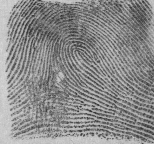
Sample Fingerprint: Gender: M Class: R History: f0002_05.pct R a0385.pct
However, this project seemed less cultural. There was less ‘truth’ in it, and less of a people’s factor. I was advised to look into a different image data set and I did. I started looking at an image set of 1 mn audio covers.
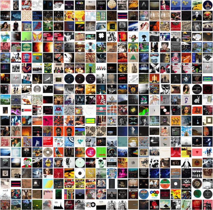
So I had a whole new data set of beautiful 1 million audio record covers. I first cleaned the image-set to remove all he junk images. Then I used ofxTSNE algorithm by Gene Kogan to make a grid of these covers sorting the visually similar images. I did multiple small grids with sets of images from the big image-set. This is the TSNE grid I got from all the images. It very strangely resembles a wolf when zoomed out.
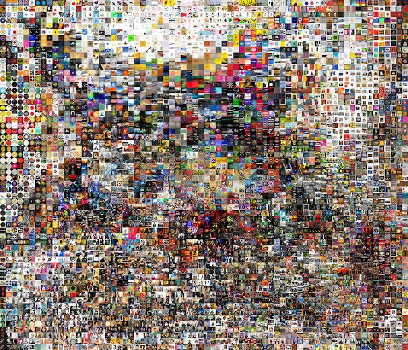
TSNE Grid of Audio Album Cover
Zoomed in versions of the TSNE:
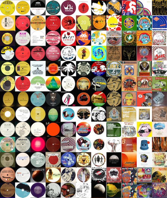
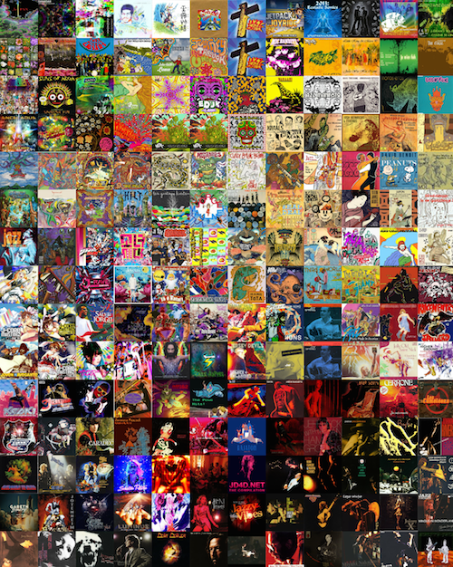
I recognized several visual patterns in these album cover designs. There were shape patterns like circular disks. Several album covers had a group of people, most commonly the band members, sometimes the crowd. Some audio album covers had a single person with a guitar or another musical instrument. A group of images were just very intricate designs or ornate patterns. It was interesting to observe the change in lighting in different album covers.
I then attempted to run a web search algorithm on each image to associate some sort of meta-data to it, like the genre, or time. The aim was to add audio files to each image. But I failed in doing this because I could not find a lot of these images and scraping audio was difficult for me. So I reverted back to trying to sort these images. One sorting that excited me was intricacy of the album cover design. I used average pixel color variation from the median color of the image, and used this standard deviation measure to determine the more complex images vs the less complex. Another sorting I did was based on the image saturation. This was interesting because I saw a pattern in genres when I did the saturation sorting. A lot of classical music and jazz appeared in the less saturated images. A lot of Jazz also appeared in the night images. A lot of international music, like Indian or Japanese music appeared in the most saturated brackets. I then arranged these images in a video and associated the Shepard sound note to them, to produce a progressive music effect, to show an increase. The Shepard tone gives the audio illusion of being an increasing tone, but in reality it’s really a sound consisting of a superposition of sine waves separated by octaves. The idea was to show an ‘increase’. This video has a set of 11,000 images.
Growing Album from Safinah Ali on Vimeo.
I received a good amount of criticism and feedback for this. A major one was that, I am trying to show a change, but a video is not the best way to do it, because you can see the slow progression, but not the change over time. A static visualization with the images arranged in sequence would have made for a better way to depict this ‘variety’ in images.
Source code: https://github.com/safinahali/ImageSorting-SaturationVariance/
Acknowledging:
Kyle McDonald for an introduction to working with large image datasets.
Golan for the guidance.
Colleagues and guests at the critique session for feedback.
References:
https://archive.org/details/audio-covers
https://github.com/genekogan/ofxTSNE
https://www.youtube.com/watch?v=BzNzgsAE4F0
https://en.wikipedia.org/wiki/Shepard_tone