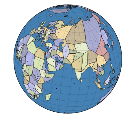
World Capitals Voronoi by Jason Davies

View interactive globe here: https://www.jasondavies.com/maps/voronoi/capitals/
The above map is a spherical Voronoi diagram that partitions Earth based on proximity to a nation’s capital. Every point is colored based on what capital it is closest to. Proximity is one of many geographic factors influencing the formation of nation boundaries. This map is a rough depiction of what the nation boundaries might look like if proximity were the only factor. What makes this map intriguing is how its boundaries compare against the “correct” boundaries. When the Voronoi boundaries are very wrong, it helps the viewer consider what factors might have led to the formation of the “correct” boundary (for example, the rather lopsided territory of Russia relative to Moscow). Likewise, because proximity is such an insufficient factor for describing nation boundaries, it’s even more interesting when the Voronoi boundary is actually close.
One particular problem I have with it is that spherical distance is a very bad notion of distance to use. The use of spherical distance leads to odd situations like South Africa claiming a significant chunk of Antarctica even though any traveller would need to cross a restrictive amount of ocean. On the other hand, Chile, Argentina, and Uruguay are nations that have an easier time getting to Antarctica but manage to claim much less of it than South Africa. There are datasets and models out there that provide a measure of travel times between any two locations on Earth. Their use would make the diagram a bit more informative, since it would incorporate a better understanding of geographic factors.