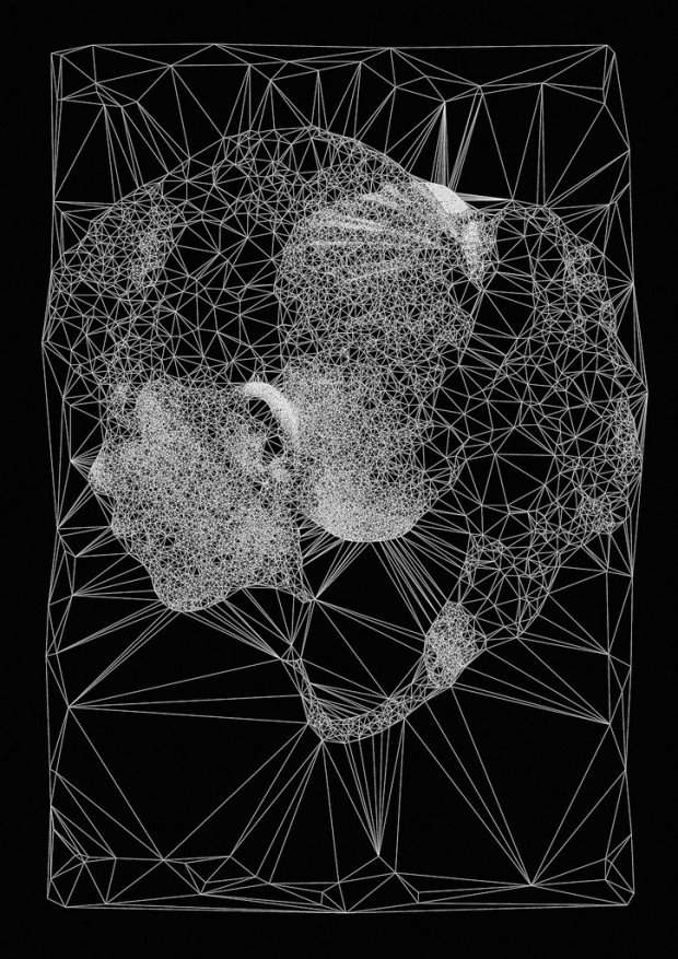
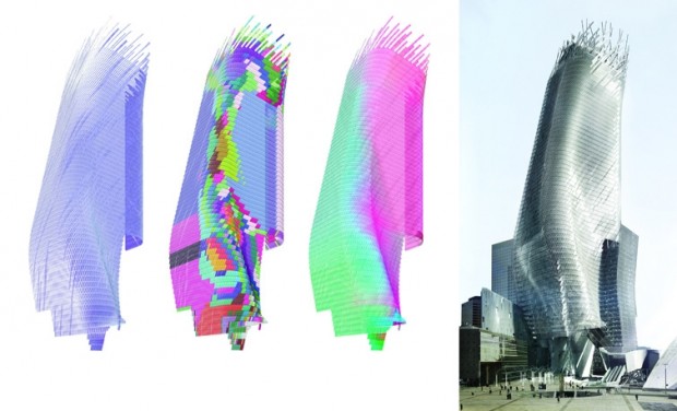
“It’s You” by Karolina Sobecka. 2012
This eerie installation engages the passing by pedestrian by simulating an audience looking at something the passer-by cannot see. The crowd acknowledges the pedestrian’s existence by turning briefly to glance, and then open up a view after a few seconds to what they are looking at. After a couple minutes the crowd turns to the real person and at this point the person has the opportunity to perform for this digital crowd and get the audience to applaud.
So what’s exciting to me about this project is the eerie level of engagement it provides with life-sized people who acknowledge your existence. It’s in an area where you wouldn’t quite expect an audience, let alone a digital audience, to be. I like that term: “digital audience”. It seems this one is a little too easy to impress, and is very limited in its responses. It makes me think of rock band a little, too, where you can very easily un-impress the crowd, but the measurement there is so blatant with a scoring system based on how many notes you get right. Either way, the technology use in this project is pretty clever, using Unity, Blender, and open frameworks all together. A clever mixture of tools perfectly suited for this project scope.
More
“United Snakes” by Massive Attack + Dave Ferner and Tak Fung
This project is simple in concept but I’m sure it was at least mildly complex in execution. Or maybe not. I can never really tell. Regardless, a very enticing final result was produced for a music video for Massive Attack which is some band I never heard of before. The program written purely in open frameworks has the user drawing shapes, setting a fidelity, and then click-dragging to move the mesh around and recording in real-time. Various other features are implemented it seems such as copy/paste and having one click-drag affect copies. It results in one of those mesmerizing types of melt-y flow-y visualizations that are fun to stare at and not have to think about anything else.
I like this kind of thing because it’s simple and functional. I also like artsy and meaningful things, projects with loaded metaphors or meaningful representations, those are great and thought-provoking, but I find myself more attracted to purity, where things simply are what they are. The project then focuses on how to make it re-usable and allows for many different yet similar outputs. I like vagueness, I like when it just is what it is. This project really is what it is, a tool for creating a mesh to then drag around and record, and create a cool effect. Maybe that’s the architect in me, enjoying function and form.
The first project I looked at was slightly more poetic or attempting to be it feels, simply because of the eerie effect and what seemed to me like a comment on social behavior regarding focus on subject. Also enticing, but has so many questions left unanswered, never feels complete, it’s really a wicked problem project. For that reason I am probably just going to focus on the pragmatic side of things, or simply for the sake of my personal interest and what ‘feels cool’ to me. I dunno. Maybe I’ll try loading one of these two projects with some meaning. Maybe.
More

