Category Archives: LO-2

pedro

21 Jan 2015

This week I investigated some data visualization of urban systems. Big data, simulation and visualization are important topics in urban planning and management of emerging urban cities. There are many associations of research institutions with government agencies in pursuit of new tools for urban resilience and to promote a deep understanding of urban phenomena. Here I will focus on 2 labs that are developing  very interesting tools for data visualization around the world: ETH Future Cities Lab and MIT Senseable City Lab.

Future Cities Laboratory is one of the research programs of the Singapore-ETH Centre for Global Environmental Sustainability (SEC).  It developed many tools to model and simulate many urban phenomena and dynamics. It comprises the many scales of the city – from material and building to territory – and one of the main focus in the urban scale is transportation. In this video Eva Friedrich presents a tool that supports the analysis of accessibility in the urban tissue of Singapore: Singapore transport accessibility (2013). It contains many algorithms such as clustering and shortest path that allow the user to choose what data to visualize and even to simulate some hypothetical situations (time of a travel).

The MIT Senseable City Lab is also focused on visualizing the phenomena of the city in real time and it has developed many visualizations of world cities over the last 10 years . The lab also developed 3 tools to visualize mobility data at Singapore, in the project visual explorations of urban mobility (2012). One of this tools is called touching bus rides, which uses data from smart cards of bus transportation to enable the exploration the patterns of use of the buses and in different lines. As in the project above, it uses a multi-touch table to amplify the interaction with the researcher.

Based on data from the Land Transport Authority, the data lenses tool enables to magnify the details of the network to monitor the bus stops. It also allows to select layers to quickly visualize other data such as passengers load and paid fares in specific locations.

Finally, traffic origins uses information (local and time) of traffic accidents and road-speed and traffic-flow data derived from Land Transport Authority’s network of sensor to analyze the relation between accidents and congestion.

All these tools have a very well-defined goal and at the same time, they inspire future scenarios of participatory design and planning in big cities. Surely, this would lead us to a political debate that is beyond the scope of this topic. All these 4 tools are very interesting, but in a brief analysis, I consider that Singapore transport accessibility is less specific than MIT tools, at the same time it has many interesting algorithms. In this sense, it seems to enable a more engaging experience.

All in all, this is a topic that is becoming part of our daily life, so I hope that soon everyone could access all these data and use similar tools to analyse our urban environment and the transportation system for free.
Zach Rispoli

21 Jan 2015

wikigalaxy

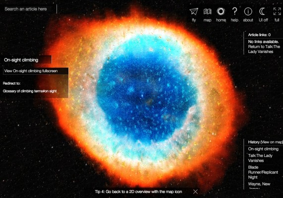
WikiGalaxy is a browser-based interactive visualization of Wikipedia, stylized as a cluster of stars. I thought this project was sort of interesting (although things like it have been done before) but I’m a sucker for things related to space, so it caught my eye. I’ve always wondered if at some point someone will develop a network-like interface like this that works well enough to replace the system of viewing one page at a time and following links which the internet currently exists as. This sort of system is good for visualizing relationships between lots of objects – a really good example of this is RedditViz, which is a map of all of the subreddits on Reddit. You can easily make out different communities which can be playfully personified as islands or countries (in this case, there’s a uncomfortably large NSFW peninsula as well as an isolated Brony Island…).

I haven’t yet seen a map like this which can be used to not only visualize, but to be used to browse through information. WikiGalaxy is interesting to look at, but isn’t really viable for browsing Wikipedia with.

(also the project is supposed to be a galaxy, but the image they used is of the Ring Nebula which is most certainly not a galaxy)

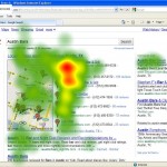
google-local-heat-mapAustinBars_Heatmap

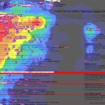
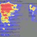
Google-HeatmapsHeatMap

Another visualization-related thing I found interesting were these heatmaps generated by tracking the eyes of Google users. I think they’re sort of strange, almost like mold was beginning to grow on the page as the user’s gaze moved over it. Heatmaps in general are fascinating because they seem so data driven and digital but also so creepy and organic. I really want to do a project involving heatmaps at some point.

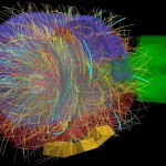
what-does-the-discovery-of-higgs-boson-mean-video--1ffb4d375aurl

I also really want to do something visually similar to these physics experiment visualizations by CERN – some of these are massive, complex experiments done to try to find the Higgs Boson (nicknamed the God Particle – which reminded me of the religious proto-chemistry of 14th/15th century alchemy).

Zack Aman

21 Jan 2015

onesecond

oneSecond

#oneSecond [philippadrian.com] by graphic design student Philipp Adrian aggregates all the tweets sent at exactly 14:47:36 GMT of 9 November 2012.”  The project comes in four volumes:  a book of the actual messages, ordered by language; a book of the colors used by Twitter account, ordered by timezone; profile description, ordered by Klout score; and profile name, ordered by number of tweets sent.

There are two things I love about this project:  that it seeks to expose the detail in a huge data set instead of reduce it to summary metrics and the different relationship of variables for each book.  I feel like many infographics are reductive and seek to summarize the data by averaging everything together; #oneSecond instead preserves the detail of an enormous data set and truncates the data instead.  The variables also seem logical and thought out — they aren’t enormously complex but they feel deliberate.

I can’t immediately think of anything Adrian could have done better.  I love the print format and the concept.  Maybe he could have added more variables, but I there are definitely diminishing returns on simply adding variables for the sake of exhaustively finding relationships.

Adrian doesn’t explicitly talk about his influences, but visualizing and measuring Twitter definitely has a rich history — not particularly surprising since it feels like an unfiltered hive mind.


Metrico

Metrico is a game that both uses the typical infographic aesthetic as well as uses metrics as a control system.  The game itself is a puzzle platform that tracks the input of the player — by manipulating the input the player can control the map (such as by jumping multiple times to raise a platform).

I find this project to be particularly inspiring because of its interactivity.  Many data visualizations and infographics present the data but stop short of leading the viewer to action.  In Metrico, the loop is closed; the level is the data, and the way through the level is to change the data.

It’s hard to give a proper critique without playing through the game myself, so I’ll talk about some things that I would want to see in it.  I’d love to see social metrics, so that you aren’t isolated when playing the game but can use data to quantify your performance in relation to others.  I would also want the game to be educational in a way and build up from simple data to more complex data; maybe later levels would not be just about how many times you jump but about the relationship between different metrics (such as maintaining a ratio of one jump per two projectiles.)

The most obvious influence is platform games in general, a genre that is always simple at its core but people always manage to find a new twist for.  Data visualization has also always been an integral part of games (such as tracking army growth in Starcraft), and Metrico does a nice job of flipping this part of the game.

dsrusso

21 Jan 2015

Point Cloud from James Leng on Vimeo.

POINT CLOUD // JAMES LENG

Point Cloud by James Leng is a kinetic sculpture that was created to visualize weather data in real time.  The complex motion is created by servo mechanisms within the meshed geometry.  The created wire mesh allows for complex mechanical relationships between the points of actuation. Then conceptual basis for the project was the observation that most of the weather data that is circulated today is vastly over simplified.  Many meteorological phenomenon are documented through simple numbers within a constructed scale.  These scale lack any greater context or perception.  The sculpture begins to critically question the relationship to data and the physical world we inhabit.  So much of our visualization for data exists in “flat” representations which are both limiting and often ineffective.  However, there are a few critical issues with this specific work.  The relationship between the data and the movement is not clear.  The actual visualization of the data is not effective, although it’s efforts to depart from flat representations are admirable.  This project provides an excellent example of how data can be brought into our very physical and dynamic world.  Leng’s architectural background was a huge inspiration to the piece.  The way in which it was constructed is the very essence of how digital geometries are created and modeled.


INTERNET TOPOGRAPHY 2011 from art of failure on Vimeo.

INTERNET TOPOGRAPHY // ART OF FAILURE

Internet Topography by Art of Failure is a project that seeks to visually represent data that is not detectible by human sensory.  The project functions by taking a signal and sending it out through a network.  The sound is then routed back to it’s source via the specific network.  The signal from the network is very similar to the original although it contains all of the anomalies and echoes created by the network structure.  This essentially then gives a sonar like image of the digital infrastructure.  The received data is then processed in a generative way, which then creates a physical “map” of the network.  This project is conceptually important in that it contributes something that is totally imperceptible otherwise.  The installation is a critical mediator between us and the digital environment which we spend so much of our time interacting with.  Although the installation is very immersive and complete, I do think that it could be a great opportunity to reach further into the physical world.  Means for this could be any variety of mechanical actuations or possibly mapped content into real space.  Art of failure has an extensive portfolio which revolves around bringing hidden forces to light.  The vast majority of their projects explore the web and virtual worlds, although several projects are more physical.  (Flat Earth Society)  Sound is the main vehicle for their explorations, although most of their explorations involve translations into present geometry.  This becomes a sort of “enhanced cymatics” that begins to reach spacial scale.  (See examples of cymatics for possible source of inspiration)

Thomas Langerak-LookingOutwards-2

Data visualization is more than “just” about posters and images. I believe that the best data visualizations are interactive and you can manipulate the layout. I believe that Microsoft just took this a step further, though arguably VR in generally does. We are now not limited to a screen anymore, we can show data when it is appropriate. Remember that it is more than just about collection of images, are ratio between ethnicity. Weather forecast is data, traffic is data. We now can show them when and where they are appropriate. We have to be careful though, data can be overwhelming. It is up to designer to make careful decisions about how appropriate certain data at certain moments is.

Capture

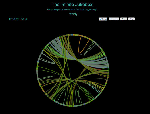
The infinite jukebox  is something a bit different from the ordinary data visualization. One can choice a song (either from a database, or upload one). The software searches for similarities in this song and makes being doing so transitions between different parts of the song in such a manner that the song will be played endlessly. I like this piece of software because of several reasons. First of all the idea is simple, the execution is probably not. Yet it is done quite well. Next to this I like the layout, you can follow the song and the jumps it makes and where the jumps can be made. I still think they left something in the layout I just cannot put my finger on it.

http://labs.echonest.com/Uploader/index.html