Data visualization is more than “just” about posters and images. I believe that the best data visualizations are interactive and you can manipulate the layout. I believe that Microsoft just took this a step further, though arguably VR in generally does. We are now not limited to a screen anymore, we can show data when it is appropriate. Remember that it is more than just about collection of images, are ratio between ethnicity. Weather forecast is data, traffic is data. We now can show them when and where they are appropriate. We have to be careful though, data can be overwhelming. It is up to designer to make careful decisions about how appropriate certain data at certain moments is.
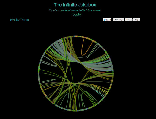
The infinite jukebox is something a bit different from the ordinary data visualization. One can choice a song (either from a database, or upload one). The software searches for similarities in this song and makes being doing so transitions between different parts of the song in such a manner that the song will be played endlessly. I like this piece of software because of several reasons. First of all the idea is simple, the execution is probably not. Yet it is done quite well. Next to this I like the layout, you can follow the song and the jumps it makes and where the jumps can be made. I still think they left something in the layout I just cannot put my finger on it.
http://labs.echonest.com/Uploader/index.html
