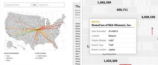
Two recent projects that have come across my Twitter feed are 538’s airport visualization and Propublica’s Health Data Breach visualization. I like them because they are both very competently executed, but they approach user interaction in different ways. During the previous critique, Chris Harrison mentioned about my project that it had “a patina of interactivity” as opposed to rich interactivity. The Propublica graph could have the same the critique leveled at it, while the Airport visualization is much richer. There are strengths to both strategies.
Which Flight Will Get You There Fastest?
538 presents a map with US airports as nodes. The map initially contains no data beyond the airport locations. The user can hover over an airport and see which other airports have more efficient routes. Clicking on a second airport isolates the connection and displays additional information. As the user clicks through the progression, cards stack next to the map showing the user’s state.
The primary pleasure of the experience is hovering over different airports, seeing the routes light up and seeing which airports contain mostly green or mostly red airports. The least successful parts are the zoom-in information screens. The detailed information graph is difficult to read, and requires moving your eyes away from the screen.
Going back to the quality of the interactivity, The 538 map offers no information unless interacted with. That’s great for people like me who are looking at this data and curious about the vis’s construction, but to someone on smart phone or someone without much interest, the amount of work to get to insight is too high.
Over 1,100 Health Data Breaches, but Few Fines
I like ProPublica’s visualization of health data breaches because it works well without any interactivity at all. In addition, the non-interactive initial layout entices the viewer to interact and learn more information highlighting outliers with actual numbers. The filter and zoom interactivity that is front and center for 538 is secondary for Propublica. The user most likely only filters by state and company if they have a specific question about the data.
Deeper interactivity is non-existent. Deeper meaning more than filter and hover.
I think both strategies for interactivity are needed for a successful data visualization. The vis needs to entice the user for interaction, then deliver on that enticement.