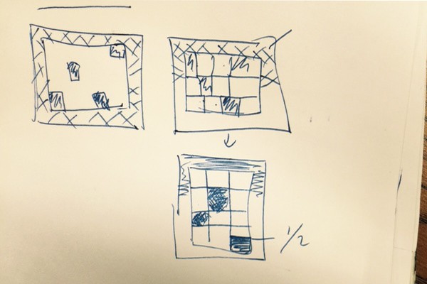
When I started brainstorming about what type of clock I was going to do, I did some research of what was out there. Many of the examples I found were using organic style shapes like circles. After going through many different design ideas as can be seen in the image below, I decided to do something with squares. I have never really liked the square as a shape; it was so many rough edges. But I decided that for this project I would explore it.
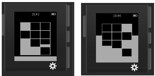
My goal was to represent time as a static cubic painting. The frame will consist of the seconds filling in the frame every second. The hours are the main blocks of the painting and the minutes are a portion of a block. For example if its 3:30pm, 3 blocks will be present and one will be half filled. When I finished my initial prototype, I found it was not as cool I though originally. It was not interactive. It looked too static:
To fix this issue, I decided to allow the user to move the blocks around with the accelerometer. To do this, I decided to create a type of puzzle experience. I developed a very simple collision detection between the blocks and between the internal wall. To make it more interesting, every hour, only a percentage of the blocks are active. The rest are acting as barriers and collision boxes. This made it more fun to move the clock around and try to make different shapes every hour.


