Category Archives: looking-outwards

Alex Sciuto

11 Mar 2015

Two visualization projects that use photos as raw material.

On Broadway

Screen Shot 2015-03-11 at 2.52.50 PM

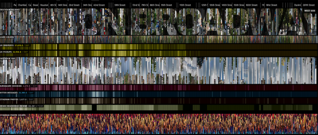
On Broadway is from the same people who did Selfie City, which I wrote about before. I didn’t know that when I visited the On Broadway visualization, but it makes sense because the two projects share a love of exploring what it means to be a city through visualizing photos of the city. In On Broadway, the creators pair Google Street View photography with social media data and locate it along New York City’s Broadway Ave.

The most striking feature of the visualization is the accordion-like photos that expand and contract as the user zooms in and out. It reminds me of the NYTimes Fashion Front Row graphic. I also like that they created a physical installation for people to be on Broadway and explore On Broadway.

I think the actual visualization is overwhelming and doesn’t help the viewer make insights. The zoom-in-and-zoom out lets me explore different sections of Broadway elegantly, but the addition of social media info is just noisy. Twitter, Foursquare, and Instagram don’t paint a very interesting story. I did like how the visualization extracted Instagram color information. I did like that touch.

Whale Hunt
Untitled-7

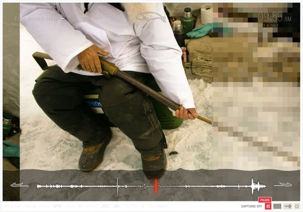
Whale hunt is an older project from Jonathan Harris that I think is a nice contrast to On Broadway. Harris took photos in 2007 of a whale hunt, and created a (flash-based) experience to relive the experience. Where On Broadway is open-ended in its exploration without any narrative, Whale Hunt is most powerful when it is viewed as a slideshow with time stamps and minimal captions. Interactivity is lost, but story is added. Photos snapped every five minutes give a sense of time that scrolling or zooming spatially couldn’t give.

At the same time, I do wish Whale Hunt were a bit more like On Broadway. Whale Hunt is most powerfully an automatic slideshow, but I wish there were ways to play with the images more. Harris doesn’t provide some meta data, like subject, caption, color-composition. But that’s not really used in the interface.
dantasse

11 Mar 2015

Ok, dang. Too early for LO 9 I suppose but I got to share this because what I thought it was is super inspiring.

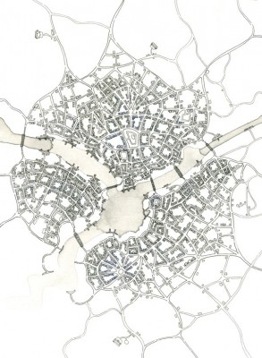
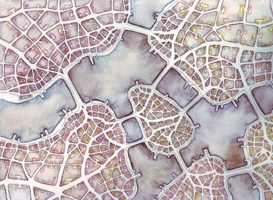
Emily Garfield’s an artist, and some of the things she draws are maps of imaginary cities, like these:

9a0ee5396

3ccbed227.

Based on the title of this article about her art, I thought there was some kind of fractal algorithm behind it. Turns out she’s just drawing these by hand, which is awesome, but I’d love to see generative cities, where you put in a few parameters and see what the map looks like. Right now they’re evocative and fun, feel like the city map from an old video game or something. But I feel like they could be evocative and informational. Like, get a rough idea of what a city would look like if you put this or that policy into place. And then, it’d be even better to connect it to life somehow; to take a map and see how it’d feel on a day to day basis.

Huh, maybe that’s a final project idea. (well, it’s two final project ideas: generative maps, and maps -> feelings.)

Places and Non Places by Andrew Price

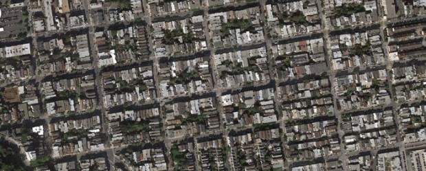
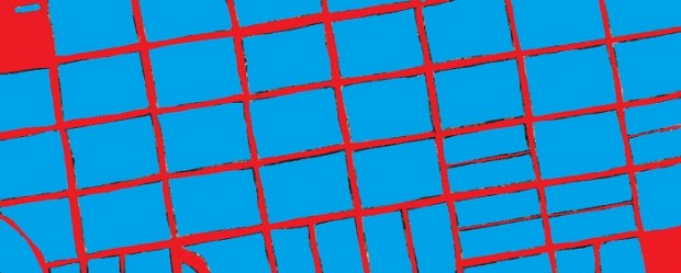
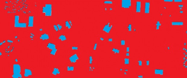
Price takes satellite photos of places, manually annotates the “Places” (buildings, parks, useful space) and the “non places” (roads, pavement, parking lots, green space that you can’t really use for anything). Here’s an example in San Francisco:download

download (1)

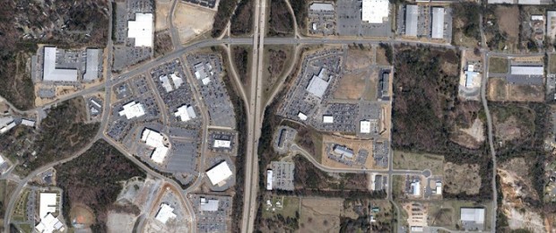
Then he quantifies the ratio of places to non places (places are blue, non-places are red). 4.25:1 in this case, or 81% place. Here’s an example in suburban Little Rock:

download (2)blog43-6


0.08:1, or 8.5% place.

I find this really compelling, as it gets at what we really want to know about density. How much is *neat stuff* and how much is dead space? Neat stuff is fun to walk around, dead space is not. Also, it might give us a way to quantify the destructive impact of parking lots, wide streets, and other big wastes of space.

The downside is, it’s quite labor intensive to make one of these drawings. (So far.)

ST

09 Mar 2015

http://ani-gif.com/2.7/04/

And here where we are now?

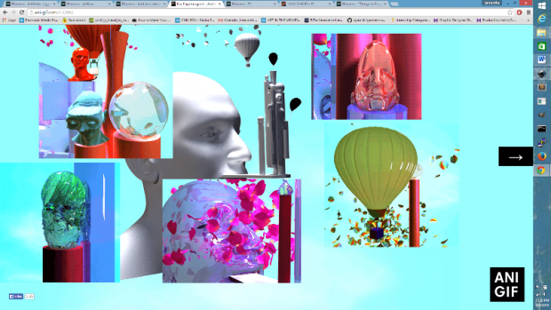
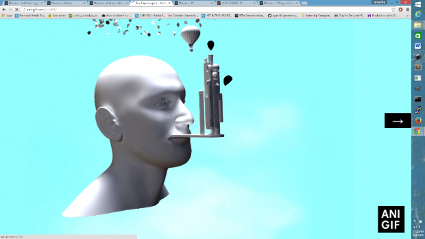
A browser based interactive project by Eva Papamargariti

LO8-2

LO8

Clicks make additional GIFS pop up, clicking on the arrow will direct the viewer to a new GIF base. With squares of image, sequentially generated by the users click, this work is a visual narrative. The GIFS are awesome, gorgeous, and appear to be (at least partially) computationally generated.  Though the site is only seven pages, it’s an exciting adventure, and I don’t mind looping back to the beginning. I’m super into this browser experience.


http://archive.rhizome.org/artbase/1678/wrong.html

%20wrong

A browser work by JODI

LO8-3

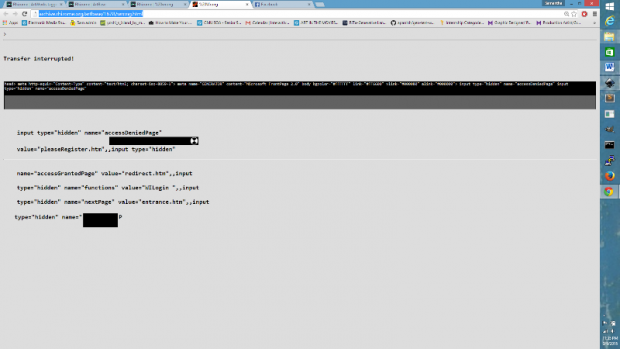
This work was a ‘splash page’ created for a Rhizome series. Users would be directed to this page when visiting rhizome.org. The animated page might convince some of a hack, but more likely (since it is a new media site -_-) it didn’t trick any. However, I am attracted to the idea of the ‘splash page’. The splash page is a way for a site to express itself. It can really make or break a web experience and since it is not required to display any real content, there are many options.

I will have to think more about the role of the splash page as I continue to brainstorm for my final project.

ST

09 Mar 2015

For a while now, I have been interested in zines. I’ve always thought that the internet and zines were very closely related. Both spread ideas, are low-cost to the consumer, and have unique limitations in design.

I found a couple of online zines, some more successful than others. Here are two and what I think does and doesn’t work:

http://www.toosexyandweird.com/

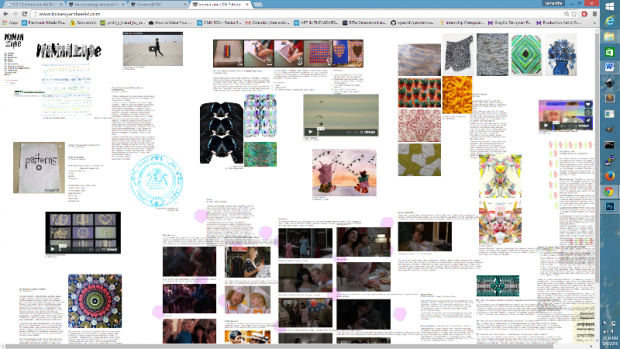
I zoomed out in my browser to capture the following screen. This zine is awesome, with animations, videos, photos, and short writings all displayed on a single page. To me, it feels like a zine, and really incorporates a similar aesthetic. That is where this zine differentiates itself from a blog or artist website.

LO7


http://inconnumag.com/

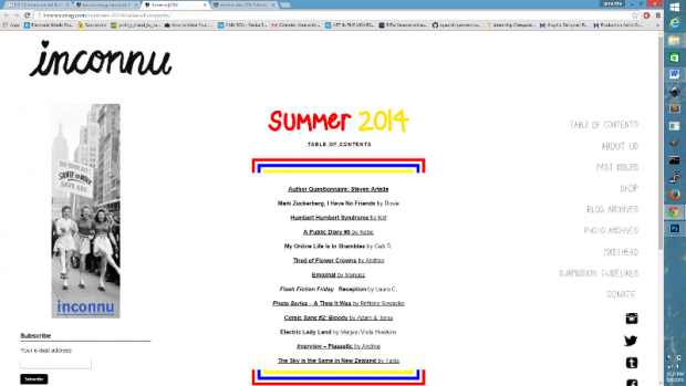
I found this zine to be less successful. With links to all of the content, it was certainly less creative in its layout. Even though the content was hosted on this site, it feels less related, simply because of the navigation to new pages, none of the content can be viewed together.

LO7-2


Is this new media art? I think that the first definitely qualifies. It is using the browser as a medium, and really considering its strength, limitations, and of course, the SCROLL. The second, not as much. Just using the web to store and display the work. Here, the site is not the work, it is just a vehicle.

I am interested in web browser environments and an online zine-making is an awesome approach to content generation.

pedro

08 Mar 2015

It took me a little bit longer to find a topic of interest for this LO post. It is difficult to find recent works in computational design in which architectural space and organization is the central issue (while form and performance follow it).

zha
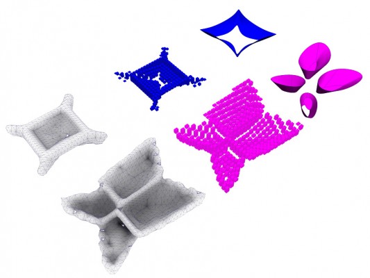
Firstly, I was visiting the website of the ZHA|CODE (Zaha Hadid Architects Computation and Design Group) and saw that predominantly the works focus on producing an appropriate work-flow to deal with complex forms based on some kind of performance. However, among these research and workshops there are some opportunities in which space and organization seem to emerge. Particularly, I found it interesting the project “BODY PLANS : voxelise ,breed , evolve“. As the title makes clear, this project is part of a research on topology optimization and voxelization and it is connected to the participation of the group in the Venice Biennale 2012  in which they produced a beautiful pavilion. Maybe it is only in my eyes, but I really saw potential in these mesh generation to think about architectural configuration, that is why I decided to post it here.

After a while researching for poly surface and mesh subdivision for spatial exploration I ended up discovering the website dplay with many interesting propositions on design and computation. Between these propositions there was a post titled “Exploring Soft: Exploring computational methods to play with and articulate flexible programs/space”, in which Kaustuv De Biswas developed a Java applet called metabolica (in a cross reference to meta balls and metabolism) to deal with design exploration.

It is interesting that the author presented this tool as a part of a larger project called Sunglass in which a common environment should support design exploration with different inputs, leaving the obsession by technical performance as a consequence of this process of discovery (and not the inverse). This proposition may sound very simple, but in terms of design thinking and computation it is clearly out of the mainstream. Not only it challenges the common ground of generative and performative design (in which form should be only an output of objective constraints) but also it try to grasp flexibility and ambiguity of a design exploration based on ideas and interested in space.