And here where we are now?
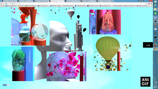
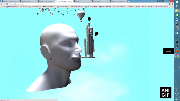
A browser based interactive project by Eva Papamargariti


Clicks make additional GIFS pop up, clicking on the arrow will direct the viewer to a new GIF base. With squares of image, sequentially generated by the users click, this work is a visual narrative. The GIFS are awesome, gorgeous, and appear to be (at least partially) computationally generated. Though the site is only seven pages, it’s an exciting adventure, and I don’t mind looping back to the beginning. I’m super into this browser experience.
http://archive.rhizome.org/artbase/1678/wrong.html
%20wrong
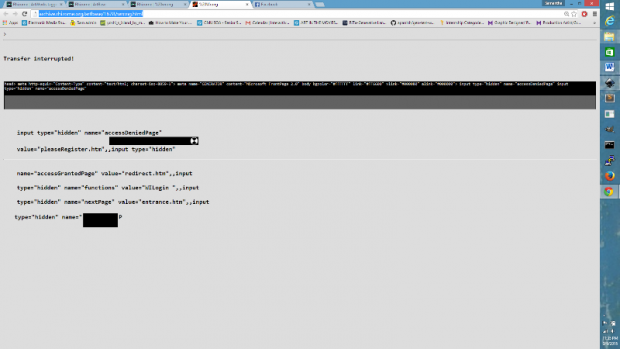
A browser work by JODI

This work was a ‘splash page’ created for a Rhizome series. Users would be directed to this page when visiting rhizome.org. The animated page might convince some of a hack, but more likely (since it is a new media site -_-) it didn’t trick any. However, I am attracted to the idea of the ‘splash page’. The splash page is a way for a site to express itself. It can really make or break a web experience and since it is not required to display any real content, there are many options.
I will have to think more about the role of the splash page as I continue to brainstorm for my final project.