Category Archives: looking-outwards

AlexSciuto-LookingOutwards-2

Humpback Whale Song

out-2-2

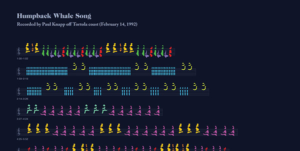
In 1992, the best, clearest audio recording of whales singing was captured. Mike Deal and David Rothenberg take the audio and visualize it in a gorgeous poster. They also provide a really nice, and well illustrated history of the recording and attempt to visualize it. I’m inspired by the project because of its masterful visual design and because they took a piece of data that was over 20 years old and brought it back to life. I wish the visualization was interactive though and allowed me to hear the whale songs. The article lays out the history and influences of visualizing whale songs well. I’d only add that there are many attempts at visualizing music and dance before, and this project fits with that tradition.

Selfie City

 out-2-1

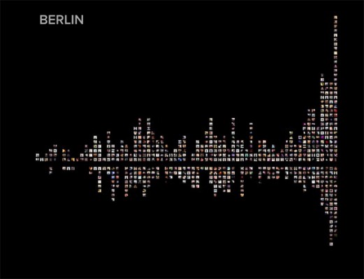
I found Selfie City while looking for this post. In the project, a team of seven members, took thousands of photos from Instagram that were taken in five different cities, submitted them to two rounds of Mechanical Turk analysis, then created visualizations based on the resulting data. I like this project because of all the different techniques that the creators used to create the dataset. The final dataset contains selfies from different cities with users ages, genders, and other characteristics estimated by Mechanical Turk workers. I can’t think of any problems or things I would do to the project, actually. I’m in awe of it. Aaron Koblin has used Mech Turk for art visualization projects before, but he used the workers differently. I can’t think of any other projects like this one, but I think more projects should use this as a model.


dave

20 Jan 2015

This is a visualization of an image Famouse Failures, posted by George Takei (https://fbcdn-sphotos-b-a.akamaihd.net/hphotos-ak-xfa1/v/t1.0-9/599976_504919949537463_2132246819_n.jpg?oh=38ad5d34226541e057cc825a2f9fe91c&oe=5522B0BF&__gda__=1428447542_49778975b127771e511bdde7ccc070c9), going viral. It is made by Stamen. I really like the organic animation, how it spreads out like water or fire. The movement is very mesmerizing. However, datapoints seem to be just placed randomly. Instead, I would prefer if the X and Y axis were to have some meaning. It reminded me of timelapse visualizations, such as those found in weather reports. After some research, I realized that Stamen do in fact make weather report visualizations.

Invisible Cities visualizes social media usage as terrain, generating a secondary city on top of an existing map. I like how it created a totally foreign and new landscape based on an existing one. However, the ground texture is pretty low res, which when combined with the monochrome theme makes the land barely recognizable as such. The interactive element is fantastic, which allows one to explore wherever they want. However, this does not seem to be doing it live, as I would like to see what the current landscape looks like. I like its choice of using a dimension, instead of say color in a heatmap as other visualizations do.

mmontenegro

20 Jan 2015

googleSearch

I found a very nice interactive website that compares similar events and their google search result in different countries for the year 2012. This website allows you to explore events and connect them with how people around the world saw them too. It not only informs you but it makes you realize connections that you may have not bee able to realize without seeing the data in the map. One thing I would have done different would be to allow the user to look for specific events. even though this would through the purpose of the most searched, it would also connect more to the user. I really liked the animation of the red cops dropping after you select a pin. It makes you realize that something changed in the map.

I recommend you to just explore it and have fun with it:

http://www.google.com/zeitgeist/2012/#explore


Zach Rispoli

20 Jan 2015

Novice_Art_Blogger_M_Plummer-Fernandez_502

Novice Art Blogger is a bot with a tumblr account that uses deep learning algorithms (super cool new stuff that only recently is starting to work pretty well) to blog its thoughts on various works of abstract art. This project was interesting to me because I’ve been really interested in bots lately, having recently found out about Darius Kazemi’s Twitter bots. Also, this is the first project I’ve seen to use image recognition software creatively.
The idea is very interesting, but I feel like the way the bot describes the artworks could be more complicated. The reason I think bots are so enjoyable to make is because, with a complex enough system, every now and then the program will spit out something surprising, funny, poetic, etc. This bot hasn’t really posted anything too crazy yet.

adamFerriss10000pixels_640

Adam Ferris’s 100000000 pixels is a giant explorable generative image. A sort of tiny universe is contained in the 10000×10000 frame, and the algorithm is complex enough to make the universe interesting.
I really like this project because it does something clever with algorithmically generated art. Many times generative images are simply just nice to look at, and most of the enjoyment comes from the novelty of the image or forms being randomly generated/infinitely many/created by a computer etc. This piece is visually influenced by op art and makes references to famous images taken by the Hubble Telescope (also, the artist has worked with ideas about space before) which made me imagine that the piece is more than imagery, and what the artist is actually doing is creating an entire world that, although not designed by any individual, is still a world filled with mystery and is something that people want to explore.

rlciavar

18 Jan 2015

Patterned by Nature from Sosolimited on Vimeo.

Patterned by nature is a 10′ x 90′ ribbon composed of 3,600 glass LCD tiles. By varying independently varying the transparency of each tile, animations can be displayed on the ribbon surface. The installation runs through 20 pre-programed animations that celebrate abstraction of nature’s infinite complexity into patterns through the scientific process.

My favorite aspect of this installation is its simplicity of form and integration into the space. The use of varied transparency to create figures allows the environment to interact with the animations in a compelling way.

The piece currently cycles through 20 pre-programmed animations. I wonder how the viewers experience might change if they were allowed to interact and create their own patterns. What if the installation reacted to patterns occurring naturally within the space, such as, the spacing or motion of people below it.

Vanishing Point from United Visual Artists on Vimeo.

Vanishing Point creates a space within a space using light. With the use of projection mapping, arbitrary vanishing points are chosen to define new volumes and spacial divisions to be explored by the audience.

I was most struck by the way light can be used to manipulate our experiences of reality and relationship to a physical space. Makes me wonder how much of out everyday experience is a result of our individual perception and how easily it can be manipulated.

I wonder if the experience could have been made more dynamic by adding animations to the projections that simulated motion. This could have added to the distortion of space feeling. It’s hard to tell without experiencing the piece in person though.