ofxProcTree – a procedural tree generator. Looks like it makes trees, like this:
I guess this is a “parametric object”, like our next assignment will include. There’s a handful of parameters, and I guess if you tweak them right you can get something cool and semi-realistic like this. Not super-realistic, but I could imagine a forest of these and it would look reasonable.
ofxObjectSurfer– an object recognizer/tracker. You draw a lasso around an object in one frame of a video, and this will track that object in the rest of the video. I was kind of hoping it was a general object recognizer (I give it an image and it returns a list of objects in the image), which it seems not to be, but still cool. I don’t know much about vision, but it looks like it works based on “features”, or little tiny bits of the image that it can recognize even when rotated or moved.
We have been talking about data collection and how to answer a question or tell a story with all that data. Untitled No.1 has a lot of data! They collected only images from the previous 24 hour news cycle. As we can see in the video, there are a ton of images. But what are they trying to show us? I really enjoyed how the video starts by showing us nonsense of the data. I felt it was trying to represent all the amount of news that happens in 24 hours and how crazy it is. But then, when the images come together and show a big picture, I was amazed! I had been waiting for them to do it and then there it was! I thought it was a very good use of the collage and of the data they had. I didn’t like the music the video had. If I could change anything it would have been take the music out or put something different. I would have also cut the amount of time showing craziness and added more time showing big image collages.
Collages have been a very nice way to show a lot of images in a cohesive way, and I really liked how they did it here in a 3D space.
no1 documentation
The process of rendering the videos was also very interesting. You can see they experimented a lot and tried different techniques of rendering video and images. Perception plays a lot in the video processing. We can see what they get and how they want to interpret it. I have to say I really enjoyed watching the process because you get to see what inspired them and how did they get to the final goal.
Note: I did not see the note that says that the projects need to be related to open frameworks until it was too late. I have appended some cursory comments about some interesting ofxAddons that I have found/find interesting.
This is a project that attempts do display the personal territories of individual people interacting with it. It seems like it computes a vernoi diagram for actual people in space. I like this piece, because it is an example of a project that tries to make an abstract concept concrete. This project was done in 1998, so it is quite old. Now that artists are starting to create technology that can sense a person’s emotional state, this project could evolve into a subjective personal bubble visualization that displays a person’s personal bubble to others. Imagine if we could see our friends and know when we should leave them alone when their personal bubble is large. We could also see when someone is inviting us to enter a closer conversation of social interaction if we saw them having a small bubble. People who are sensitive to being interacted with in certain physical ways, such as people who do not like people tapping them on their shoulders could indicate these behaviors that they do not like my configuring their personal bubble. This project seems to come directly from Vernoi diagrams and the introduction of real time image synthesis.
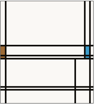
myData = myMondrian
http://archive.rhizome.org/artbase/24114/myData/
Bryce’s Personal Mondrian
This project is a webapp that asks the user for personal information and then maps the input data to a Mondrian drawing. I like how the project maps quantified values and the personal cultural value of a person to a generated work of neoplasticism reminiscent of Piet Mondrian. I find this to be fitting, because artistic movements such as neoplasticism and minimalism sprung p from the counterbalancing pendulum of cultural taste and rebellion. I find it hard to understand these art movements in the current times when they are taken out of context from their predecessor art movements that they sought to differentiate themselves from. These art movements that I find hard to appreciate non-rationally sprung up from mundane everyday cultural tastes just like the data that is entered in this artwork.
ofxAddons
ofxDelaunay
https://github.com/obviousjim/ofxDelaunay
I am a big fan of computational geometry and it seems cool that people are putting up code for Vernoi diagrams and Delaunay triangulations.
ofxFatLines
I am also a fan of drawing functions that allow the pixels to dance better. I often find myself wishing to draw lines of very particular thicknesses that are not always supported by standard libraries.
ofxTonic
https://github.com/TonicAudio/ofxTonic
I am interested in sound synthesis, so this addon that allows access to a sound synthesis library seems very useful.
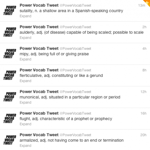
Power Vocab Tweet is a twitter bot written by Allison Parish, which posts randomly generated words and their markov’d definitions. She calls this an exploration into “speculative lexicography”. I found this work interesting because it takes a generative approach to text (a lot of high profile examples of generative media are based in art and sound), and because it attempts to kind of assault readers with randomness; by compelling an audience to process this random, generated text, it forces them to think about something truly novel and reflect – in the same way Dada often does.
Parish explains that the project was inspired by the many existing “word of the day” twitter bots that send users new vocabulary words daily. She also draws philosophical inspiration from author Suzette Haden Elgin. Parish explains:
“Elgin’s contention is that the manner in which a language “chunks” the universe of human perception into words reflects and reinforces structures of power; therefore, to break the world up into words differently is a means of counteracting the status quo.”
In her work (albeit less rigorously), Parish attempts to explore similar themes.
I like the artist’s idea of making their audience think by having them read plausible but ultimately meaningless text. However, I’m not sure if I believe this project manages to do that. I think there exists a lot of content that compels us to reflect and emote, but vocab words and their definitions aren’t one of them, if not simply because there are so many words out there we simply do not know or never use – it’s neither a novel nor a particularly gripping experience. I would rather she do generative “missing child” signs or history books, something where imbibing the text triggers an emotion or forces us to buy into the nonsense on the page.
Energy Flow, a joint effort of FIELD and The Creator’s project, is an interactive, generative film that links together 4-10 storylines about the forces that shape the modern world – the narrative changes each time the film is played. It employs non-linear narrative and abstract representation, entreating the viewer to bring their own interpretation to what they see on the screen.
This project excites me because it uses generative narrative to try and make compelling statements about the world at large. I haven’t seen the film, but the medium of generative filmmaking is very interesting to me, and it appears that the creators created complex algorithms to power the presentation.
The statement that the responsibility of creating a message from the content lies on the viewer is a little sketchy – an argument could be made that even with randomness, the creator should have some intent or meaning in mind, and that if it isn’t communicated, the nonlinear medium is sort of ineffective. I don’t know how much I buy into that, though.
The piece is inspired by “current” events such as Arab Spring and Fukishima – the piece tries to address the chaos of the modern day. Many of FIELD’s previous projects also explored generative form and nonlinear narrative.
“Water Works” is a physical 3D data visualization created by Autodesk artist in residence, Scott Kildall. Large-scale 3D-printed sculptures, are paired with an interactive web map to map the water infrastructure of San Francisco.
Unlike most data visualizations which are typically digital, “Water Works” represents its data as a physical form derived from digital data. Coming from an industrial design background I appreciate the tangibility of presenting data this way.
Currently the model and map are very separate, I wonder how the connection between the interactive map and the physical prototype could be more integrated. What if the map were projected onto the prototype? Maybe the prototype could be the method of interaction.
Points is a smart sign that pulls content from Foursquare, Twitter, transportation APIs, RSS feeds and other online sources to direct people to interesting things going on nearby. Three arms point in different directions, each displaying text of a nearby destination. The arms rotate towards new directions and the text updates to reveal newly selected content on the touch screen.
I appreciate the way the Points creates a new system for experiencing digital content in the physical world by referencing traditional way-finding tools. The merging of digital and physical content in an intuitive way.
Right now the content seems fairly generic, it would be interesting if you could input your own data, Facebook, likes, friends, etc into the sign to get customized recommendations. It could suggest something like “your friend Joe is attending a concert at 19th ave”. Or “this restaurant down the street is similar to this other restaurant that you like”.