Category Archives: LO-1

Matthew Kellogg-Looking Outwards-1

Foreign Nature

Julius Horsthuis created an immense and detailed fractal which he navigated and rendered for the Oculus Rift. I like this project because I like digital art that doesn’t borrow too much from reality, but instead creates its own. It is also interesting to see that a fractal can be so complex. This project makes me want to look into fractal art and algorithms. Also, I appreciate the lighting, material, and other environmental work put into the render. While the structure imposes impossibility, the render makes it feel more realistic.

Article: http://thecreatorsproject.vice.com/blog/now-you-can-explore-a-fully-3d-fractal-universe-with-oculus-rift


Specimen Box

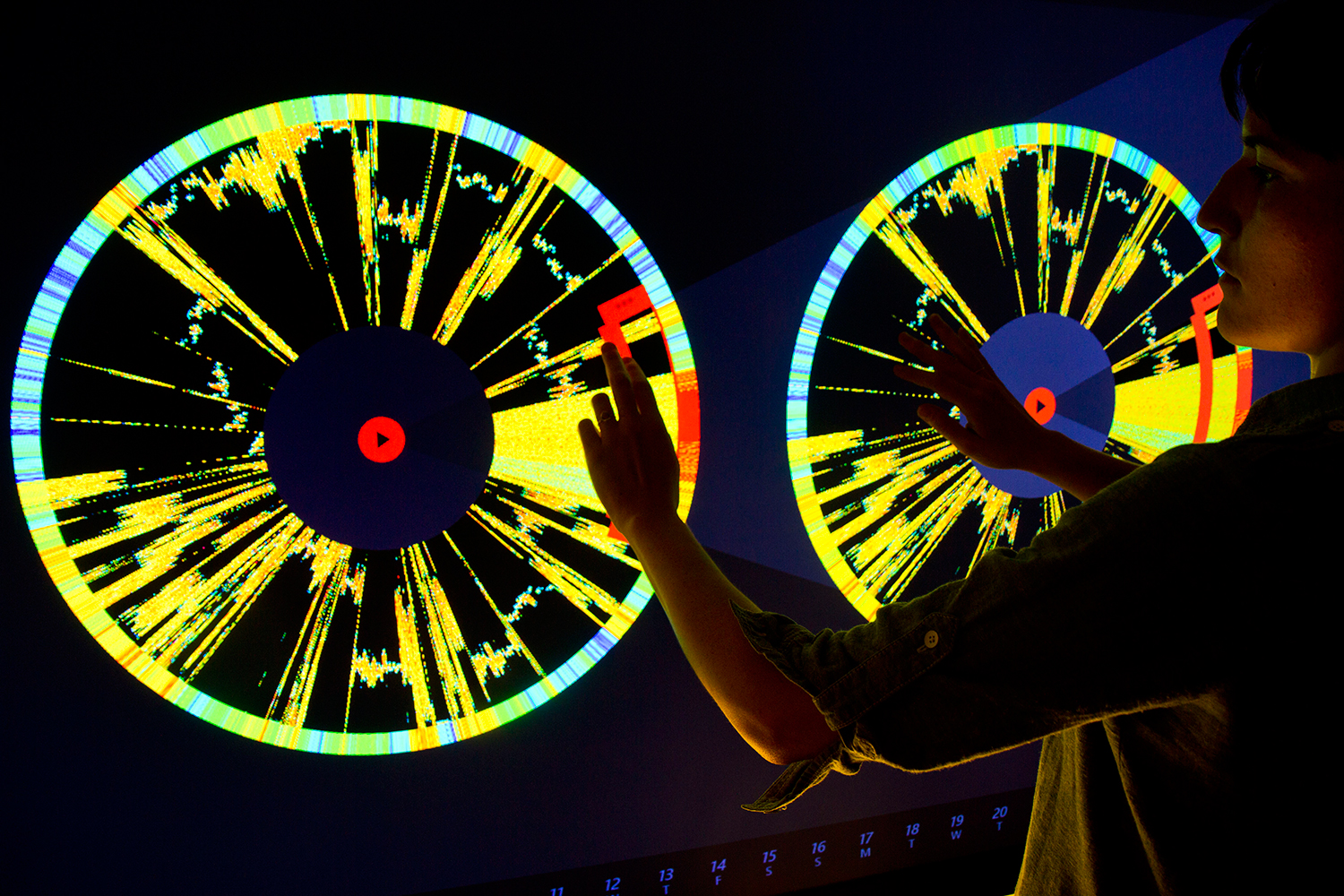
The Office for Createive Research created an interactive audio-visual piece that visualizes and sonifies the activity of botnets. I found botnets to be a great resource for data in an information visualization piece. I found the interface and interactions to be vibrant and smooth. I appreciate the color scheme, and all-in-all the interface seems very well designed. I do think however, that the sonification of the data to be useless. It sounds only like noise, because it has no audio basis, and the noise gives the user no indication or further understanding of the data. In my opinion, if the piece is to help understand in inform users about the data, this is clearly a mistake. Perhaps the data could be extrapolated in some interesting way to create something more informative/musical.
IMG_3027

LValley

15 Jan 2015

One of my first experiences with interactive media was when I was in kindergarten and I visited the Pittsburgh Children’s Museum. There was a display by the name of “Text Rain” by Camille Utterback in which you could stand beneath a shower of words.

If you held out your arms, the letters would stall on your limbs, and if you stood still long enough, you could even hold a sentence. The only catch was that none of it was real—the letters, the words, the sentences—they were all digital, but at the center of it all, I believed it was magic.

The interactive performance “Pixel” by Adrien M and Claire B instantly brought my back to my Children’s Museum days. In this piece, a series of performers dance and interact with a blackened stage filled with nothing but projected pixels. Apart, both elements would sustain interest for a little while, but together, a few colored dots and a woman with an umbrella create an entire storm.

Perhaps my favorite thing about Pixel is how seamless the actions appear. The concept of an interactive projection isn’t necessarily groundbreaking in this day and age, but framing it as a performance and having both the performers and the technology participate equally was something to evoke wonder in more than just children.


Pixel – extraits from Adrien M / Claire B on Vimeo.

After digging a little deeper, I was able to find another piece by Adrien M and Claire B that was a lot more similar to “Text Rain.”

The piece “XYZT” is a series of interactive experiences. Instead of just words, it features a technological, fun house-esque mirror, a letter Tetris game, and a tank of projected words interacting with real environments.

The diversity in this piece is one of the most striking elements for me. While the individual sections are similar, they each had a unique element that was enough to keep me interested throughout my discovery of each sub-piece.

XYZT présentation from Adrien M / Claire B on Vimeo.

maddy

15 Jan 2015

028653db6335f4e66061fbc5752e50b610987724

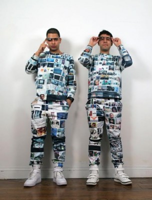
Avatar Apparel is a conceptual lifestyle brand that shifts your online #brand into meatspace. Clothing ranges from a Google Maps suit (a concept that is realized beautifully in Rachel Binx’s monochōme) to wearing your Facebook wall as a tshirt. My favorite realized line is Searchwear, which pulls the top images from a Google image search of your name and tastefully places them on a suit (highest ranked photos go on the chest, middle ranked go on the arms, lower ranked go on the pants). Why choose what patterns my clothes should have when Google can algorithmically decide what images are most “me”?

 03__parcel_xts_03

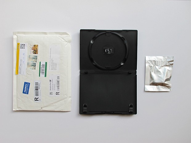
Random Darknet Shopper is an automated shopping bot. Each week it’s given a budget of $100 in Bitcoins and randomly choses and purchase one item on the deep web, which it then sends to the Kunst Halle St. Gallen. The items are then displayed at the exhibition “The Darknet. From Memes to Onionland”. Besides the shock value/questionable legality of the bot purchasing things like MDMA, the project presents an interesting portrait of what the modern black market looks like.

Priya Ganadas- Looking Outwards1

1. “WikiGalaxy” by Own Cornec

WikiGalaxy is 3D visualisation of wikipedia articles. What I like the most about this project is that the metaphor of galaxy that has been used. Wikipedia articles are related to each other. When I read about something I don’t know the definition of that word always has two,three words I go back and find again on wiki. I feel the connected-ness of the wiki articles are depicted beautifully by the artist.  Also, wikipedia is like a galaxy of articles that is interconnected which forms a universe of its own. I find the visualisation pretty neat, especially the fly through animations and the features of UI- map and  ability to turn off the UI and exploring random articles in wikiGalaxy. I also believe that there is scope of adding more features in UI and structuring the information in a better way when someone clicks on a star in  galaxy (article in wikipedia). Currently, the data appears scattered on screen and is not readable. As a user, I enjoyed the interaction with UI but could’t read well on the website, which seems to be the prime focus of the project.

more- http://wiki.polyfra.me/

2.  “Handheld” by Pors and Rao

Handheld is an interactive art piece. It simulates the motion of a small person holding a big piece of paper in both hands and trying to balance it. What I found most impressive about this project is simplicity. There are not too many elements involved in the design to create an effective experience . Also, the motion of balancing the piece of paper seems real. Hands at the edges facing outwards create an image of a person hidden behind the paper facing towards the paper.  What’s missing or what can be added in this project at the cost of adding a little complexity is real time interaction with audience. If the motion of hand reacts to voice of a person, distance or ambient noise in the room, richer and engaging interactions can be created. If the artpiece is made into a painting and is made to tilt towards left when viewer says “left” (as if trying to get the orientation of painting right on the wall) and so on, I believe it will be more fun.


Ron

15 Jan 2015

Just Landed

Using Processing and MetaCarta, this project maps travel routes by searching for the phrase “Just landed in” in Twitter updates and extracting the home city listed on a person’s profile page.

I’ve long been fascinated with maps, and being able to uncover and visualize global travel movements in 3D arcs from text updates is quite beautiful. The pulses in the arcs allows us to see the movement more clearly. Examining the maps shows the majority of the movement originating from North America, with not many flights mapped back to North America; this indicates that Twitter usage appears to be more concentrated in U.S./Canada, or perhaps that additional languages would need to be parsed to determine movements from other continents. Additional parsing would need to be done to determine movement from abroad to back home (North America). Also, the routes are plotted from west to east, when the airplane movement may not have necessarily traveled in that direction; this is likely a limitation of simply searching for the phrase “just landed in” and connecting location to the user profile’s hometown without additional directional information. The creator explained that he was inspired by a discussion with a friend to determine the spread of infectious diseases as well as the “Where’s George” project (that tracks the travel of dollar bills by having users enter the serial number and ZIP code). He concedes that much more work is needed to capture disease travel information accurately. But it’s a good and visually interesting start.

Furl

This project combines EEG signals with soft silicone inflatable air muscles. Brain wave activity is read and then translated to air pressure, causing these soft robot appendages to smoothly inflate and unfurl like tentacles. Seeing this soft robotic material bend and morph in varying contours is a pleasant contrast to the typically rigid material from which most robots are typically constructed, with many clear applications for more natural prosthetics for the severely disabled. New architectural possibilities are also enabled by this material. However, the collective appearance of this thing looks a bit like an alien sea-creature that is somewhat off-putting. Similar projects that influenced Furl include Slow Furl, a room-sized fabric installation that morphs and reacts to the presence of guests moving about in the room, and HygroSkin, a modular thin wooden skin that reacts to weather changes by contracting and expanding built in apertures without any electronics.