Category Archives: LO-1

JohnMars—LookingOutwards—1

PSX: Autonomous Game Controllers from Julian Bleecker at the Near Future Laboratory

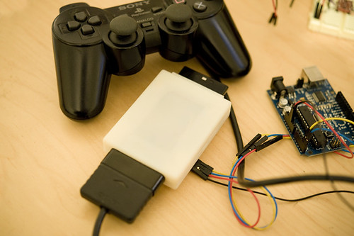
Explained: Intercepting/modifying/replacing commands from Playstation controllers using an intermediary microcontroller.

Chosen: I’ve been playing a lot of video games lately, and this just spoke to my current mindset. Software-reliant cheaters are pretty much gone from the online console community thanks to a variety of countermeasures, but what happens when the hardware is modified?

Critiqued: His given prompt for the project — to realistically slow characters down from exhaustion — is an artistic prompt, not a marketable one. I think opportunities are missed from presenting this object with a prescribed purpose instead of as a platform.

Related: Near Future Lab is a speculative design / design fiction practice, so much of their work is derived/inspired from (and in turn derives/inspires) those fields. This particular project seems to have been a product of two things: a desire to create an “anti-game controller” and to explore logic analyzers. I can’t find any notable works derived from it.

Fragmented Memory Textiles from Phillip Stearns

Explained: Contents of a computer’s memory converted to color and woven on a CNC loom.

Chosen: The actual content of memory has fascinated me since I learned how it works. The logic behind the jacquard loom provides an interesting analogue to that concept as well.

Critiqued: Since there’s a direct mapping from RAM to yarn color, the entire tapestry can be reverse-engineered thanks to an included key, i.e., cool. I wish there was more of an experiential connection between what the fabric shows and what was actually on the computer.

Related: Computers evolved from punch-card looms; there’s a beauty from coming around full-circle.

Sylvia Kosowski

15 Jan 2015

Project 1 – Oculus Rift Gameception

http://thecreatorsproject.vice.com/en_au/blog/oculus-rift-project-lets-you-play-game-boy-in-virtual-reality

http://www.takohi.com/unitygb/

In this project, a team of developers called Takohi created a Gameboy emulator which runs inside Unity games. The idea of a game-within-a-game is further enhanced by running the game using Oculus Rift to create a virtual reality experience. I find the idea of nested games fascinating. Imagine if virtual reality were so advanced that it was almost indistinguishable from actual reality. If virtual reality games were nested inside other virtual reality games, it would be impossible for a player to figure out when they are playing a game and when they are in reality- basically the game equivalent of Inception. Of course, this idea is also pretty terrifying. That being said, I think there’s a lot of potential for games-within-games without taking it to such an extreme level (i.e. actions the player takes in nested games could produce consequences in the outer layer of games, etc.) To this end, I think the project didn’t explore all the things it could potentially explore with the nested game concept. The project is more of a technical demo and less of an exploration into how nested games can create a unique experience for gameplay. That being said, this project is obviously just meant to be a tool for others to use in their own Unity projects, so it’s understandable that the creators themselves might not explore all the possibilities available with nested games right away. The creators main influence for creating the project was simply that they enjoyed playing Gameboy games as children and wanted to create an emulator, so they decided to create one in Unity.


Project 2 – Classic Paintings as Data

http://thecreatorsproject.vice.com/blog/heres-what-classic-paintings-look-like-as-data

The second project I found was created by Yousuke Ozawa and is a visualization of classical paintings as data. In these pieces, the artist took digital image files of the paintings, and printed out the code that makes up these digital files, displaying this image data as a new work of art. I think these pieces are interesting because they are reverse takes on data visualization. They present raw data as an art form when usually data visualization pieces attempt to mask the data with pretty visuals. It also inspired me to think about how data can come from many different and unique sources: data isn’t limited to numbers in spreadsheets. While I appreciate the bold statement of just displaying the raw, unedited data, I do think that the project could be interesting if the raw data was more interactive with the viewer rather than just a long cluster of words to look at. For example, it could be interesting to provide some sort of app in which the user could search up certain words or patterns in the data, or compare patterns in the data between two different pieces, etc. In the article I read, Ozawa was influenced by going to museums and thinking about how paintings are so much more detailed in real life than in their digital replicas. That caused him to think of the physical qualities of the paint as data which inspired the data visualization project.


Epic Jefferson

15 Jan 2015

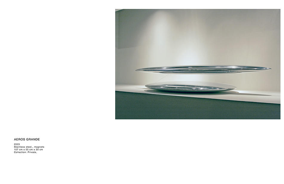
Tom Shannon – Aeros Grande (2003)

This sculpture levitates an object in a magnetic field, held in position by a single string.

Incorporating physical phenomenon into artwork is especially attractive to me. It’s a way of experiencing nature’s invisible aspects in a way that is both otherworldly and undeniably present. The use of stainless steel sort of removes any identity from the piece itself as it reflects it’s surroundings, and it’s shape strange but common in nature.

The tether is the single detail that sort of “grounds” the sculpture in “reality”. Which is both a relief and a showstopper. It’s seeing the rabbit in the hat. We all want to know how it’s done, but that will destroy the illusion.

Christian Bannister – Subcycle

This project combines graphical interface design and sound synthesis. Bannister created a personal interpretation of how he thinks this music should be interpreted visually and how it’s generation should be controlled. In the world of touchscreen based interfaces, i think this is the most comprehensive example of what the technology can do and how these interfaces can be customized to suite aesthetic and functional needs.

mileshiroo

15 Jan 2015

Screen Shot 2015-01-15 at 1.03.47 AM

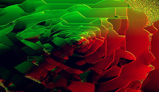
“84” is a browser-based, generative artwork by Adam Ferriss, in which fluorescent waves move out from a central point, forming unstable, layered structures. The code for the work is fully visible in the page’s source, and a brief inspection reveals that it is programmed in GLSL. Since it uses shaders, which leverage the GPU, the piece runs smoothly on my machine despite its complexity. The temporary patterns are complex and engrossing, neither predictable nor chaotic. Ferriss shows a great attention to color, and the forms take on a metallic quality as they transition from one carefully chosen palette to the next. While there is no text description for this work, I’ve seen similar patterns in reaction-diffusion simulations, so I suspect that is where Ferriss draws some inspiration. “84” is aesthetically similar to his project “Gush,” which uses the webcam to seed the reaction.

Screen Shot 2015-01-15 at 1.02.55 AM

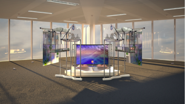
“Nissan Yogurty” is an exhibition featuring work by Kate Sansom in Chrystal (Crystal?) Gallery – a nonexistent gallery curated and rendered by Timur Si-Qin. “Nissan Yogurty” consists of a written dialogue between the artist and Costco, and high resolution images that serve as the simulated documentation and actual content of the exhibition. The images are photorealistic renderings of the Chrystal Gallery space and the artworks of “Nissan Yogurt,” which incorporate elements of painting, sculpture and collage, and feature appropriated logos, products, cartoon characters, lemons and live 3D oysters. The Chrystal Gallery website is self-consciously basic in terms of design and usability, which is a conspicuous choice given the technical sophistication of the images. While it would be convenient to view enlarged versions of the image when clicking – currently, doing so opens them in new tabs – this is a minor caveat. The images are highly detailed and reward close viewing, and the surrounding gallery – a generic corporate space littered with cigarettes and beer cans – convincingly communicates a feeling of banality.

chen

15 Jan 2015

(BEAT BLOX from Per Holmquist)

I found this project on the webpage, which introduced the tools used in this project. As far as I know, it is an interactive beat machine using turntable device and sensors to detect the location of small squares, and then produce sound out using this data.

I found this project very interesting because the quality of beats produced by this machine is well designed and of quite high quality, and this device is colorful which is also attractive.

However, I think the variety of the beat is constrained by the number of rings and number of turntables. If people want to add more kinds of beats, they could only add more turntables and this disadvantage would make this work hard to develop. Besides, the maximum speed is also limited.

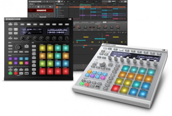
As of the key part of this work, the idea of beat machine has been developed by thousands of artists and musicians. I guess this work is also inspired by many traditional beat machines or sequencer like the following, from native instruments:

oie_15637507yM9GhP3

The most similar work I can find is this one:

(Turntable based Sequencer and synthesizer / MAX MSP from Itay Niv)

The theory of making beat machine is similar, and both of the two works choose to do it in an interactive way. The first one uses distance sensor, while the second one chooses digital camera to capture image of small objects.

// I’m the dividing line!————————————–

(Drum Cannonry from Renaud Hallée)

This video is about a music game that detects rhythm patterns and then uses this pattern to battle. It could detect live drums and also MIDI signals, and display the rhythm or beats on a screen.

This game video seems interesting for me, but I must say, the improvement space for the user interface is big and the game play pattern is rather simple. It might be a general defect of music games like osu! and jubeat. To add music factors into an interactive design, I would prefer to put music into daily use rather than make it a game.

// dividing—————————————————-

There is a third work I want to recommend, which is not new for me. It is a cute small piece of music using keyboard of a laptop to trigger music samples.