Looking Outwards: Arduino Style (Andrea Gershuny)
1) “No Place Like Home” by Dominic Wilcox


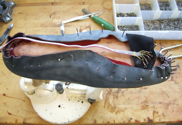
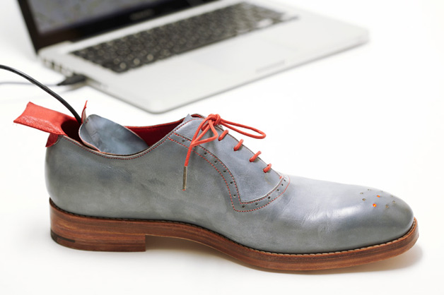
This project is a pair of shoes which uses a built-in GPS to guide the wearer to the preselected destination of their choice. Inspired by Dorothy’s shoes in the Wizard of Oz, all the wearer of these shoes has to do is select a location on a map in a special program that accompanies these shoes, then click their heels together to turn on the GPS–from there, the small LEDs on the shoes (distance on the right shoe, direction on the left) guide the wearer to that destination. I love how this project is both very functional and aesthetically pleasing, and how it draws upon the historical importance of the shoe in the place it was made, contrasting tradition and technology. The shoes are still pretty stylish, and the machinery is well concealed/integrated (not that it necessarily had to be concealed). I also think the red shoelaces were a very good design choice, they help tie the color of the LEDs to the shoe as a whole. At this point I think the next logical step for this project would be to make more of them, and in different styles of shoe. As someone who gets lost pretty much everywhere, I would buy a pair of these shoes in a heartbeat!
Here’s a link to a short article with some more info on the project. It makes me want to learn how to make shoes!
2) “Fluid Dress” by Charlie Bucket
This project is a dress knitted out of plastic tubing, though which different colored liquids are pumped to make some crazy patterns! Visually this dress is stunning, and I’m even more impressed by how seamless it seems to run–no leaking or blockage or kinks in the tubes, all the loops facing the same direction, etc. I wish the dress could stand alone without a backpack, but I don’t know if that’s feasible from an engineering standpoint. I also really appreciate the shape of the dress he chose to make–I think anything with sleeves or draping or anything not form-fitting would lose some of the direct aesthetic that the dress has; more detail would be overwhelming. (I would say the opposite of the video itself, though; I think it had too much extraneous stuff in it, like the balloon inflating/deflating at the beginning and all the shots of the red circle in the window. I just want to see the dress, I don’t care about this little other stuff! It was distracting.) I’d like to see this idea implemented on a bigger scale–what if there was a runway show with a bunch of garments all continuously knitted together, so liquid flowed freely from one model wearing a dress to another? It’s probably an engineering feat, but I think it would be awesome.
3) “Printing Dress” by Asta Roseway
This project is a dress onto which tweets (ostensibly the wearer’s) are projected, and LEDs corresponding to different characters in the tweet light up. It’s made of paper and ink, referencing the way typography was/is used to communicate, and has some other letters stitched into the skirt.
I’m not sure how I feel about this piece. I like it conceptually–referencing the history of short-form communication and describing people as “what they tweet”–but I don’t know if I like the finished project. For one, I think the design of the dress is kind of ugly and generic; it doesn’t seem like much thought was put into the shape of the dress other than the big skirt to project on. I also think the placement of the “keys” is awkward, even if it references a typewriter. And what is with the random letters in the skirt? Do they have meaning? They seem random, and therefore without meaning, to me, unless maybe she means to imply something about the permanence of print media versus the temporary nature of digital media. Lastly, I understand that the dress is made out of paper because it references print, but I HATE that the dress is so wrinkly. I think the paper is important, but I can’t reconcile that importance with how much I wished they’d just run a cool iron over the paper to smooth it out. Perhaps the wrinkles are intentional, but without knowing that the dress was made of paper intentionally, I just thought it was awfully wrinkled muslin, which made it just seem sloppy and lazy to me.
These wearable pieces are so cool! And about the wrinkly-ness of the paper dress: I don’t mind it too terribly much, but what’s funny is that if you look closely at the artist’s shirt it’s pretty wrinkly too. Maybe she just has a thing for wrinkly clothes. :)
Stephanie: I noticed her shirt too! I was wondering if that was made out of paper too, but then I realized how impractical that would be, unless you never moved ever.