Oliver – Looking Outwards – 1
Livehoods
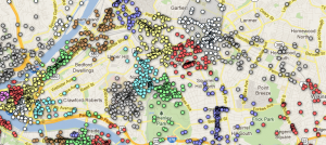
Livehoods.org is an interactive website created by several researchers at Carnegie Mellon. The site shows a map of a city (Pittsburgh, New York, and others) and uses Foursquare check-in data to separate that city into “Livehoods,” which are designated using an algorithm determined by the relations between places where people check in. Livehoods turn out to be different than the formal neighborhood lines that separate, for example, Shadyside from East Liberty. It’s possible to see the connections between different neighborhoods by clicking on a location and then looking at the top 5 related Livehoods. I think that this site is very well done. It’s aesthetically pleasing and easy to use. Livehoods uses the Google Maps API, which creates a background map that most people are familiar with already, and then adds colored dots to represent the Foursquare data. Each Livehood is shaded in a particular color when the user scrolls over it. I think an improvement would be to also show the formal neighborhood separation lines, as well as the Livehood separation lines, so that the viewer could compare.
Vizify
Vizify is an online visualization tool that takes information from a user’s various social media accounts (Facebook, Twitter, LinkedIn, Foursquare, and Instagram) and creates an interactive visualization based on some of the data. I tried it out, and this link shows the result. Visually, I found the result to be impressive. It looks clean and it’s easy to navigate and interact with. However, some of the content could use improvement. For example, I use Twitter very rarely, and have only posted one tweet within the last year or so. Vizify used that one tweet to create a page of “Words I say a lot on Twitter,” which only had one word. I post on Facebook quite a bit, but the tool did not visualize words I say a lot on Facebook. It also didn’t seem to use any data from my Instagram account. I thought the tool did a great job of visualizing my Foursquare account data, because it separates my check-ins into categories which the user can click on and see in more detail.
Come To Your Census
[youtube http://www.youtube.com/watch?v=h34aNRbajPE&w=560&h=315]
The Australian Bureau of Statistics made datasets available, and those datasets were visualized by a group called Spinifex. Not only did Spinifex create interactive visualizations, they also managed to project them on a large building, which was connected to a touch screen that could be manipulated by the audience in order to look at different demographic statistics. The audience could also interact with a network visualization of some kind, though I couldn’t tell exactly what the network was. It appeared to be towns or cities, but I’m not sure how they are connected to each other. Other parts of the presentation looked more like short cartoons demonstrating various characteristics of Australia’s population. I like this project because of its ability to use interactive media to get people interested in census statistics, something that otherwise may be considered boring to many of them. In the U.S., much of our census data is available to the general public, but remains lifeless as tables on the Census Bureau’s website. One critique that I have of this project is that the building they projected on did not make the best screen – it had many windows that got in the way of the image. I would have preferred a more blank canvas.

