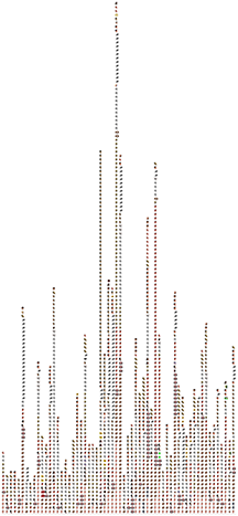
Twitch Dialects tells the story of what’s happening on Twitch.tv through scraping and visualizing chat emotes.

An hour of Arteezy’s Dota2 stream.
Full size examples viewable here, here, and here.
I’m fascinated by Twitch.tv. At it’s core, Twitch is a place for people to stream video games — what’s made it successful, however, are the viewers. The chat experience is integral to watching a stream, providing a constant, hive-mind commentary. In this project, the chat becomes the focus. In particular, I wanted to look at three things:
- Can you understand the story as it unfolds by only looking at the emotes used?
- How does the hive-mind work? How do people bandwagon together in spamming emotes?
- Do different channels have unique ways they use emotes to communicate?
I’m interested in these questions so I can better understand and design for participatory chat experiences. In Twitch Plays Pokemon, for example, the viewers collectively become the player. While this is hard to do in more complex games such as Dota2, there are ways people attempt to bridge the gap between game play and game spectation. For example, some streams are set up to speech-synthesize spectator-input messages when donations come in. My goal with this project is to create a tool to examine culture in spectation and look for ways to watching more participatory.
In this image (larger here), you can see how Twitch chat spikes around certain events. At the highest peak, you can infer that Arteezy (the player that is streaming) made a poor play, resulting in viewers spamming the facepalm emote.
I would like to continue refining this — one of the key things I took away from critique on Tuesday was that the data set is solid, but it’s hard to make sense of the data in its present form. The real question I need to answer is, “What context do I need to provide so that people can understand a story?” To this end, I’d like to either accompany the graph with other graphs that chart a sort of sentiment (boredom is closely linked to the sleeping face), or provide a way to interactively look at different hour slices and filter the graph down for easier viewing.