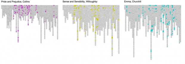
These two projects are from an exploration of projects related to visualizing text corpuses. I’m thinking that my final project will be a dataviz project for exploring State of Union speeches. These two projects are also from Lynn Cherny’s TextVis Pinterest Board.
Visualizing Jane Austen

This is a chart of visualizing where words appear in different Jane Austen novels. I like the wide overview they give of the entire novel, and I like how the different words, when chosen correctly, tell the viewer something interesting about the structure of the book. I think the project could be improved a lot. This is the start of a great visualization, but it needs more layers of interaction and data to make the experience richer. My first thought it to let the viewer zoom into different paragraphs to see each block, but I think rearranging the text blocks according to different properties would be enlightening too.
Understanding Shakespeare

I want to highlight this project because of its gorgeous print design. It’s an undergraduate thesis visualizing the hidden connections in Shakespeare. From the project website:
As a result, and based on data from the WordHoard project of the Northwestern University, an application of computational tools was explored in order to extract and visualize the information found within the text and to reveal its underlying narrative algorithm. The five approaches presented here are the first step towards a dicussion of this potentionally new form of reading in an attempt to regain interest in the literary and cultural heritage of Shakespeare’s works among a general audience.
The project is doing interesting transformations of text, then delivering it as a book. I like the return to printed form that hints at a reimagining of what reading could be if infoviz were inserted into books. The designer also made a series of interactive processing applications. I wish I could have seen those.