The Dawn Wall: El Capitan’s Most Unwelcoming Route

http://www.nytimes.com/interactive/2015/01/09/sports/the-dawn-wall-el-capitan.html
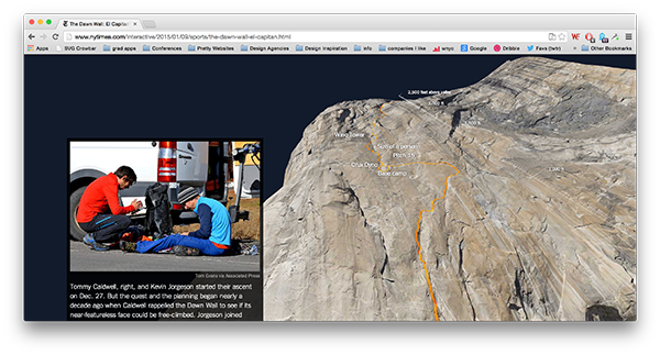
This was a news project I saw this morning, and I think it’s a great use of web-based 3d. The New York Times article shows a series of images and captions as a 3d model of El Capitan is rotated in the background. The 3d movement give the viewer a better sense of how large the cliff is, and the added labels and scales give me more cognitive information about the wall itself. When I first opened the page, I scrolled up and down it a few times, mesmerized by the 3d models smooth movements. The experience has stuck with me all day because the creators got the most important part right: that by having a moving model, the viewer would get a better sense of how big the wall is.
The creators of the project could have done more with the 3d model to convey its massive size. In the first swoop of the model, we are meant to see the cliff from its base. But the movement felt more like the cliff was being laid flat on the ground. That movement suggested to me showing comparable other objects next to the cliff. How many football fields tall is the Dawn Wall? How many city blocks?
I can tell that the project was created using WebGl and D3.js. D3.js’s creator, Mike Bostocks comes out of Stanford and Jeffrey Heer’s data visualization lab. I haven’t seen many good uses of WebGl to date. I remember http://spacecraftforall.com/ that used WebGl and 3d in conjuction with documentary footage and interviews iISEE-3 reboot. Google Maps uses WebGl for their maps (try Google Maps, go into satellite mode, and zoom out as far as possible). On the non-technology side, this graphic seems to fit in with National Geographic’s great history of creating detailed maps for print that included lots of overlays of additional information. like Draining California and this map of Venice.
Echos
Videographer Susie Sie creates rich and mysterious textures using common materials filmed in slow motion. In Echoes, she uses video of inky fluids to create other worldly effects. The music and sound design is by Clemens Haas.
I like this piece because of its raw experimentation and craftwork that ends up as great polish. Sie didn’t do any advanced computer editing, she took great films shots first. Together, the shots and the music induce a feeling in the viewer that is both sinister and also beautiful. The unknown in majestic and kind-of-scary glory.
Sie describes her work as trying to expose the underlying mathematical-basis for nature using strictly analogue means:
She is on a mission to explore the physical and mathematical nature of unusual forms, substances and materials to show the hidden beauty and magic of our natural world that constantly surrounds us.
Her dedication to analog and documenting nature as specifically as possible reminds me of Group f/64 from last century. Like Group f/64, Sie is dedicated to using photography without much human intervention. For the camera to be a seeing eye that impartially takes in the world that surrounds it. Unlike Group f/64, she seems to realize that the act of taking a picture is by itself an editorial choice. We can never really objectively photograph the world around us, just as can never write about or draw the world around us.
I call this piece an experimentation because it can’t live on its own. There’s not enough there to sustain interest or engage for more than a few minutes. I think the web video format doesn’t suit the piece. What if it were in a different context? One that allowed people to ignore or pay attention to it as they liked? What if we were given more information about what is being filmed? I think these images could be used in other projects very well.