Here’s geotagged tweets in Pittsburgh in 2014, by the hour.
Data: all* geotagged tweets in Pittsburgh in 2014, sorted by lat/lon bins and by hour. Stored in a MongoDB on an EC2 instance, then scrobbled together with a bunch of python scripts.
How it’s made: A small web app using the Google Maps API and their heatmap layer. Max set at 600 tweets – I chose to keep it linearly scaled instead of log or anything, but we don’t know which of the red spots are 600 and which are 6000. GIF created using this photoshop tutorial and gifmaker.me. Screenshots taken with the mac “screencapture” tool so they all line up.
Why it’s cool: Okay, people wake up and go to sleep, and downtown and Oakland are busy all the time. Fine. South side gets busy at night. Shadyside and Lawrenceville do a little bit too. Sure. But check out the south hills at night: what’s going on there? And what’s happening over in Lincoln/Larimer? How about Highland park at 8pm?
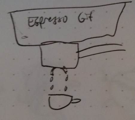
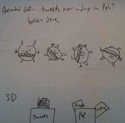
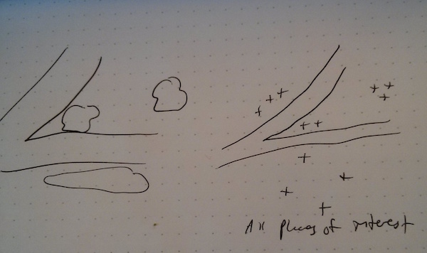
What I wish I’d done better: Curated it at all. This tells stories, but they’re the most interesting or meaningful stories. My sketches (below) were a little primitive; I thought I’d turn this data more into a 3d shape, so maybe you’ll see it more in that project. This is more “computational” than “art and design”. Still, this is way more interesting to me than a coffee cup filling up or a little doodle or something.
* I don’t really know if it’s “all”. We’re just using the public API. Still, you can get something like 1% of all tweets from their public API, and geotagged tweets in Pittsburgh is way less than 1% of all tweets, so we have reason to believe it’s all the Pittsburgh tweets.
Code: on github. (not embedded because there’s rather a bit of it)


