Category Archives: looking-outwards

Epic Jefferson

15 Jan 2015

Tom Shannon – Aeros Grande (2003)

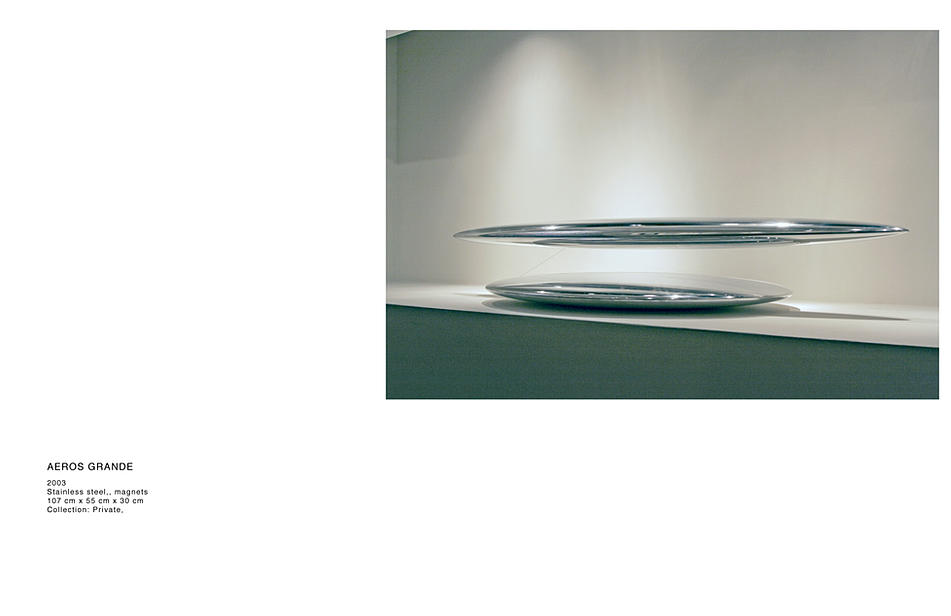
This sculpture levitates an object in a magnetic field, held in position by a single string.

Incorporating physical phenomenon into artwork is especially attractive to me. It’s a way of experiencing nature’s invisible aspects in a way that is both otherworldly and undeniably present. The use of stainless steel sort of removes any identity from the piece itself as it reflects it’s surroundings, and it’s shape strange but common in nature.

The tether is the single detail that sort of “grounds” the sculpture in “reality”. Which is both a relief and a showstopper. It’s seeing the rabbit in the hat. We all want to know how it’s done, but that will destroy the illusion.

Christian Bannister – Subcycle

This project combines graphical interface design and sound synthesis. Bannister created a personal interpretation of how he thinks this music should be interpreted visually and how it’s generation should be controlled. In the world of touchscreen based interfaces, i think this is the most comprehensive example of what the technology can do and how these interfaces can be customized to suite aesthetic and functional needs.

mileshiroo

15 Jan 2015

Screen Shot 2015-01-15 at 1.03.47 AM

“84” is a browser-based, generative artwork by Adam Ferriss, in which fluorescent waves move out from a central point, forming unstable, layered structures. The code for the work is fully visible in the page’s source, and a brief inspection reveals that it is programmed in GLSL. Since it uses shaders, which leverage the GPU, the piece runs smoothly on my machine despite its complexity. The temporary patterns are complex and engrossing, neither predictable nor chaotic. Ferriss shows a great attention to color, and the forms take on a metallic quality as they transition from one carefully chosen palette to the next. While there is no text description for this work, I’ve seen similar patterns in reaction-diffusion simulations, so I suspect that is where Ferriss draws some inspiration. “84” is aesthetically similar to his project “Gush,” which uses the webcam to seed the reaction.

Screen Shot 2015-01-15 at 1.02.55 AM

“Nissan Yogurty” is an exhibition featuring work by Kate Sansom in Chrystal (Crystal?) Gallery – a nonexistent gallery curated and rendered by Timur Si-Qin. “Nissan Yogurty” consists of a written dialogue between the artist and Costco, and high resolution images that serve as the simulated documentation and actual content of the exhibition. The images are photorealistic renderings of the Chrystal Gallery space and the artworks of “Nissan Yogurt,” which incorporate elements of painting, sculpture and collage, and feature appropriated logos, products, cartoon characters, lemons and live 3D oysters. The Chrystal Gallery website is self-consciously basic in terms of design and usability, which is a conspicuous choice given the technical sophistication of the images. While it would be convenient to view enlarged versions of the image when clicking – currently, doing so opens them in new tabs – this is a minor caveat. The images are highly detailed and reward close viewing, and the surrounding gallery – a generic corporate space littered with cigarettes and beer cans – convincingly communicates a feeling of banality.

chen

15 Jan 2015

(BEAT BLOX from Per Holmquist)

I found this project on the webpage, which introduced the tools used in this project. As far as I know, it is an interactive beat machine using turntable device and sensors to detect the location of small squares, and then produce sound out using this data.

I found this project very interesting because the quality of beats produced by this machine is well designed and of quite high quality, and this device is colorful which is also attractive.

However, I think the variety of the beat is constrained by the number of rings and number of turntables. If people want to add more kinds of beats, they could only add more turntables and this disadvantage would make this work hard to develop. Besides, the maximum speed is also limited.

As of the key part of this work, the idea of beat machine has been developed by thousands of artists and musicians. I guess this work is also inspired by many traditional beat machines or sequencer like the following, from native instruments:

oie_15637507yM9GhP3

The most similar work I can find is this one:

(Turntable based Sequencer and synthesizer / MAX MSP from Itay Niv)

The theory of making beat machine is similar, and both of the two works choose to do it in an interactive way. The first one uses distance sensor, while the second one chooses digital camera to capture image of small objects.

// I’m the dividing line!————————————–

(Drum Cannonry from Renaud Hallée)

This video is about a music game that detects rhythm patterns and then uses this pattern to battle. It could detect live drums and also MIDI signals, and display the rhythm or beats on a screen.

This game video seems interesting for me, but I must say, the improvement space for the user interface is big and the game play pattern is rather simple. It might be a general defect of music games like osu! and jubeat. To add music factors into an interactive design, I would prefer to put music into daily use rather than make it a game.

// dividing—————————————————-

There is a third work I want to recommend, which is not new for me. It is a cute small piece of music using keyboard of a laptop to trigger music samples.

jackkoo

15 Jan 2015

My Looking Outwards

Smoothed out mickey mouse

sekumoi3-2-smooth-operator-matthew-plummer-fernandez

http://www.plummerfernandez.com/Smooth-Operator

I did a lot of digital sculpting and also like viewing glitch art. When you first started using zbrush you would work on your character you always run into problems  where you don’t use your move tool correctly and end up with bad mesh. Then you start trying to smooth it out and you end up with these pointy areas that just won’t go away.

There was a lot of faculty from college that liked glitch art so I often took pictures when programs crash and resulted in pretty artifacts, or when my fractal algorithm isn’t “correct” but ends up looking really cool. I usually looked at glitches as a potential good thing and felt that they had their own aesthetic. However whenever I got those weird pointy spots causes by smoothing bad mesh, they were just annoying. Its felt really strange to see it used as a glitch art aesthetic.

L System 

l-systems7

http://www.michael-hansmeyer.com/projects/l-systems.html?screenSize=1&color=0#8

I found this piece on a person’s gallery tucked away in the final images of a series. L – Systems are famous for rendering trees. Most algorithms seem to be praised for having some semblance of organic life, such as conway’s game of life, or Mandela fractals. We see square looking fractals but they honestly don’t look very impressive. This however is a lindermayer rendering of what looks like a factory or warehouse. That’s kind of really odd…

What this picture made me wonder a lot, is how much are the designs and the pattern part of the actual algorithm. If the stair looking parts, the colors, and transparency were naturally part of the algorithm it somehow makes it a really cool piece. But I feel that if they were applied after it loses some kind of value to it. I guess its a bit like how we dislike hard coded programs, since they aren’t “elegant”. Hmm I really wish people would explain their procedural art more and how explain how the shapes were formed. This one is rather curious.

pedro

15 Jan 2015

How can we define generative strategies to help inhabitants or experts to organize their own environment?

Many computational approaches to spatial generation were developed and debated in the 1970s and 1980s but they were too specialized and deterministic and so… ended up not influencing real architecture practice. Today, we have access to many techniques of form-finding and digital fabrication. However, in this quest for new shapes and among the widespread complex geometric techniques available for architecture, spatial organization remains an secondary topic.

Facing this gap, I searched for recent experiments of generative design related to spatial organization. The first example is Space Syntax programme and external form generator by Frano Bazalo.

This project is based on a excel sheet set to register the characteristics of the rooms (size, height, level and name) and its connections. This set is an input to a grasshopper definition that generates a three-dimensional space syntax diagram (a graph of the functions). Based on the attributes of each node or room, the algorithm generates an overall volume that is divided by a 3d voronoi diagram.

On one hand it is interesting to note that the author adopts part of these design strategies to develop some specific design experiments, using the resulting 3d voronoi diagram to generate also the structure. On the other hand, this strategy seems to work without real building constraints such as circulatory systems or site conditions. Besides, it needed to be more interactive to stimulate design exploration.

Another interesting project that I found is a multi-agent systems called PROBOTICS, developed at the Architectural Association Design Research Lab by Jose Sanchez, Knut Brunier, Anica Taneja, Diego Rossel (Course Tutor: Alisa Andrasek).

It seems to be formed by primary agents that move around and interact in vector fields. The environment is also populated by secondary structures that can leap to the orbit of these agents generating different patterns of organization. In this interaction of two levels of agents, the team was able to organize different infrastructures.

It is even more experimental than the first project presented, so it does not deal with real constraints and does not consider a specific programme as a pre-requisite. Besides, it is based on agents and it is more adaptable to a specific environment, which increases the space of possible solutions.