Category Archives: LO-8

ypag

12 Mar 2015

Bernoulli Ball Blower
“Many learners ignore the label copy and just play with the ball, walking away with a fun memory but no better understanding of the phenomenon “
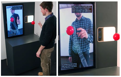
This project demonstrates use of augmented reality to visualise the invisible paths of forces. Users can interact with the system real time to understand the classic Bernoulli Ball Blower setup. The camera is tracking its position (color blob tracking) and feeding that information to the processing program, which then renders the visualization that illustrates areas of higher and lower air pressure.

Screen Shot 2015-03-12 at 1.02.39 AM

Gravity Well
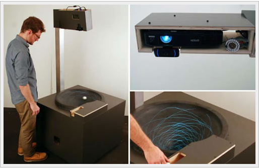
Gravity well is result of pull of gravity by a mass in space. Gravitational forces form a funnel shape around a mass. If the weight is heavy as a planet, the time space fabric is streched and there is steeper curve. This concept is demonstrated by “Gravity Well”. Using augmented reality the motion of the rolled ball is replayed. the facilitator now slows down the motion of the ball to explain the physics behind it. I find the project quite interesting since it touches upon the ability of augmented reality technologies in learning application by “slowing down” laws of physics that govern our world.

Screen Shot 2015-03-12 at 1.02.48 AM

Reference: http://mw2014.museumsandtheweb.com/paper/augmented-reality-for-interpretive-and-experiential-learning/
dave

11 Mar 2015

Bad Trip is made by Alan Kwan. In this game, the player explores a dark landscape, and they can come across blocks of memories that contain video footage of what the artist saw that day, which are recorded via a camera mounted on his glasses. I do like the concept, the controls, and the aesthetics. However, a lot of it is unexplained. Why are there people with trees for heads? Why does the environment has to be so large? It takes away from the main focus of the game, which are the video footage. The ambient atmosphere is heightened by the deep erratic breathing sound effects, which makes this piece less surreal and more horror, akin to most horror games such as Amnesia or Dead Space, which I feel takes away from the main concept that the artist is trying to convey.


Pingtime uses projection to augment the ping pong experience. The visuals are cool, and the technology is nice, but since ping pong is already such a fast paced activity, the projection and the real world actions clash, causing each to become a distraction to the other. If only they can apply the same technology to some slower action, or use visuals that are less overwhelming. It is similar to some other projection based interactive pieces, such as those made by Camille Utterback.

Alex Sciuto

11 Mar 2015

Two visualization projects that use photos as raw material.

On Broadway

Screen Shot 2015-03-11 at 2.52.50 PM

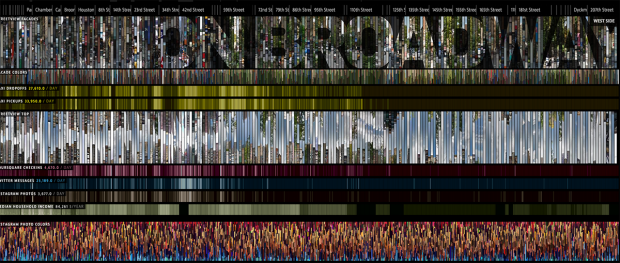
On Broadway is from the same people who did Selfie City, which I wrote about before. I didn’t know that when I visited the On Broadway visualization, but it makes sense because the two projects share a love of exploring what it means to be a city through visualizing photos of the city. In On Broadway, the creators pair Google Street View photography with social media data and locate it along New York City’s Broadway Ave.

The most striking feature of the visualization is the accordion-like photos that expand and contract as the user zooms in and out. It reminds me of the NYTimes Fashion Front Row graphic. I also like that they created a physical installation for people to be on Broadway and explore On Broadway.

I think the actual visualization is overwhelming and doesn’t help the viewer make insights. The zoom-in-and-zoom out lets me explore different sections of Broadway elegantly, but the addition of social media info is just noisy. Twitter, Foursquare, and Instagram don’t paint a very interesting story. I did like how the visualization extracted Instagram color information. I did like that touch.

Whale Hunt

Untitled-7

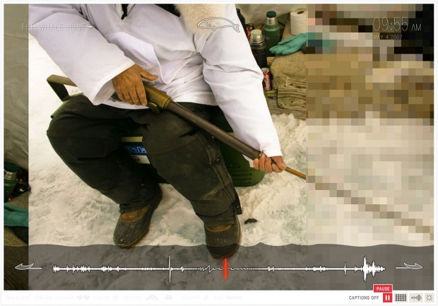
Whale hunt is an older project from Jonathan Harris that I think is a nice contrast to On Broadway. Harris took photos in 2007 of a whale hunt, and created a (flash-based) experience to relive the experience. Where On Broadway is open-ended in its exploration without any narrative, Whale Hunt is most powerful when it is viewed as a slideshow with time stamps and minimal captions. Interactivity is lost, but story is added. Photos snapped every five minutes give a sense of time that scrolling or zooming spatially couldn’t give.

At the same time, I do wish Whale Hunt were a bit more like On Broadway. Whale Hunt is most powerfully an automatic slideshow, but I wish there were ways to play with the images more. Harris doesn’t provide some meta data, like subject, caption, color-composition. But that’s not really used in the interface.

ST

09 Mar 2015

http://ani-gif.com/2.7/04/

And here where we are now?

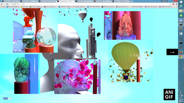
A browser based interactive project by Eva Papamargariti

LO8-2

LO8

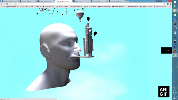
Clicks make additional GIFS pop up, clicking on the arrow will direct the viewer to a new GIF base. With squares of image, sequentially generated by the users click, this work is a visual narrative. The GIFS are awesome, gorgeous, and appear to be (at least partially) computationally generated.  Though the site is only seven pages, it’s an exciting adventure, and I don’t mind looping back to the beginning. I’m super into this browser experience.


http://archive.rhizome.org/artbase/1678/wrong.html

%20wrong

A browser work by JODI

LO8-3

This work was a ‘splash page’ created for a Rhizome series. Users would be directed to this page when visiting rhizome.org. The animated page might convince some of a hack, but more likely (since it is a new media site -_-) it didn’t trick any. However, I am attracted to the idea of the ‘splash page’. The splash page is a way for a site to express itself. It can really make or break a web experience and since it is not required to display any real content, there are many options.

I will have to think more about the role of the splash page as I continue to brainstorm for my final project.

pedro

08 Mar 2015

It took me a little bit longer to find a topic of interest for this LO post. It is difficult to find recent works in computational design in which architectural space and organization is the central issue (while form and performance follow it).

zha
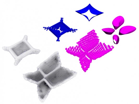
Firstly, I was visiting the website of the ZHA|CODE (Zaha Hadid Architects Computation and Design Group) and saw that predominantly the works focus on producing an appropriate work-flow to deal with complex forms based on some kind of performance. However, among these research and workshops there are some opportunities in which space and organization seem to emerge. Particularly, I found it interesting the project “BODY PLANS : voxelise ,breed , evolve“. As the title makes clear, this project is part of a research on topology optimization and voxelization and it is connected to the participation of the group in the Venice Biennale 2012  in which they produced a beautiful pavilion. Maybe it is only in my eyes, but I really saw potential in these mesh generation to think about architectural configuration, that is why I decided to post it here.

After a while researching for poly surface and mesh subdivision for spatial exploration I ended up discovering the website dplay with many interesting propositions on design and computation. Between these propositions there was a post titled “Exploring Soft: Exploring computational methods to play with and articulate flexible programs/space”, in which Kaustuv De Biswas developed a Java applet called metabolica (in a cross reference to meta balls and metabolism) to deal with design exploration.

It is interesting that the author presented this tool as a part of a larger project called Sunglass in which a common environment should support design exploration with different inputs, leaving the obsession by technical performance as a consequence of this process of discovery (and not the inverse). This proposition may sound very simple, but in terms of design thinking and computation it is clearly out of the mainstream. Not only it challenges the common ground of generative and performative design (in which form should be only an output of objective constraints) but also it try to grasp flexibility and ambiguity of a design exploration based on ideas and interested in space.