Mudra

https://cycling74.com/project/mudra/
This project is an example of a project made using Max with gen. The author has put together a working synthesizer that boasts the feature of “slice phase synchronization”, which I believe is saying that it can phase shift slices that are put next to each other such that they link up and do not produce discontinuity artifacts in the waveform.
I do not have much experience with Max, so it is hard for empathize with whatever process this person took to create this tool. From an empirical perspective, it looks like the interface is clean enough and that it has lots of useful features. As with all sound generators, I would be very happy if it could include a box for me to type in a mathematical function that I am interested in.
Visual Dictionary
http://groups.csail.mit.edu/vision/TinyImages/
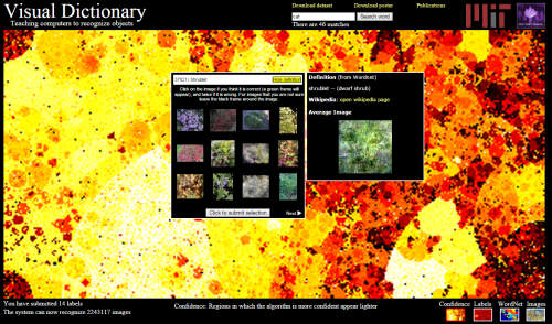
This project is an attempt to represent words by the distribution of colors among images of them. The project allows users to type in words and train the set by selecting images that match the words and eliminate images that do not match the words. In this way as more and more users help out, the database can objects in scenes with higher and higher accuracy. I like the information visualization components that allow the user to see how the current training is going. It is also nice to see that the colors in the image seem to be indicative of the objects that they are representing, for instance I looked up pegboard and found a mostly brownish image. This project reminds me of one of the ones that we saw in class, which tried to reduce words to a single color. I think this project is much more robust, because it captures a distribution of colors instead of just one. From an information theoretic point of view, these 2 dimensional arrays of color averages can address a larger set of words with higher discrimination. The main thing that I was dissatisfied with was that the images that users need to look at to determine whether they are a good fit or not are too small for me to tell.
