Name: Amy Friedman
Status: Graduate Student
Program: Tangible Interaction Design
Background: Bachelors of Arts in Architecture, Carnegie Mellon University
Twitter: @amy_friedmann
Github: https://github.com/amyfried
Homepage: www.amyefriedman.com
I am currently a Graduate student studying for my Masters in Tangible Interaction Design at Carnegie Mellon University graduating December 2015, I completed my Bachelors of Arts in Architecture in May 2014. My focus is upon user experience of wearable healthcare and sports performance technology. There is a disconnect between what is advocated as a healthy lifestyle and what people truly accomplish each day. With better design we can improve the usability of technologies and strengthen the importance of healthy living to the everyday person.
When Im not in class I enjoy playing volleyball, spending time outdoors (during all seasons), exploring new places in the city, taking pictures, and dancing at random moments.
ACTIVATE YOURSELF

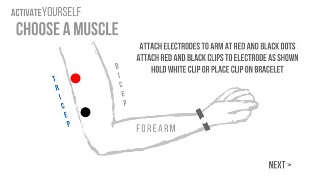
Activate Yourself is a visualization aid, to understand muscle activity. Users follow on screen prompts to visually understand if their muscle of choice is being used during different motions they utilize. This is a beginning step to better understand our bodies and whether we “activate” ourselves during different activities the way we think we are.
Using Processing 2.0 I created the onscreen prompts and software. The software connected to the Backyard Brains Electromyogram(EMG) Shield/Arduino through Firmata imports into Processing, and using the Firmata Code on the Arduino. Readable data informed whether a muscle had been “activated” while someone was moving. The higher the analog read, the more the muscle was trying to be utilized through local electric muscle activity sent from the brain.
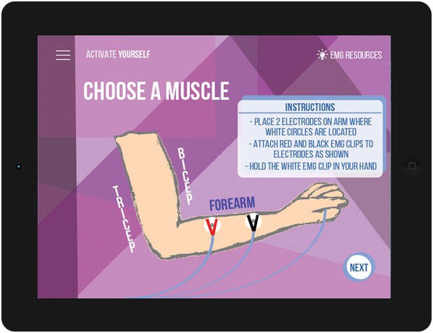
This project excited people about using their muscles that the EMG was attached to. The enjoyed getting visual feedback which they were moving, but wished that the activity was shown in a different way. I was able to successfully convey Muscle Activity to users and create an experience. I spent time sketching out the interactions and how they should experience the timers. Creating the software took me time as it was hard to program how to navigate between menus. I also had trouble moving words while utilizing a timer. I spent too much time on making this work, that the end “AH HA” moment to compare the two activities needed more attention. It was hard to program the UI they way I designed leaving the app looking clinical. I created new wireframes seen below to add move value to the experience.


