Monthly Archives: February 2014

Kevan Loney

11 Feb 2014

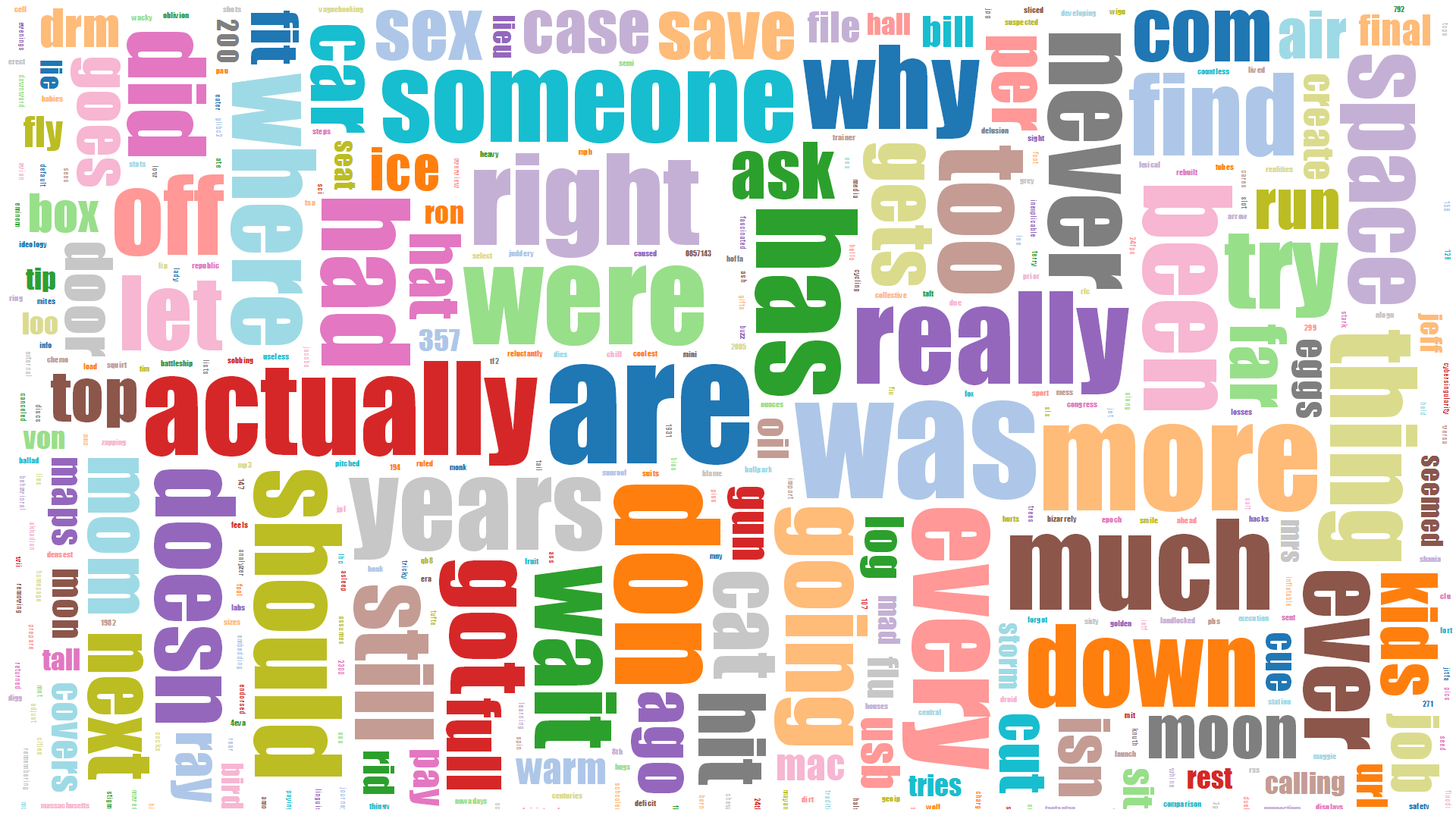
Looking through the visualizations of datasets, I was surprised by my findings. I was expecting something either monotone, or just plain “digital”. Which in some cases can look appealing or clean-cut. In return, I found that many of the visualization popped out at you with color, with organic wonder, and all around thought provoking visualizations that you can get lost in by the pure aesthetic alone.

The three that I really enjoyed were:

Mark Wattenberg’s Wind Map:

http://bewitched.com/windmap.html

Screen Shot 2014-02-11 at 2.12.30 AM

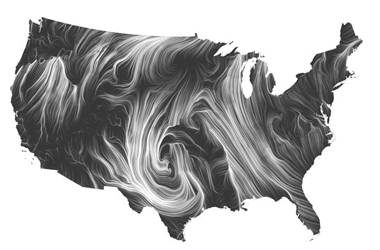
In the wind map visualization, I was overwhelmed with the organic beauty made from the technical data used. The longer you stair at it the more you begin to unfold and find. It’s equivalent of looking at a Van Gogh painting… Getting lost in the push stokes of the data.

Pitch Interactive’s Flight Quest:

http://visualization.geblogs.com/visualization/flight-quest/

Screen Shot 2014-02-11 at 2.03.55 AM

This one I found not only visually appealing and eye catching, but also fun to watch and interact with. I believe the design always helps capture an audience, and this one does just that. It draws you in visually and then keeps you with it’s simplistic design cues and clean animations. All-in-all, this one is one of my favorite’s from a design standpoint that meets and excels at keeping you engaged in the interaction.

Chris Harrison’s Amazon Map:

http://www.chrisharrison.net/index.php/Visualizations/AmazonMap

Screen Shot 2014-02-11 at 2.12.39 AM

These also appealed to me from a visual standpoint. On first glance they reminded me of the classic animating technique of making color scripts for your movie to plan out the color cues/light changed per shot basis. This allows the animation to not only think about storyboarding the action, but the color as well to enhance the story’s emotion, setting, and plot being told. This actually works with this project taking color cues from different covers to create the visualizations. I would love to incorporate this idea into my quantitated selfie.

Andrew Russell

11 Feb 2014

For the scraping assignment, I decided to figure out which words were most commonly used in XKCD’s alt-text. Being a big fan of Python, I decided to use Python and Beautiful Soup to scrape the data.

XKCD uses a very simple URL scheme (http://xkcd.com/<comic_number>). I simply figured out what was the most recent comic number manually, then, in a python loop, went from 1-1328 and downloaded the html of each page. Once that was done, I loaded each page in Beautiful Soup to extract the alt-text from the comic. Each comic page contains a <div id=”comic”>…</div> which has an <img> inside that. The <img> tag contains the ‘title=”…”‘ attribute which is the alt-text.  I then created a file where each line contained a single comic’s alt-text.

I then created a second Python script to parse the alt-text data. This script loaded the file I had created earlier, removed all punctuation, and counted every single word.  It then output a csv file of each word and their count.

I then loaded the csv file into d3 and, using d3.layout.cloud.js, created a word cloud of the alt-text words.  To get the word cloud to look nicer, I removed all common English words (eg, the, and) and removed all words less than length two.  The result is shown below.

cloud

I did not imbed a running example of the d3 code since it takes a few minutes to parse the csv file.  However, all code, data, and instructions on how to run it can be found on my Github.

Spencer Barton

11 Feb 2014

Hotels of the World: Soap & a Globe

C++ and openframeworks was a whole new can or worms for me. I knew it would be tricky and I was not let down.

It began with linker errors on provided examples. I switched from VS to codeBlocks and was much happier. From there I needed to tackle the data. I quickly learned that real world data is not clean. Our dataset had NULLs scattered throughout, random unfilled sections and unlikely hotel addresses. For both of my attempts to visualize the data I did much cleaning and reduction before loading into the programs.

Attempt 1: Globe

Screenshot 2014-02-11 01.52.29

I took the simple approach of mapping hotel locations to a globe. The globe image was logical and the red dots showed well. Simple zoom, tilt and pan is implemented.

Github

Attempt 2: Bars of Soap

Screenshot 2014-02-11 01.50.51

Screenshot 2014-02-11 01.51.13

I got to thinking about hotels and I remembered all those bars of soap. Every morning at every hotel I’ve been too I get a new bar of soap even if the one I used the night before is in fine condition. I used this as inspiration. Hotel capacity by country was mapped to the area of the bars of soap in the visualization. The data being of US origin was skewed heavily towards the US and common US tourist destinations. Nonetheless it is interesting to note the shear volume of soap spent daily. This may be a gross approximation but I imagine the order of magnitude is close enough. I went for the pile of soap because this is a pile of disposed bars of soap. The user can pick-up the bars of soap.

Github

Brandon Taylor

11 Feb 2014

I scraped property information from the Allegheny County website.  Originally, the mapping project had got me thinking about mapping property values.  Unfortunately, the two projects didn’t totally come together (I’d need to convert address data from the Allegheny website to geo data via google maps or something).

I used BeautifulSoup to write a scraper that just iterated through parcel and lot numbers and pulled off addresses, land size, purchase prices & dates, and land & building values.

I got hung up using d3.  I don’t do a lot of web programming.  Though it turned out the biggest problem was with trying to access a local file.  After I figured that out, I didn’t have much time to do anything interesting beyond just plotting the data.

ScrapeViz


The implementation was largely taken from Jerome Cukier’s blog.

Also, I couldn’t get the embedded d3 stuff to work.  It seemed like no one did?


Nastassia Barber

10 Feb 2014

I had such strange problems getting started with OpenFrameworks that by the time I got to trying to make the add-ons work I just didn’t have time to deal with the lack of Windows instructions, so I did this assignment with Processing libraries instead. I chose two libraries that I found interesting but probably wouldn’t actually use together- blob detection and cell noise. I think cell noise is really interesting as a natural phenomenon and can make some really beautiful things. Blob detection seems like it could be useful for lots of interactive projects.

The biggest thing I learned from this project was that if I intend to use OF add-ons I should decide to get help or use the macs in the studio really early in the project…

cell_noise_screenshot


Here’s a  video of some more generated noise.

2.3- Nastassia is pretty scared of news website commenters

For this project, I decided to take data from around 100 comments on articles announcing that the Boston bomber may be eligible for the death penalty. I have sort of a morbid fascination with how happy people seem to be able to get about other people being executed. I got a bunch of comments from several different news sites (but essentially the same article) with Kimono and found the most common words in the comments. I discounted words that show up in basically all written English, like ‘and’ or ‘the’. I coincidentally already had an excel sheet for finding the most common words in blocks of text, so I used that to find them. I did encounter a couple of websites that didn’t work with Kimono, but most did, so it wasn’t a major problem. I also had to continue to struggle with JavaScript, and I’m starting to hate it slightly less!

Trying to get the D3 imbedded properly below, but here is the screenshot. Winner of most surprising word is probably “virgins.”
screenshot_finished

World’s Hotel God Tool

[vimeo 86370143 w=600]

The World’s Hotel God Tool displays some 499,000 hotels throughout the world as individual OpenGL points. The points are controlled by a customized version of Golan Levin’s MPM-Fluid, which I renamed ofxMPMFluid. I made several modifications to the library, most notably adding the ability to specify the starting location of each point on setup, as well as the ability to specify a unique RGBA color for each point, and the ability to reset all points to the original position. I’ll explain the functionality a bit later.

h1

The World’s Hotel God Tool wasn’t my first pass to visualize the hotel dataset. I originally went down the path of placing points on a ofMesh and using ofxGrabCam to manipulate the perspective in three dimensions. The visualization above displays all the hotels on the X Y axis with the number of rooms in the hotel as the Z axis. Below I experimented with with several X Y planes. Here there was a plane for each hotel star rating from 0 to 5. Don’t mind the color choices, they were randomly chosen for this proof of concept.

h2

Below are screenshots of the final design. The points are managed by a MPM Fluid library I customized to give the points a sexy particle effect. The user can grab a section of the map and throw it at another continent, completely obliterating it. You can also adjust the physics settings live using a control panel at the bottom. When you want to start over, just press ‘r’ and all the points will flow back to their original position.

Voila_Capture24 Voila_Capture 2014-02-10_08-37-33_PM Voila_Capture 2014-02-10_08-57-19_PM

openFrameworks Add-ons:
– ofxCSV
– ofxMPMFluid (Customized: Source)
– ofxControlPanel
– ofxXMLSettings

Code: https://github.com/jeffcrossman/WorldHotelGodTool

Spencer Barton

10 Feb 2014

Sleep from Fitbit

Screenshot 2014-02-10 18.30.48

I created a d3 heatmap using my total sleep time over the past few weeks as recorded by my fitbit.

The main challenge here was parsing the data. Temboo/Fitbit returned json with a bunch of escaped characters in unicode. This took awhile to deal with and convert to ascii. Pulling the data was very simple using temboo. Once I had data, python was immensely helpful with parsing and cleaning. I set-up sheetsee to hold my data which was fairly simple but I again had difficulties getting sheetsee to communicate with d3 stuff as they had slightly different formats.

I learned the most about d3 which was a new tool for me. I was impressed by the versatility though I had to work heavily from provided examples.

Github

Live Project (sorry I couldn’t get d3 working in this page):

Andrew Russell

10 Feb 2014

Thereface is a computer base theremin which is controlled by the position of your face. It works by using ofxFaceTracker to find a face on the screen, and return the position in pixels of the face. The top left corner being (0, 0) and the bottom right corner being (640, 480), which is the application’s screen size. The face position is then used to compute both a frequency and a volume to be used as a pitch. The pitch varies from 200 Hz from the far left to 1000 Hz at the far right. The volume ranges from 0% at the top to 100% at the bottom.

The audio is synthesized using ofxTonic, which is an openFrameworks port of Tonic Audio. Tonic Audio is a sound synthesizing library for C++, which allows easy synthesis of various types of waves. Thereface uses a simple sine wave. We update the sine wave’s frequency whenever we detect the face as being in a new position.

Please note that in this video, the audio sometimes stands still while my face is still moving. This is because the face tracking software stopped recognizing my face. I blame the beard. Also, I apologize for the application crash. Thereface worked great until I started using a screen capture software and that was best take I could get.

Github