Daily Archives: 17 Feb 2014

Kevyn McPhail

17 Feb 2014

Project 1:

Long Distance Art

Project 2:

Appseed

Project 3:

HypoSurface

I chose these projects because of my interests in the digital representation and recreation of analog activities.

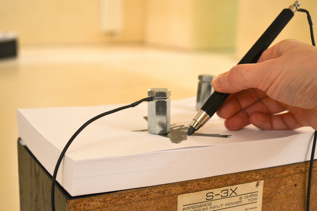
As someone who has been looking into with getting robots to work intuitively with humans I am really impressed with the first project by its ability to translate human movement to the robot arm. What is interesting about the project is that even thought the robot and the artist are pretty much perfectly in sync, you can see that the robot’s drawing is a close but slightly modified version.  But this is probably due to a lot of technical faults such as the sensing and reaction timing of the robots in addition to the motors getting up to speed, etc… However this project is still pretty amazing and a good precedent for a potential capstone project.

I was really interested the second project because of how it very elegantly touches on the ideas of digitally representing analog items very well. Especially since it makes it very easy to prototype application interfaces. It removes a lot of steps in between sketching and wire framing to interface development.

Lastly the final project caught my eye because of its flexibility  in interaction. The hyposurface responds to almost any type of physical interaction with the wall. The three key interactions that it responds to are sound, light and touch. But it can also respond to a mix of these senses. From an architectural stand point, the hyposerface can introduce a whole new perception of spaces, allowing them to be responsive to it’s inhabitants. It can also change the way buildings perform allowing spaces to be, literally, shaped by the emotions and physical reactions of a building’s users.

Sama Kanbour

17 Feb 2014

Usable: Celebrating every minute spent outside

Description This website presents an interactive timeline that shows how different people spend their time minute by minute on a daily basis. The timeline integrates images along with captions. People can be tagged to an entry, and thus can be tracked. A search feature allows the user to find specific entries by the time they took place. The timeline animation is very pleasant.
Tools and resources the timeline was generated using JavaScript

ScreenShot002


Useful: Interactive design

Description what I liked about this interactive website is not the idea or content, but rather the animated transition between the different layouts. I find this example of interaction useful for my own project as I am gathering ideas about how I can visually organize my information for the Quantified Selfie.
Improvement looking at the source code, it appears that the developer used JavaScript to create animations, which I don’t think is ideal. Given how powerful CSS3 is today, I am confident there is a way to recreate these animations using CSS only.

ScreenShot003


Desirable: Express your musicality!

Description: this is a web app that allows you to make a human miniature beatbox. To me, this app is more related to a cappella music than beatboxing. Given that cappella music is à la mode, this app in my opinion is very entertaining and fun to play with. It could almost reproduce Mike Tompkins’ exceptional vocal art!

ScreenShot005

Wanfang Diao

17 Feb 2014

This is a project by Disney Research. It use simple circuits embedded in cards to help children build interest to physics knowledge and understand these knowledge by hands-on experience. I believe people learn from doing. In this project, the technology is not complicated, but it prove that simple idea can also be significant and fun. There are lots of way to interact with objects and explore the world, not only clicking the mouse or typing on a touch screen. That’s also one thing this project try to tell children.


This is a project from a CIID student. Her idea is to use color drops produce notes. I think there is more potential in this project. There is several question to think about: Why does her mapping colors to notes? Which color map to which note? Lights and sounds are all waves. So what’s happened to the notes when colors are mixed together as a new color? Can interaction be more rich besides using the dropper? Anyway, this project is simple, but it is a good inspiration.


I like this project because it is so beautiful! The author used the changing of capacitor when wood be touched to control the led lights under the wood as an interaction. It is so natural and smooth. I believe there is more interesting interaction patten the author can explore. What’s more, the documentation is great.

Crossman-LookingOutwards-6

Tongueduino
http://www.theverge.com/2013/2/21/4014472/trick-out-your-tongue-taste-the-world-with-tongueduino
[youtube=https://www.youtube.com/watch?v=zUyoVHjXF3A]
Tongueduino is an interface to the tongue that allows for small electrical impulses to be applied to the tongue as input to a human. Having never tried it, the tongue apparently is highly receptive to input at a fairly high resolution. Higher than the 3×3 interface shown in the video above. While this looks like a novelty, there is research showing this technology as a way to help blind “see”. But I am sure there are some fun uses for this as well.

Papa Sangre
http://www.papasangre.com/
This is an iPhone game from a few years ago that used stereo audio as a replacement for video. Meaning there was no video output to help the user navigate the virtual world. Instead the player had to listen in order to figure out where to go and what to do. This is probably not the first game to do this, but I remember hearing about it a few years ago and thought it was a cool idea that did something unconventional for a game.

Racer
http://www.chrome.com/racer
[youtube=https://www.youtube.com/watch?v=17P67Uz0kcw]
I’m not sure what it is with games for this post, but this is another game from last year. This Chrome Experiment allowed the multiple devices to be used together to create one game board. What is most interesting about this project is that it takes these typically very personal devices, cell phones and tablets, and makes them something that is shared. Typically each user plays from their own device, and usually not is the same physical space as their counterparts, but this game brings back a nostalgia with playing with neighborhood kids when I was younger.

Collin Burger

17 Feb 2014

Sweet Pads by France Cadet

‘Sweet Pads’ is an experiment with cognitive dissonance in interaction design.  The installation consists of a multiplayer game of the first person shooter Quake 3 Arena with custom controllers.  The game is known for fast-paced violence but the custom controllers require that players slow down and caress the pad in order to control their character.  Interaction design that evokes examination of the content with which the user interacts is often more interesting than modes of interaction that are very novel, seamless, and/or useful.

MegaFaces by Asif Khan and iart

MegaFaces: Kinetic Facade Shows Giant 3D ‘Selfies’ from iart on Vimeo.
MegaFaces is an installation at the MegaFon Pavilion at the Sochi 2014 Winter Olympics that displays three dimensional self-portraits, or selfies, into 8x6x2 meter monumental sculptures. People visiting the pavilion enter a photo booth in which they position their faces and photos are taken, then they choose which photo they would like to be displayed.  The installation queues the faces of the visitors and displays three of them at a time like a giant, colored PinPressions toy shown below.

The purpose of the installation is to reacquaint the participants with the concept of the self-portrait and examine their connection to their own face.  In the era of digital surveillance and identification, this sort of examination is necessary.

The Manual Input Workstation by Golan Levin and Zachary Lieberman

There are a number of reasons why The Manual Input Workstation makes it to my list.  I have yet to see anything else quite like it. The use of anachronistic technology in conjunction with cutting-edge computer vision techniques presents a very interesting juxtaposition.  There is an element of familiarity with the physical technology present, however, the really impressive aspect of the work is hidden in the software processing.  Also, the use of negative space interests me greatly. Its use is successfully employed in many great works of other visual arts, but to my knowledge has not been utilized in new-media art to any great degree. 

Spencer Barton

17 Feb 2014

The Bean

Chicago is one of my favorite cities to visit. Part of the appeal lies in the waterfront area which hosts a number of museums and the Bean. The Bean is always surrounded by people no matter the weather (and it can get cold in Chicago). Every vantage point offers a unique distortion of your profile on the stainless steel surface. The Bean itself is large enough to demand respect and attention and curious enough to draw viewers closer. I believe that the joy of interacting with the bean is seeing yourself distorted. People love to see themselves in new and interesting ways.

“Wooden Mirror” (1999) by Daniel Rozin

This project also lets the viewer see himself through a new lens. A camera tracks the viewer and distorts the wooden panels so mirror the viewer. This creates a pixelated mirror. I find this project particularly interesting because of the material. The viewer is not simply seeing a projection, the mirror is an actual sculpture. The interaction is fairly linear but there is some delay as the wooden panels move into place. This makes the piece feel more organic.

Nike+ City Runs

This project is a nice use of gps data from Nike+. Runners using Nike+ shoes stored their run data and their runs were visualized on a map. The interaction is fairly simple in terms of mapping gps data linearly to a map. This project is more interesting because they did a nice job with the mapping and creating a clean visualization. Run paths are the purpose of the visualization and this shows clearly with a clean map that really just shows the run paths. This project may serve as some inspiration for use of my gps data.

Nastassia Barber

17 Feb 2014

Nervous Structure

nervous_system

I really like this piece even though the idea is extremely simple because it’s just so believable.  It consists of physical strings as well as bands of light projected onto the same surface.  The projected lights move in response to the motions detected by a camera.  I think these piece takes a general idea I’ve seen a lot of people trying to achieve and does it really well.

Paper Circuits

This project is a setup with several loudspeakers on which participants can draw on a piece of paper with a pencil.  After placing contacts on different parts of the drawing, the participant will hear the sound that results from their drawing.

Cloud Ceiling

It’s interesting to see interactive art in a normal public space, a bar in this case.  Project Bar in Chicago has a large light installation that lights up paths in response to patrons moving through the bar.  I think the artists did a really good job of integrating the piece with the space and I wish this kind of installation was more common.