EliRosen-Project2-CivilWarVis

by eli @ 1:32 am 9 February 2012

For this project I chose to visualize the battles of the civil war. Aside from the fact that I have always loved to study the civil war, I found this to be an interesting data set because it has so many different dimensions: battle names, geographic information, dates, commanders, casualties, et cetera.  The data was scraped using a python script from the website www.civilwar.com. Thanks to Asim Mittal for all the help with python. I thought at first to visualizes the data on a map as a kind of animation of the civil war but found that that had actually already been done.
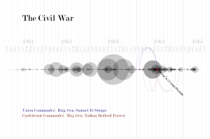
My next intuition was to use a timeline. I used this early processing sketch as a way to see what the data would look like on a timeline with the battles sized by total casualties;

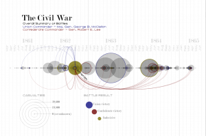
I liked this direction but decided I had to add a second element to make the project more interesting. I toyed with the idea of having an animated chronological visualization where as a playhead reached a battle it would explode, scattering two colors of particles that would represent the casualties on each side. Instead I decided to focus on the commander data to try to show where commanders had fought throughout the war. I drew connections for all commanders to all their battles. I found this to be much too cluttered and decided instead to introduce a selection mechanism so that only one battle and set of commanders was in focus at any one time. The user can step through the battles with the right and left arrow keys. Below is the result:

At this point I just added the legend to finalize the piece:

I’m pretty happy with the result. I think it provides some interesting high-level information about when commanders fought and how they fared. It also reveals some instances where commanders faced off in multiple battles. It is also interesting to see how the war escalated and then petered out. The visualization does not however give good insight into individual battles. The exact number of casualties is hard to discern and there is no information on the size of the armies that faced off. The areas where many battles occurred in rapid succession become very difficult to read and the dense areas do not read as being as dramatic as a single large battle even though the total casualties may be greater. It might be nice to have a supplemental tool to target a span of time and see the total casualties on each side.

Here is a video of the visualization as I step quickly through the battles of the war:

[youtube https://www.youtube.com/watch?v=zaA2Px_29dc&w=640&h=360]

Here is the live processing applet:
Select the applet and use your left and right arrow keys to step through the battles.
SankalpBhatnagar-GraphingColor

by sankalp @ 1:08 am

What if you could see color?

What if you could do more than just look at color? To perceive it, understand it, analyze it, really see it, color needs to be visualized.

My name is Sankalp, undergraduate Mathematician + Designer at Carnegie Mellon and I plan to do just that. The first question we must ask ourselves is, how can we possibly visualize something already visual? The answer I found can be summarized in four steps: First, treat color as data. Second, interpret this data as information. Third, graph this information. Fourth, notice patterns in graphs.

“Treat color as data”

In order to treat color as data, we must quantify the the qualitative. To do this, we must reference basic color theory. Every color that we digitally see can be broken down according to the RGB model. This model yields three distinct values according to a particular color’s Red, Green, and Blue hues from any given blended color. For example, the color Black has 0 hue increments in Red, Green, and Blue and thus has an RGB value of (0,0,0). Whereas, the color White has 255 hue increments in Red, Green, and Blue and thus has RGB value of (255,255,255).

“Interpret this data as information”

To interpret this data, we need to increase the scope of color to palettes. A palette is simply a range of colors used by artists, designers, and other creatives. In design, palette consists of around 5 different colors. These colors are usually brought together for their contribution to a palette’s overall mood or theme. Because of the nature of palettes, designers tend to create various versions in pursuit of a specific quality. In fact, at Kuler, designers from around the world can submit their individual palettes with “tags” relating to the mood or theme they interpreted from the palette. Kuler even has the option to organize the available palettes by “Most Popular” (in relation to how many times that palette was downloaded), “Highest Rated” (in relation to how many stars out of 5 the palette averaged), and “Newest” (in relation to the palettes most recently submitted). This online tool is widely used by artists and designers and will serve as the perfect host for our information visualization.

“Graph this information”

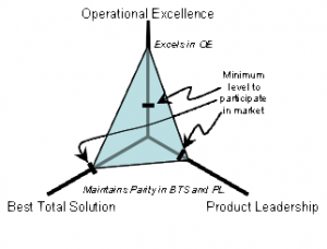
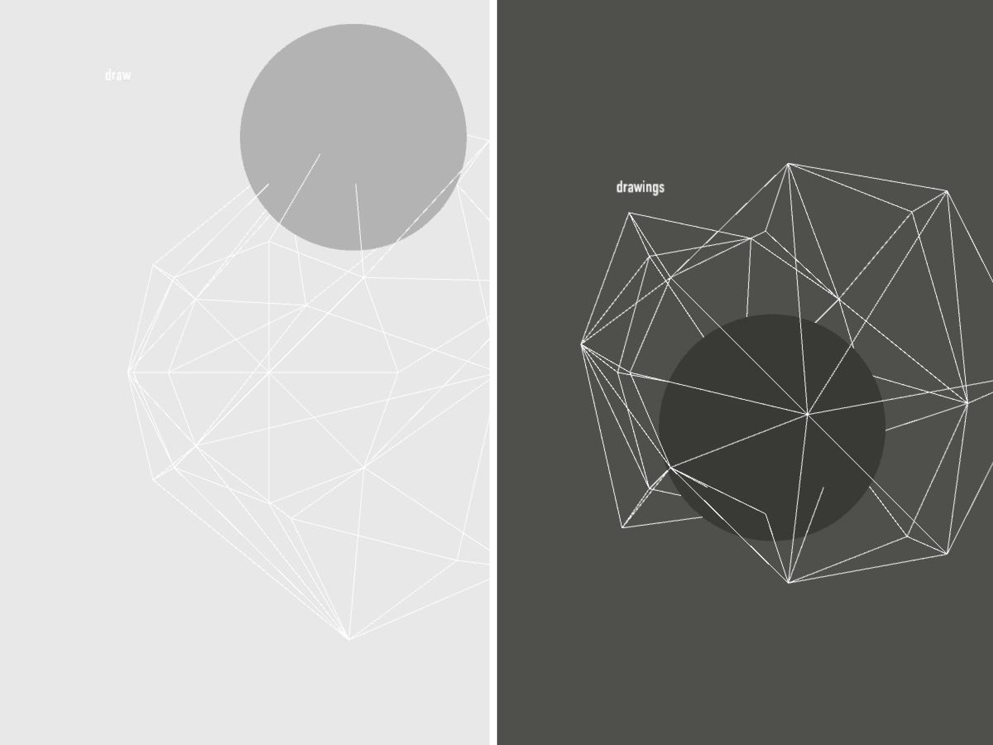
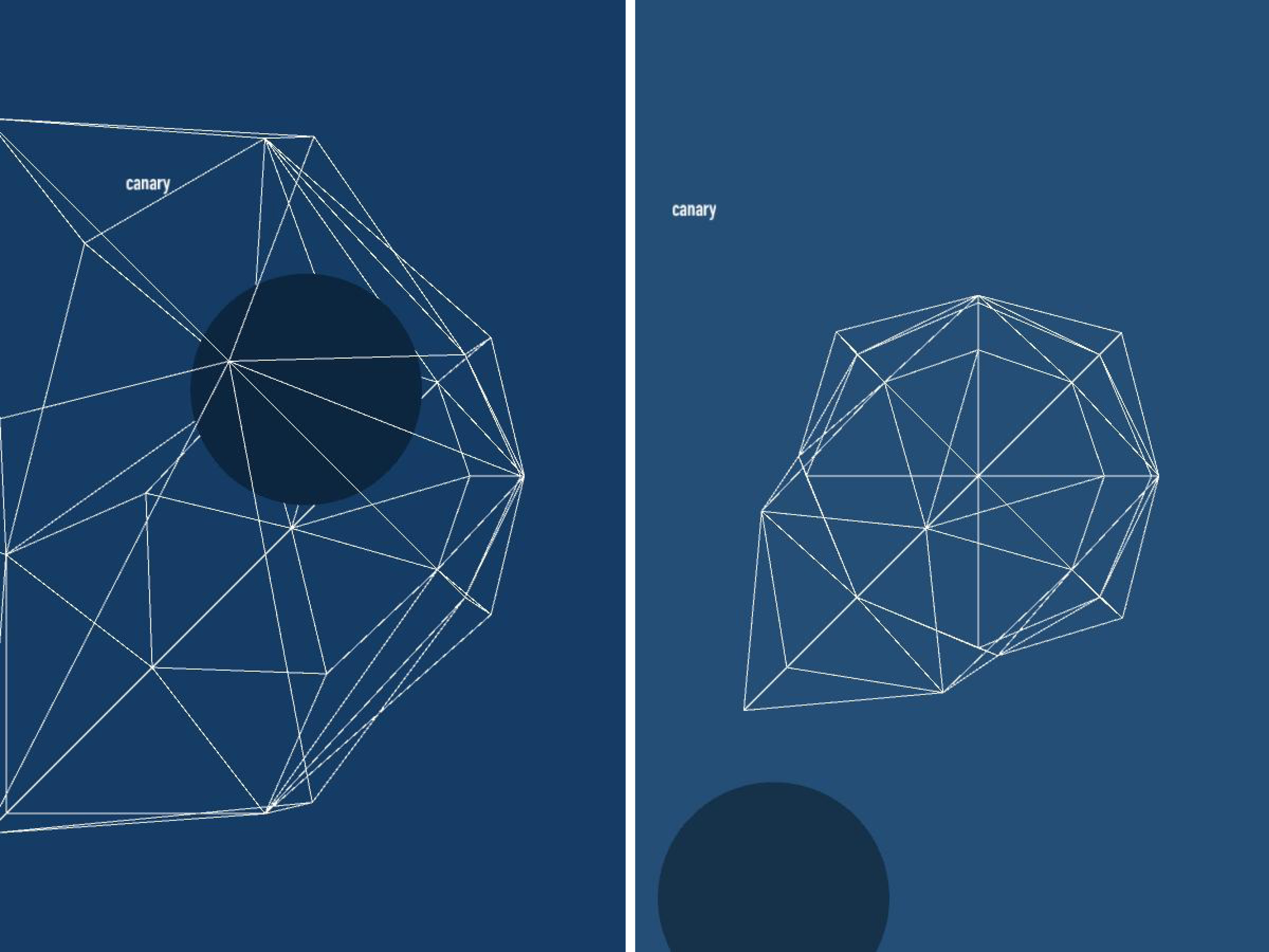
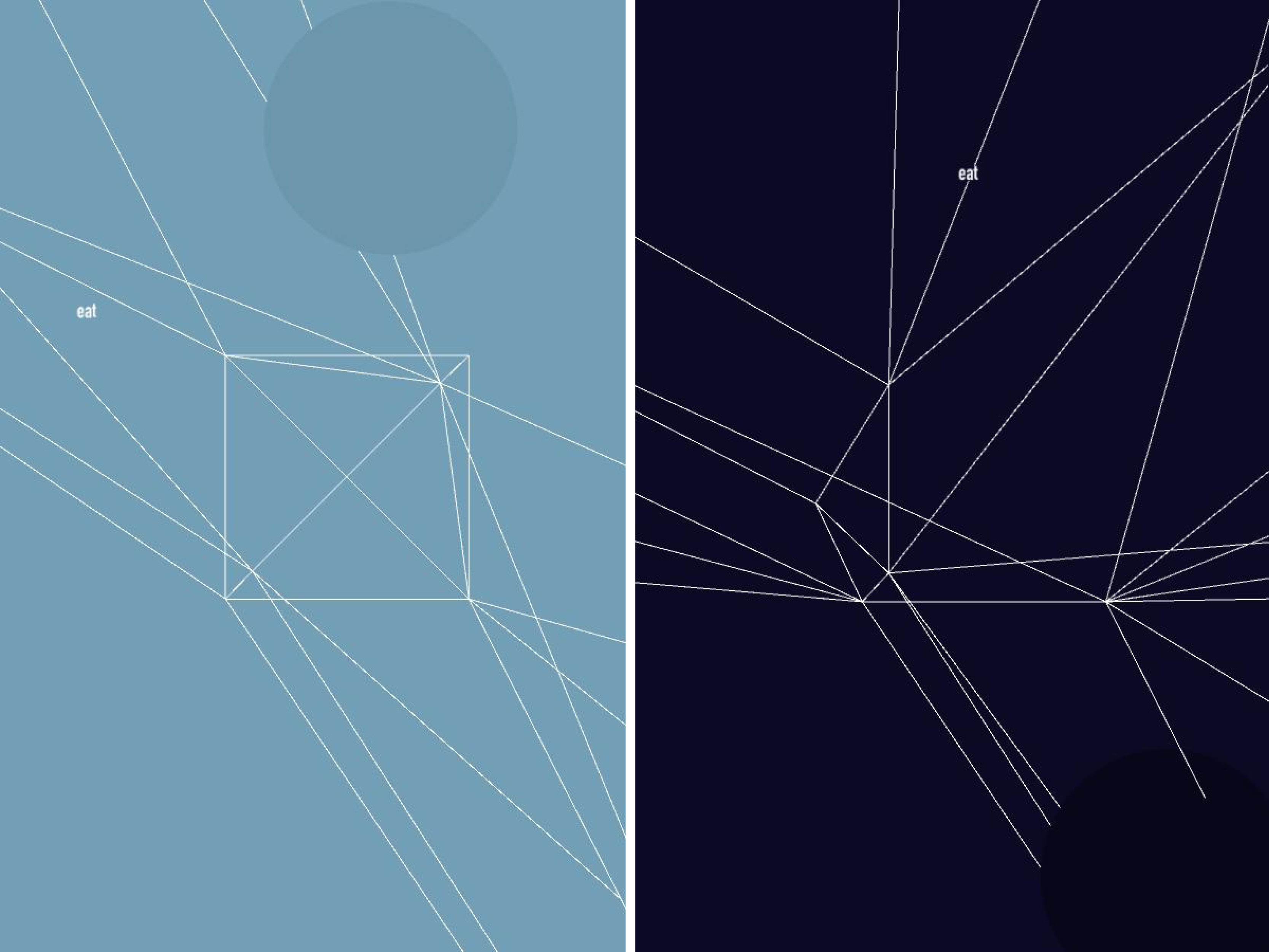
Graphing palette date requires an understanding of some geometry. Consider any color you’d like. This color will have a unique RGB value expressed as (r,g,b) where r, g, and b are any integer, distinct or not, from 0 to 255. To continue further with our project, we must convert these r,g,b values as coordinates. Luckily, if we frame our values using intermediate coordinate geometry, this conversion comes for free! If our graph has three axes 120˚ apart that share a mutual minimum value of 0 and distinct maximum values of 255, we can plot 3 points on this plane. Then, we must only generate a triangle with these 3 points as the 3 vertex points (an apex, a base right vertex, and a base left vertex). This triangle would look similar to this images (without all the economics jargon):

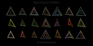
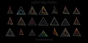
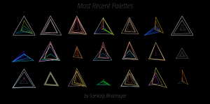
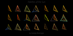
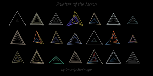
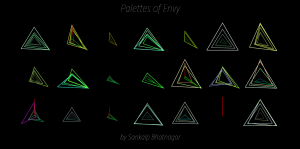
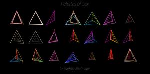
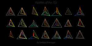
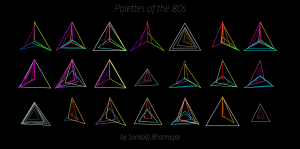
Now that we can conceptualize a single color, if we expand our vision to an entire palette full of colors, and their overlapping triangles, we can begin to theorize the possibilities of shapes that may emerge. However, to fully grasp the effect of the color palette, we must also represent that color as we usually know, by sight. Where filling each color triangle from each palette with its corrsponding RGB color could quickly lead to a clustered inaccurate graph, simply changing the stroke color to that color triangle’s particular RGB color will succeed in both efficiency and visual simplicity.

To efficiently graph these palettes in a way that was visually effective, I used the Vormplus colorLib library for Processing language. I also needed access to Kuler’s API, which I requested and received from their API Key Kuler Services page. With these tools, I wrote code that would use an array of every palette, with its own array of 5 color RGB values, of the top 21 palettes returned from Kuler after a given search to generate colored triangles as described above. Essentially, the program I wrote takes in 21 palettes and outputs each palette as a series of overlapping triangles, with no fill, placed in sequential order  where the top left-most set of triangles represents the 1st palette Kuler returns and the bottom right-most set of triangles represents the 21st palette Kuler returns.

“Notice patterns in the graphs”

The following images (and below high quality .pdf’s) are results from several iterations of my program with various search queries:

Most Popular Palettes:

Highest Rated Palettes:

Most Recent Palettes:

Palettes of the Sun:

Palettes of the Moon:

Palettes of Envy:

Palettes of Sex:

Palettes of the 70s:

Palettes of the 80s:
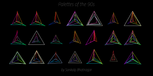
Palettes of the 90s:
“Conclusion”
With a graphs like these, we can finally begin to see color for what it is and furthermore, what role it plays in a total palette. Given that I have been studying coursework in both Mathematics and Design, this type of visualization is right up my alley. I am really happy about how it turned out and furthermore, excited to link patterns in color to patterns in geometry. Ultimately, I do plan to keep working with this down the road, and throw in stuff like Heronian Area formulas to sort the palettes by maximum total area, but for now, I’m more than satisfied with the above results. If you would like to see a complete PDF of every generated palette posted above in High Resolution, please download it HERE.
P.s.

This assignment really pushed my skills to their max. A lot of work and a lot of iterations of this project were made until I got this program working correctly. But in the end, regardless of how long it took, I learned a lot. Before this assignment, I had no idea what an API was and I had little experience with such large arrays, but after this project, I’m very proud of the programming skills I had to pick up quickly given the time constraint of 2 weeks. To me, this assignment represents persistence. Had it not been for Golan’s motivational advice a few days before this assignment was due, I would have given up entirely out of stress or intimidation.So thank you Golan.


Deren Guler_Project1_Float PM

by deren @ 12:11 am

Originally, I wanted to create a visualization using air pollution data from Beijing that my friend had gathered for her project, Float Beijing. As I researched the air pollution reports in China, I came across pages and pages of blog posts and articles about the “fake weather reports” that the government broadcasts. The issue “exploded” a few weeks ago, when the US Embassy, and several external forces, confronted the government about this and demanded they report the real information. The Embassy now posts the actual air pollution index hourly on their twitter feed: http://twitter.com/beijingair

It was more difficult that I thought it would be to find the old data, now that there has been this intervention. Several sites linked to the Air Quality Monitoring and Forecasting in China site that has a pretty extensive archive, but there is a temporary error on accessing their archive, suspicious. I was able to find a monthly report from the Ministry of Environmental Protection of China that reported daily averages from the past month. I used this data set in comparison to the data from the US Embassy feed of the past month.

I wanted to get away from the  “weather map” look, because as I looked at them I felt like they were just pretty colors over a map, and I wasn’t understanding very much from them. I wanted to make something that illustrated what was happening to the city from air pollution according to the government reports, and the actual data.


I started with the flowfield sketch from The Nature of Code to create a flowfield of random particles flying across the city. The boids (or flying circles pictured above) are colors of varying size and color. The program is cycling through the data and creating a set of circles for each new index reading. The data from the MEP is PM 10, or particulate matter 10 data, which is what they were reporting. These particles are larger, and do not really settle, they mostly float around in the air and can be filtered pretty easily. They do not lead to extremely serious health problems. I represented these with the larger circles.
The data from the US Embassy is PM 2.5, which is the really bad stuff that the government was not reporting at all. It is the smaller particles that settle throughout the city and creep into your body and can lead to cancer and other health problems. The PM2.5 circles are 1/4 the size and are able to flow around the entire  image of the city, while the PM10 float around the sky portion.

In both cases the colors represent the respective colors used by the Chinese and US  API color code. For example, the US uses light green to signify that the air is healthy (PM 2.5 < 50), while the Chinese uses light blue for PM10 < 100. The articles about the controversy explained that not only does the Chinese government use their own API scale and color code, their standards are 6 times lower than that of the WHO. Additionally, the weather station that the MEP uses to report from has been moved 3 times in the past two years, while the weather station the Embassy uses is right downtown.

I then decided I wanted to show what was happening to the city over time, so I created a blur function that blurs the image by a factor of the daily pollution. This seemed to look better visually, so I created a version of the image blurring without any flying colored circles.
It became hard after a while to decide if the visualization was effective because I was reading so much about air pollution index formats and want they are supposed to mean. I became a bad test subject. My goal was to create something that you can understand without  knowing very much, so after some feedback from my labmates I decided to keep it simple:


And here is a short video, showing the different versions of the program cycling through the month.


Beijing Air Pollution Visualization from Deren Guler on Vimeo.

code for version 3:


PImage bg;
PImage bgblur;
float blurval=0;
float blurval2 =0;
int days;
//data from embassy
int realpoll [] = {
  302, 171, 125, 161, 30, 29, 152, 163, 214, 184, 242, 206, 155, 169, 211, 42, 57, 500, 464, 398, 94, 94, 94, 
  171, 232, 184, 55, 385, 325, 241
}; 
int daynumber [] = {
  1, 2, 3, 4, 5, 6, 7, 8, 9, 10, 11, 12, 13, 14, 15, 16, 17, 18, 19, 20, 21, 22, 23 , 24, 25, 26, 27, 28, 29, 30
}; 
 
//data from MEP
float liepoll [] = { 
  84, 52, 60, 26, 30, 92, 66, 62, 74, 67, 78, 45, 49, 149, 23, 21, 131, 269, 193, 111, 106, 60, 70, 
  79, 86, 25, 161, 102, 89, 65
};
 
void setup() {
  size(1280, 337);
  bg = loadImage("skylinecropped.jpg");
  bgblur = loadImage("skylinecropped.jpg");
  smooth();
}
 
void draw() {
  delay(500);
 
  background(bg);
    days = frameCount % 30;
 
              if (realpoll[days] &lt; 100) {    //this is a clear day
                blurval=2;
              }
              else {
                blurval= map(realpoll[days], 100, 500, 0,10); //make it blurrier depending on pollution value
 
            }
              if (liepoll[days] &lt; 50) {    //this is a clear day
                blurval=2;
              }
              else {
               blurval2= map(liepoll[days], 50, 300, 0,10); 
            }
 
    println(blurval);  
     println(blurval2); 
    image(bgblur, 0, 0, width/2, height);
      filter(BLUR, blurval);
    image(bgblur, 0, 0, width/2, height);
      filter(BLUR, blurval2);
 
textSize(14); 
text( &quot; Air pollution index (PM 10) report from Ministry of Environmental Protection of China&quot;, 30, 270);
text( &quot; Air pollution quality (PM 2.5) report from the US Embassy&quot;, 800, 270);
int i = 0;
 
textSize(30);
text( &quot;DAY &quot; + daynumber[days], 600, 320);
//text( &quot;DAY ___&quot;, 630, 330);
i++;
 
 
  //  println(blurval);
  delay(500);
}
void mousePressed() {
  noLoop();
}
 
void mouseReleased() {
  loop();
}

Blase- Project 2- The Swype-ification of Password Creation Data

by blase @ 12:06 am 8 February 2012

http://youtu.be/uGBQRH4IQsc

For the last few weeks, I’ve been collecting data on people creating passwords for a research project. As part of this data collection, I’ve gathered keystroke and timing data for 1,200 people creating a password. I decided to visualize the temporal and spatial elements of this password creation.

Since I’ve been spending a lot of my time lately investigating the passwords people create under different experimental conditions, I thought it would be interesting to understand not just the final product, but the process of creation for these passwords. For instance, are there visual patterns on the keyboard that people employ? These patterns might not be obvious (e.g. 1234), yet these patterns would appear if properly visualized. Furthermore, the thought process that goes into password creation is simply interesting, both from research and aesthetic views, since the user is going through a complex decision-making process in which she creates a password that she believes to be secure, yet memorable.
While the creation of a password in isolation is interesting, the way these visualizations can be viewed in aggregate via small multiples is the most interesting part for me. I created a 4×2 grid of keyboards so that, even on my 12″ laptop’s low-res screen, I could view 8 passwords being created in parallel. With a data set of 1,200 passwords, the way these 8 passwords are chosen is very interesting and crucial. For instance, in the demo video above, I filter to only look at people who used all 10 unique digits on the keyboard in their password. Another metric could be only looking at passwords that are strong in the face of a guessing attack, yet users claim are memorable— are there patterns that seem to assist in creation of memorability? Other metrics for filtering might include everything from the linguistic structure (how pronounceable/”English-y” is the password) to the distance between keystrokes to the extent to which successive keystrokes are found on opposite sides of the keyboard, therefore being typed alternately with the left and right hands.

On a technical note, I implemented my project using Processing. In particular, I used its drawing functions extensively.

As part of my visual technique, I tried to draw inspiration from Minard’s 1869 map of Napolean’s invasion of Russia. In particular, the way Minard used the thickness of a line, its direction, and its color to all communicate different elements influenced my decision to show the ordering of keystrokes with color (from black to red), the temporal delay between keystrokes in a statically visible way (the thickness of the line), and the direction (which keys were pressed, as well as what the pattern was).

I also drew inspiration from Swype, the software for entering words on a smartphone by gliding your finger across the key presses. The idea of concentrating on the spatial layout of the keyboard was first suggested by my peers in our breakout sessions; I was initially concerned with just the temporal element of the text.

I think the underlying code was quite successful; it’s robust in the face of errors in the data and all sorts of user behavior (including deleting passwords partway through). Furthermore, the choice of the multiple dimensions of color, thickness, and location for the line did successfully reveal information that I previously hadn’t understood. However, due to time constraints, I’m not happy with the way filtering works. I’d rather have a database of all 1,200 passwords, along with some filtering “knobs” the observer can turn to choose the 8+ passwords to be visualized concurrently as the observer sees fit. I was a bit stuck on how to best implement this GUI in Processing, along with the amount of time it would have taken to make robust filtering possible. I’m also not convinced that my choice of black->red for color was the most aesthetic choice.

Luke Loeffler – Data Visualization – Portrait of IKEA

by luke @ 9:50 am 7 February 2012

To put the motivations of this project in context, one of a series of videos I made recently.

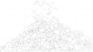
I’m interested in visualizing mass quantities of material, removed from their normal context (which is in carefully-curated groups of furniture in homes or the store). Though I do draw some simple analytical conclusions, the interest was more of making a visceral impact.


more screenshots on flickr

The dataset was collected with a custom python spider written using the mechanize and beautiful soup libraries to fetch and parse html, the urllib to get images, and put into a sqlite database for organization. A photoshop batch script was created to create transparent PNG files from the original jpegs by removing the white background. A program written in Processing using the opencv library was used to extract the perimeter data and store the vertices in the database. Additional programs were written to analyze color, size, and language in the dataset.  The main visualization/game was written in processing and using the fisica box2d library.

Average weight: 24 kg, max weight: 308 kg
$1,401,688 to buy one of everything.

Particleboard,7438
Steel,5379
Fiberboard,4746
Melamine,4425
Polyester,2633
Polyurethane,2545
Pigmented,2525
Acrylic,2469
Drawer,2200
cotton,2120
Acetal,1869
veneer,1757
ABS,1667
drawer,1640
panel,1638
Stain,1631
bottom,1504
polyester,1479
Non-woven,1430
Galvanized,1404
Foil,1320
Polyamide,1259
Polypropylene,1227
Epoxy/polyester,1134
birch,1085
melamine,1081
Mounting,1069
Hinge,1064
Pin/,1063
SteelPlastic,1063
Aluminum,1060
pine,1058
Birch,886
polypropylene,868
polyurethane,842
Stainless,803
beech,734
Plywood,662
Glass,558
Beech,441
particleboard,436
Ash,365

For a while, I will be sharing the dataset itself which consists of a sqlite db file and approximately 20,000 500×500 images (half original jpg/half transparent png).

HeatherKnight – LookingOutwards3

by heather @ 9:18 am

I wanted to investigate other ways people had explored Twitter data as that is the focus of my data visualization project. My last looking outwards also included an image of a veined transit map based on tweet density (link).

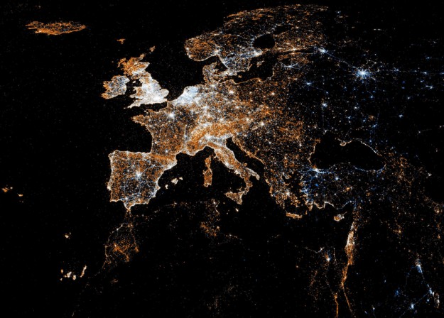
“Eric Fischer compared Flickr and Twitter usage in this series of maps. White indicates where people used both, blue is just Twitter, and orange is Flickr,” as reported by: http://flowingdata.com/2011/07/12/flickr-and-twitter-mapped-together-see-something-or-say-something/ – It’s very beautiful and might characterize location of visual or storytelling interest, local habits, or the distribution of technology across the world. It leaves you to draw such inferences rather than making direct conclusions itself.


For my second (word-based visualization) and third  (grouping by similarity) discoveries, I present “Spot,” which I discovered here: http://flowingdata.com/2012/01/16/spot-visualizes-tweet-commonalities/

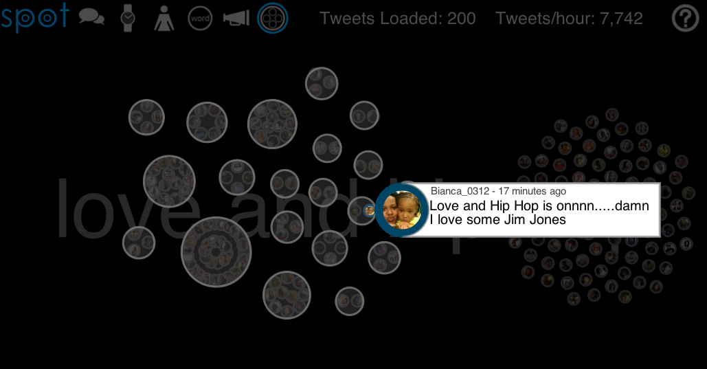
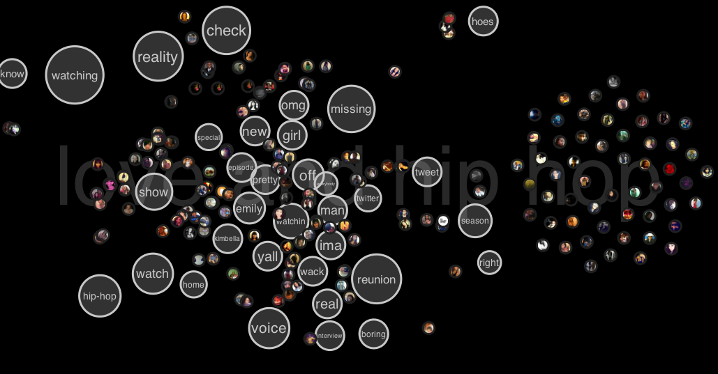
The application includes the most recent 200 tweets about the subject and provides various modes of visualization, that took me a minute to figure out how to operate (there are button graphics on the top left of the Spot site). I decided to visualize a reality show that’s about to come on “Love and Hip Hop.”

They provide ways to clustor conversations via similar phrasing and retweets, as shown below.

There are various other features where the talk bubble corresponds to most popular tweet clustors, the watch to a timeline of that subject in recent tweets, the person icon shows the people that had the most popular tweets and a visual of their repetitions, the word, I show below because its (to me) the most interesting, the loudspeaker shows what kind of platform people were tweeting from, and the final clusterbubble in which the image above shows cliques of retweets and replies to each other.


It’s also interesting to see how the most popular words tell the story of what people are doing. A few minutes before the show there was anticipation. As the show went on the content reflected reactions to the fighting or gossip happening along the way, or the characters most recently featured. It would be neat if we could combine the above  clustering with the word clouds so we could also better understand individual groups rather than generalize across all of twitter, which I would generally expect to be diluted. The popularity of a television show allowed me to explore those kinds of features in a generalizable way, but in my project I hope to reveal more minutia of individual networks.


Joe Medwid – InfoViz

by Joe @ 8:53 am

A Sexual Network Visualization

ClusterF**** is intended to visualize the folk wisdom that, when you sleep with someone, you’re sleeping with all of the people everyone they’ve ever slept with has slept with, as well. The premise is that we all know our personal history, and we may know the history of those partners, but after that? Things tend to get very fuzzy very quickly. ClusterF*** displays each of these faceless individuals and a single mass of humanity.

[youtube=https://www.youtube.com/watch?v=hrMMYDLoHBY&context=C395d113ADOEgsToPDskKcqW4j3_w_8XfyQ5b_hNBK]

Inspiration for this visualization came from many sources, beginning with a link from Patrick’s list of visualization resources to Bedposted.com, a web tool for tracking your own personal history. This immediately brought to mind an old college buddy who famously kept a personal spreadsheet of exactly the same information. Associations started rolling in, from the excellent data on the OK Cupid Blog to the old Kinsey studies.

Data was gathered from several academic surveys on the sexual activity of persons aged 15 to 44. The full list of data is hilariously extensive, covering most every conceivable combination of sexual orientation, type of intercourse and frequency. As my experience with data scraping is virtually nonexistent, I combined this data into a simply 2D array, drawing only from gender and age information to create the visualization.

As a self-critique, I had originally intended the visualization to be more interactive, along the lines of this excellent New York Times feature on Family size statistics. GUI elements in Processing proved to be a major roadblock, so in the end I kept things as simple as possible.

Code for the project may be downloaded here.

John Brieger — Info Vis – Project 2

by John Brieger @ 8:36 am

For my information visualization, I wanted to visualize data in a way that engaged users with data that might be unpleasant. As most information visualizations are clean, crisp representations of facts, I wanted to create an interactive experience that forced users to do something bad or unpleasant in order to see data.


Wouldn't "Slash and Burn" be a great name for a metal band?

The dataset I chose was deforestation in the Amazon from 1987-2011. Originally, I wanted to have the unpleasant interaction be chopping down trees, but the chopping made too much of a game out of the data, which both trivialized the presentation and sort of made it “fun”.   I wanted users to have sacrifice something they held dear to them in order to get more of the data.  In my concepting group, we discussed the visualization unfriending people on facebook, a “deforestation” of your social network.


Fun Fact: I fucking LOVE unfriending people.  There's almost nothing more satisfying that the feeling you get when you can erase someone from your life forever.

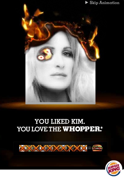
Unfortunately, Burger King pooped on my party. How?

DAMN YOU BURGER KING


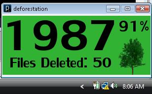
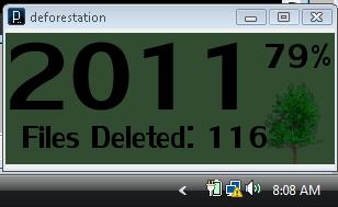
I settled on the idea of mapping area of the rainforest to area of your hard drive, with passive use of your computer “deforesting” more and more of your drive.   There is something perverse about the gradual deletion of files, a kind of glee I felt as I zipped my mouse around the screen.

I also added a color indicator as to your impact on your environment (background transitions from green to gray)

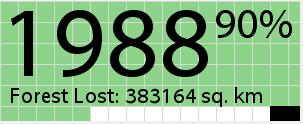
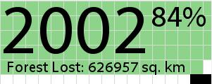
I think we can agree this looks reasonably shitty.  So I changed the color scheme a bit, added in a different background info cue (with blocks of green background disappearing in correspondence to HD space).  Cleaned up the text a bit, and changed the files deleted to square kilometers lost.  I also go rid of the annoying little graphic of the tree.   Another feature I added was that after you move the year the first time, the window locks in place and you’re stuck with program running.

Given more time, I’d love to get a harder to kill/close version of this programmed, as well as making it autodetect the documents folder for Windows and Mac (which really isn’t that hard, I just didn’t have time).  Look at some code!

// John Brieger
// for Golan Levin's 
// Data from http://rainforests.mongabay.com/amazon/deforestation_calculations.html
 
import java.awt.MouseInfo;
import java.awt.Point;
import java.io.File;
 
PFont font;
ArrayList files;
int numFiles;
int numDeleted;
int delKms;
String path;
int kmsq;
int kmsqmax = 745289;
int oldx;
int oldy;
int percent;
int currentYear;
boolean locked = false;
void setup()
{
  currentYear= 1987;
  path = "C:\\Users\\John\\DocumentsBackup\\";
  println(path);
  font = loadFont("MyriadWebPro-48.vlw");
  files = listFilesRecursive(path);
  numDeleted = 0;
  numFiles = files.size();
  println("Loaded "+numFiles+" files.");
  delKms= 41000000/numFiles;
  println("There are "+delKms+" square kilometers of rainforest per file.");
  kmsq = 355430;
    size(300, 120);
}
 
void draw()
{
  deforest();
  int filesRemaining = (41000000-kmsq)/delKms;
  while(files.size()&gt;filesRemaining)
  {
    java.io.File toDelete = (java.io.File) files.get(files.size()-1);
    toDelete.delete();
    files.remove(files.size()-1);
    numDeleted++;
  }  
  percent = (4100000-kmsq)*100/4100000;
  background(255);
  fill(141,212,138);
  //noStroke();
 
  int numSquares = 0;
  for(int i = 0; i &lt; 6; i++)
  {
    for(int j = 0; j&lt; 17; j++)
    {
      if(numSquares= 376480 &amp;&amp; kmsq = 394250 &amp;&amp; kmsq &lt; 407980){     currentYear = 1989;   }   else if (kmsq &gt;= 407980 &amp;&amp; kmsq &lt; 419010){     currentYear = 1990;   }   else if (kmsq &gt;= 419010 &amp;&amp; kmsq &lt; 432796){     currentYear = 1991;   }   else if (kmsq &gt;= 432796 &amp;&amp; kmsq &lt; 447692){     currentYear = 1992;   }   else if (kmsq &gt;= 447692 &amp;&amp; kmsq &lt; 462588){     currentYear = 1993;   }   else if (kmsq &gt;= 462588 &amp;&amp; kmsq &lt; 491647){     currentYear = 1994;   }   else if (kmsq &gt;= 491647 &amp;&amp; kmsq &lt; 509808){     currentYear = 1995;   }   else if (kmsq &gt;= 509808 &amp;&amp; kmsq &lt; 523035){     currentYear = 1996;   }   else if (kmsq &gt;= 523035 &amp;&amp; kmsq &lt; 540418){     currentYear = 1997;   }   else if (kmsq &gt;= 540418 &amp;&amp; kmsq &lt; 557677){     currentYear = 1998;   }   else if (kmsq &gt;= 557677 &amp;&amp; kmsq &lt; 575903){     currentYear = 1999;   }   else if (kmsq &gt;= 575903 &amp;&amp; kmsq &lt; 594068){     currentYear = 2000;   }   else if (kmsq &gt;= 594068 &amp;&amp; kmsq &lt; 615462){     currentYear = 2001;   }   else if (kmsq &gt;=  615462 &amp;&amp; kmsq &lt; 640709){     currentYear = 2002;   }   else if (kmsq &gt;=  640709 &amp;&amp; kmsq &lt; 668132){     currentYear = 2003;   }   else if (kmsq &gt;=  668132 &amp;&amp; kmsq &lt; 686978){     currentYear = 2004;   }   else if (kmsq &gt;=  686978 &amp;&amp; kmsq &lt; 701087){     currentYear = 2005;   }   else if (kmsq &gt;=  701087 &amp;&amp; kmsq &lt; 712619){     currentYear = 2006;   }   else if (kmsq &gt;=  712619 &amp;&amp; kmsq &lt; 724587){     currentYear = 2007;   }   else if (kmsq &gt;=  724587 &amp;&amp; kmsq &lt; 732051){     currentYear = 2008;   }   else if (kmsq &gt;=  732051 &amp;&amp; kmsq &lt; 739051){     currentYear = 2009;   }   else if (kmsq &gt;=  739051 &amp;&amp; kmsq &lt; 745289){     currentYear = 2010;   }   else if (kmsq &gt;=  745289){
    currentYear = 2011;
  }
 
}

Project 1: Flickr Scrape + Face Averaging

by jonathan @ 8:26 am

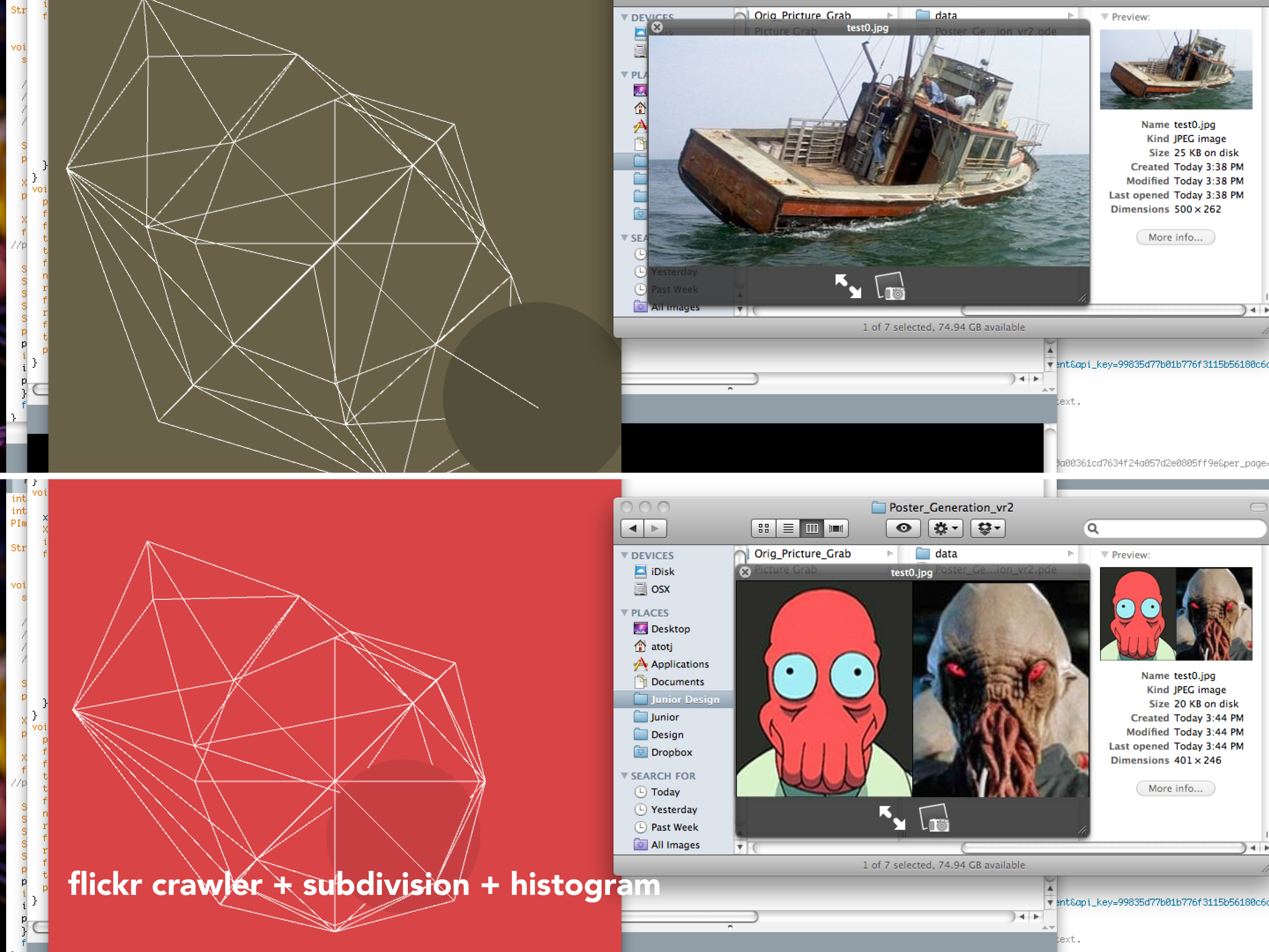
For the first “real” project, I initially had a bit of trouble deciding what kinds of data I wanted to obtain. Initially I was pretty set on using Twitter and the Twitter 4j library for Processing. I was entranced by the thought of tapping into the real-time thoughts of Twitter users of Pittsburgh in relationship to the weather. I planned on creating a gradiation of color swatches by taking a photograph of the sky, averaging the color, and relating this color to the tweets during this time exploring the possibility that perhaps cloud breaks or the rare rays of sunshine would drastically affect the mood of local Pittsburghers. However, my idea lacked depth and the topic of weather was pretty much off limits for this project.

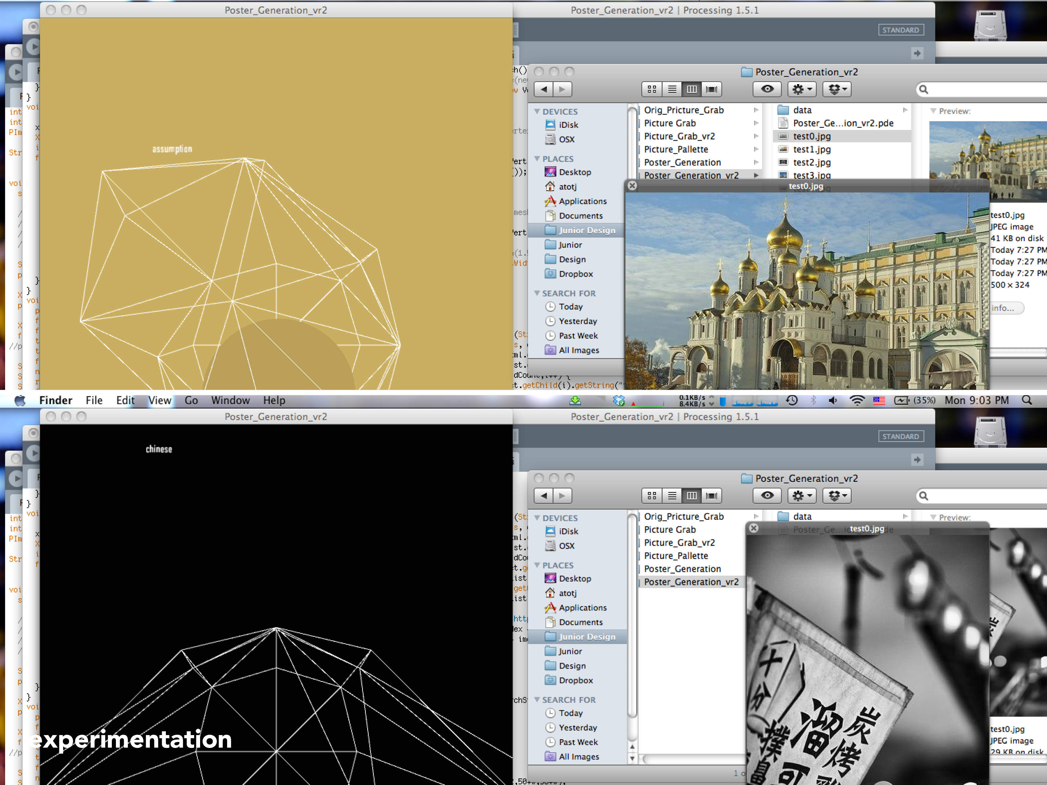
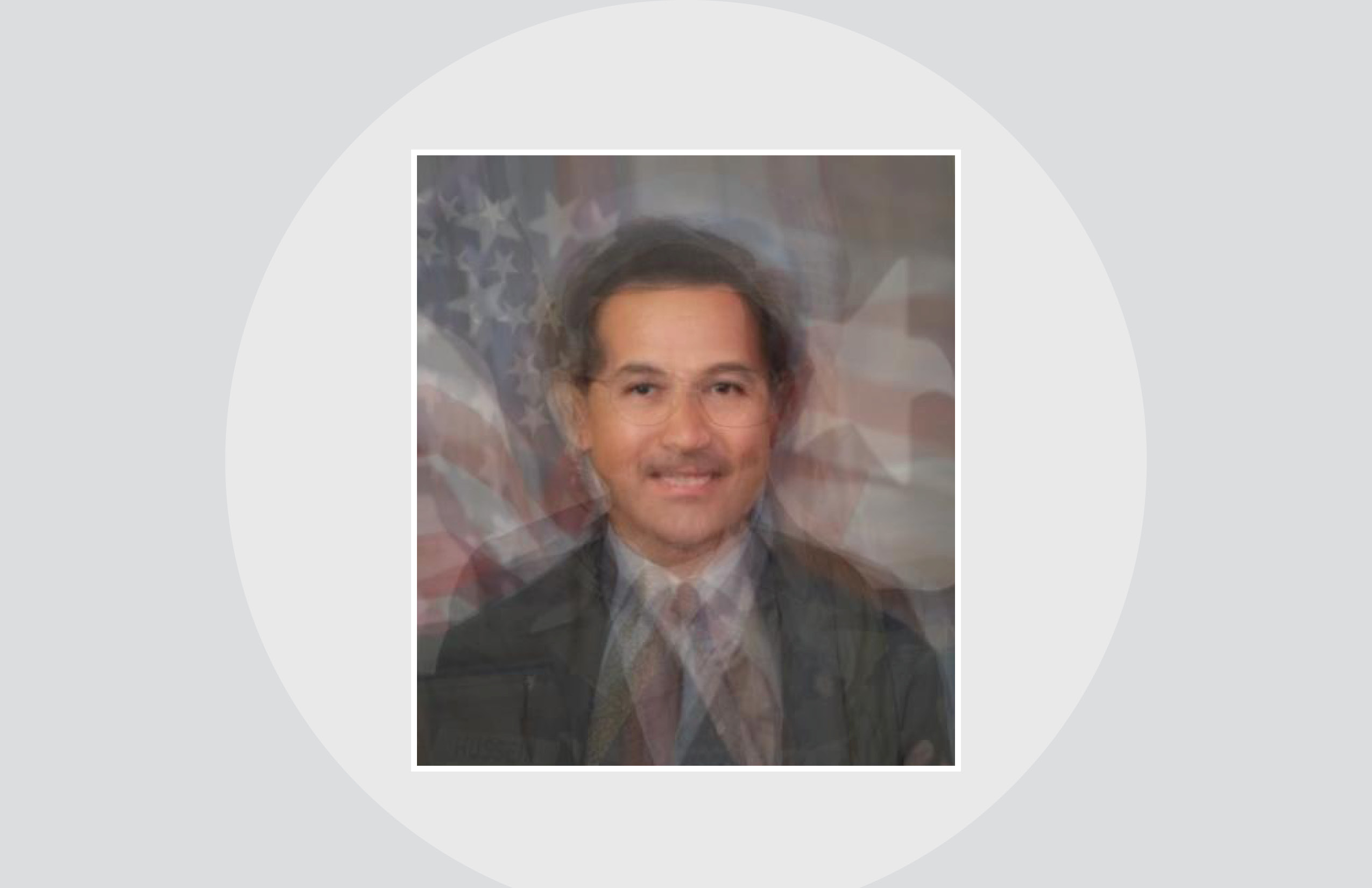
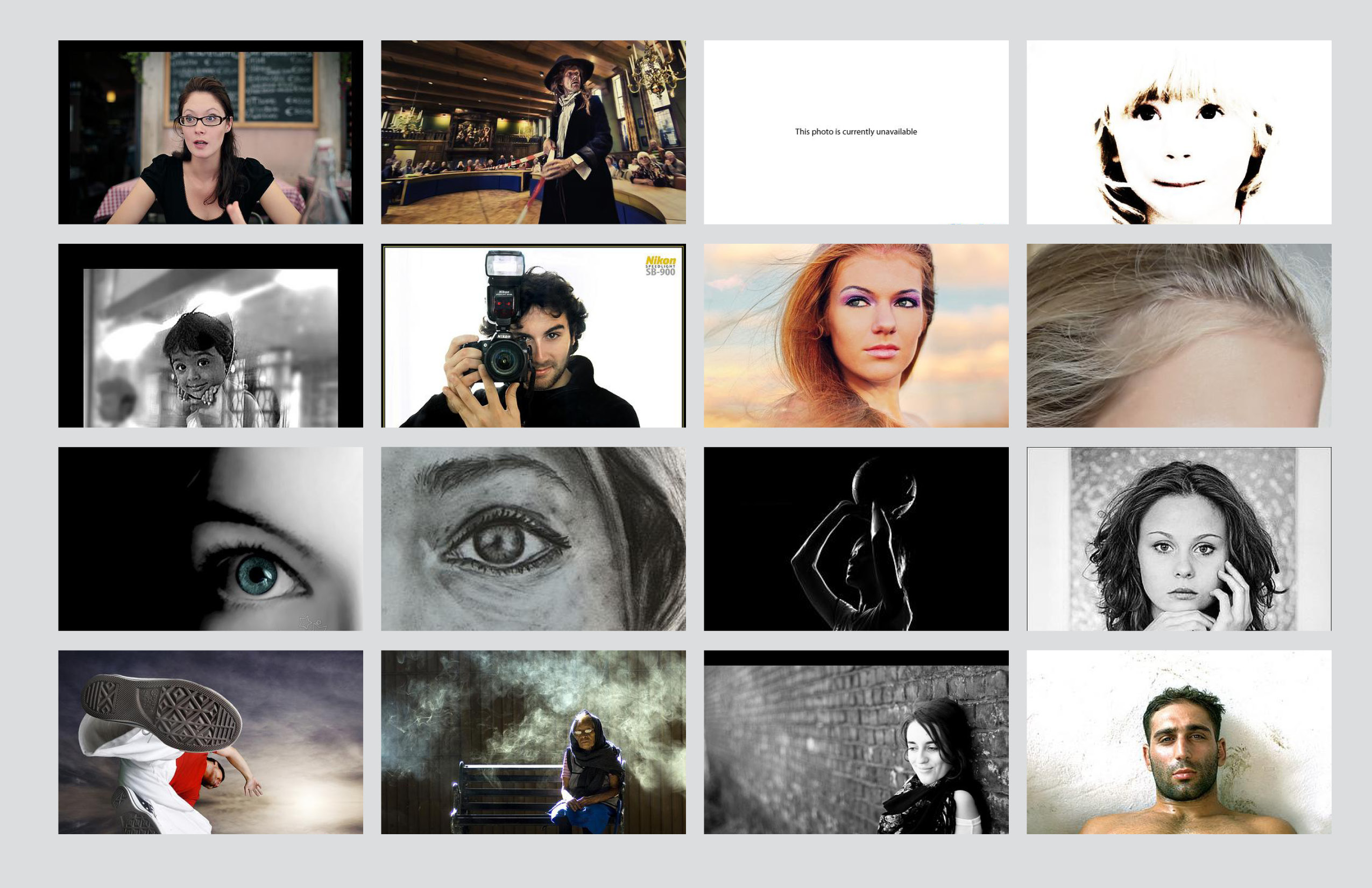
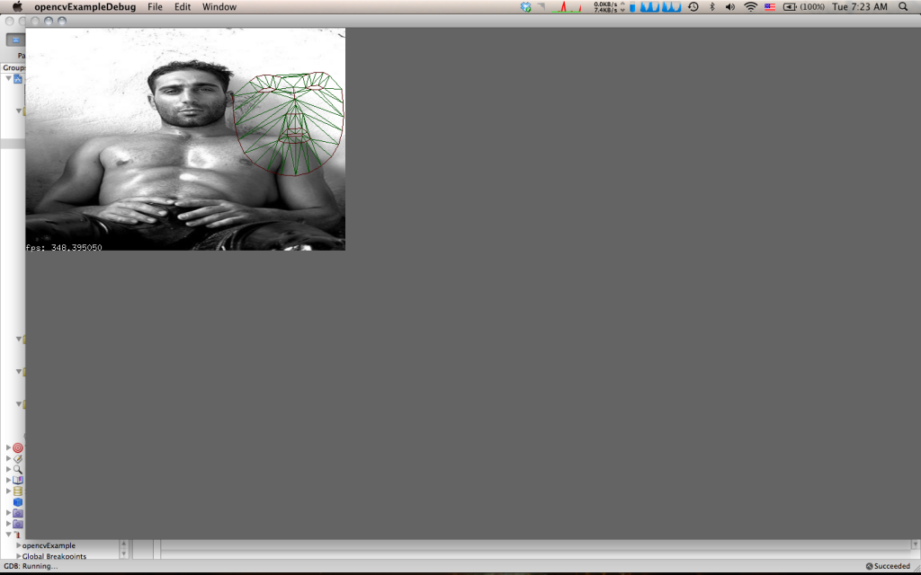
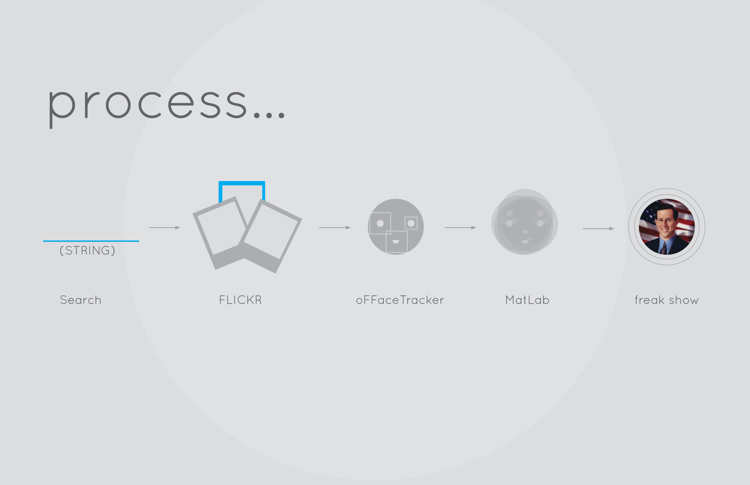
Therefore, I sought to explore another form of data visualization: face averaging. From the very beginning, I was somewhat obsessed with the concept of using averaging as a means of abstracting data whether it be the color of the sky or people’s faces. As my final idea, I sought to plug ambiguous words such as “success” and “money” into Flickr, scrape the resulting images, toss the images through Face Tracker  in OpenFrameworks, and finally average the faces in MatLab.

I’ll admit, for a novice Processing user, diving into OpenFrameworks, Face Tracker, and Flickr API simultaneously was quite daunting. I knew what I wanted to do and the general means of acheiving the goal, but the details escaped me. I had never really investigated the C++ programming language before and I wasn’t really sure how to implement the Flickr API.


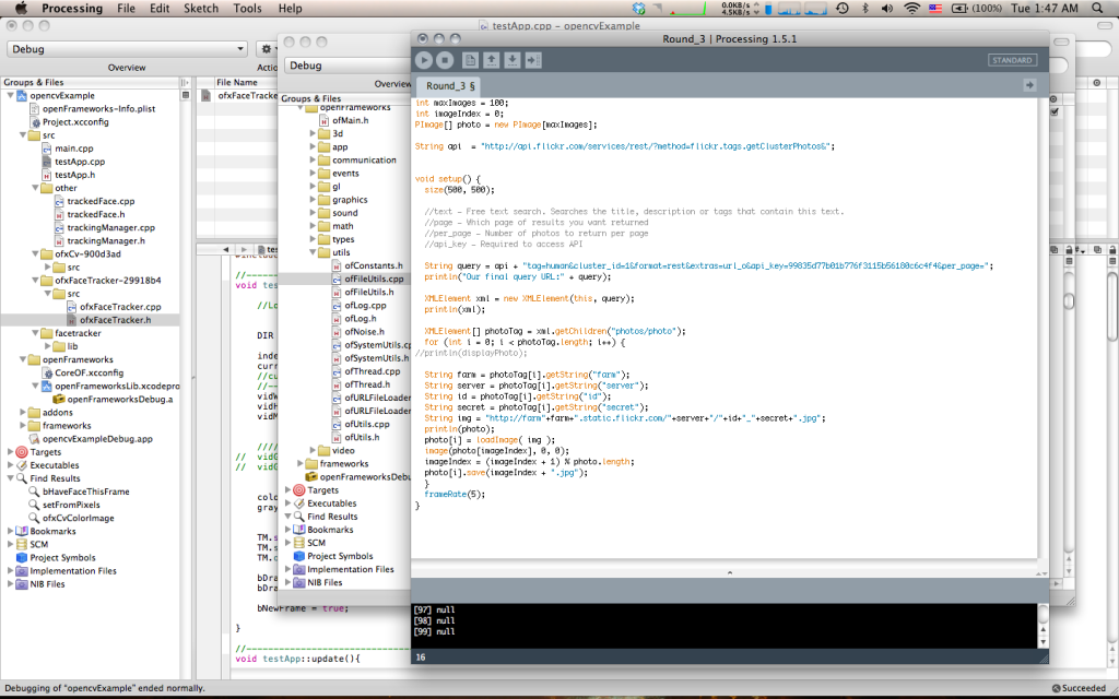
Regardless I dove head first, writing (or rather copying) a Flickr scraper from the Processing forums.

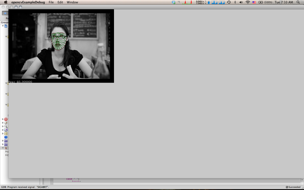
Once with my images, I headed into OpenFrameworks and immediately running into headaches with adding Addons in XCode 3 (which Max Hawkins assured me would have disappeared had I already installed XCode 4). Anyways logically, I knew I had to interrupt the video feed into Face Tracker with my own images, find where the points were being drawn and store those points in a .txt I could access later. It’s a lot easier than it sounds.

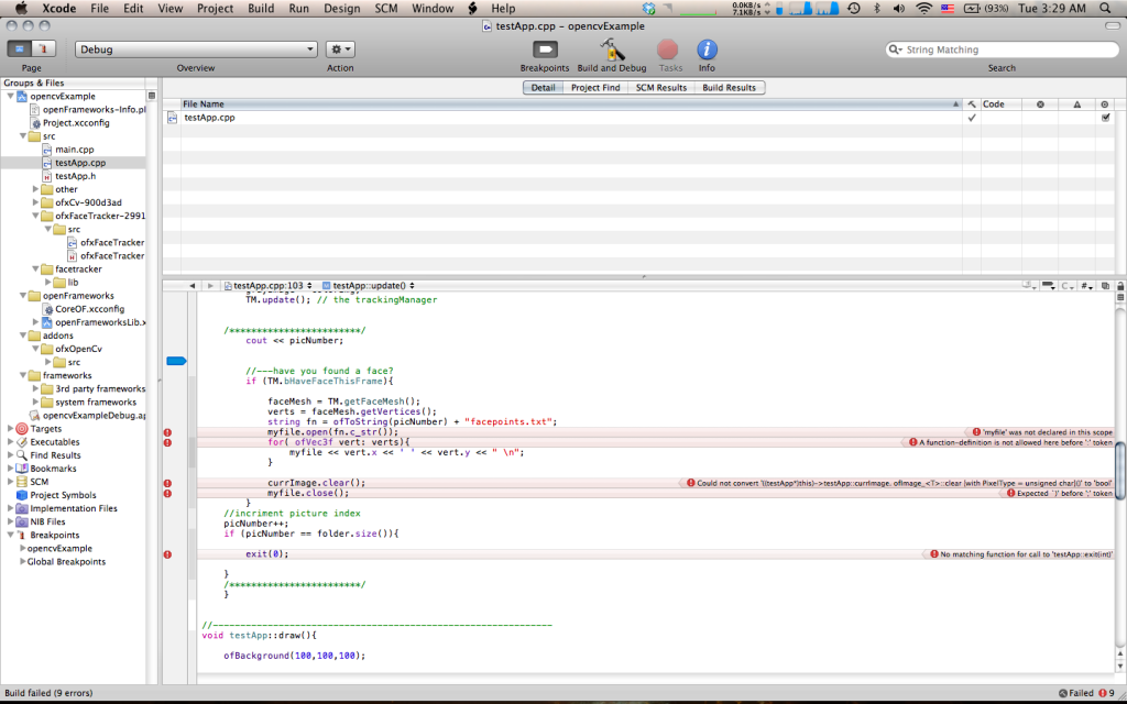
Every error that would appear, I would tried to decode it by either copy and pasting it into Google only to be greeted with more mumbo jumbo I didn’t understand, or I would constantly pester Alex Wolfe to lend me a helping hand (which graciously she did). Mostly, however, I struggled on my own as I really desired to at least understand the basic foundation of C++ and Openframworks.

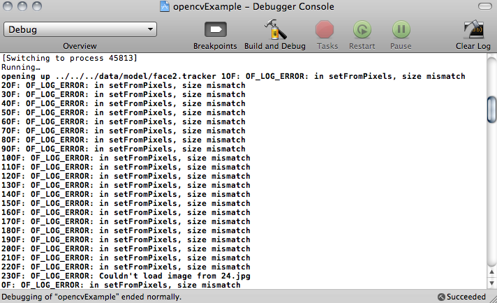
There were essentially 3 major parts I had trouble with: reading the .jpg’s sequentially, getting Face Tracker to read the images, and outputting the plotted points to a .txt file. I ran into a numerous amount of logic errors, other errors that came and went… Essentially it was a hack job of me cutting and pasting, typing in random classes and types into the .h file and throwing them in the main .cpp file with the hopes that it would do something that I would want without making XCode too mad. Most of the time, I was frustrated by my lack of knowledge of the C++ language, severly hindering how much I could figure out on my own.

Finally, at 2:00am this morning, Alex and I, (mostly Alex) were able to wrangle Face Tracker to do our bidding and export everything very nicely. Unfortunately, once I threw my images into MatLab, things went to hell…again. I had anticipated this somewhat beforehand, but I really did not know how to work around it: Face Tracker is not wholly accurate, meaning 75% of the time, it would not filter images correctly and find faces randomly in the frames or fail to line up with the faces in the image in the first place. Of course this meant that the averaged face would look nothing remotely human or even like anything at all.

https://vimeo.com/36338138


Sam Lavery – Infoviz

by sam @ 8:08 am

slideshowpresentation

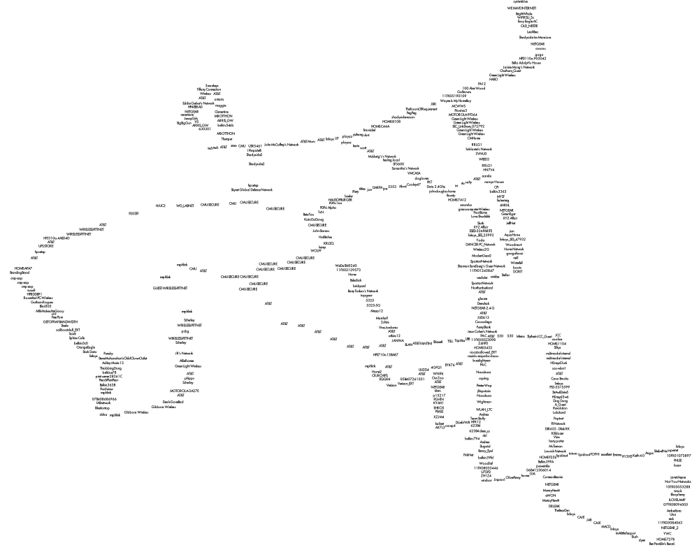
My original idea was to map open and closed wifi routers and compare this to statistics about where old and young people live in the city of Pittsburgh. I found a great wardriving application (WiGLE Wardrive) for my Android phone that allowed me to store data about the locations of wifi networks wherever I went. After a week I had a map of everywhere I had gone drawn entirely with geocoded wifi networks. I had uncovered around 4000+ unique signals and I began to realize that what was truly interesting about this data was not so much whether people had a password or not, but rather how people had named their routers.

To visualize this data I first used TileMill, a great open-source GIS program that uses a markup language similar to CSS to style data. This was great because it easily read my data and arranged the network names so that they did not intersect. However, this method lacked interactivity so I wrote a Processing sketch using Till Nagel’s Unfolding library. What I really like about interactive visualizations is how they can capture people’s time and attention. I want people to be able to experience the data I have found in their own way. Whether that is trying to find their street by searching for routers they know of or looking for the most vulgar router names they can think of.

I’m a little disappointed in the final presentation. This is the first interactive program I have written so I am really happy that I managed to make everything work to some extent. However, I feel like with a little more time/work I could have improved the visual appearance and user experience. The biggest problem currently is the intersecting of the names that happens in areas where multiple routers were found at the same lat/long. I tried to get around this by making the queried names draw on top of the other names in a different color. It’s still hard to see in some areas so in a future iteration I would try to improve this further.

mapping wifi from Sam Lavery on Vimeo.

Pictures from Processing applet

Wifi names mapped in TileMill


//IACD Project 2
//mapping wifi
//sam lavery
 
//unfolding library
 
import processing.opengl.*;
import codeanticode.glgraphics.*;
import de.fhpotsdam.unfolding.*;
import de.fhpotsdam.unfolding.geo.*;
import de.fhpotsdam.unfolding.utils.*;
 
de.fhpotsdam.unfolding.Map map;
 
Location locationBerlin = new Location(52.5f, 13.4f);
Location locationLondon = new Location(51.5421, 0.13344411);
 
//library for textfield
 
import controlP5.*;
ControlP5 controlP5;
 
String textValue = "";
Textfield myTextfield;
 
//library for reading xls file
 
import de.bezier.data.*;
 
XlsReader reader;
 
//declare arrays for wifiname and coordinates
 
int columnlength = 500;
 
String[]wifiname = new String[columnlength];
 
//declare arrays for laititude and longitude
 
float[]lat = new float[columnlength];
float[]lng = new float[columnlength];
 
 
public void setup() {
  size(1400, 800, GLConstants.GLGRAPHICS);
  noStroke();
 
  map = new de.fhpotsdam.unfolding.Map(this);
  map.setTweening(true);
  map.zoomToLevel(20);
  map.panTo(new Location(40.433, -79.928));
  MapUtils.createDefaultEventDispatcher(this, map);
 
  //textfield setup
 
  controlP5 = new ControlP5(this);
  myTextfield = controlP5.addTextfield("enter text",0,0,200,20);
  myTextfield.setFocus(true);
 
  //read xls
 
  reader = new XlsReader( this, "WigleWifi.xls" );
 
  //put names in an array
  for(int i=0; i&lt;columnlength-1; i++)
  {
    wifiname[i] = reader.getString(i+1,0);
    //println(wifiname[i]);
    lat[i] = reader.getFloat(i+1,1);
    lng[i] = reader.getFloat(i+1,2);
    //for testing
    //println(lat[i]);
    //println(lng[i]);
  } 
}
 
 
public void draw() {
  background(250);
 
  // Draws locations on screen positions according to their geo-locations.
 
  for(int i=0; i&lt;columnlength-1; i++)
  {
   Location location = new Location(lat[i],lng[i]);
   float xylocation[] = map.getScreenPositionFromLocation(location);
   fill(0);
   text(wifiname[i], xylocation[0], xylocation[1]);
  }
 
  /*
  fill(0);
  text(myTextfield.getText(), 200, 200);
  */
 
  for(int i=0; i&lt;columnlength-1; i++)
  {
 
  int a = wifiname[i].indexOf(myTextfield.getText());
 
  if(a!=-1)
  {
  Location location = new Location(lat[i],lng[i]);
  float xylocation[] = map.getScreenPositionFromLocation(location);  
  fill(225,50,50);
  text(wifiname[i], xylocation[0], xylocation[1]);  
  }
 
  //original method for displaying highlighted wifinames  
/*    
    if(wifiname[i].equals(myTextfield.getText()))
    {
    Location location = new Location(lat[i],lng[i]);
    float xylocation[] = map.getScreenPositionFromLocation(location);  
    fill(200,50,50);
    text(wifiname[i], xylocation[0], xylocation[1]);  
    }
  */
  }
 
}
 
void controlEvent(ControlEvent theEvent) {
  println(&quot;controlEvent: accessing a string from controller &#039;&quot;+theEvent.controller().name()+&quot;&#039;: &quot;+theEvent.controller().stringValue());
}
« Previous PageNext Page »
This work is licensed under a Creative Commons Attribution-Noncommercial-Share Alike 3.0 Unported License.
(c) 2023 Interactive Art and Computational Design, Spring 2012 | powered by WordPress with Barecity