HeatherKnight – LookingOutwards3
I wanted to investigate other ways people had explored Twitter data as that is the focus of my data visualization project. My last looking outwards also included an image of a veined transit map based on tweet density (link).
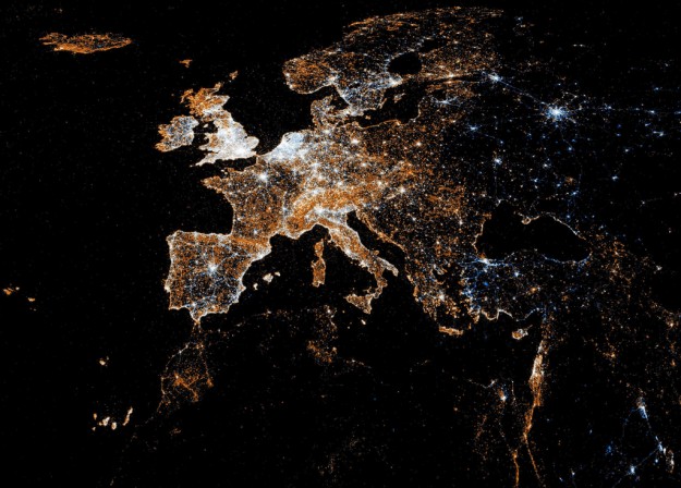
“Eric Fischer compared Flickr and Twitter usage in this series of maps. White indicates where people used both, blue is just Twitter, and orange is Flickr,” as reported by: http://flowingdata.com/2011/07/12/flickr-and-twitter-mapped-together-see-something-or-say-something/ – It’s very beautiful and might characterize location of visual or storytelling interest, local habits, or the distribution of technology across the world. It leaves you to draw such inferences rather than making direct conclusions itself.
For my second (word-based visualization) and third (grouping by similarity) discoveries, I present “Spot,” which I discovered here: http://flowingdata.com/2012/01/16/spot-visualizes-tweet-commonalities/
The application includes the most recent 200 tweets about the subject and provides various modes of visualization, that took me a minute to figure out how to operate (there are button graphics on the top left of the Spot site). I decided to visualize a reality show that’s about to come on “Love and Hip Hop.”
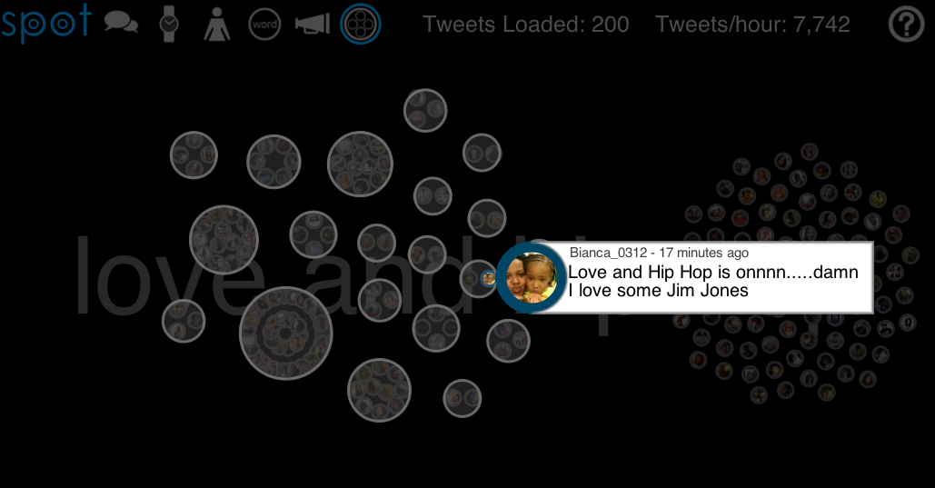
They provide ways to clustor conversations via similar phrasing and retweets, as shown below.
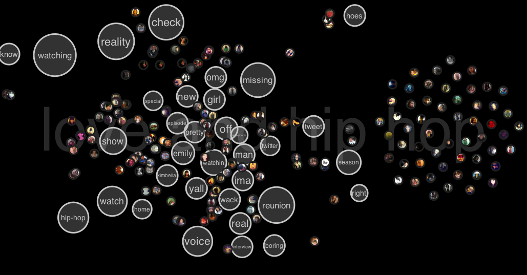
There are various other features where the talk bubble corresponds to most popular tweet clustors, the watch to a timeline of that subject in recent tweets, the person icon shows the people that had the most popular tweets and a visual of their repetitions, the word, I show below because its (to me) the most interesting, the loudspeaker shows what kind of platform people were tweeting from, and the final clusterbubble in which the image above shows cliques of retweets and replies to each other.
It’s also interesting to see how the most popular words tell the story of what people are doing. A few minutes before the show there was anticipation. As the show went on the content reflected reactions to the fighting or gossip happening along the way, or the characters most recently featured. It would be neat if we could combine the above clustering with the word clouds so we could also better understand individual groups rather than generalize across all of twitter, which I would generally expect to be diluted. The popularity of a television show allowed me to explore those kinds of features in a generalizable way, but in my project I hope to reveal more minutia of individual networks.


