Sarah Keeling Final Project: A Summary of Suburban Life

by sarah @ 8:04 pm 16 May 2012

There is a lack of physical activity in the day-to-day activities in suburban life due to the sprawling layout and design. From this, I felt that the overall suburban experience could be condensed into the experience of three chairs; the front seat of a car, an office chair and a la-Z-boy recliner.
I wanted to emphasize how frequently these chairs are used by activating them with a series of motors and mechanical systems, creating the appearance as though they were actually being used. So, the office chair would swivel back and forth, the front seat of the car would vibrate to suggest that a car engine was turned on and the la-Z-boy’s foot rest would automatically swing in and out.

By the end of the semester I was able to get the office chair and the car seat to work as I intended, but am still working on automating the motions of the recliner. I believe my problem is a lack of efficiency in the system I devised that attaches to the motor which is mounted under the chair. Over the summer I plan to revise this and get the last chair up and running.

**Documentation taken from the display of the exhibition Unsettling Space: A Study of the American Suburbs, which the piece A Summary of Suburban Life was a part of.

Final Project by Xing Xu

by xing @ 11:37 am 15 May 2012

Name: “Star” Xing Xu
Title: Drawing

Description: This project runs in mobile browsers which supports HTML5 and JavaScript. The drawing is in a generative and random way. The drawing is directed by the acceleration in 3 dimensions of the device and the finger touches in the screen. One part of the meaning of the work is exploring a new way of drawing instead of brush and also explore a new and gentle way to interact with iPad. I tried to combine all different inputs and interactions with the reaction on the canvas by colors, scale, shapes, path and speed.  I looked up the apps from the Scott Studio:  http://snibbestudio.com/

Test it out in your iPad or iPhone. http://starxingxu.com/ipaddrawing.html


Jonathan Ota + John Brieger — Final Project: Virtualized Reality

by John Brieger @ 4:21 pm 14 May 2012

Virtual reality is the creation of an entirely digital world. Virtualized reality is the translation of the real world into a digital space. There, the real and virtual unify.

We have created an alternate reality in which participants explore their environment in third person. The physical environment is mapped by the the Kinect and presented as an abstracted virtual environment. Forced to examine reality from a new perspective, participants must determine where the boundary lies between the perceived and the actual.

Project Overview

When a participant puts on the backpack and associated hardware, they are forced to view themselves in third person and reexamine their environments in new ways.

Virtualized Reality’s physical hardware is composed of:

  • A handcrafted wooden backpack designed to hold a laptop, battery, scan converter, and a variety of cables.
  • A CNC Milled wooden truss, fastened into the backplate
  • A Microsoft Xbox Kinect, modified to run on 12v LiPo batteries
  • A pair of i-glasses SVGA 3D personal display glasses
  • A laser-cut Styrene helmet designed to fit over the glasses
  • A backpack running simple CV software to display Kinect Data

Virtualized Reality, at its core, is about having a linear out of body experience.

First, participants put on the backpack and goggles, mentally preparing them to have a technological experience.

Then, they put on the helmet, a visual cue that separates the experience they have inside of the Virtualized Reality from the physical world.

At that point, we guide participants through the three stages of the experience we designed:

  1. Participants view themselves in 3rd person using the Kinect’s RGB Camera. They begin to orient themselves to an out of body viewing experience, learning to navigate their environment in third person while retaining familiarity with normal perceptions of space.
  2. Participants view themselves in 3rd person using a combination of the Kinect’s depth sensing and the RGB camera, in which object’s hues are brightened or darkened based on how far they are from the participant. This also is the first display that takes into account depth of environment.
  3. Participants view the point cloud constructed by the Kinect’s depth sensing in a shifting perspective that takes them not only outside of their own body, but actually rotates the perspective of the scene around them even if they remain stationary. This forces participants to navigate by orienting their body’s geometry to the geometry of space rather than standard visual navigation. While disorienting, the changing perspective takes participants even farther out of their own bodies.

Design and Process Overview

We wanted to create a strong, clean visual appeal to our structure, something that was both futuristic and functional. We ended up going with an aesthetic based on white Styrene and clean birch plywood.

Jonathan’s first iteration of the project had given us some good measurements as far as perspective goes, but we had a lot of work to do structurally and aesthetically.

We started by sketching a variety of designs for helmets and backpack structures.

The Helmet:

We started with a few foam helmet models, one of which is pictured below:

This was followed by a material exploration using layer strips of Styrene, but the results were a bit messy and didn’t hold form very well.

Then, Jonathan modeled a faceted design in RhinoCAD that we felt really evoked the overall look and feel of our project.

This was then laser cut into chipboard and reassembled into a 3D form:

Happy with this form, we recut it in white styrene and bonded it together with acrylic cement

The Truss:

At the same time, we had also been designing the back truss that would hold the Kinect behind and above the participant’s head.

First we prototyped in Foamcore board:

Then we modeled them in RhinoCAD:

Finally, we used a CNC Mill to cut them out of birch plywood:

The Backpack

The curved rear shell of the backpack was made by laminating together thin sheets of wood with a resin-based epoxy, then vacuuming the wood to a mold as the epoxy cured

We then cut a back plate and mounted the truss to it.

Jonathan tests out the backpack with a blue foam laptop:

Finally, we added a styrene pocket at the base of the truss to hold the scan converter, Kinect battery and voltage regulator, and extra cable length.

Expansion and Further Thoughts

While we had initially concepted the project to use heavy amounts of algorithmic distortion of the 3D space of the participant, we found that it was both computationally infeasible (the awesomely powerful pointclouds.org library ran at about 4fps) as well as overly disorienting. The experience of viewing yourself in 3rd person is disorienting enough, and combined with the low resolution of Kinect and the virtual reality goggles, distorting the environment loses its meaning. An interesting expansion for us would be real-time control over the suit, something like handtracking to do the panning and tilting, or perhaps a wearable control in a glove or wristguard.

“Tango” by Alex Rothera | IACD 2012 Final Project

by alex @ 12:20 pm

Abstract:

As over-stimulated and over-scheduled individuals, we constantly exist alone in overpopulated physical space. My work looks to populate spaces with people from separate moments in time.

Summary:
This software is a tool for spatiotemporal interlocking performances. Using a Microsoft kinect, my software examines the movement of performers in a common physical room. The software looks to place as many people as possible in one room without colliding with one another. The Kinect camera records video footage of cutout individuals to place in the space. The recordings are from different shots but can be combined into a room where no person runs into one another.

Using commonplace technology such as an IR camera we can easily understand our body in physical space. Separate from physical space is our existence in Time. It is an existence in time that allows us to relate to one another as people.

[youtube https://www.youtube.com/watch?v=-8Oos2AD_U4&w=640&h=480]
[vimeo https://vimeo.com/42240287]

[vimeo https://vimeo.com/42241042]

Technology:
This was my first project using openFrameworks. I have always previously been using processing. This project utilizes ofxKinect, ofxCv, and openFrameworks.

An early prototype of this same project was made in Processing using Daniel Shiffman’s kinect library, but I quickly realized I had little chance looping video playback while using processing.

What is next:

~Interface to selectively add or delete layers
~Better Layer ordering
~RGBDToolKit (for high resolution output)
~Second Kinect for increase space
~MAKE ART. PERFORM.

Inspirations:

I’ve always been inspired by technological innovation. The artists that have been able to push the bounds of what they have, not necessarily to make projects overly impressive, but to make work fun and expressive. Some of my inspirations are Norman McLaren, Zbigniew Rybczynski, and Peter Campus.


Final Project – Tunable surface: crowd driven acoustic behavior

by varvara @ 11:19 am

What is it about? ————————————————————-

This project builds a workflow between a crowd simulation and an acoustic simulation with the aim to control the acoustic experience of space by taking into account the given crowd configuration.


Overview ————————————————————————

The geometry of a space can significantly affect its acoustic performance. In this project crowd behavior mediates between geometry and acoustics. The simulation of people moving in space drives the movement of a kinetic structure, with the goal to affect the acoustic experience of the space by the surface’s changing geometry. The constantly changing crowd aggregation areas provide sound sources used as input in an acoustic simulation; the results of the simulation determine which surface configuration is appropriate for each crowd condition with the help of an evolutionary algorithm. The project is developed as a feedback loop between the Unity game engine, used to simulate the crowd behavior and the resulting surface changes and the Grasshopper parametric modeling platform used to run a ray trace acoustic simulation and an evolutionary solver.


Background ——————————————————————–

This project was motivated by the work developed in the context of the Smart Geometry 2012 workshop by the Reactive Acoustic Environments Cluster, which I joined as a participant. The objective of this cluster was to utilize the technological infrastructure of EMPAC, in Rensselaer Polytechnic Institute in Troy in order to develop a system reactive to acoustic energy. The result was a surface that changes its form – and therefore acoustic character – in response to multimodal input including sound, stereoscopic vision and multi-touch.

Below a couple of photos and a link that summarize the work done during the Smart Geometry Workshop:

Manta, Reactive Acoustic Environments

cluster leaders: Zackery Belanger, J Seth Edwards, Guillermo Bernal, Eric Ameres

http://issuu.com/manta2012/docs/manta


Other precedent work that focuses on the topic of how geometry can be explored in order to affect the acoustic experience of space:

Virtual Anechoic Chamber

This project explores how the acoustic performance of a surface can be modified through geometry or material and more specifically explores the sound scattering / sound diffusive acoustic properties of doubly-ruled surfaces. The project team develops digital parametric models to test the surfaces digitally, using computational acoustic analysis techniques suitable for the prediction of sound scattering, as well as physical scale models.

project page: http://www.responsive-a-s-c.com/

Tunable Sound Cloud

This project is exploring a canopy with real-time responsive capability to enhance acoustic properties of interior environments. This system is designed with a dynamic self supporting spaceframe structure and layered with a responsive surface actuated with memory alloy materials to control sound behavior.

project page: http://www.fishtnk.com/gallery-links/tunable-sound-cloud/


Concept ————————————————————————

The acoustic performance of a surface, thus the acoustic experience it provides, can be modified through geometry or material. The precedent work cited highlights that.

When sound strikes a surface, it is absorbed, reflected, or scattered; thus if we change the geometry of the surface we get different acoustic properties. If we consider a structure that is kinetic then we can constantly alter the geometry in order to control the acoustic experience of the space. This project explores how crowd behavior can be the driving parameter of how to update the geometry. In a previous work I tried to explore the same idea by capturing crowd movement with a kinect and then trying to infer the crowd distribution so that I can change the kinetic surface according to some preset configurations. This time I chose to set a system where I will be able to create crowd simulations so that I can later explore more variations in crowd behavior.


Process ————————————————————————

The project combines two different software into a continuous workflow, where each updates the other. Unity 3d game engine is used to run a crowd simulation (with the help of Unity Steer library) and Grasshopper (for Rhino) is used for the surface modeling, tessellation and panelization as well as the simulation of its kinetic behavior. In the Grasshopper environment two plugins are used,  Acoustic Shoot and Galapagos, to perform a qualitative acoustic simulation  and to test the results of the simulation in an evolutionary algorithm respectively. Unity sends via OSC (Open Sound Control) signals to Grasshopper regarding the crowd distribution and Grasshopper uses this data to identify the main sound sources. It further uses these sound sources to run an acoustic raytracing for a given amount of time. The results of the acoustic simulation are fed into an evolutionary solver in order to compute which surface configuration is the fittest so that we can reduce reverberation in space. More specifically the evolutionary solver tries to minimize the amount of bounces of the sound rays. The configurations that are output as the best genomes are used to update the mesh back in Unity.

Below a diagram that represents the described workflow:


Grasshopper parametric modeling platform was used to generate the surface geometry. The initial geometry was tessellated and then a kinetic component was applied to each surface grid.

The kinetic component was defined according to a parametric schema in order to be able to capture the range of its movement and also to be able to apply it to four-sided polygons of arbitrary shape. Below a diagram that shows how the component moves, from folded to completely flat position. The red circles define the constraints along which the three free points of the component move, the rest of the points are constraint on the frame of the overall surface.

The idea of the component was developed the Smart Geometry 2012 workshop by the Reactive Acoustic Cluster participant David Hambleton. During the workshop, a prototype of the kinetic component was built. In the current project I created a grasshopper definition to use it in the suggested workflow.

Diagram of the component while moving: from folded to flat (axonometric view).

Diagram of the component in open position (front view).

There is a numeric range (min, max) that controls the movement of the component, for example at max the component is folded, at min is flat. There is one such controller for every movable component on the surface. Below we can see  diagram of different configurations of the surface where random values were given to control the movement of each component. The red rays represent the result of the raytracing algorithm for a common given source. The rays represent how sound moves in space while being reflected by the various surfaces. We can observe that the different configurations of the set of components result to different sound behavior.

In the project the controllers that control the movement of each component were fed as the genome in an evolutionary solver. As mentioned the fitness function was trying to minimize the number of bounces of sound in space. The configurations selected as the best genomes are updating the geometry back to unity. This is possible by converting our geometry to a mesh, saving the information in a text file as a connection graph, i.e. by storing the points/nodes of the mesh and to which nodes are connected. This text file is used in unity to rebuild the mesh and update the model.

Here is a demo/video of the project:

Blase’s Final Project- Gestures of In-Kindness

by blase @ 8:20 am


Title: Gestures of In-Kindness

Maker: Blase Ur (bur at cmu.edu)

Expanded Academic Paper: Available Here


Description: ‘Gestures of In-Kindness’ is a suite of household devices and appliances that respond in-kind to gestures the observer makes. For instance, the project includes a fan that can only be “blown” on; when the observer blows air at the fan, the fan responds by blowing air at the observer. Once the observer stops blowing his or her own air, the fan also stops. Similarly, there’s an oven that can only be operated by applying heat, such as the flame from a lighter. Only then will it apply heat to your food. A lamp that only turns on when light is applied and a blender that only spins its blades when the observer spins his or her body in circles round out the suite of devices. All devices operate over wi-fi, and all of the electronics, which I custom made for this project, are hidden inside the devices.

The interesting aspect of this project is that it leads observers to rethink their relationship with physical devices. In a sense, each device is a magnifying glass, amplifying the observer’s actions. This idea is highlighted by the devices’ quick response time; once the observer ceases to make the appropriate gesture, the device also turns off. Having this synchronicity, yet divergence in scale, draws the observer to the relationship between gesture and reaction. Oh, and the blender is really fun. Seriously, try the blender. You spin around and it blends. How cool is that?!


Process: On a conceptual level, my project draws inspiration from a number of other artists’ projects that have used household devices in an interactive way. One of my most direct influences is Scott Snibbe’s Blow Up, which is a wall of fans that is controlled by human breath. The idea of using a human characteristic, breath, to control devices that project the same behavior back at the observer on a larger scale was the starting point for my concept. While I really like Snibbe’s project, I preferred to have a one-to-one relationship between gesture (blowing into one anemometer) and response (one fan blowing back). I also preferred not to have an option to “play back” past actions since I wanted a real-time gesture-and-response behavior. However, I thought the idea of using breath to control a fan perfectly captured the relationship between observer and device, so I stole this idea to power my own fan and kickstart my own thought process. I then created a series of other devices with analogous relationships between gesture and device reaction.

James Chambers and Tom Judd’s The Attenborough Design Group, which is a series of devices that exhibit survival behavior, is an additional influence. For instance, a halogen lamp leans away from the observer so that it’s not touched; the oils from human hands shorten its life. Similarly, a radio blasts air (“sneezing”) to avoid the build-up of dust. In some sense, Chambers and Judd’s project explores the opposite end of the spectrum from mine. Whereas their devices avoid humans to humorous effect, my devices respond in-kind to humans in a more empathetic manner. I want the observer not to laugh, but to think about their relationship with these devices on a gestural, magnifying level.

Kelly Dobson’s Blendie is, of course, also an influence. Her project, in which a blender responds to a human yelling by turning on and trying to match the pitch of the yelling, captures an interesting dynamic between human and object. I really liked the noise and chaos a blender causes, which led me to include a blender in my own project. However, while her blender responded to a human’s gesture in a divergent, yet really interesting way, I wanted to have a tighter relationship between the observer’s action and device’s reaction. Therefore, with the conceptual help of my classmate Sarah, I decided to have the blender controlled by human spinning.

In class, I also found a few new influences. My classmate Deren created a strong project about devices that respond to actions, such as a cutting board that screams. For his final project, my classmate Kaushal made a fascinating camera that operates only through gesture; when the participant makes a motion that looks like a camera taking a photo, a photo is taken using computer vision techniques. Having these influences led me both towards the ideas of using household devices in art, as well as using appropriate gestures for control. Of course, Kaushal’s project is reminiscent of Alvaro Cassinelli’s project that lets an observer make the gesture of picking up a telephone using a banana instead of a telephone and similarly using gestures on a pizza box as if it were a laptop. This idea of an appropriate gesture being used for control is echoed in the projects that both Kaushal and I created.


Technical Process:

On a technical level, my project began with a project on end-user programming in smart homes that I’ve been a key member of for the last two years. As part of that research project, I taught myself to “hack” physical devices. However, I had never worked with ovens or blenders, two of the devices I hoped to use. In that project, I had also never worked with sensors, only with “outputs.” Therefore, a substantial amount of my time on this project was spent ripping apart devices and figuring out how they worked. Once I spent a few hours with a multimeter uncovering how the blender and oven functioned, as well as ripping apart a light and a fan, I had a good understanding of how I would control devices. This process of ripping apart the devices can be seen in the photographs below.

Inside each device, I’ve inserted quite a bit of electronics: power regulation, an Arduino microcontroller, a WiFly wi-fi adapter, and a solid-state relay. First, after opening up the devices, I isolated where power is sent to the device’s output (for instance, the oven’s heating elements or the blender’s motor) and cut the hot wire. Then, I started to insert electronics. As power came from the wall, I inserted a DC power regulation circuit that I ripped from a 9V DC Adapter that I purchased from Sparkfun; I could now power an Arduino microcontroller off of the electricity the device already had flowing into it. Then, I inserted a relay into the device (a 20A Omron solid-state relay for the oven and blender, and slightly more reasonable 2A solid-state relays for the fan and lamp). An Arduino Uno-R3 controls the relay, and a WiFly wi-fi adapter sits on the Arduino to provide wireless capability. I programmed these devices to connect to a wireless router, and all communication occurs over this wireless channel.

On the sensor side, I have a separate Arduino that reads the sensor inputs. For sensing breath, I used a surprisingly accurate (given its low cost) anemometer from Modern Devices. For sensing temperature, I used a digital temperature sensor; for sensing light, a photocell did the trick. Finally, to sense spinning to control the blender, I used a triple-axis accelerometer from Sparkfun. Since I wanted to avoid having a wire tangle with a spinning person, I connected this Accelerometer to an Arduino Fio, which has a built-in port for XBee (802.15.4) chips. This rig was powered by a small Lithium Ion battery. At my computer, I also had an XBee connected via USB listening for communication from the accelerometer.

I wrote the code for all Arduinos (those inside the devices, the Fio for the accelerometer, and the final Arduino that connects to all the sensors), as well as Processing code to parse the messages from the sensor Arduino and accelerometer. In this Processing code, I was able to adjust the thresholds for the sensors on the fly without reprogramming the Arduinos. Furthermore, in Processing, I opened sockets to all of the devices, enabling quick communication over the wi-fi network.

For additional information, please see my paper about this project.


Images:

Final Project – The Human Theremin

by duncan @ 11:43 pm 13 May 2012

The Human Theremin

By Duncan Boehle and Nick Inzucchi


The Human Theremin is an interactive installation that generates binaural audio in a virtual space. It uses a Kinect and two Wiimotes to detect the motion of the user’s hands, and Ableton Live synthesizes binaural sounds based on the hand motion.


Video Summary


[vimeo https://vimeo.com/42057276 w=600&h=338]


Software Pipeline


The full pipeline uses several pieces of software to convert the motion into sound. We use OpenNI sensor drivers for Kinect in order to detect the user’s head and hand positions in 3D space and to draw the body depth map in the visualization. We use OSCulator to detect the button presses and acceleration of the Wiimotes, which sends along the data it receives via OSC.

We then have an OpenFrameworks app that receives this sensor data, which renders the visualization and sends along relevant motion data to Ableton Live. The app hooks into OpenNI’s drivers with a C++ interface, and listens for OSCulator’s data using OFX’s built-in OSC plugin.

Our Ableton Live set is equipped with Max for Live, which allows us to use complex Max patches to manipulate the synthesized sound. The patch listens for motion and position data from our OFX app, and creates a unique sound for each of the four Wiimote buttons we listen for. The roll, pitch, and acceleration of the controller affect the LFO rate, distortion, and frequency of the sounds, respectively. When the user releases the button, the sound exists in the space until it slowly decays away, or the user creates a new sound by pressing the same button again.

The sounds are sent through a binaural Max patch created by Vincent Choqueuse, which spatializes the sound into full 3D. The patch uses a head-centered “interaural-polar” coordinate system, which requires our OFX app to convert the position data from the world coordinate system given by the Kinect. The system is described in detail by the CIPIC Interface Laboratory, which supplied the HRTF data for the binaural patch. The azimuth, elevation, and distance of the hands are relative to the user’s head, which is assumed to be level in the XZ-plane and facing in the same direction as the user’s shoulders. This computation allows the user to wander around a large space, facing any direction, and be able to hear the sounds as if they were suspended in the virtual space.


Reception


We set up the installation during the Interactive Art and Computational Design Final Show on May 3rd, and a lot of visitors got a chance to try out our project.

Overhead view

One user is calibrating the Kinect body tracking.

The reception was very positive, and nearly everyone who participated was really impressed with how easily they were immersed into the virtual soundscape with the binaural audio. We experimented with having no visual feedback, because the system is based primarily on audio, but we found that showing users their depth map helped them initially orient their body, and they later felt comfortable moving through the space without looking at the display.

Testing the binaural audio

Another participant is testing the binaural audio.

Some participants only tried moving their hands around their head for a minute, and then felt like they had experienced enough of the project. Many others, however, explored far more of the sound design, placing sounds while walking around and frantically moving their hands to try to experiment with the music of the system. One person looked like a legitimate performer while he danced with the Wiimotes, and said that he wished the system could use speakers instead of headphones so that more people could appreciate the sounds simultaneously.

Dancing with audio

Another participant danced with the Wiimotes, turning our work into a performance piece.


Conclusion


Although we received primarily positive feedback, there are still a few directions that we could take the project to make a more compelling experience. Based on one suggestion, it would be interesting to try to create more of a performance piece where pointing in space would create sounds along the outside of a room, using an ambisonic speaker array. Other participants suggested that they wanted more musical control, so we could change some of the sounds to have simpler tones and more distinct pitches, to facilitate creating real music. The direction of the project would certainly depend on what type of space it could be set up in, since it would have far different musicality in a club-like atmosphere than it would as an installation in an art exhibition.

Over all, we achieved our goal of creating an immersive, unique sound experience in a virtual space, and we look forward to experimenting with the technologies we discovered along the way.

Final Project – Housefly

by craig @ 10:51 pm

A highly directional “sonic spotlight” on a pan-tilt mount creates the auditory hallucination of a housefly — a housefly that doesn’t exist.

Lucille Ball, star of the 50s television sitcom I Love Lucy, once reported a peculiar turn of events related to a set of dental fillings she had received. “One night,” told Lucille, “I came into the Valley over Coldwater Canyon, and I heard music. I reached down to turn the radio off, and it wasn’t on. The music kept on getting louder and louder, and then I realized it was coming from my mouth. I even recognized the tune. My mouth was humming and thumping with the drumbeat, and I thought I was losing my mind.” Ball claimed that this phenomenon was the result of the fillings acting as a radio receiver, resonating radio stations into her jaw.

This work utilizes a highly directional ultrasonic speaker and a pan-tilt system to create sonic experiences that cause the participant to question the objectivity of their perception.

Initially I intended to replicate Lucille Ball’s hallucinations, using an ultrasonic speaker and a camera tracking system. However, once I began experimenting with the ultrasonic speaker, it became apparent that a constant tone produces a more realistic sound. A housefly’s tone was the perfect sound to use. Using a pan-tilt mechanism I was able to mimic a housefly’s movement throughout a room. I used the PureData audio processing toolkit to synthesize the housefly’s sound, whose pitch increases and decreases in relation to the acceleration of the fly’s movement. This movement is in turn derived from a real-time Perlin-noise animation developed in Processing. Finally, an Arduino controls the servos which regulate the pan-tilt rig, directing the fly’s sound around the room.

[youtube=”https://www.youtube.com/watch?v=pIMluFK0HEQ&feature=youtu.be”]
Jump to 0:28″ to get a view of the device that’s making this pesky racket, or see the image below.


SankalpBhatnagar-FinalProject-StrokeWeight

by sankalp @ 10:09 pm

strokeWeight

A data visualization meant to display weight loss through a new perspective. Meant to merge my personal health with my vision of effective design. The goal was to visualize my own weight loss in a meaningful and unique way. The result was typographical motivation to lose weight, one pixel at a time.

Here is the official video, developed to demonstrate the data visualization:

[youtube https://www.youtube.com/watch?v=gX9yQBNqtpQ&w=560&h=315]


How’d I come up with this?

For the last 15 years, I have been overweight. In December of 2011, I peaked at 314 lbs. As a college student, my weight limited my involvement on campus and in my community; as a boyfriend, my weight put various strains on my relationship with my girlfriend; and as a guy, my weight was causing unforeseen health problems in my personal life ranging from exercise asthma to more serious health complications. So in January of 2012, I decided to change my life around. My girlfriend at the time was starting her semester abroad in France and I knew this semester would be the best semester for me to really focus on achieving this goal.

As a big guy, one of the first thing you find when you scour the web for tips and tricks on how best get motivated are what I call thinspiration photos. These usually consist of people’s before and after shots, most of which are not just comparisons and some of which are just outlandishly fake. However, what I noticed was that regardless of how many photos I saw, I never really felt compelled to keep on a diet. Furthermore, I never really felt that the slower, week-by-week progress points were properly documented. Because of that, I didn’t think it was very worthwhile only depending on photos of my body.

In my work with communication design, I primarily used tools like Illustrator to help me adjust typography. So recently, I was interested in visualizing information through just typography. I wondered if it was possible to develop inspirational typography to help me assess the progression in my weight loss initiative through a well-documented visual analysis.


First Attempt(s)

At first, when I thought of the basic concept for this, I actually wanted to change other aspects of typography. Originally, I planned on changing the kerning (or space) between the letters in my name based on my monthly BMI. However, I felt that the spacing between letters would not be the best part of the word to change since it may appear too obscure for the audience to recognize any major shift in BMI. Then I thought about changing the size of my name based on my weight, but quickly decided that would likely get out of hand and would portray my name at too large of an initial size to be accurately compared to the size of what my name should be at an ideal weight.


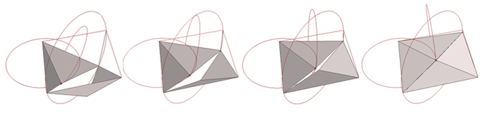
Eventually, I decided to go with the stroke of my name. For every pound I lost, my name would be displayed in a less thick, or obese, stroke. This would ensure the legible spacing of the letter and also minimize any unnecessary obscurity from my project. It was the best of both worlds, in terms of demonstrating my weight loss—and it even sounded great too. I mean, losing weight to decrease strokeweight is pretty catchy.

After getting through the initial concept, I took to my notepad and began drafting the idea further:

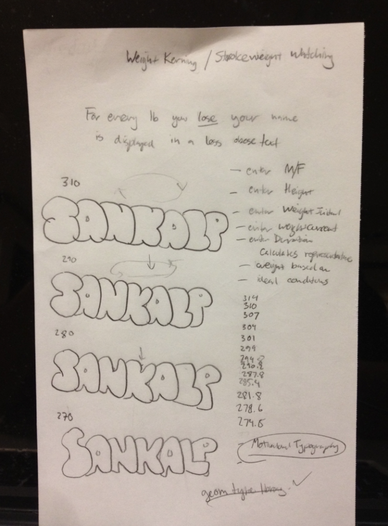
Originally, I just wanted the letterform to morph from thick to thin and keep repeating, so the user could keep in mind how much weight I lost. However, that ended up appearing very confusing and after I met with group in one of the class sessions, I was told to make the piece more understandable. Mainly, I was tasked with trying to effectively demonstrate my weight loss, without making the program look like I was just cycling though the thick and thin versions of my name.

Fellow designer Luci told me that I should aim to demonstrate the data through chronology. That I should aim to visualize the evolution of the letterform, not just the changing of strokeweight. I agreed and began to iterate a few ideas:


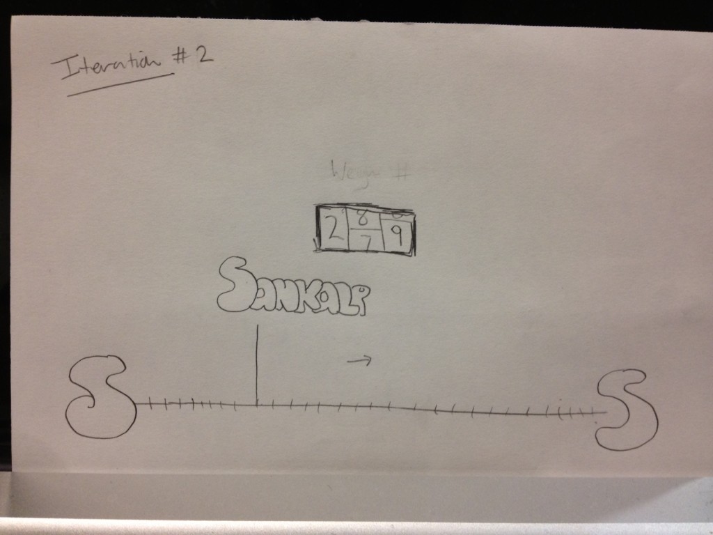
I thought of including a timeline at the bottom of the window that my name’s letterform was attached to that could move right across as I lost more weight and approached a thinner letterform. This could be complimented by a lottery-styled weight-tracker that would display my actual weight. Up until then, I had not planned on including my weight numbers, partly because I didn’t think it was necessary and partly because the data is very personal. Originally, I thought it’d be cool to have a lottery-spin style number visualization.  Ultimately, I scrapped this idea, but I decided to display actual numbers in the window in a more simple fashion.

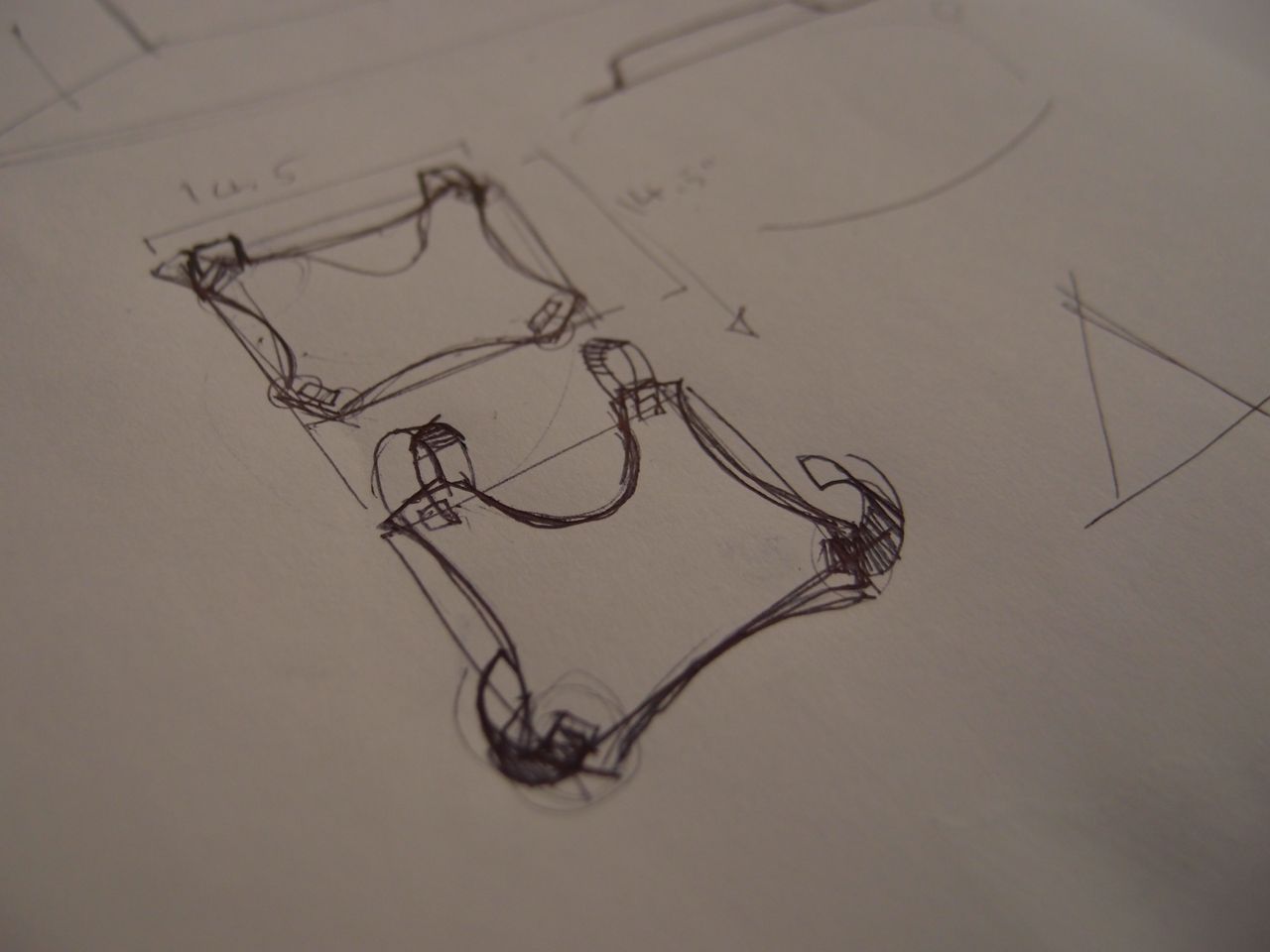
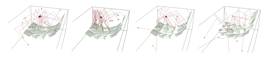
Next, I began thinking about how best to show progress in this timeline I wanted to include.How could I make an effective timeline? Below is a sketch from that iteration where I started to link circle icons to different positions along the weight-loss path. For instance, the dark circle would match a thicker representation of my name, and the lighter circle could represent the healthier, target representation of my name. This idea led to add something major to my work. I took these colored circle icons as a sort of instruction for the audience to put together and understand. If I could place them along this timeline in a way that hinted at what I wanted to be at, I believe I’d be able to successfully add motivation to the piece. Something it lacked before, and could definitely benefit from. After all, I believe that allowing an audience to feel a connection with a design work is one of the most essential things to effective design. If the audience could realize themselves what I was doing, with no instructions, just a moving dot, a progressively thinner letterform, and a subtle hint at my goal, I feel that I’d earn their appreciation.

Any kinks?

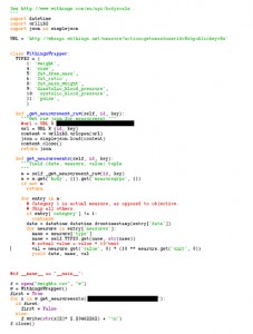
One of the biggest issues with this project was getting the API to work. Not because working with API’s is necessarily difficulty, but because the Withings API wasn’t exactly the best API to work with, not to mention I could only find a python wrapper for the Withings API—and I didn’t know Python.

Yeah, so I had to learn in the span of a few days, how to do basic programming in Python. It wasn’t pretty, but it got the job done. Took longer than I thought, but I feel that it made me a better programmer. I mean, working in a language you don’t know is one thing, but learning that language for the first time and then trying to work in it is another thing entirely.

However, I’m proud to say that I got that little kink straightened out and proceeded to use Processing, the only language I’m truly familiar with and have worked with all semster. I had to use a few new functions in the Processing library including functions that loaded text files, parsed them, and then used those points as an array to hinge my letterforms on. It was overwhelming at times, but I believe I was able to get through it, and get my code working properly.

How was it built?

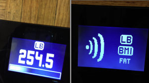
I purchased a Withings WiFi body scale that allowed me to upload my weekly weigh-ins to a user-account site. I then wrote my first python script that utilized the online Withings API to scrape the data into a text file. I used Processing to load the values from this text file and visually display the information with the help of the Geomerative Library.


What now?

Throughout the development of strokeWeight, I ran into a few issues, however these were mainly due to my lack of programming knowledge. In the future, I plan implement strokeWeight in a more interactive way. This project serves as the foundation on which I plan to design more health related programs. I actually plan on transitioning strokeWeight into an actual app that could display the data visualization on my mobile devices.

Currently the project is limited by the lack of real-time interaction. Because of the nature of the device, the current user must weigh themselves, wait for it to upload to the site, run the python script, and then run the processing application to display the visualization. I would like to program this project in such a way that the process is more streamline. I believe it is possible and I plan to work with this project to develop the appropriate system that allows the user to step on the scale and within moments see their current stats placed upon the weight axis. I feel this would add a great layer of audience interaction to the program. To do this, I will likely have to reprogram the scale or perhaps even implement an arduino.

Also, I plan to expand the capability of strokeWeight so that the user can enter their own name, and personalize their data visualization with different themes or varying personal preferences. I believe this would provide the most effective inspiration to others who wanted to use strokeWeight to motivate themselves, but wanted to tailor their experience with the program to their own needs.

Luckily, my time and work on this project in Interactive Art & Computational Design for the last month and a half has made me confident in my abilities to continue to iterate and develop this program until it is truly revolutionary. I learned how to do so many things through this project, including how to further scrape an API for data; I learned how to write a working python script for the first time in my life, and I learned how to deal with a few new functions and tools within Processing. All in all, through all of my projects this semester, I am most proud of this one. It definitely pushed my limits both mentally and physically, and I feel like that was the only way I could get something truly inspirational out of this. In my mind, the project is a success because it demonstrates my own ability to develop, code, and design an effective visualization for something extremely personal to me. I currently weigh 252 lbs (down from 314 lbs) and I plan on using strokeWeight to demonstrate any further weight loss to my friends, family, and faculty.

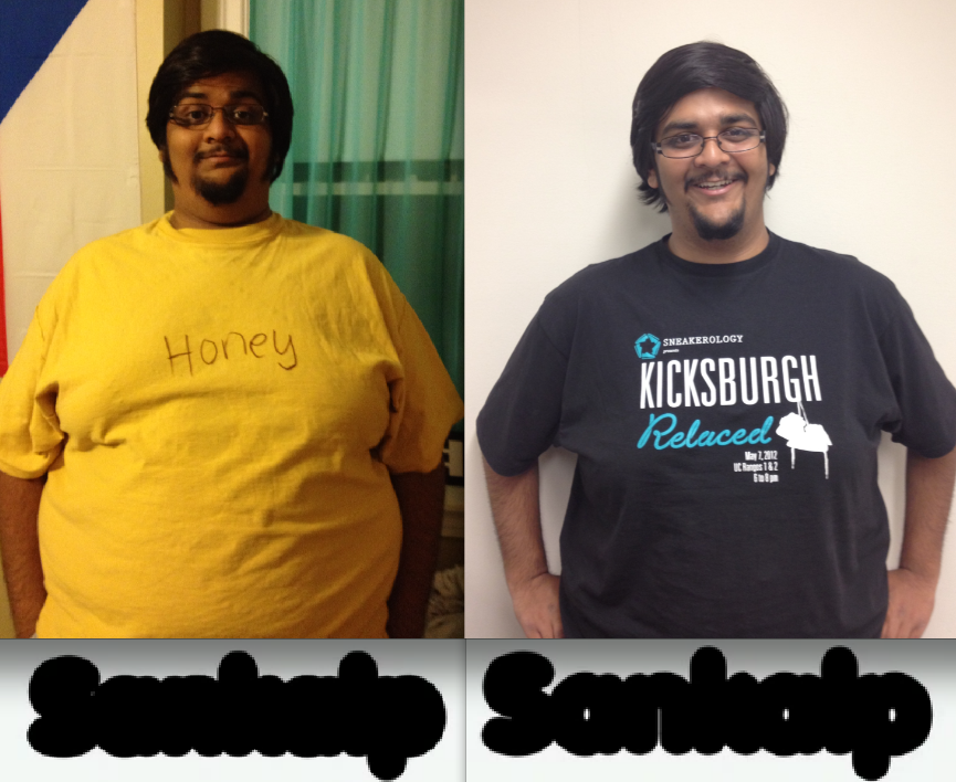
Oh and for good measure, while I believe strokeWeight is typographically successful, here is a before and after photo of my weight loss so far, if you were curious. (On the left, in a 3XL shirt and on the right, in a 2XL shirt)


Billy Keyes – Final Project – SketchSynth

by Billy @ 12:23 am

[vimeo https://vimeo.com/42053193 w=600&h=338]

SketchSynth: A Drawable OSC Control Surface

SketchSynth lets anyone create their own control panels with just a marker and a piece of paper. Once drawn, the controller sends Open Sound Control (OSC) messages to anything that can receive them; in this case, a simple synthesizer running in Pure Data. It’s a fun toy that also demonstrates the possibilities of adding digital interaction to sketched or otherwise non-digital interfaces.

Background

Ever since I was little, I’ve been fascinated by control panels. In elementary school, my neighbor and I would spend our bus rides pretending to operate incredible imaginary machines with cardboard controllers we drew, cut, and taped the night before. Even now, I pause when I see desks covered in gauges, switches, knobs, and buttons, wondering what they all do. At Golan’s suggestion, I tried to capture some of that excitement, updated for an age where imagining that your picture of a switch does something just isn’t as satisfying.

The advantage my eight-year-old self still has is variety. By necessity, the visual language SketchSynth can handle is limited to three input types, illustrated below. Despite this, I think it covers most control possibilities: many knobs are just sliders that take up less space and many buttons are just switches in a different form. Outputs, like gauges and indicator lights, are also missing, but with a general purpose surface it’s unclear what they would display.

Three control types: momentary buttons (circle), toggle switches (rectangle), and sliders (horizontal line with end caps)

While the program is designed to recognize these symbols, it doesn’t reject all other marks. If you like, you can draw anything and see what it is interpreted as.

Technical Details

SketchSynth is built on openFrameworks and makes heavy use of Kyle McDonald’s excellent ofxCv addon, which integrates the powerful OpenCV library into openFrameworks. A standard webcam looks down at the paper and detects both controls and hands. To prevent confusion, there are two modes: EDIT and PLAY. The system basically does nothing in EDIT mode, allowing you do draw controls. When you switch to PLAY mode, the controls are detected. From then on, you can interact with any detected controls. While an infrared camera is ideal to prevent interference from the projection, I had to make due with a standard color camera when my IR conversion didn’t go as planned. Projector interference is acceptably eliminated by looking for the hand in the green channel of the video and projecting controls only in the red and blue channels.

Controls are detected by finding contours (blobs) in an edge-detected version of the image. Ratios of the areas of enclosing shapes to the actual areas of the blobs are used to determine the type of each control. Hands are detected by subtracting the constant background and looking for blobs. The contour of the largest blob is smooth and the finger is assumed to be the point farthest away from the center of the blob. The system can’t actually tell when a person touches the paper, but this seems to work out alright in practice. Dilation and erosion are used heavily to improve the blobs and reject noise.

The camera and projector are aligned by clicking on the four corners of a projected rectangle (as seen by the camera) when the program starts up. This behind-the-scenes video shows how the process works and what the setup/debug screen looks like.

[vimeo https://vimeo.com/42053693 w=600&h=338]

You can get the source code on Github (for Linux).

Images

Next Page »
This work is licensed under a Creative Commons Attribution-Noncommercial-Share Alike 3.0 Unported License.
(c) 2023 Interactive Art and Computational Design, Spring 2012 | powered by WordPress with Barecity