Sam Lavery – Infoviz
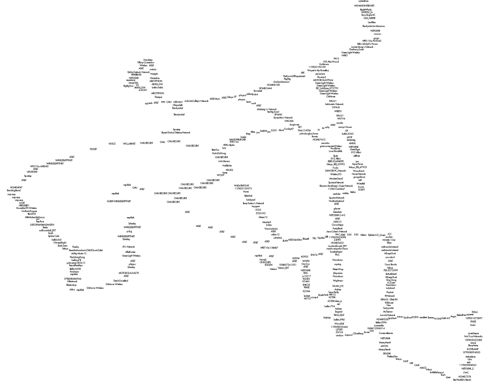
My original idea was to map open and closed wifi routers and compare this to statistics about where old and young people live in the city of Pittsburgh. I found a great wardriving application (WiGLE Wardrive) for my Android phone that allowed me to store data about the locations of wifi networks wherever I went. After a week I had a map of everywhere I had gone drawn entirely with geocoded wifi networks. I had uncovered around 4000+ unique signals and I began to realize that what was truly interesting about this data was not so much whether people had a password or not, but rather how people had named their routers.
To visualize this data I first used TileMill, a great open-source GIS program that uses a markup language similar to CSS to style data. This was great because it easily read my data and arranged the network names so that they did not intersect. However, this method lacked interactivity so I wrote a Processing sketch using Till Nagel’s Unfolding library. What I really like about interactive visualizations is how they can capture people’s time and attention. I want people to be able to experience the data I have found in their own way. Whether that is trying to find their street by searching for routers they know of or looking for the most vulgar router names they can think of.
I’m a little disappointed in the final presentation. This is the first interactive program I have written so I am really happy that I managed to make everything work to some extent. However, I feel like with a little more time/work I could have improved the visual appearance and user experience. The biggest problem currently is the intersecting of the names that happens in areas where multiple routers were found at the same lat/long. I tried to get around this by making the queried names draw on top of the other names in a different color. It’s still hard to see in some areas so in a future iteration I would try to improve this further.
mapping wifi from Sam Lavery on Vimeo.
Pictures from Processing applet

Wifi names mapped in TileMill
//IACD Project 2 //mapping wifi //sam lavery //unfolding library import processing.opengl.*; import codeanticode.glgraphics.*; import de.fhpotsdam.unfolding.*; import de.fhpotsdam.unfolding.geo.*; import de.fhpotsdam.unfolding.utils.*; de.fhpotsdam.unfolding.Map map; Location locationBerlin = new Location(52.5f, 13.4f); Location locationLondon = new Location(51.5421, 0.13344411); //library for textfield import controlP5.*; ControlP5 controlP5; String textValue = ""; Textfield myTextfield; //library for reading xls file import de.bezier.data.*; XlsReader reader; //declare arrays for wifiname and coordinates int columnlength = 500; String[]wifiname = new String[columnlength]; //declare arrays for laititude and longitude float[]lat = new float[columnlength]; float[]lng = new float[columnlength]; public void setup() { size(1400, 800, GLConstants.GLGRAPHICS); noStroke(); map = new de.fhpotsdam.unfolding.Map(this); map.setTweening(true); map.zoomToLevel(20); map.panTo(new Location(40.433, -79.928)); MapUtils.createDefaultEventDispatcher(this, map); //textfield setup controlP5 = new ControlP5(this); myTextfield = controlP5.addTextfield("enter text",0,0,200,20); myTextfield.setFocus(true); //read xls reader = new XlsReader( this, "WigleWifi.xls" ); //put names in an array for(int i=0; i<columnlength-1; i++) { wifiname[i] = reader.getString(i+1,0); //println(wifiname[i]); lat[i] = reader.getFloat(i+1,1); lng[i] = reader.getFloat(i+1,2); //for testing //println(lat[i]); //println(lng[i]); } } public void draw() { background(250); // Draws locations on screen positions according to their geo-locations. for(int i=0; i<columnlength-1; i++) { Location location = new Location(lat[i],lng[i]); float xylocation[] = map.getScreenPositionFromLocation(location); fill(0); text(wifiname[i], xylocation[0], xylocation[1]); } /* fill(0); text(myTextfield.getText(), 200, 200); */ for(int i=0; i<columnlength-1; i++) { int a = wifiname[i].indexOf(myTextfield.getText()); if(a!=-1) { Location location = new Location(lat[i],lng[i]); float xylocation[] = map.getScreenPositionFromLocation(location); fill(225,50,50); text(wifiname[i], xylocation[0], xylocation[1]); } //original method for displaying highlighted wifinames /* if(wifiname[i].equals(myTextfield.getText())) { Location location = new Location(lat[i],lng[i]); float xylocation[] = map.getScreenPositionFromLocation(location); fill(200,50,50); text(wifiname[i], xylocation[0], xylocation[1]); } */ } } void controlEvent(ControlEvent theEvent) { println("controlEvent: accessing a string from controller '"+theEvent.controller().name()+"': "+theEvent.controller().stringValue()); } |
========================================
Sam Lavery: Wifi Routers
Maybe draw the highlighted ones LAST so they appear on top of the black text which is kind of noisy… Also, could draw red on a white background or with white glow… Better placement Did you collect signal strength data? if so, maybe you could use that to randomly draw the text slightly away from the path you walked.. So if it’s really strong, then it’s very close to where you walked, so less random; if weaker, more randomized, farther from your path. You’d have less overlap possibly. What about a force-directed layout .. the center point is where you walked, signal strength is the strength of the force… Look into the traer library
Did you find “Die Hipster Scum,” my roomate’s old network in Bloomfield? << My neighbor's is 'Rootkit installer', no one's touching that shit << and by "one" you mean a person who knows what a "Rootkit" is Love the 'cool searches' portion of your presentation, that helps. Great concept and good job following through on it. Cock walnuts Maybe if you could add the sketch of the map into the work....Great idea.....tons of fun what's interesting here is really the names, it's harder to read them the way they overlap on the locational map ^ Agreed, a suboptimal visualization of some really great data! Like Death Death Death Death? I'd like to even see you just exploring the names as opposed to the locaiton, maybe show location only when you want to see it I'd even like to see just the names, one after another, and sorted, Lukes visualtion of IKEA prodcuts by price how is this sorted? alpha? why are the names spread horizontally like that?they're geographic <
Comment by patrick — 7 February 2012 @ 11:27 am