sansal-Clock

I've always been interested in the idea of conspiracies involving the world and society as a whole, especially the ones regarding the 'flat earth' theory or the 'illuminati'. I wanted to incorporate that into my project as part of the overarching theme that 'time is a construct'. Time is essentially just a measure invented by humans to facilitate the navigation of life, and has no real, tactile value. As such, I began experimenting directly in p5.js, and don't really have drawn sketches to show.

I began first with the 'illuminati' triangle in the middle. I measured the millisecond rollover for each second and subtracted a fraction of it from the current minute to achieve a sort of old-pocket-watch ticking effect, where the hand backticks a bit before snapping back to a certain position (when the minute changes). I then added the 8-ball, and used a custom easing function for the y-coordinates to make it seem like it was bouncing up and down. I used the seconds + millisecond rollover for the x-coordinates. After that, I added the spinning arc (basically a thin line) in the background, corresponding to the current millisecond (mapped from 0 to 1000 to 0 to 2π). I also added the oscillating rectangle at the bottom of the screen, where the width of the rectangle corresponds to the current hour (in 24-hour time). The text in front of the rectangle also changes depending on whether it is before or after noon. If it is before noon, 'CONSTRUCT' is displayed, and if it is after, 'CHANGEABLE' is displayed. 

I wanted to further enhance the idea that the idea of time is manipulable, so I added my own seemingly random 'digital time' display at the top, where the only thing noticeable is the current year. The other numbers vary depending on the current value of t (used for the y-coordinates of the bouncing ball), and change when the mouse is pressed over the clock. This is also true for the gradient background (for which I got the code from Codeburst.io), which changes its top color depending on the mouse click. Both of these things were meant to add to the whole 'time is a construct' motif once again, as well as make the clock a bit interactive. 

Ultimately, I am pleased with the final product, but I feel as if it is lacking some details. However, I did not want to detract away from the many things happening at once in the clock, so I'm sure this is to be expected. This makes the clock illegible to anyone who has not read this description, so the most they will be able to get out of my clock is the current year (which means it's highly valuable to time travelers who don't know what they're doing).   


https://editor.p5js.org/svsalem/sketches/5uauQjAHy
 

rysun-clock

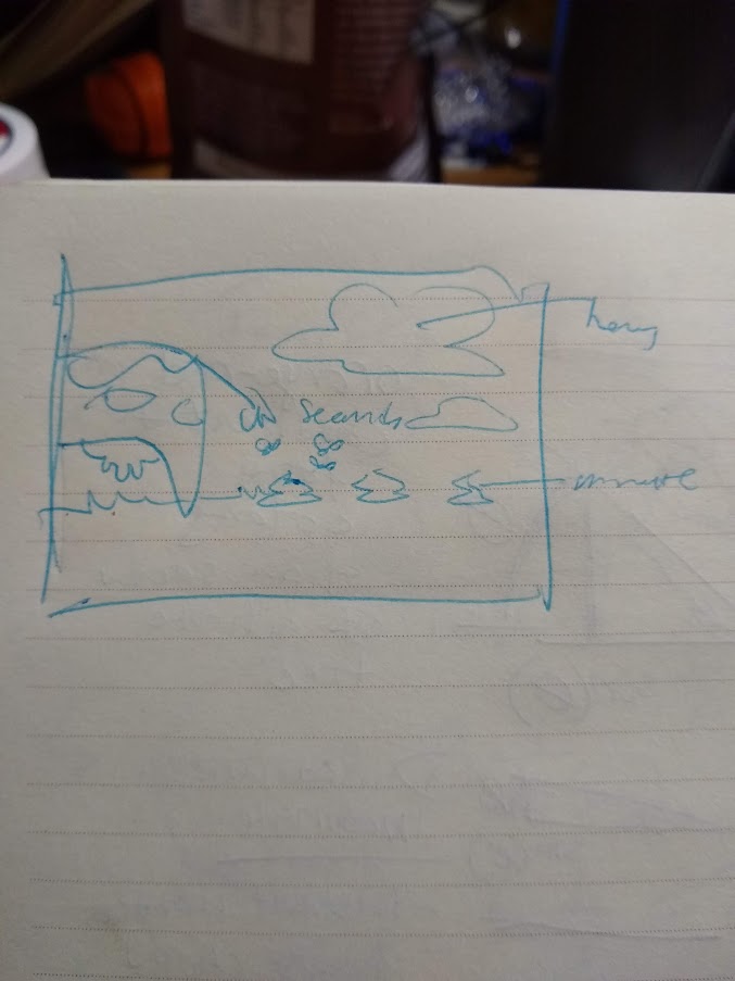
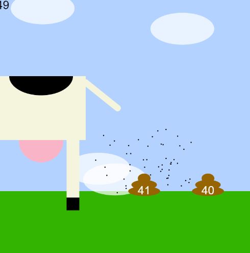
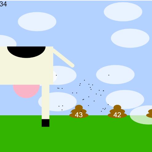
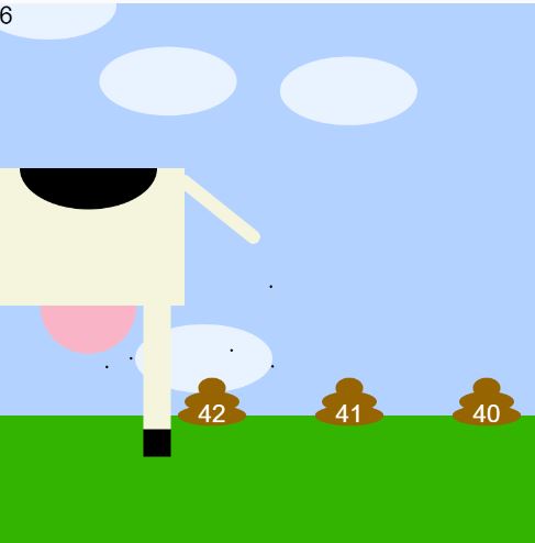
I wanted to make a project which emulated life, and the relationship between living things and time. Originally I'd considered simulating population growth over time, or depicting sperm fertilising an egg, but it was hard to conform those ideas with the 60x60x24 clock concept. I thought the idea of a cow endlessly pooping was funny and settled for that. The number of flies represents the seconds; the number on the most recently pooped poop is the minute; the number of clouds in the sky represents the hour. If I had more time, I would have tried to make the animations smoother and the shapes more aesthetically pleasing. Right now it looks very crude. I would have tried to define the cow's udders, tail, and body better; I would have had the clouds loop more seamlessly; I would have added more details to the ground to reinforce its scrolling feature.

4:41 10:434:42
Link to Project: https://editor.p5js.org/rsunadaw/sketches/D0YrI0fgz

arwo-clock

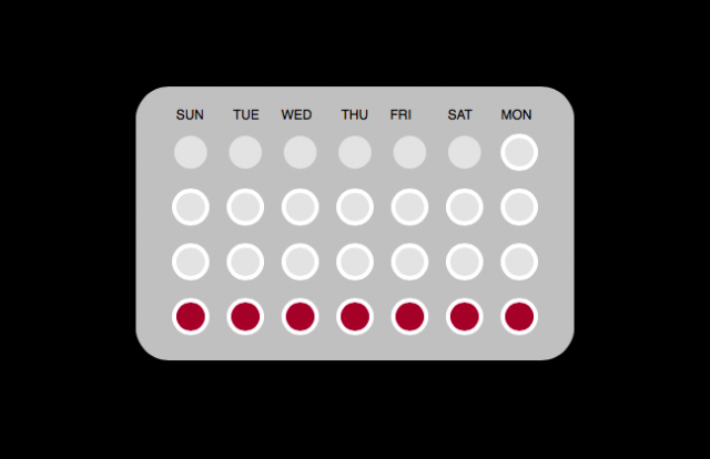
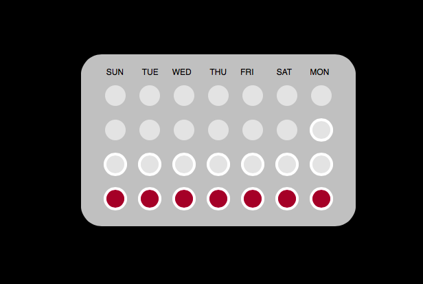
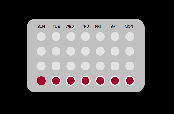
For this clock assignment I thought about different formats other than regular second minute hour that humans organize time (such as a calendar). I found that the menstruation cycle was applicable to this and in the form of birth control, relevant to many women's self care routine and everyday lives. There are multiple apps out there to help women track their cycles (whether on birth control or not) and remind them to take birth control everyday. Usually these apps are displayed in a circular format. Other physical birth control packets are rectangular and structured in 4 lines for the 4 weeks of the cycle. I decided to go with this approach because it was taking from the physical world format of menstrual cycle tracking but different from any digital versions of this. I used for loops to create the configuration of rows and columns of ellipses to mimic how pills are placed, labeled the week days, and through for loops and time function was able to unhighlight the pills/days that have already gone by (also mimicking the real life/physical packed of the pill being popped out of the packet).

https://editor.p5js.org/wolf.arden/sketches/74UcXsjQ0

gray-Clock


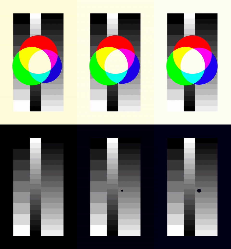
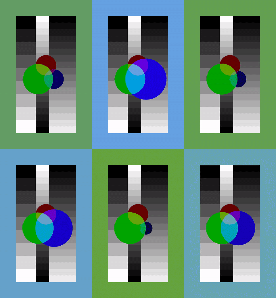
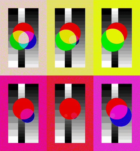
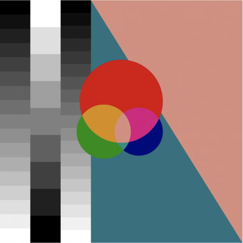
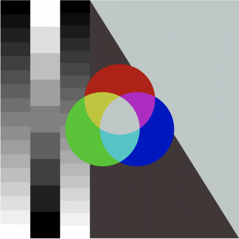
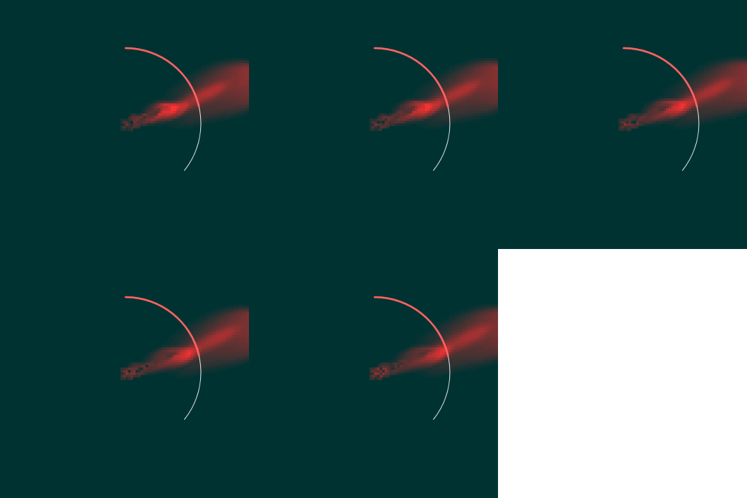
This is my clock, at 1x, 10x, and 100x speed.

processing link: https://editor.p5js.org/gray/sketches/wH8Vz6rR8

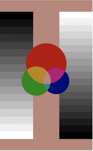
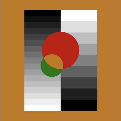
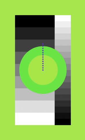
I'm pretty happy with my final product, although it's not very practical. The last few hours I spent working on it I tried to add practicality, and I was never happy with how it looked. In the end, I had to balance aesthetics with practicality, and I leaned more toward aesthetics. I think it's enough to show a new way of measuring time and have people ponder that, without actually making it a very useful clock. That said, it does encode the time. The hours (0-24) are encoded as red (0-255), the minutes are encoded as green, and the seconds as blue. The color in the background, and where the 3 circles all overlap, is that color. The size of each circle also corresponds directly with the hours, minutes and seconds, as does the color of each circle individually. The background displays the month, year, and day in left-to-right order. I put the year in the middle because the middle line is often mostly obscured, and I figured most people know what the year is anyway.

Initially, I just wanted to swap time with some other dimension and see how it would look. I thought I would encode time as the width or height of the image in a slitscan style, but I've already done a couple projects like that, and I didn't want to repeat myself, so I thought I would use color as the time axis somehow. There are definitely a lot of ways to do this, but I just thought I would do the simplest one I could think of and use hours for red, minutes for green, and seconds for blue. A lot of people have done this before, such as Jaco Pacolo in his Color Clock: http://www.jacopocolo.com/hexclock

The hex clock doesn't cover all possible colors, but other than that it's basically the same idea, so I wanted to make up for that by really thinking a lot about the design. I wanted to show each color individually so that you could at least get a sense for the time without needing the actual numbers, so I first thought of this sketch:

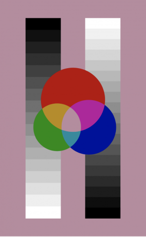
Or something similar, where there's bars in the background to show the seconds, minutes and hours. But I thought it was kind of boring, so I thought of the three circles. I wanted it to kind of look like a color study. This was the second iteration:

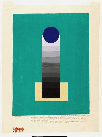
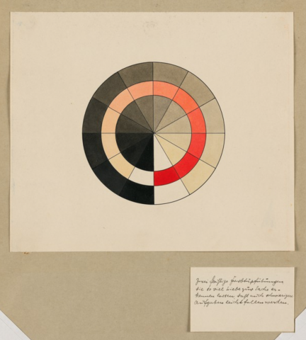
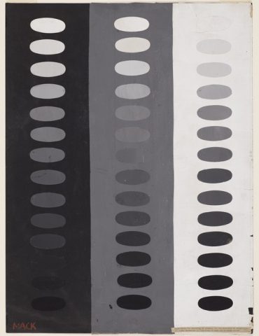
I was pretty inspired by these Bauhaus color studies I had seen before:

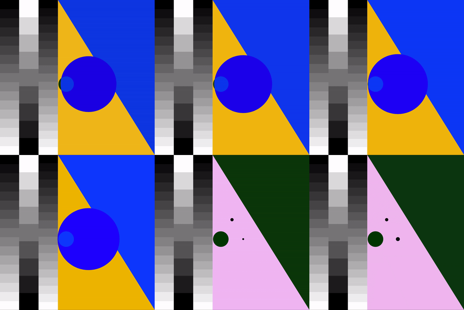
I liked the complementary colors in the background, but they didn't really serve a purpose for the clock which I didn't like. It also felt a little cluttered, so I changed it to the third version, which I made a lot of different tiny changes on.

I kind of got really caught up in the details. The only thing I wish is that the clock was more functional, which I might work on in the future. Also looking at the top pictures above, I kind of think it looked better when the black bars were separated. I'll probably keep adjusting it.

szh-clock

Menstrual Clock. /  Code

The circle represents the actual period cycle.

Whereas the red arc of the circle represents the time actually bleeding. In this case, the program takes the average, 28 day cycle with 6 days of bleeding.

I think an interesting/practical place for my clock to live is on the landing page of a period tracker app. It can live in the background as the user checks through their calendar / expected periods. Information wise, it may not as accurate as say, a table chart, but I think the visual representation can be a nice touch to the app.

In the future, I would like the day that the period starts and the length of bleeding + period cycle to be dependent on the actual user, and take data from previous cycles.

Process

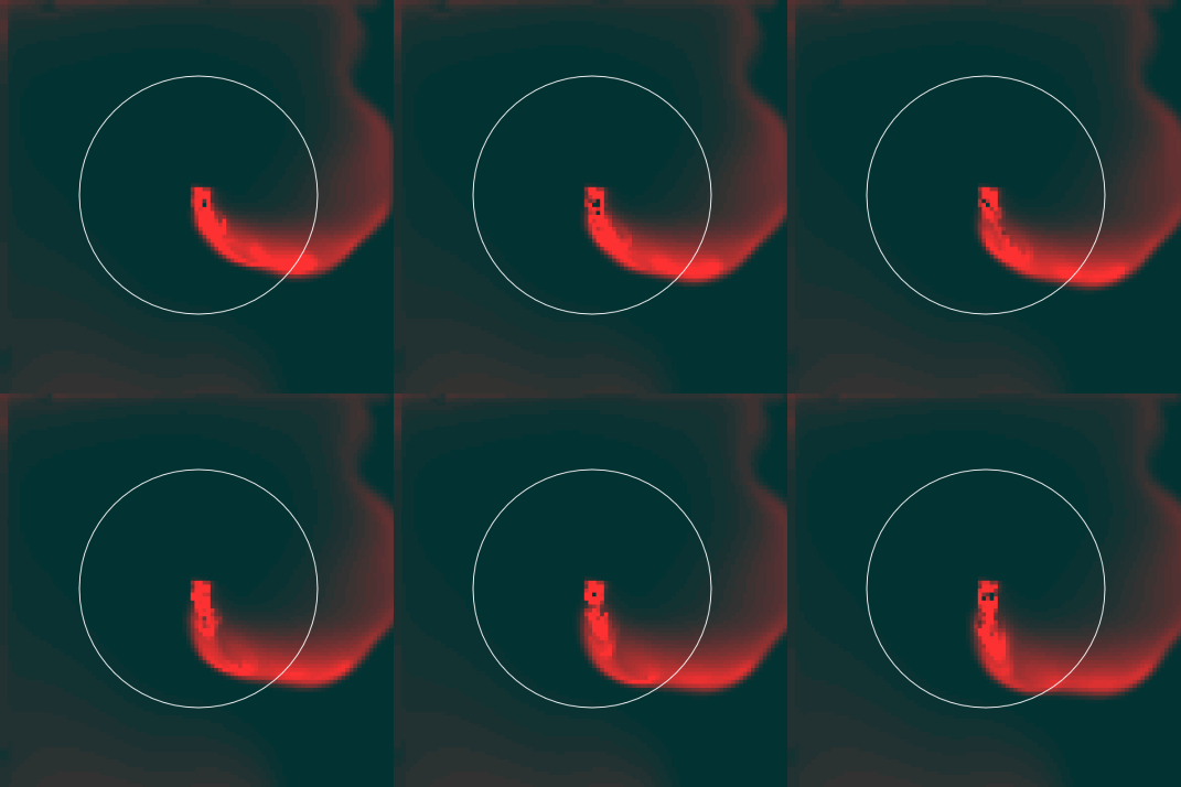
I originally intended this clock to be used over the course of days, and the fluid simulates the actual flow of a period (color getting darker on the last couple days, starting off little and peaking on day two, then gradually decreasing). The amount of fluid (density, instead of area), that is being added was intended to be close to a bell curve and I tried using an easing function to simulate this, but my results don't have a drastic change towards the density of the fluid.

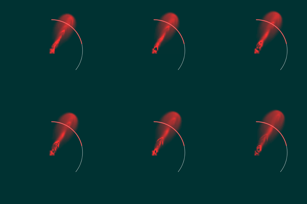
As I got my fluid simulation to work, I realized that visually, it works best at a second time step than a day one, hour one, or even minute:


(You can see there are hardly any difference between day vs hour vs minute.)

Therefore, I decided to make the fluid simulation based on the seconds passing, rather than any other time factor (since the density of fluid added wasn't working as well as I hoped anyways, which was also supposed to be set at a day-scale).

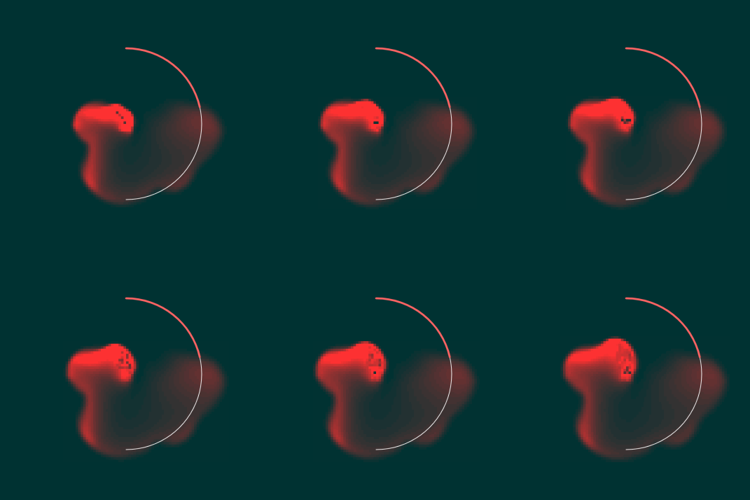
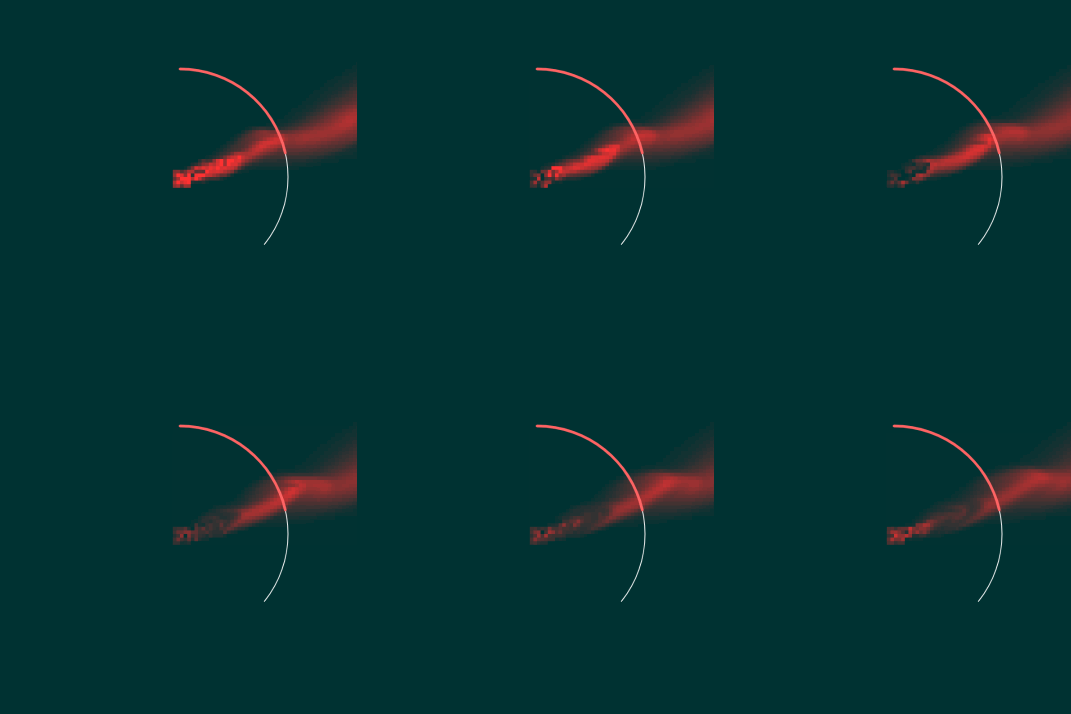
Changing between days:

As you can see, the line increases, but because the bleeding period is over, the arc is white.


sovid – Clock

Sketch can be found here.

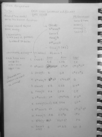
For this assignment I was interested in combining music theory and time to create a clock. I started by identifying twelve chords that I found beautiful or interesting, and then divided up their notes into bass, alto, and soprano. After I recorded these notes on my flute, I loaded each note file into P5 and had each chord play on a specific hour, with the seconds playing a different note in that chord with each tick. I liked the ideas in lecture about approximating time; in theory, someone with incredible perfect pitch would be able to tell what hour it is just by listening to the bass note of the chord of my clock. I also really enjoyed the idea of a time garden, so the flowers seen "floating" on the water are in fact pressed flowers that would be planted in that garden. Of course, there is so much to improve on. Working with sound in P5 turned out to be a huge pain and I spent most of my time figuring that out - looking at my finished project I wished I spent more time on the visual side of things. To make matters worse, when I combined my two files with the sound code and the flower simulation code, the program's visuals run extremely slowly.

Because my clock mostly relies on sound, I've attached a video rather than a gif. The video shows my clock at 4PM, noon, and 3AM.

Sketchbook notes:

lubar-clock

Link to Program !

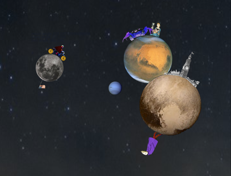
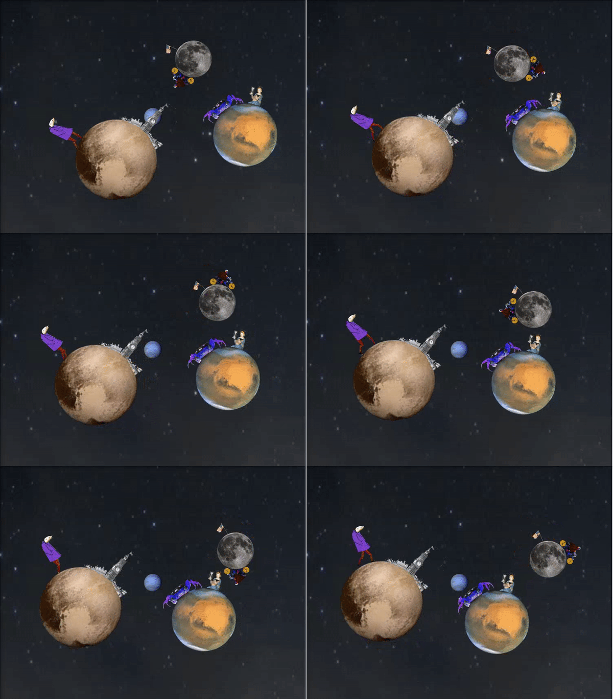
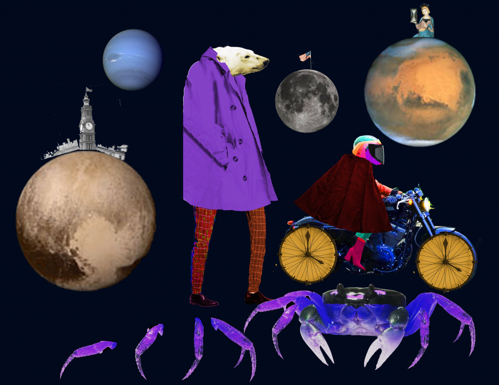
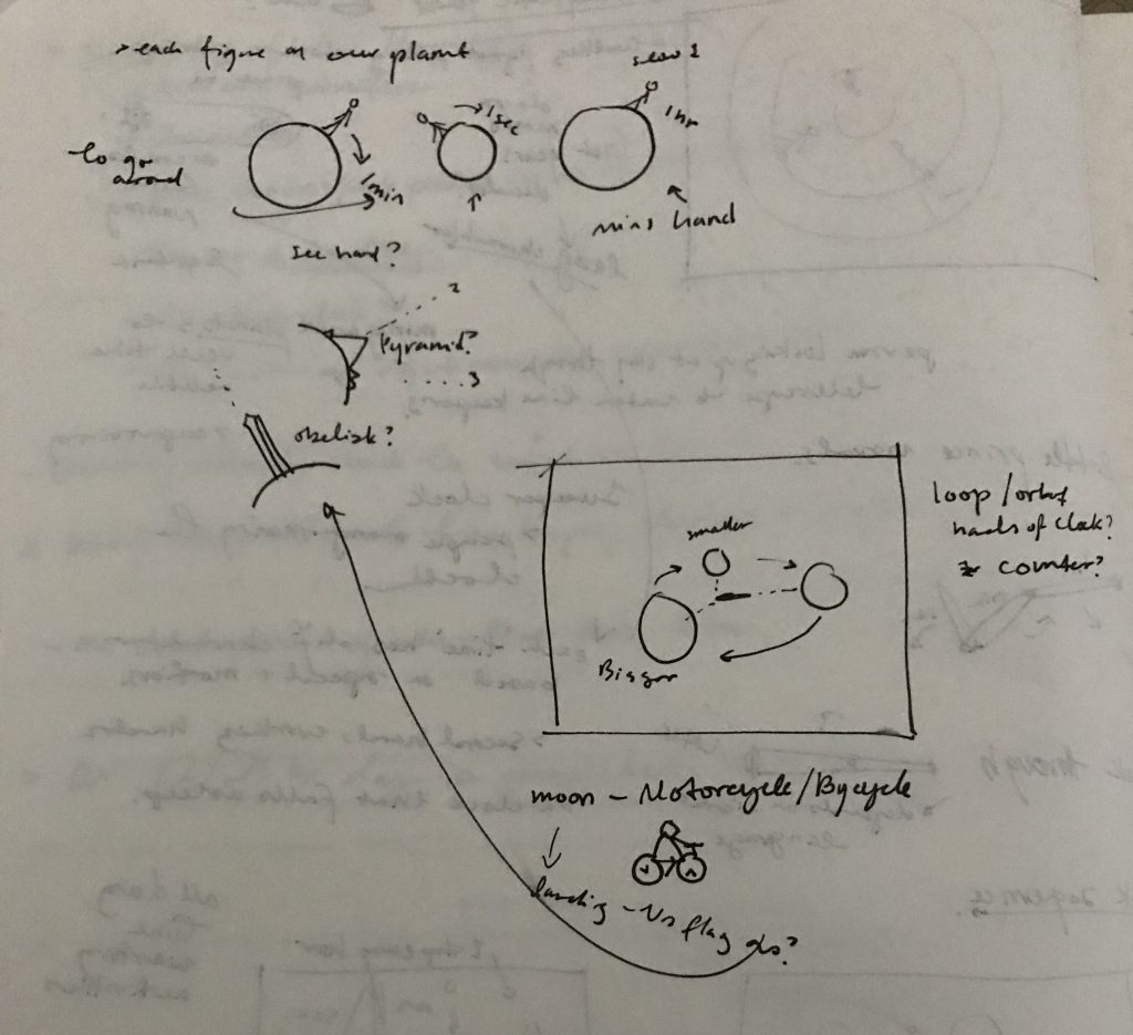
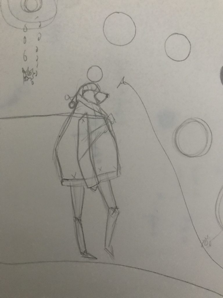
For this piece I was particularity interested in how we have formed our entire system and concept of time on a series of, what appears in many ways to be, random and coincidental relationships of cycles in the universe. I'd like to imagine that there could be a space in which the system of time is determined by the rhythm of a polar bears walk, a crab's waving, or the speed of a motorcycle. All entirely random things on random planets. In this case however, I did still want to create a readable, if not somewhat ambiguous, and I really wanted the feel of cycling cycles to be visualized. The polar bear and crab's feet pace on a rhythm of seconds, and they move across their prospective planets with speeds based on the 12 hour, 60 minute etc, clock.
I had a lot of fun creating the characters and was inspired by the intro sequence to Good Omens, created by Peter Anderson Studio, for the cacophony collage feel. Overall I am happy with how the piece turned out, although there are still changes that I would like to make, that I did not get around to getting to work (primarily with the order of layering to get the planets to appear to be moving in in the z axis seamlessly). I was initially working with the composition in a 3d space, however was unable to keep the transparent edges of the imported images from overlapping and covering pieces of the other images. Another element that I am happy with is the process of actually planning out my program ahead of time, to significantly minimize on problems that come up because of decisions not thought out in the beginning of the process.

tli-Clock

https://my-time-with-you.glitch.me/

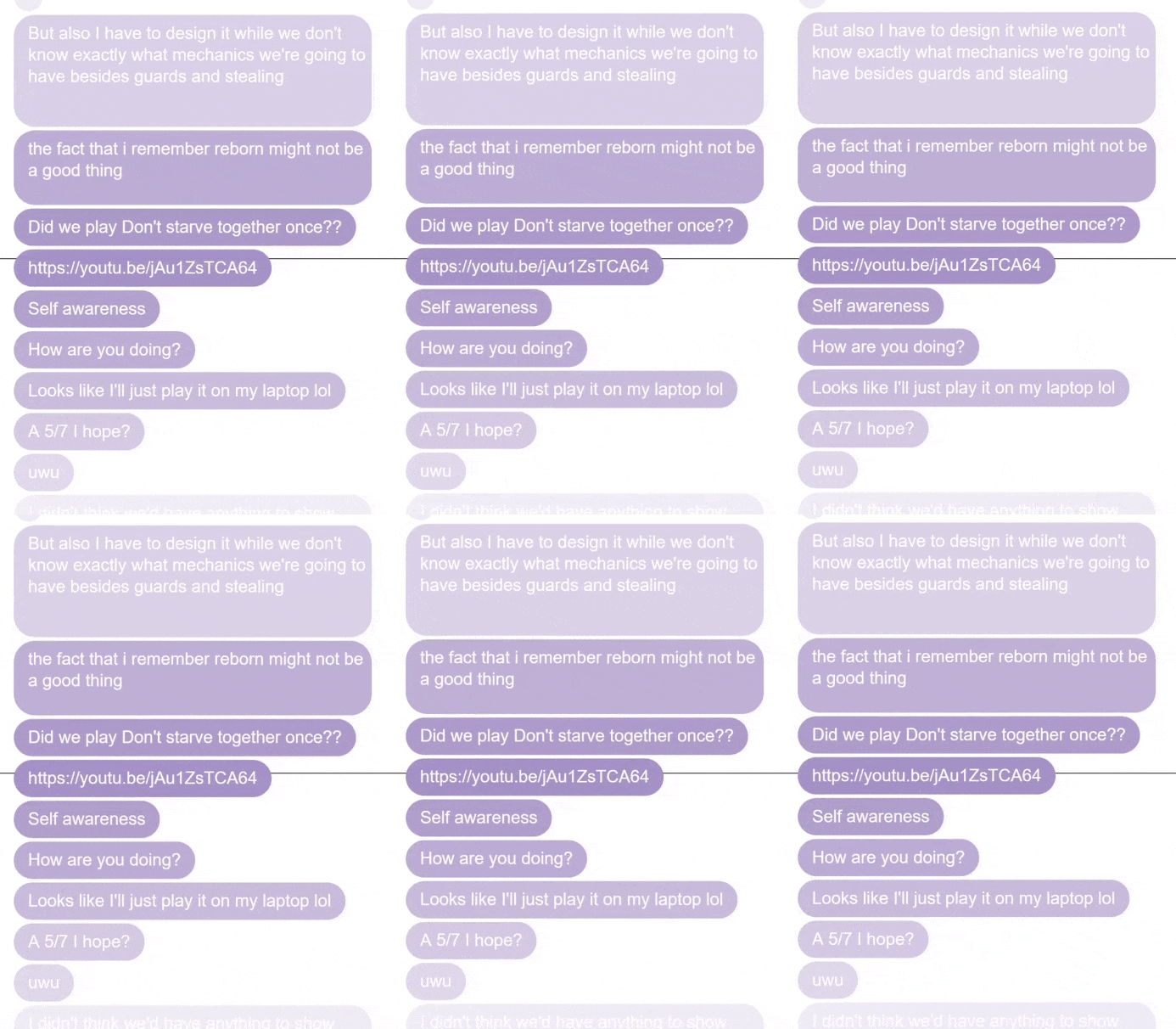
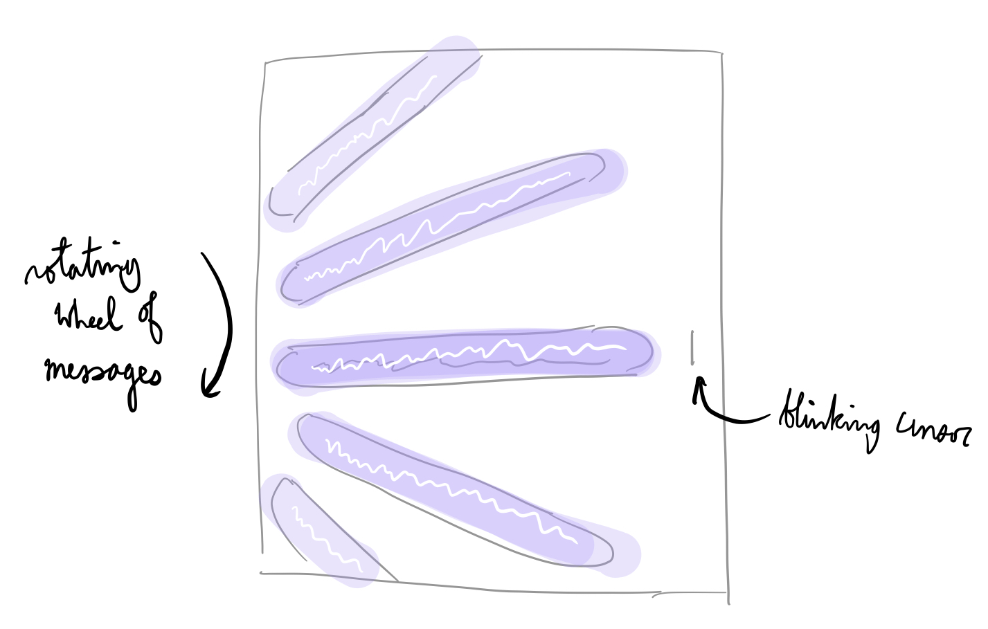
This clock is a rather personal one. I took every message I sent to this individual, mapped it to a time of day, and presented it in a cyclical loop--a clock of my interactions with this individual. I explore the thought that my moods and my interactions with other people are cyclical, and I take it to a personal extreme by presenting my messages as a clock. What does it mean to be stuck in an emotional cycle with another person? I was seeking some closure by creating this, but I am not sure I achieved that.

I downloaded a JSON of all my messages to this person from Facebook, parsed it within Glitch, and served the most relevant messages to any client who connects to the web page in the form of a clock. The sizes of the text box as well as the minute rollover are jank, but I think this prototype delivers the concept well enough.

9/19/2019 Addendum

In a future, I think it would be interesting if I made this a web service that allows users to upload their chat histories. I had a discussion with jackalope about highly personal art and whether they're interesting. While we strongly disagree on whether personal art is interesting as art, I think we both agree that personal art is interesting to the person in question. So maybe a next step will be opening this experience up to other people.

I went back and fixed the rollover issues, the colors of the message boxes, and added a black line to indicate the passage of the minute. I recorded additional GIFs:

zapra – clock


View code

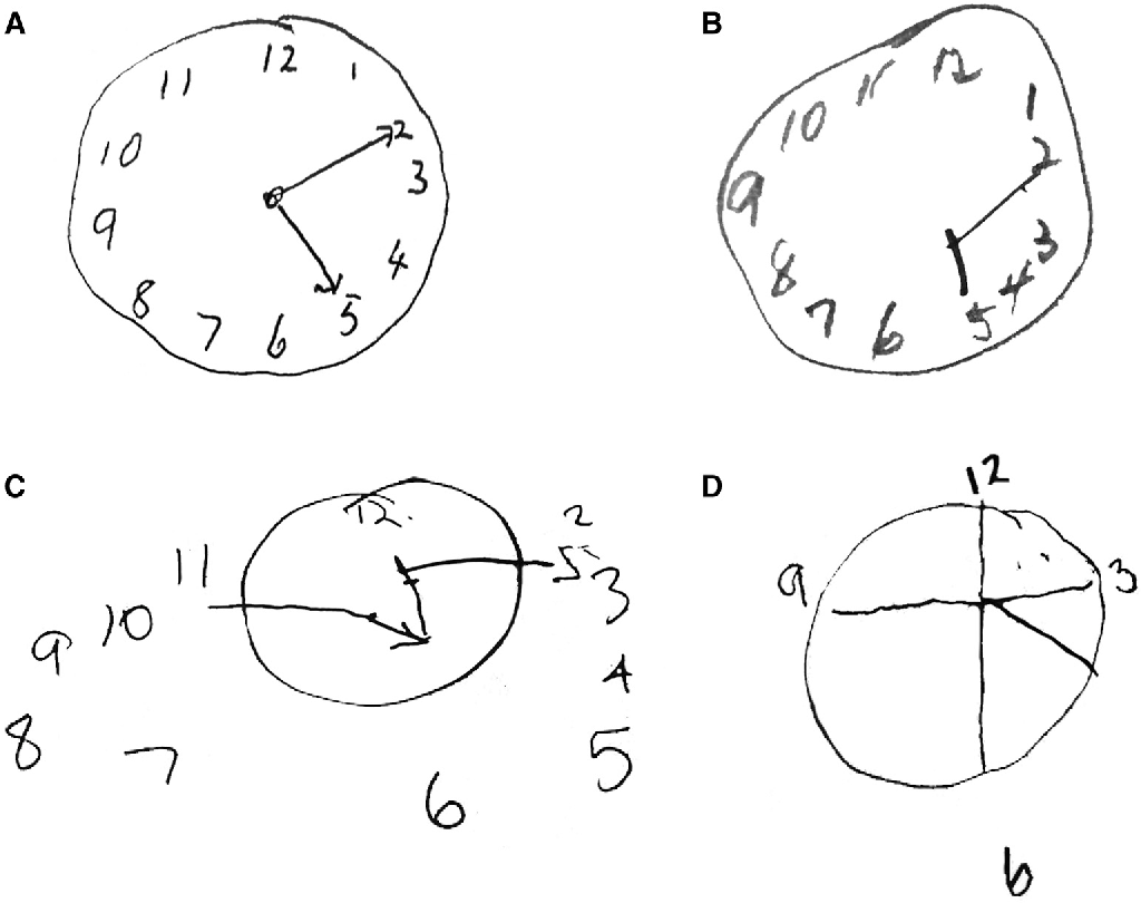
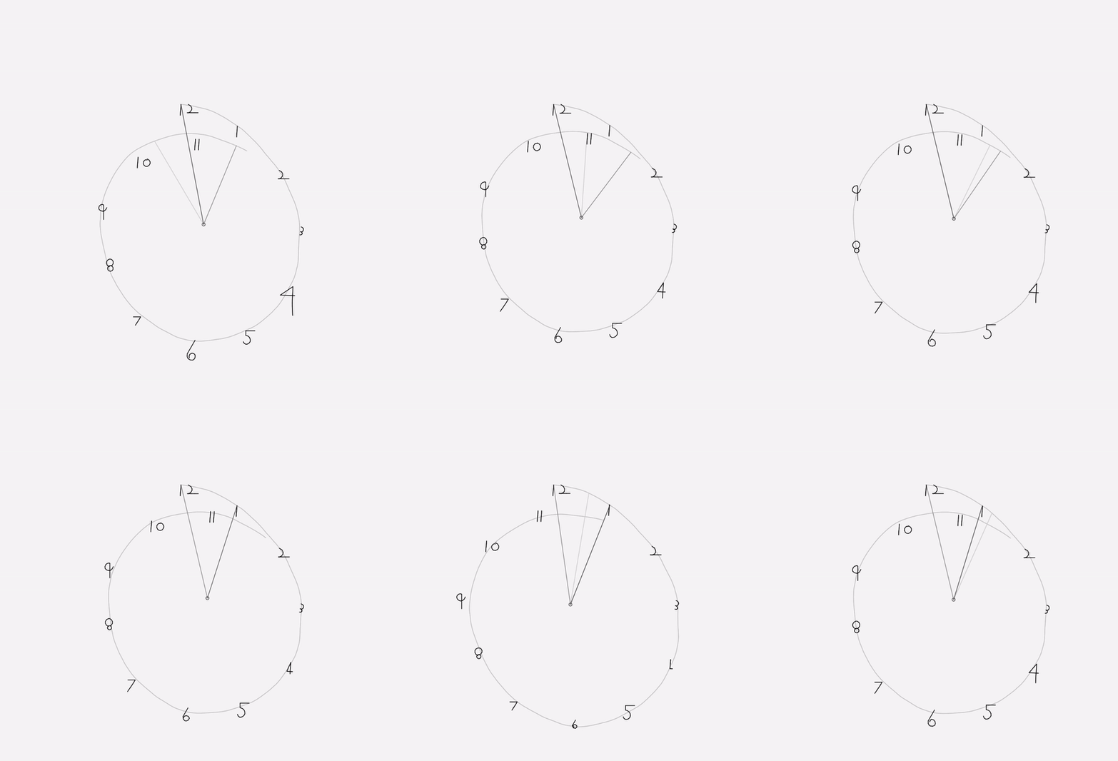
I think I really might have focused on the wrong aspect of this project. After exploring a handful of ideas, I remembered the discussion about "perceived" time and remembered a clock drawing test that's common in medical screenings. The exercise is often used to visualize cognitive impairments such as aphasia, left neglect, etc. While the basis of my idea was to animate these drawings by having the numbers and hands move irregularly in a non-circular pattern, I got sick yesterday and now have a much less clean and much less functioning version of everything I had planned. I think I spent too much time trying to get the visual elements to look right, and I didn't dedicate enough time to the actual, functioning timekeeping. I feel frustrated that I spent so long trying to get the numbers to look right that I don't I actually achieved my concept.

clock drawing test


vikz-Clock

12:00
6:00
Time is not shown because angle does not pass through the actual time angle

https://editor.p5js.org/vikz/sketches/SOEcKQUJg 

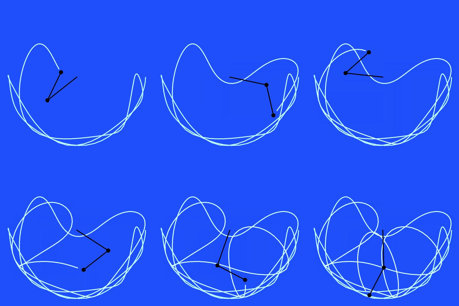
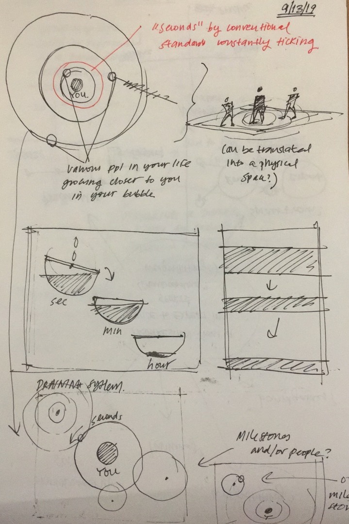
Initially, I had a large range of ideas that I wanted to portray in my clock - my "word bank" of ideas that I had included: time as something relative and personal, time as a "regulated" and measurable amount, linear vs non-linear forms of time, time as an accumulation of information/stories/ideas, and the juxtaposition of a personal journey of time with a societal construction of time. This led me to the idea of utilizing pendulums to represent the relativity of time to oneself in the various roles that one had in their lives, in juxtaposition to a "societal" construct of time (aka our 24 hour day). In this original idea, I had envisioned the center of a double pendulum "true you", the first mass stemming from the center your "role", and the second mass at the end of both pendulums as the "external factor". For example, my center would be "true Vicky", my first mass would be "sister", and my second mass would be "Allen" (my brother.) Another example would be "design student" as my first mass, and "Carnegie Mellon University: School of Design" as my second mass. Then, using my relatively perception of how I believed I was progressing or "moving", as an individual in that role, would influence how "crazily" that pendulum spun. The several "roles" I play in my life, however, would be juxtaposed with "societal time" as a pendulum that would move based on a 24 hour clock. I struggled a great deal and spent a large amount of time trying to figure out a class system of pendulums that would move at different accelerations, but managed to figure it out.

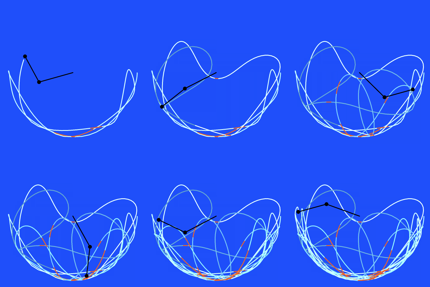
However, in the end, I decided to scrap the idea of having multiple random pendulums move at seemingly arbitrary hours, and instead opted for (to Golan's great recommendation), of having my double pendulums bounce randomly, but have it tell glimpses of real time if the first angle of the double pendulum pass by the correct "angle" at which that time were to be. When it does so, the pendulum highlights a bright orange, and marks the path a bright orange as well. For the rest of its journey, however, the pendulum path just follows a gradient of light blue to dark blue, on a loop of 60 seconds, to indicate when a minute has passed.

There was a great struggle in finding a way to have my clock tell the correct time, and I ended up having to manipulate my time so that the time I obtain from it (say 12:00), is rewritten as a different time (6:00), so that it correctly is displayed, because for some reason, my clock is mapped off. Additionally, the first angle in which it drops greatly varies the path that it follows, which is something that I would like to fix, as it hardly ever(?) goes to 12:00 when the first angle starts at PI/2, however, when set to PI, it swings rapidly and eventually skyrockets off into a lunatic acceleration.