Category Archives: looking-outwards

mileshiroo

05 Feb 2015

Parag K Mital – Simpsons vs. Family Guy

Screen Shot 2015-02-05 at 8.26.30 AM

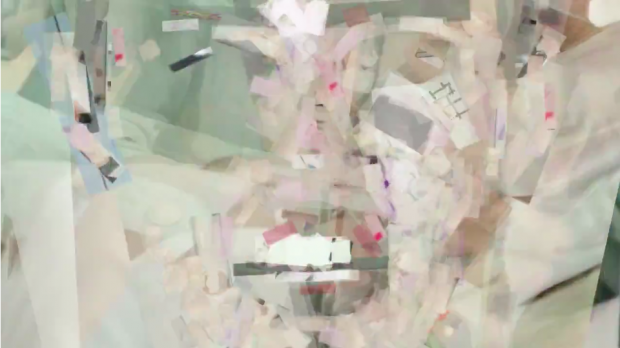
Mital’s video “Simpsons vs. Family Guy” is a generative reconstruction of the Simpson’s intro using objects segmented from the intro to the show Family Guy. Objects from the family guy intro are stored in a database, and matched to ones in the Simpsons intro. The video shows the original intro beside the resulting mosaic resynthesis. This piece is a part of a series of similar resynthesis videos, with titles like “Michael Jackson’s Beat it w/ Resynthesized Audio using Chris Watson” and “Concatenative Audio Synthesis of “Das Racist – Michael Jackson” using Michael Jackson album Thriller. These videos are interesting because they give the original content new, often contradictory meaning, by altering the material rather than narrative structure of the original. It seems like this kind of semiotic playfulness is lacking in a lot of generative art. I don’t think it’s necessary to show the original and the reconstructed video side by side, and Mital’s later videos forgo this presentation style. The video was made with OpenCV and openFrameworks.


Parag K Mital – Miley Cyrus – Wrecking Ball (YouTube Smash Up)

Screen Shot 2015-02-05 at 8.25.57 AM

In this video, Mital reconstructs “Miley Cyrus – Wrecking Ball” (the #1 video on YouTube, at the time) using the audio and video material from YouTube’s top #2 – 10 videos. This video seems more technically sophisticated than “Simpson’s vs. Family Guy”, although Mital doesn’t include technical details in the video description. This video, along with Mital’s other YouTube reconstructions, considers the material and semiotic qualities of videos. They transmute banal, pop culture into something much surreal and intangible. Mital’s process for these SmashUp videos is strictly appropriative, and adheres to a strict scheme –– that he will synthesize the #1 video using material from #2-10 videos. Inexplicably, these videos have a handmade, rough quality to them, and they remind me of handwoven quilts or Dada collage. I think these reconstruction videos could become a whole genre, so it would be helpful if Mital included more information about his process so others could get started.

Matthew Kellogg – Looking Outwards – 4

Generative Machines

Created by Michael Chang, Generative Machines creates procedural machines blow out diagrams that self assemble. It is an impressive piece of work for me because the machines always look incredibly intricate and technical. The smooth animations which interact with the mouse movements or animate through a set of views are well done. All of the pieces fall into each other and assemble. It is however noticable that the pieces used are only meant to look technical, as they don’t make sense for real machines. This is especially true of the springy-looking bands. I would have liked to see this project done with a wider variety of parts based on existing machinery. This evokes a certain sense of irony in that it generates machines which are meant to look mechanic whereas any normal blow out drawing with similar looks would be describing a machine built to serve a purpose with some utilitarian purpose. This reminds me of background gadgets in SciFi themed media. Designers make objects which look “futury” that could possibly serve a purpose, but viewers have no idea what they may be, they just accept it as part of the aesthetic. This project is similar in that it makes modern looking gadgets which look like they might have a purpose, but clearly do not.

To view it in a browser, see it here Generative Machines

Supernova

Supernova is an iPad app created by Glenn Marshall in 2010. I was particularly interested in it because I couldn’t figure out how he made the misty galaxy effect. I would like to say that he is using a stock alpha particle and drawing it with an additive blend mode to the scene, but I couldn’t figure out the shape of the particle, leaving me to revert to just staring at the imagery created by the app. The colors and shapes are similar to pictures from the Hubble telescope, but the animation is something different. It is smooth and creates a mesmerizing pattern.

EDIT: After staring a while longer I believe that the scene may have been created based on zooming, rotating, moving, colorizing, and overlaying several source images from the Hubble telescope over each other. Along with this some solid white particles may have been used to create a diverse set of differently moving stars. This would explains why such an advanced simulation was capable on an iPad five years ago. It also explains why none of the space dust flowed or changed shape. Nonetheless, it is a good looking project accomplished in an interesting way.

John Choi

05 Feb 2015

It looks like I accidentally got the topics switched from the Looking Outwards #2 and #4.  (I found two projects on Generativity for Looking Outwards #2).

So instead, I’ll describe two projects on Information Visualization that I find interesting:

Wall of War, by Dylan Halpern (2010)

From information sourced from WikiLeaks, this project shows all the recorded happenings in Afghanistan and Iraq since the United States has put a military presence in the areas.  Small icons are placed side by side from left to right by day and up and down by month, and there is a picture associated with every kind of event:  an airplane for an air mission, handcuffs for detainee operations, picket signs for protests, et cetera.  With over 463,000 recorded events, there truly are a lot of symbols, completely covering walls spanning an entire room.  It really makes me think of Egyptian hieroglyphics covering burial chambers for pharaohs, with the user walking around in awe of the recorded history.  This really impresses me further because this is a student project who had the initiative to launch a successful Kickstarter project to gain the funds he needed to make this project a reality.  If this project was to be preserved for thousands of years, I wonder whether future generations would be able to dig this up and decipher the history of this conflict.

Link: https://www.kickstarter.com/projects/204448405/wall-of-war-a-massive-data-visualization-art-insta

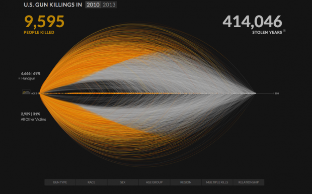
US Gun Killings in 2010 | 2013,  by Periscopic (2014)
periscopic
This is a infographic detailing all the recorded gun deaths in the United States during the years 2010 and 2013.  Every individual arc represents a single life, where the orange parts show the time of life actually lived before being halted by a firearm, and the grey parts show the length of life that could have been lived.  In addition, this project goes into further detail by allowing the user to set parameters on the circumstances of the death, such as firearm type, age, race, and gender of the victim.  This project demonstrates a powerful message about the level of gun violence that continues to exist in the United States.  I think the strongest aspects of this piece are the numbers on the top left and right corners being transposed with the curves – it may be hard to grasp the sheer magnitude of the death count as a flat number, but the density of the curves shows it all.

Link: http://guns.periscopic.com/?year=2013


Sylvia Kosowski

05 Feb 2015

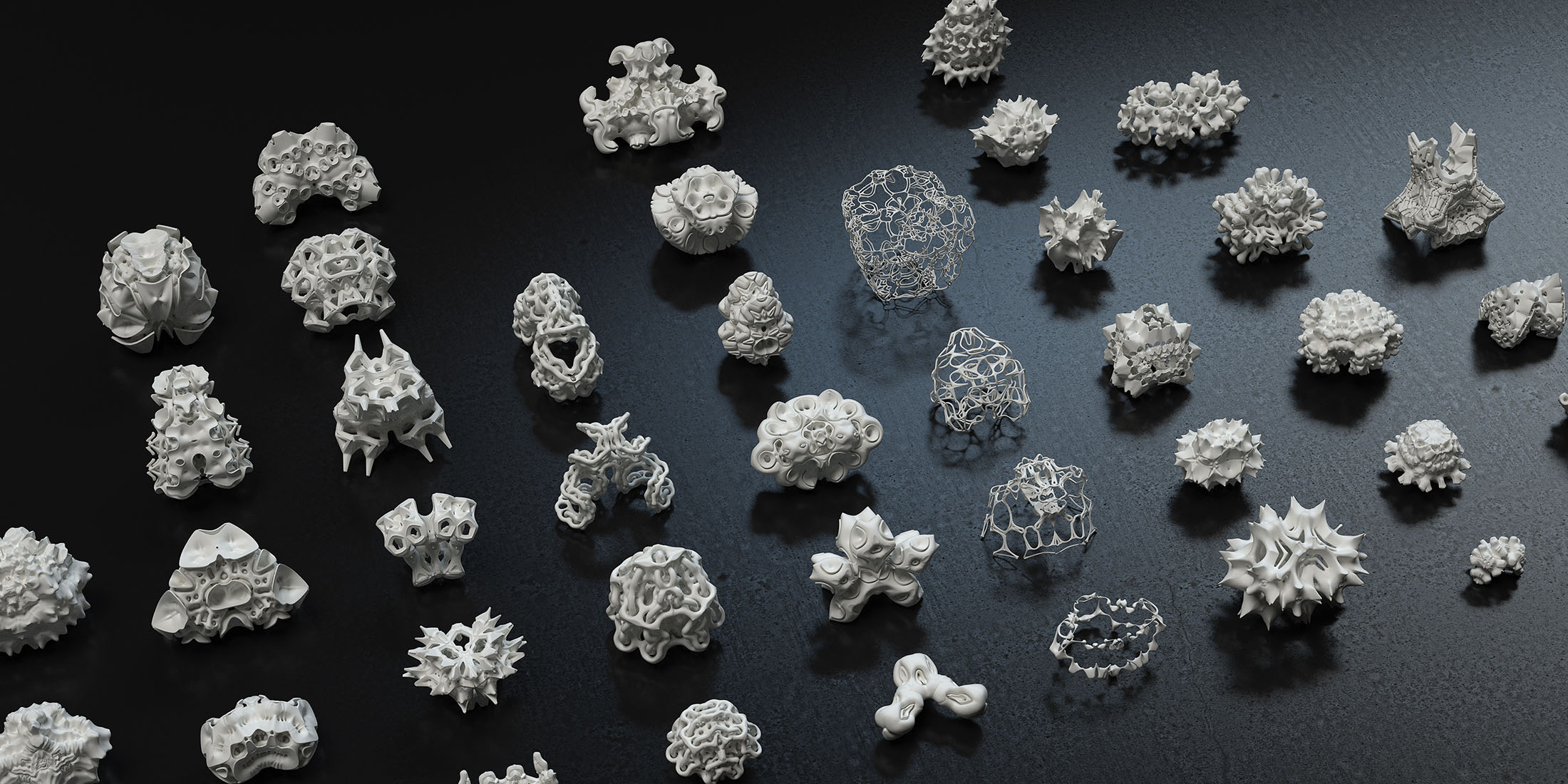
Simp – Symm

https://www.creativeapplications.net/objects/simpsymm-complex-procedural-geometry-for-3d-printing/

Simp – Symm is a procedural modeling algorithm which enables the user to create extremely complex symmetrical geometric shapes from more simple geometric shapes. The simpler geometry is copied many times and reflected/rotated/positioned/etc using procedural generation to create complex shapes. What inspires me most about this project are the 3D printed end results. I love how they look because they look so delicate and precious. To me they seem like almost nostalgic artifacts from a lost age, things that, if there were some huge apocalypse on the earth, would remain when all humans were gone, as delicate reminders of the complexity that humanity tried to accomplish before its downfall. On a less poetic note, by watching the video I really liked how their interface for doing the procedural generations looked. It wasn’t bloated with uncountable confusing features like Maya. Instead the interface was very visual and simple and it looked like anyone would be able to pick it up. I think the project could have been more effective if you could mix and match several small parts to create the finished object, rather than just having the one key simple geometry which is repeated throughout. This could result in the creation of even more complex miniature structures.

FIELD – Interim Camp / MUSE

http://www.generatorx.no/20101130/abstrakt-abstrakt-field-interim-camp-muse/#more-668

Interim Camp and MUSE are generative worlds which are procedurally created. The camera’s motion and the motion of the terrain is also computationally generated during the experience. I particularly like MUSE (the one which I embedded the video for). I love how surreal and abstract it is, like a journey into a forgotten dream or a rift between the fabrics of time and space. It has a mesmerizing visual quality that teeters between the idea of a world to explore and an abstraction of color to appreciate. There’s something about the idea of a computer generating this almost organic, fluid dreamspace which really appeals to me. I’m a bit disappointed that these are only short films however, from what I can gather from the article. I would appreciate them even more if they were completely interactive experiences which you could immerse yourself in for however long you wanted. I really want to be able to explore these surreal worlds myself, rather than just viewing them from the outside.

ST

05 Feb 2015

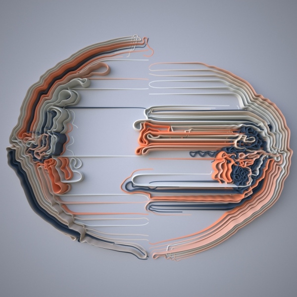
Meanders
by Giuseppe Randazzo

LO4-2

Meanders is a series of sculptural works created for fabrication in Processing. Each agent is given an initial position and a velocity. Each particle’s path is recorded, these are the lines seen in the sculpture. The paths loop around each other, and sometimes cut through one another.

Once the program had finished running, Randazzo exported the paths to be printed. The result is a physical work, which is one part of it that I really enjoy. I also appreciate the level of design that went into the project including material and color choice. Overall, the result is mostly a formal study. The work is tagged as a personal project, it doesn’t seem to have a contextual practice element.

I can imagine that having the agents being initialized by some external data points could lead to some interesting results. A strange new kind of graph.


Digital Grotesque
by Michael Hansmeyer and Benjamin Dillenburger

LO4


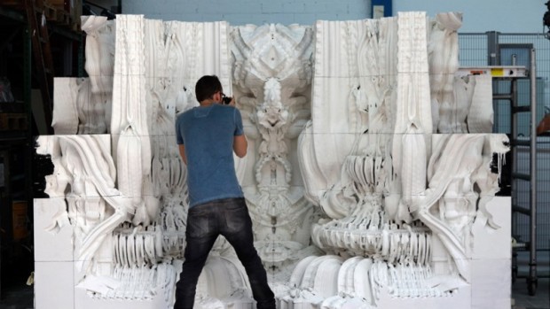
For Digital Grotesque, the artists used generative programming to invent a new space, which exists in the physical world. Similar to Meanders, a program was used to create a model which was then 3D printed in sandstone. The program outlined a procedure (inspired by cell division) that begins with a simple cube and ends up carving out architectural details down to the millimeter.

This project is even more interesting to me than the previous one in this blog post. Even though the process was very similar, these artists are working with complex ideas, beyond formalism.

For me, it seems like generative art contains complex ideas regardless of the artist’s intentions. To have an algorithm generate something that is aesthetically pleasing to the human eye… really complicates the role of an artist. And I think we can really see this shift of the artists’ role when comparing contemporary work to all preceding artistic movements.

This shift is highlighted in this Digital Grotesque project. Here, the computer has not only rendered or printed something beautiful, but has actually generated a real space. How complicated.