Category Archives: looking-outwards

Alex Sciuto

11 Feb 2015

I focused on projects made with Max MSP for this looking outwards. I had a hard time finding projects that used Max MSP in ways that appealed to me. A lot of projects seemed to be reducible to “audio frequency histogram in, weird wavy visuals out.” I did though find a few that I thought broke the mold and did some interesting stuff.

Richti-Areal05

Rotterdam Model / Richti-Areal Model

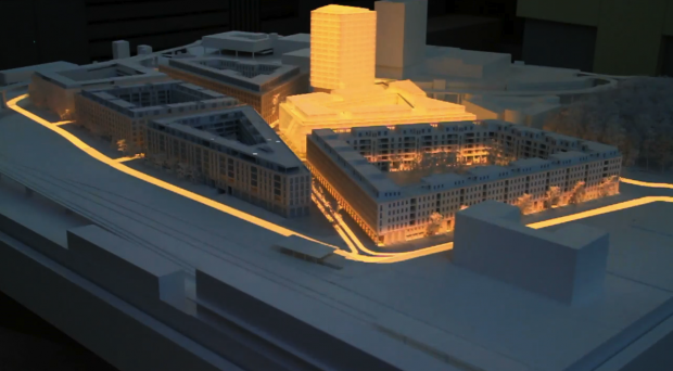
These are two separate project that use multiple projectors to provide an overlay of light to a 3d architectural model. I like the two together because the Rotterdam project uses this overlay for educational purposes. It’s situated in a museum telling about the history of the city. the Richti-Areal Model appears more aesthetic. The creators are trying to see how much liveliness and personality they can add to their model using just layers of light. I’m reminded of many tangible user interface projects by Hirosi Ishii when I see these projects.

Metal Mirror / Drawn Music

These are two projects that use Max MSP in relation to music, but they turn the standard relationship of sound in images out on its head. In both projects, Max MSP is used to translate unexpected movements and gestures into sound. In Metal Mirror, ambient industrial music is produced using magnets and sheet of metal. The sound of the metal and the magnets is complimented by computer generated noise. It’s a variation on the theremin, but I like it. Drawn Music takes colored drawings and translates them into music in real time. The results aren’t spectacular, but I like the mashup quality of the project. Again, it’s nice to see unconstrained gestures being used as input for an artistic system
Thomas Langerak

11 Feb 2015

For this Lookingoutwards assignment I have taken a look at the possibilities of mas MSP in combination with light. Artworks making using of lights and lasers have always been an interested to me and therefore I decided to look around in this area.


“Created by UVAVanishing Point employs perspective as both tool and visual outcome to reshape, redefine and represent a pristine space. Inspired by sketches of Great Masters like Leon Battista Alberti, Leonardo DaVinci or Albrecht Dürer, UVA sends lines into space from an arbitrary vanishing point, creating different volumes, divisions and rooms to be explored by the audience.”

In short VanishingPoint makes room and walls by using a laser from a vanishing point. Due to this they can created the illusion of being confined. I like also that they have sound that is not pre-recorded but is generated by the lasers ‘drawing’ those walls.

Created by COCOLAB from Mexico and commissioned by ARCACycles is an audio visual installation comprised of a series of laser projectors to visualise short cycle audio compositions by a collection of A/V artists including Julian Placencia – Disco Ruido (MX), Shiro Schwarz (MX), Eduardo Jiménez (MX), Tijs Ham (NL) and Sebastian Frisch (DE).

I just like the looks of this piece of art. It is a 6.5m diameter circle with 17 laserbeamers. I think it is beautiful how they react to the music and form nice shapes together and on their own. Though I still miss a bit of coherency it the design I really like what they tried to achieve.

dave

11 Feb 2015

SWEATSHOPPE created augmented reality video paintings on walls. I can see cool things being produced from this, but their documentation does not appeal to me. It gives off the impression that they are trying to be edgy, with people sucking popsicles in their videos and low framerates showing them running in the dark. I want more variations that shows off the different range of emotions this project is truly capable of evoking in people, and I want this to be more available to the masses for all kinds of people to interact with it. It reminded me of Camille Utterback’s Falling Words project, which also involves projections being affected by physical interactions. Her documentations are closer to what I want SWEATSHOPPE’s to be more like.


Saba Khalilnaji used supervised machine learning to teach a bot to play foosball. He documented his theory here. For the hardware, he used a PS3 Eye for the camera, and and Arduino for the moving parts. The complexity and ambition of the project amazes me. I am also interested in artificially behaving creatures, so watching the table play against the human really makes me happy. By having this, it is almost as if you have a friend to play foosball with :( There are of course technical limitations of the project, as he explained in his documentation, and the way the bot moves is too sporadic and random at times to tell if it is actually intelligent. It reminded me of the Street Fighter AIs that people wrote that learn from human players and can beat them. Nintendo’s Amiibos are also similar, learning from player’s play style and adapting it as their own.

mmontenegro

11 Feb 2015

Interactive Robotic Painting Machine

This robot is painting depending on what sound it hears. Depending the sound, the robot has to take a decision on what / how to paint. We can wee a very good combination of AI and the arts with this video because the robot is making decisions just as humans are in relation to what to draw. Sometimes when we draw, we take decision on what we see, experience etc; well this robot is doing the same by making them by what it hears. I think this is very interesting and worth exploring more to see how many other inputs you can give to the robot for it to have a bigger decision space.
It was done by Benjamin Grosser:
bengrosser.com
bengrosser.com/projects/interactive-robotic-painting-machine/

Simple Audio Reactive Se

I had never really looks for Max/MSP/jitter art, so I found this looking outward very educational.  I found “Simple Audio Reactive Set” very interesting because during the entire song, it introduced various geometric shapes. I really liked how it changed from abstract cubes, to lines , to spheres, to shapes etc. I would have liked it much more if it didn’t change SOO fast between shapes. I felt like I just got a glimpse of the new visualization, and then it was gone. I really could fully  appreciate it. I would have left each new visualization for a longer period of time. This way the transitions wouldn’t feel so drastic and sporadic. I also liked the use of color. I basically realized that the shapes were changing because the color would change as well. I really liked that extra pump it gave it. Everything was moving very fast, my eyes were a little overwhelmed. I didn’t quite feel it went with the music, so I was a little thrown off of why everything was changing so fast! And I think the main problem was the transitions, they were to drastic,m there was no smoothing between shapes, it was more like, boom, here you go a new thing!

pedro

11 Feb 2015

This week I spent some time thinking about the data visualization of building footprints. As I sketched the infoviz assignment I struggled with two concepts: ranking and micro-organism dispersion. In other words, a more objective classification of building and a a kind of visualization in which these footprints moves in a fluid, taking their out of their context and orientation.

Anyway, I decided not to look for generative/parametric stuff this week. Instead, I investigated some data visualization projects that combine some individual diagramming of the sample with an dynamic system of classification.

foodpoisoning

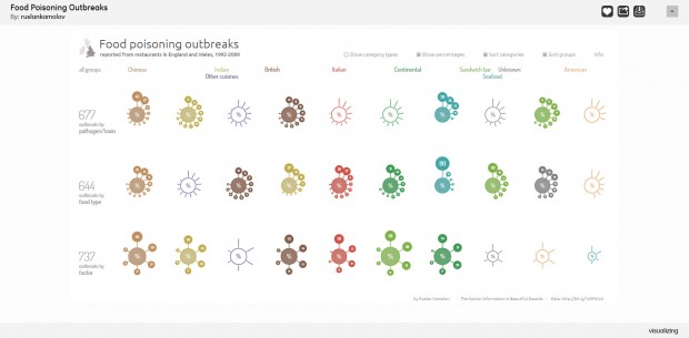
The first project is Food Poisoning Outbreaks (Ruslan Kamalov) that evaluates the food from restaurants in England. Each kind of food is represented as a centralized graph whose nodes grow or shrink to quantify some factor or classification related to intoxication. The interesting thing is the ability to customize the visualization of each graph maintaining the overall ranking from left to right.

world of terror

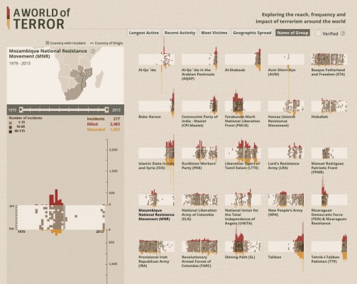
World of Terror (periscopic) explores the “reach, frequency and impact of terrorism around the world”. Each terrorist group is represented by a rectangle overlapped by bar charts, that associate the number of victims of attacks with the year, like a compressed time line of its impact on the world. Besides the internal information – that can be seen in detail in the left menu -, the rectangles are associated with a map and they can be classified dynamically according to topics.

I believe both projects are interesting and successful in dealing with these different “scales” of data visualization (object x ranking). However, World of Terror’s rectangles are a very stimulating way to synthesize and contrast the groups characteristics and at the same time to create identifiable objects in a ranking system.