Category Archives: LO-7

mileshiroo

26 Feb 2015

The syllabus for Paul Soulellis’ graduate course at RISD Experimental Publishing Studio is on NewHive for anyone to view. The topic of the course is the “circulation of work in a post-digital space”, and its central question is: is posting (always) publishing? Experimental Publishing Studio is organized in 6 sections: Substrate (nothingness), Versions, Dispersion, Transduction, Balconism, Manifesto. Included in the syllabus are links to readings, lectures and other content. The syllabus was met with both criticism and praise. One Twitter user said: “to publish course content on a commercial, unstable platform is not necessarily a choice for prosperity.” I think this is an excellent resource for anyone interested in experimental publishing. The Dispersion section is a good overview of contemporary net art.

Irony and Utopia: History of Computer Art was a course offered by Beau Sievers (currently a cognitive neuroscience PhD student at Dartmouth) in 2010 at the free New York based art school BHQFU. Like with Paul Soulellis’ course, the syllabus for this course is freely available on Beau Sievers’ personal website, with links to readings, videos and artworks. The course is a comprehensive overview of computer art history, and is organized by topics like Computer Music, Virtual Reality, amateur and sub-amateur, weak gestures, defaults and crowds. The Virtual Reality section is of particular interest to me. I might refer to this syllabus for my final project research.

This is unrelated but I just found some good Vine accounts:

Ryan Trecartin: https://vine.co/u/912316181317304320

K8 Hardy: https://vine.co/u/1164283982054060032
Matthew Kellogg-Looking Outwards 7

Memory of a Broken Dimension

In this project by XRA, the player explores and reveals a three dimensional world. I appreciate this piece because it drew me in with an interesting graphics effect based on glitch art. I am usually not interested in glitch art, but in this project I found that it was a very interesting effect for revealing a world which is then explored. I would definitely be interested in playing this game to see how the story unfolds.

for(){};

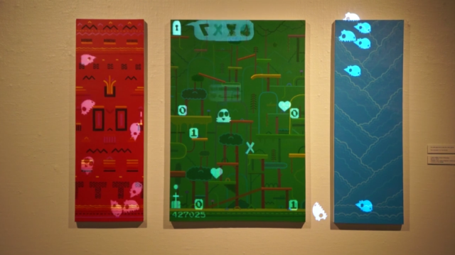
This project by Filip Visnjic projects a game onto a canvas in a gallery. It is a simplistic platform style game with no end game or aim for the player. It illustrates the mechanism of a game without the necessary elements for a game. I like it because it attempts to display a video game outside of where video games are normally found, on consoles, computers, and phones. The formal setting of the gallery for me contradicts the idea, look, and feel of a retro 8-bit style game. I also appreciate the levels being painted onto an actual canvas. I feel it adds to the juxtaposing effect of the game in the gallery by making it appear to be a simple piece whenever the projection isn’t there.

for02

sejalpopat

26 Feb 2015

I came across a few interesting papers related to editing photo and video, creating a painterly effect computationally, and applying specific styles or textures present in some source image to another image. I think I will be coming back to this paper for reference a lot, Algorithms for Rendering in Artistic StylesThe authors explain a huge range of approaches in a really easy to read style and explain many of these in detail with pseudocode. For example, one style they try to automatically apply to images given varying levels of information about the surface of the object in the image is hatching:


Other helpful papers I came across were Image and Video Based Painterly Animation and Video Textures. The latter paper describes video texture to be a medium “in between” video and photography because while it isn’t a static image it is meant to stream a “continuously infinitely varying stream of images”. I’m imagining an endless moving painting with smooth subtle variations in motion.


Ron

26 Feb 2015

City Symphonies

City Symphonies is a project that re-imagines what the sounds from vehicles could be as electric cars becomes more common and internal combustion engine cars are phased out. Many electric cars produce artificial engine sounds to make them sound like a gasoline-powered car, but this concept proposes sound generation that depends on a car’s relationship with other vehicles and the surrounding environment.  The simulation of the vehicle movement was performed with Processing, and MaxMSP was used to connect audio signals with each car. Sounds are emitted depending on proximity with other cars and pedestrians. Complex chords would be heard at denser intersections, and single notes would be heard in sparse traffic areas. This is an interesting idea that replaces the traditional honks and engine revs with a musical score unique to the place and time. The new sounds seem like something from outer space, and to me, they replace one type of cacophony with another. I don’t quite understand how the tone frequencies are chosen, though. Should there be another aspect instead of it solely based on proximity — like more aural harmony if traffic is flowing safely and more cacophony if an unsafe traffic condition begins to appear?

Angles Mirror

This 7 ft x 7 ft interactive triangular “mirror” creates an image based on linear rotation instead of reflected light, and uses a system involving motors, a video camera, a microcontroller, and software written in C++. The space surrounding the person is shown as horizontal lines, and the yellow arms pivot with various angles to produce a 3D image. It’s interesting to produce a “mirror” image using this method with arms that have a fixed hue/brightness instead of using reflection or color, and the resulting image changes based on the position of the viewer. Also, using these yellow arms as rotating pixels to form new shapes brings additional insight into what our eyes will interpret and process as an image.

pedro

25 Feb 2015

This week both projects are going to be related to the data visualization assignment.

grids

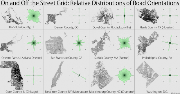
The first project is On and Off the Street Grid (Seth Kadish, 2014). The author is a data scientist an admirer of regular grids (specially when oriented towards cardinal directions) so basically It consists of the analysis and comparison of the orientation of the grid of different North American counties. After evaluating all the azimuth of the streets in the specified area he creates a diagram with their distribution using bins of 5 degrees.  For me the most interesting part of this project is this diagram and its capacity to filter the complexity of a feature of a grid into a very simple representation.

berlin

berlin

paris

paris

new york

new york

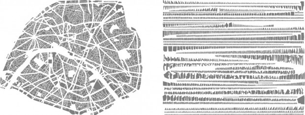
The second project is Anagrammes graphiques de plans de villes or Les Villes Rangees (Armelle Caron, 2005/2008). It also deals with maps, bit instead of the grid map, it considers its negative: the building blocks (or in the case of the countries, the land blocks). Firstly, building blocks are represented with only one colour, while grids, rivers or other elements are dissolved in a white background. Then, Canon deconstructs and decontextualizes the building parts with a very rigid system of classification. These parts are reorganized and clustered in a white rectangular plan similar to the original, based on their specific shapes and sizes. Their characteristics determine their position in series of rows. It is almost as if the geographic and urban maps gave place to a kit of parts, a military parade or a scientific classification. However, it is clear that the objective procedure is not used for the sake of curiosity (as in the first project) but to support an aesthetic statement: a mix of distance or even estrangement with the configuration and representation of our territory.