Category Archives: LO-6

Bryce Summers

20 Feb 2015

Introduction

While reading a stack overflow answer a couple of weeks ago, I came across a question that was asking about some particulars of the operation of elevators.

http://ux.stackexchange.com/questions/71855/why-do-elevator-doors-close

This post inspired me to start designing a computer game about elevators. I am planning on creating a computer game about operating elevators in a busy corporation with the goal of helping the corporation remain as productive as possible. I would like to place a special emphasis on practicing my design skills, particularly making the gameplay and user interface fun and user friendly.

Since this a looking outwards dedicated to capstone research, I have decided to share 2 examples of projects related to my planned one in some way shape or form.

 Elevator Saga

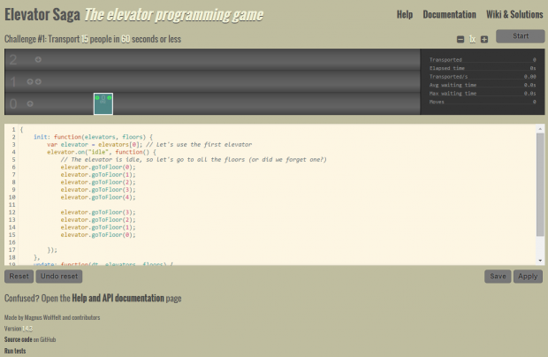
ElevatorSaga Web Interface

ElevatorSaga Web Interface

http://play.elevatorsaga.com/

Elevator Saga is a game for people like me. It is a game where you design an algorithm for operating an elevator to service a set of floors and people. The player designs the algorithm by writing code. While this game is not necessarily accessible and fun to those who do not know how to program or those who aren’t passionate about online algorithms and data structures, for the small set of people such as myself that enjoy this sort of thing, this game embodies the beauty of the logic needed to design a modern elevator system. This game embodies the fundamental reasons that cause me to be very excited about elevators. To make this game more fun, it would have to do away with the programmatic game play and allow the user to guide the state of the game through visual interactive input.

 Standard Internet Elevator Games

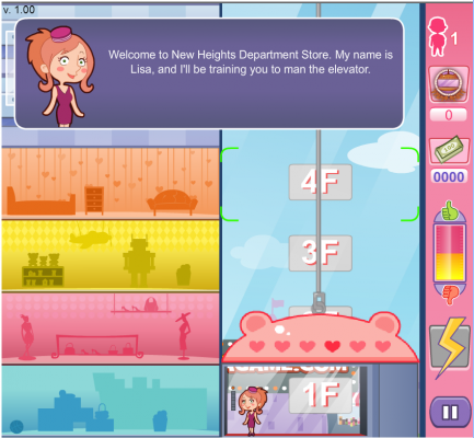
Representative Internet Elevator Game

Representative Internet Elevator Game

http://www.agame.com/game/elevator-rush

Over the years, I come across internet games based on elevators. Most of them involve 1 elevator that the player moves up and down to let people off and let people on. They all relate to the concept of providing a transportation service to passengers, but they usually differ in small game mechanical ways. These games will probably be very good places to look for gameplay ideas and prior game mechanical work. For the example game that I have listed here, it is on the opposite end of the spectrum of my gaming interest. Whereas the first example is completely syntactical and controlled, this one looks like it is too much on the “fun” side and is perhaps a bit too fluffy. I would like to find a way to synthesize the algorithmic intrigue of defining an elevator procedure with elements that can make the game appealing to a wider range of people.


amwatson

19 Feb 2015

Selective Memory Theatre is an installation that addresses the interaction between memory and perception.  It retrieves collections of Flickr images in and, in real time, distorts and decays an image until a “similar” image is retrieved and associated with the earlier “memory”.  Two screens, the “perception layer” and the “memory layer” depict the interaction between the senses and memory.

This project stood out to me, because I’m really interested in theatre that tries to depict the mind and explore the mechanics of perception, and it’s very cool to see someone using tech and real-time computation to create visualizations for the stage.  I think it defeats the purpose of “real-time” a bit to rely on manual tags to denote similarity rather than actually determining it computationally (otherwise, the machine really isn’t acting as a brain, it’s just sort of pretending to).  I’d like to see something like this, but with some clever processing to detect similar features in the existing dataset.

The artist explains that he was inspired by the “permanence” of digital memory, and that he wanted to instead model a more human notion of impermanent memory.  I’m reminded a lot of the Entropy programming language, which attacked the permanent nature of digital memory by permuting data every time it was touched.  The artist also has previous real-time visualizations he calls theatre.

Ethical Thinking is a set of “smart” devices (such as the fan displayed) that are intended to be directed by ethics, rather than user instruction.  Its settings guide what moral code it uses and, when determining how it should function, the device consults its memory, mathematics, and ultimately Mechanical Turk to determine what action is most ethical.

I really liked this project, because I think it explores a lot of really interesting questions about how to engineer differently, and the limitations of technology.  The way in which the project was built is as much, if not more, of an artistic exploration than the final output: as engineers, we are used to a couple base heuristics when we design.  Designing something with vastly different expectations and aims, something fundamentally more human, requires a unique and culturally significant departure from the way we traditionally think about machines.

With that in mind, I’d be interested in knowing more about what went into the design of the machine to make it “ethical”.  I want a better sense of why they chose their different sets of ethics, how an atheist should be expected to operate a fan differently from a hindu.  I’d also like to see the machine solve more interesting questions than the one the fan seems to.  Finally, I’m not convinced the fan in the video knows there are two bodies, where they are, and which one is fatter.  If not, I’d like to see it require less human interaction, and make decisions based on elements it can detect itself.

The project was inspired by the observation that machines so often operate under a programmed decision-making “logic” that is specific to a machine.  The engineers were interested in seeing what might happen if that logic was made more human — for instance, how would an atheist’s logic differ from a Hindu’s?  Like Selective Memory Theatre, the project identifies a certainty about how machines are made and attempts to negate it.

sejalpopat

19 Feb 2015

I looked at the paper Data Visualization in the First Person which points out a lot of interesting more psychological points about visualization and the perspective implied in these. It discusses, for example, viewpoint and how the choice of composition in visual scenes (such as paintings) can make you feel included or excluded from the scene. It also comments about leveraging human capabilities and ability to quickly locate 3d structures and spatial relationships. The paper applies these notions to possibilities in 3d visualization.

The author was responsible for many of the visualizations in the Ted Talk Birth of a Word.

mileshiroo

19 Feb 2015

Screen Shot 2015-02-19 at 7.00.32 AM

Commons was a project by web-based artist/avatar LaTurbo Avedon, shown at Transmediale 2015. It consists of a virtual environment, in which all the material is sourced from users who contributed documentation of home environments and neighbors to the project. Clips that ranged from 20 to 40 seconds in duration were mapped onto 3D models then piled on top of each other to create what looks like a mountain of debris. During the exhibition, one could download the 3D models, as well as high resolution images of the project. Most pages of the project site are offline, so it’s difficult to know exactly what the experience of it was like, although there are images on Flickr that show people viewing the work on a screen. Since the lack of documentation seems like an intentional aspect of the work (along with the theme of transmediale this year, “Capture All”), it is hard to criticize it on this point.

emoji.ink is a site by artist Vince McKelvie that allows users to draw with emoji. When you go to the site, you see a fullscreen grid of emoji, and are prompted to select one. Doing so redirects you to a blank page on which you can draw using the emoji. There is a button to save your work as a .png, and a slider to control the size of the emoji. Pressing any key brings up a semi-transparent overlay of the emoji to choose from. I appreciate the simplicity of this site. The code is all client-side, and the main JavaScript is visible in the source of the website. Already, artists like Yung Jake have used emoji.ink to make elaborate drawings (Yung Jake posts celebrity portraits made with emoji.ink on Instagram). I think the strength of this project lies in its accessibility and the overall popularity of emoji. Drawing with symbols that typically appear in grids and rows is very relaxing.

chen

19 Feb 2015

Here is a website I found from D3 Gallery. I literally have played it for 1 hour. Actually, this is why I introduce you this website; I would like to put lots of time in it.

屏幕快照 2015-02-19 上午12.34.48

屏幕快照 2015-02-19 上午12.20.25

The pixels your mouse going through will split into four smaller parts and finally it turns out to be a much higher resolution image.

This is a really novel interaction method for me, and if you are a person uneasy with undone job, it’s definitely a good chance to try this — you will regret but could not stop yourself.

Try this out! http://bit.ly/1E8clH9

—————————————————-٩(˃̶͈̀௰˂̶͈́)و————————————————————————

Sociotope.me


This is an interactive data visualization application basing on WebGL. You can connect social media with the application and it helps you analyze the posts you have made, and render it in a sorted organization.

It truly opened new ideas of doing data visualization. This application makes use of 3D modeling , Three.js and other tools we have mentioned in our class.