Category Archives: LO-3

Epic Jefferson

29 Jan 2015

Ever since I saw A Scanner Darkly, I thought of the possibility that the scramble suit could exist, it might already exist, projecting an average face onto a non-average joe. Kyle and Arturo’s work exemplifies how it could very well already exist, since many of our experiences are through the computer screen.

This is one of the projects that made me realize the power of this emerging media and programming as part of a much larger structure. The sort of thing where you say “I didn’t know you could do that!”. What’s also admirable is Kyle’s insight into how popular this sort of project would be. I wonder if it’s part of a nonchalant “this would be cool” attitude or a much more strategic approach and execution of a plan.

This project could be expanded to full head or even full body suit. Maybe it already has been. With 4k screens, flexible screens, the improvements in battery life and efficiency we may very well have already experienced the scramble suit and not noticed.

Reference – ofxFacetracker

Reference – A Scanner Darkly (book)

https://www.creativeapplications.net/openframeworks/scramble-suit-face-tracking-openframeworks/

Sylvia Kosowski

29 Jan 2015

Individual Life Form

This project is an artificial life simulation in which the life form starts out as a single cell which is given random DNA. The cells then multiply and pass on their genetic code to new cells but mutate the DNA slightly each time. I really like the visuals of this project because it is so beautiful: the colors and the way the organism unfolds is really inspiring. Besides being mesmerizing to look at, the idea of creating artificial life forms is also intriguing. The project could be more interesting if the different life forms that were created were able to interact somehow, i.e. if they could combine cells to form new organisms. It looks like the project was created for a creative coding source at a London university, which is pretty inspiring since this means that it’s a student work and something which is possible for a student like me to create.

Bozork Quest: In Search for the Lost Stroompang

This project is an exploration of “real-time ray marching distance fields” which are used to procedurally generate the world that an abstract character can explore. The scene is created solely using parametric distance functions, and no traditional graphics polygons are used in creating it. The abstract character can explore the world and modify it by spewing out or eating the terrain. I think this project is really cool because it’s exploring a new way to display computer graphics, departing from the traditional methods. The final effect of this procedurally generated world looks really interesting and beautiful. The project could have been more effective if the creator had explained it more. I wish instead of the kind of distracting background hum, the creator had been talking over the demonstration, explaining more in detail how it works and what “real-time ray marching distance fields” even are/how they differ from normal computer graphics methods. Also, the creator often opens up an interface to tweak parameters of the world or character, and it would be useful to know what exactly he’s doing when he does this since it’s not always apparent from the immediate effect on the environment. Something interesting I found when researching the background of the project is that it is created with a modified version of openFrameworks.

amwatson

29 Jan 2015

Computers Watching Movies is a vision system developed by Benjamin Grosser, which uses a combination of AI and vision to try and understand what’s visually and emotionally “stimulating” in a film scene.  His system is able to make decisions about which films to view, and upon “watching” a scene, outputs an image representing the parts of the scene the system was drawn to with its “eyes”.

A major part of what gets me excited about this project as because I am able to draw parallels to some of my own work: I’ve been doing “research” trying to figure out how to analyze a scene and programmatically determine where a camera should focus — essentially, trying to get a computer to identify focus.  It’s cool not only to see someone interested in a similar problem, but to see them solve it with AI, which is an approach I was certainly not using.

I wish I had better information about what the system is actually doing.  I respect that it’s probably complicated and worth glossing over when presenting one’s work, but even though the program seems successful at identifying key moments and features in film, Grosser explains that this project is about what the computer wants to look at, not us, and I feel like it’s hard to appreciate the algorithm’s success unless I have a more detailed view of what it’s looking for, even if was just a short logline or a flow chart.

Wired Magazine explains that Grosser was inspired by the fact that computer vision programs are almost always developed to assist humans, and wondered what it might mean to create a system that used vision purely to inform itself.

Sleepwalkers is an interactive installation at a minigolf course.  It is probably best explained by video, but essentially, tiny holographic people can be seen through small spaces in the wall, and they interact with audience members in an effort to extract a golf ball from the installation.  I find this really neat, because the installation manages to tell an entertaining and interactive story, and because, while lots of performance installations use media and projection as spectacle, I think this installation made very effective use of technology to tell a story that wouldn’t have otherwise been possible.

I find this piece hard to critique, but I guess the argument could be made that the interactive element could be more interesting and involved.  The figure has to stand on the hand of a participant, and the participant has to wiggle their fingers to progress so the motivation is absolutely there, but the audience member mostly acts as a static prop, and doesn’t do much.  It would be much more exciting if the installation required some kind of movement or action on the audience’s part.  But I understand this becomes technically challenging very fast, and it’s not clear the overall effect would justify the expense.

The piece was inspired by the miniature golf course that commissioned it, Urban Putt.  This course was created by a group of San Francisco artists, and is known have a quirky, creative aesthetic with interactive elements.  The project employs several familiar vision techniques, but actually is responsible for the creation of a new vision technique that enables illuminated characters to interact with their audience.
 

chen

29 Jan 2015

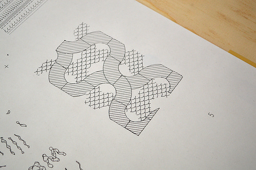
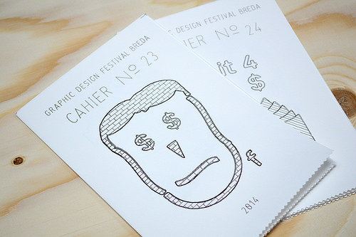
Longhand Publishers — A way for the public to print their own art designs on one paper.

When I first saw this post, I thought it was just a regular printing machine. But I was wrong — people could use longhand publisher workstations to create fantastic works.

13939173245_f4bac8fac0 13994467394_c71b7666fb

Anyone could make interesting pages, using the control knobs to select certain filling patterns, using given shapes to substitute their ideas. The creativity is not bounded, however, the shapes and patterns and size are limited.

The inventors of this workstation used their art tastes to constrain the printing works to a certain style, which makes people easier to accomplish works, but also makes people’s talent get bounded.

____________________________________________________________TEARING_____________

Play the World is an interactive audio installation created by Zach Lieberman. He used chroma features of music to constrain audio into a certain pitch scale. What to do with pitches that out of bound? Shift the pitch inside this preset pitch scale is his solution.

I’m intersted in this work for that I know research relating to chroma features of sound has been done in LabROSA. And when I explored the post further, I found Creep, kind of my favorite song, is used as an example to demonstrate chroma features.

It’s really an interesting idea to explore what’s happening in the world right now using information from audio, and then transfer audio into a musical style. A potential problem I can see is that as the audio extracted from radio is not consistent with the same pitch, with the extension of note played by the keyboard player, the pitch might shift and the anticipated musical transformation from real radio may not happen.

Here is an audio generated from radio from all over the world —

John Choi

29 Jan 2015

The Stranger, by Brain Fox (2013)

The Stranger is an immersive interactive installation that whispers louder and louder as the user moves closer to it.  Basically, the user inputs his name on a smartphone or tablet and the installation begins to visually “gossip” to itself everything it can find out about the user from publicly available information located in sites such as Twitter and Facebook.  While the whispers are prerecorded, the information displayed around the installation are gleaned in real time.  This is supposed to alert the user into finding out exactly how much is known about him or her from just his or her online presence.  I think this project really hearkens back to the magic mirror in the fairy tale Snow White.  Like the magic mirror, the Stranger seems to know about everything about everyone, almost to a level that makes it creepy.  The Stranger also looks like the white face in the magic mirror.  Frankly, I don’t think the face belongs in a project like this.  The wispy environment of texts and whispers seem to be more fit for a purely atmospheric experience.  The human entity makes the user think that he or she could interact with it and speak to it, even though it is just for appearance and does not really react in any other way than just looking at the user.

The Digital Flesh, by the Creators Project (2011)

If I were to describe this project as close as I could in just 13 words, I would say this:  Creepy growing ball of mushy faces mashed up like wads of chewing gum.  Seriously though, if this project was trying to strike a feeling of awe, wonder and disgust all at the same time, it nails it perfectly.  With beautifully warped visuals ripped straight from the trench of the Uncanny Valley, I don’t think this project could have achieved a better balance of interactivity and graphics if it tried.  It really reminds me of Zach Rispoli’s final project in EMS II last semester, really picking up on the theme of deformed faces on globby balls.  I imagine it captures faces from somewhere and processes them with the users being blissfully unaware.  I wonder how much more creepy the ball would look if it also captured other body parts like hands, arms and legs and globbed them onto the ball as well?  On second thought, I actually don’t want to know the answer to that question.