Category Archives: LO-2

rlciavar

23 Jan 2015

Pier 9 Artist Profile: Scott Kildall from Pier 9 on Vimeo.’

http://kildall.com/artwork/2014/waterworks/index.html

“Water Works” is a physical 3D data visualization created by Autodesk artist in residence, Scott Kildall. Large-scale 3D-printed sculptures, are paired with an interactive web map to map the water infrastructure of San Francisco.

Unlike most data visualizations which are typically digital, “Water Works” represents its data as a physical form derived from digital data. Coming from an industrial design background I appreciate the tangibility of presenting data this way.

Currently the model and map are very separate, I wonder how the connection between the interactive map and the physical prototype could be more integrated. What if the map were projected onto the prototype? Maybe the prototype could be the method of interaction.

Points Sign by Breakfast breakfastny.com/points

Points is a smart sign that pulls content from Foursquare, Twitter, transportation APIs, RSS feeds and other online sources to direct people to interesting things going on nearby. Three arms point in different directions, each displaying text of a nearby destination. The arms rotate towards new directions and the text updates to reveal newly selected content on the touch screen.

I appreciate the way the Points creates a new system for experiencing digital content in the physical world by referencing traditional way-finding tools. The merging of digital and physical content in an intuitive way.

Right now the content seems fairly generic, it would be interesting if you could input your own data, Facebook, likes, friends, etc into the sign to get customized recommendations. It could suggest something like “your friend Joe is attending a concert at 19th ave”. Or “this restaurant down the street is similar to this other restaurant that you like”.
dantasse

22 Jan 2015

Data visualization things that I found interesting:

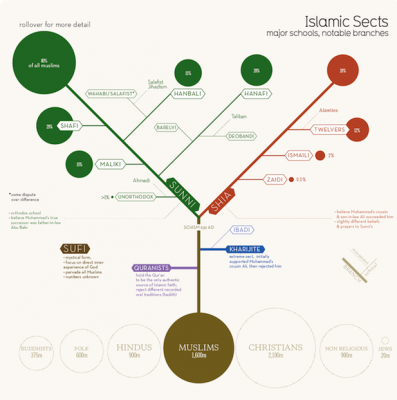
Islamic Sects. This one is just practical. You get a sense of what the groups are, how they differ, and how big each one is. It’s a little weird that I could almost draw this chart for Christianity, and maybe Buddhism, but before seeing this I’d only heard of Sunni, Shia, Wahabi, and Sufi. Other things I learned: Wahabi looks like an offshoot of an offshoot. I guess I’d have thought it was bigger. What didn’t it do? I wish it had more info about each subgroup. Just by looking at it, I have no idea what the difference is between Hanbali and Hanafi, say, except that they are biggest in different places.

1276_islamic-sects_Nov18-base

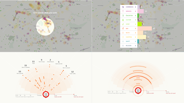
Nexity – My Neighborhood. They tried to give you a new way to look at a new house/apartment by rearranging things in the world based on how far they are. For example, the place below has 15 sports bars, 15 cocktail bars, etc within 30 minutes, and you can easily see how far they all are.

Screen Shot 2015-01-22 at 3.52.33 PMThis would be useful if you were moving somewhere new, sure. The downside is, I still don’t really feel much from this. I guess if one place had a lot of bars nearby, you could see that, but it doesn’t really feel like it. On the other hand, it’s a great aggregation of a lot of useful info at the same time. (if I moved here, where would I buy groceries? where’s the post office? etc.)


Amy Friedman

22 Jan 2015

“Qi Visualizer” by Yuan Yifan (2014)

Qi Visualizer is an application and collective data installation. Users download the app, place their finger onto of their camera light and it records your pulse activity, creating a pulse spectogram which is considered “an artistic interpretation of Qi”[1]. You can then upload the image to the twitter handle for it to be viewed in space. This installation connects people with biometric information in a personalized manner, the installation allows for people to compare their “personal informatics” and see others biometrics, when complied it looks as a topographical map. Yifan identifies the current culture to track information about ourselves, and creates an immersive experience by projecting the information in a gallery. The privacy of our body becomes public. I think that the installation fails as some may not understand what a spectogram is, or fathom the rhythm of their heartbeat. It immerses you with segments of real time uploads and feedback, but do the users relate to other people? Do they connect or understand what the images says? It doesnt seem that they can deduce any information about themselves other than recognizing their own spectogram on the screen and feeling ownership of the image.

[1]http://dl.acm.org/citation.cfm?id=2655621

“Flight Patterns” by Aaron Koblin (2005)

FAA data was utilized to create this visualization of planes flighting in and out over North America. Aaron Koblin utilized the information that preexisted to determine patterns of arriving and departing flights. We can understand the most travelled cities, and formulate an understanding of how flight transportation is affected by the type of airport and infrastructure/trade of different cities. Aaron discussed in his TedTalk that when you zoom in on the flight information you can see how arriving planes circulate the area from different directions to prepare for landings. I remember seeing an image similar to this before but didn’t realize it was about flight information. It makes me question what other data can we utilized to create connections between the way transportation, and other systems are influenced by culture and industry. This project allows for perspective on information you could never see without this imaging, I wish that you could have more data to know the names of where the flights come from and go to, understanding the plane sizes and how flights differentiate based on where they are flying and due to weather conditions. It made me think of walking on surfaces, you don’t see the footprints unless the ground is muddy or there is snow on the ground, but how much land is covered each day while we walk on the sidewalk . What are the patterns people take to avoid a broken sidewalk?

ST

22 Jan 2015

Information/Data Visualization.

To begin, I’m going way back, to look at some analog information visualization by a handful of pretty cool women.
f spectral classification
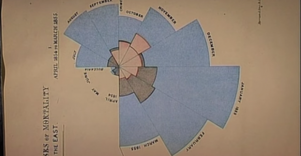
First, Florence Nightingale. Florence was a English social reformer and the founder of modern nursing. She was also a statistician who was able to produce clear and informative diagrams about soldiers deaths. In one (shown in video), it was very clear to see what percentage of soldiers were dying from preventable deaths:

LO

Her diagrams, though not at all digital, highlight the importance and impact of good data visualization. By clearly displaying vital information, she was able to share her findings clearly. I’m sure this is one of her practices that allowed her to have the impact on nursing that she did. Her work reminds me of the importance of clarity. It also reminds me that we can do even more (so much more) with programming and bring to light data trends unrecognizable by the human mind.

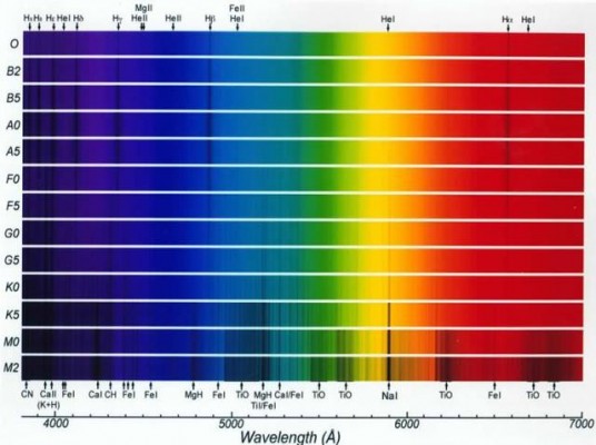
Secondly, and another non-digital example, the group of women, known as “Pickering’s Harem” who mapped out the galaxy. One woman of the group, Annie Jump Cannon is credited with the creation of spectral classification which included the generation of this interesting visual:stellar-spectra

I find it interesting that these visualizations came as a product of research as opposed to doing research in order to have a cool information visualization project. I think that screen-based data visualization can sometime rely heavily on an interesting interface, and the content comes secondary. Maybe I just have an aversion to screens. However, using the computer to generate data visualizations can lead us to see trends unrecognizable by humans.

Link

“1945-1998” BY ISAO HASHIMOTO

This is a project that visualizes every atomic bomb explosion from 1945-1998 on a global map. It also adds distinct sounds and counters for each country responsible.

The project has this sort of gamified aesthetic which i find particularly disturbing, sort of an old school computer program. Reducing the death of a hundred thousand people to a single blip. Reminds me of the fact that USA’s atomic warheads are still controlled by floppy disks.

It’s hard to put into perspective what the cold war was like, until you see this. Super powers flaunting and posturing to find out who’s the most powerful and millions of bystanders just watching.

Critique – Even though the video format is effective at scaling the timeline and providing an impactful presentation, this project can be easily updated to allow viewers to engage the information in different ways and establish new relationships with and in between the data.

Here’s an “interactive” map from the Comprehensive Nuclear-Test-Ban Treaty http://www.ctbto.org/map/#mode=nuclear