Category Archives: looking-outwards

Bueno

25 Feb 2013

Greetings, fellows. I offer as intellectual tribute the following code-based works that incorporate interactivity in various ways.

The Creators Project | San Francisco, CA

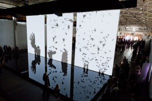
Work number one is from our very own James George along with Chris Milk and Ben Tricklebank, titled The Treachery of Sanctuary. Essentially, the work displays your shadow on one of three white monolithic screens. The work follows a bird motif – depending on the screen, your silhouette may grow wings, may be devoured by birds, or may dissipate into a flock of them. This installation is an interesting convergence of various technologies – Kinect data gleaned through OpenFrameworks is funneled into Unity. The interaction that occurs is passive – your body is simply the canvas on which the work is produced.

Link: http://jamesgeorge.org/works/treachery.html

7592665112_8b349222de_c


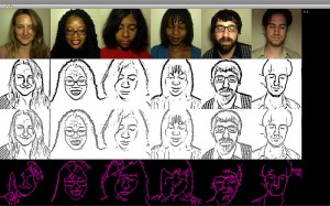
Work two is from Kyle McDonald. This interactive piece asks for a certain amount of trust from the user. While you keep your eyes closed and hold a pen, the moving platform on which you have placed your hand moves, resulting in a self-portrait created using computer vision software. It’s a blind portrait you would never be capable of drawing, a result of probably the most direct collaboration with a machine I have ever seen.

More here: http://thecreatorsproject.com/blog/you-can-finally-be-an-artist-with-this-self-portrait-machine

The Creators Project | San Francisco, CA


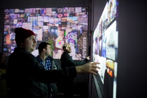
In my research of figures we haven’t discussed much in class (and talking to Golan), I discovered that Intel has its own research division that delves into creative coding. `As part of a live event, Doug Carmean and his team created an interactive work in collaboration with Social Print Studio. It took a real-time stream of instagram photos taken during the event and allowed visitors to sift through them using a Kinect. Not anything particularly revolutionary, but I like the impermanence of the whole thing – it can only exist for the event, and it seems to use that to its advantage.

Link: http://thecreatorsproject.com/blog/artists-and-engineers-create-the-future-of-art-and-technology
Elwin

25 Feb 2013

Acoustic Barcodes // HCII CMU


Straight out of Carnegie Mellon, an interesting interaction using structured patterns of physical notches as Acoustic Barcodes. Swiping the barcodes with for example a fingernail produce a complex sound that can be resolved to a binary ID. A single, inexpensive contact microphone attached to a surface or object is used to capture the waveform. While the applications might be a bit odd, I think it’s an very interesting approach by making the interaction more tangible compared to scanning an RFID.
 

Heat Map // onformative


A translation between sight and touch merges human sensing abilities. Projecting imaginary heat on top of human skin and its surrounding to create a virtual thermo reactive surface. I think this is an interesting concept of giving the illusion and perception of heat on a surface, because we are so used to the visual representation of thermo colors for temperature. The smudge effect really reenforces the illusion of heat being transferred on a surface and the heat dissipates over time. I would love to test and interact with the system for myself and see how it would play tricks on my senses.
 

Zimoun: Sound Sculptures & Installations, Sound Architectrues


Using simple and functional components, Zimoun builds architecturally-minded platforms of sound. Exploring mechanical rhythm and flow in prepared systems, his installations incorporate commonplace industrial objects. In an obsessive display of simple and functional materials, these works articulate a tension between the orderly patterns of Modernism and the chaotic forces of life. I love the simplicity of the work, and how rich and mesmerizing the experience is. It’s just something stuck onto a servo, but the compositions and sounds that the sculptures create have a very elegant feeling to it.

Can

25 Feb 2013

Chamelon Guitar (by MIT Media Lab)

It’s a 99-in-one guitar. It has different small bodies, equipped with piezo sensors. They can get the resonance of the small body, and simulate that for the whole. I think this is a really simple, and pure idea, that is relatively easily implemented.

CATEN (David Letellier)

Created for the Saint Sauveur chapel in Caen, Caten is a levitating sculpture, determined by gravity and guiding the evolution of a sound composition.
300 wires suspended from two ropes, connected themselves at each end to a slowly rotating arm, form an evanescent surface which interacts with the architecture.

At each turn, the engines emit one of the first 4 notes of the scale (Ut, Re, Mi, Fa), creating a sequence of intervals, constantly reconfigured. Low frequencies resonate in the space and emphazise the transcendental character of a place once dedicated to faith.
The name is derived from the term catenary, which describes the plane curve formed by a rope hanging between two points.

Konkreet Performer

Konkreet Performer is a live music performance controller. It has a beautiful circular multi-touch interface that reconnects the musician’s actions directly with the music. Although their description sounds a bit too commercial, I think this is a good example of what’s possible to do with multi-touch devices.

Andy

25 Feb 2013

Number 1: Obligatory Music Post.

I thought this project (and the other hundreds of similar projects with apps and music) is pretty cool. This wave of software designers is trying to find new intuitive ways to perceive, process, and manipulate music, and this is just one example which looks particularly pretty. That said, I think that coming off a project like my last one where I felt underwhelmed with my results, I think I want to leave music behind for this project. Which brings me to:

Number 2: Wii Remote Finger Tracking

I love Johnny Lee. I think we can all learn from his top notch documentation skills, plus he is very creative with inexpensive resources. While the Wii Remote Finger tracking is not an interactive art piece in its own right, I think I could easily set this up and use it as a resource for my interactive projects, which is why I am showing it here.

And number 3: Non-real-time interaction

Baroque.me: J.S. Bach – Cello Suite No. 1 – Prelude from Alexander Chen on Vimeo.

It’s a visualization. But it’s also a piece of non-real-time interactive art. The lengths of the strings interact with the pitches in the signal, and the result is a really pretty experience. Maybe without abandoning music altogether I can still make a meaningful piece in the space of my two disciplines, without putting the pressure of composition upon myself (because I am just really really insecure in my ability to compose meaningful music, by hand or algorithmically)

Ziyun

25 Feb 2013

{ PURE WHITE PAPER – LI HONGBO }

Simple, elegant, analogue interaction.  I was amazed by the fact that morphing of the structures was actually thousands of papers.

Inspiring:

a. Using analogue materials to mimic digitalization process;

b. Even the most common and ordinary material can make extraordinaries. – do we really need high technology?

c. This could be seen as a reverse and dynamic version of 3D printing.


{ L.S.D+LIGHT SEQUENCER – Benjamin Gaulon}

Using light-dependent resistor to receive the brightness of the screen as input to control the sound wave parameters.

A few things that worth thinking:

a. this might not be as interesting if is not done with analogue;

b. sound-visual connection isn’t clear enough;

c. the ultimate question for sonification: how to make the sound appreciable and beautiful and less randomness sounding.


{Voice Array – Rafeal Lozano-Hemme}

Poetic. I love it that the waveform is not always there, but you could see and hear it grow along timeline.

Light and space is immersive, but I wonder how the sound space was set-up, surround would definitely be a plus.

Meng

25 Feb 2013

When I was doing this looking outwards, I am kind of naturally re-define interactivity in my mind. I consider from large dimension of interactivity to the tiny fine interactive experience. I also think about the necessity of this interactivity and human senses.
The examples as follows are focused on the topics above.

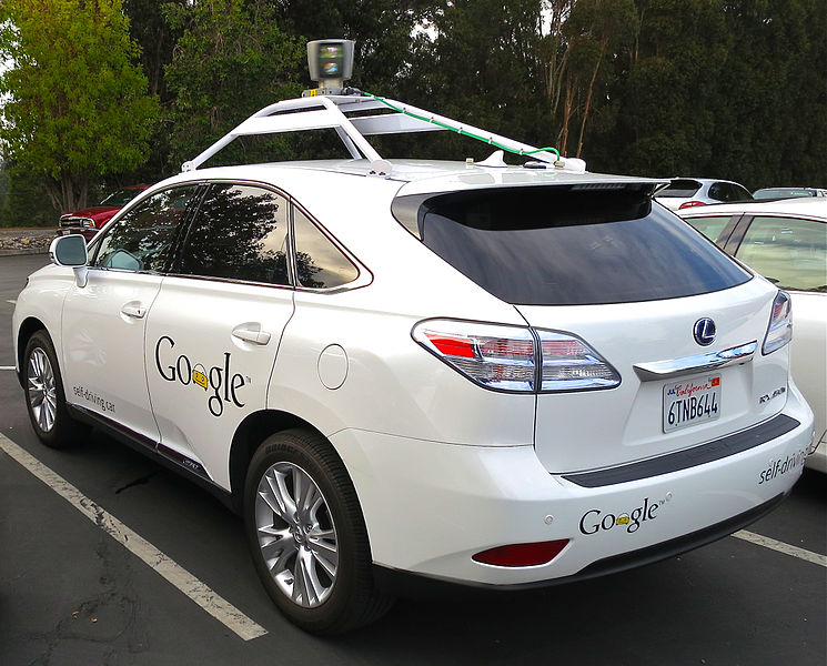
Driveless Car – Interact or Not
One day in the near future, we will not driving and the car will drive us to where we want. I am thinking two things: one is whether or not people will miss the lost feeling of driving a vehicle; another is that people will do on there driveless cars. With the coming of driveless car, people’s interaction with car will all change. People may do the work, hangout on g+, or set around drinks coffee.
In this sense, some missing interaction may be a good thing; while I am sure, this field interactivity is to be defined.

XL vs XS
WHITE NOISE WHITE LIGHT
http://www.mystudio.us/projects/3
Soft Robot Walking and Crawling
https://www.youtube.com/watch?v=2DsbS9cMOAE

The first hologram example is not extremely big, but my point is to put interactivity on an urban level. Mash up element in the living world and make something tangible is the most accessable way for people to interacte with. From this example I come up with the thought that the straight-forward playfulness is the core of tangible interaction.

Another example is the creep soft robot. people are not touching it, but people controls it. Sometime people may not controls it, and it will go on its own way. From this example i understand dimension/material/behavior contribute to interactivity.

Human Senses
It seems that we have over use our virtual senses with the advantage of screen displays. With apple’s extraordinary iphone and ipad, interaction and intelligence is greatly enabled in artifacts. However, interaction overwhelmingly based on single senese is not intuitive. I therefore list human senses as my third topic. I am very optimistic about next generation’s interaction maybe somethign we now called TUI- tangible user interface.

exTouch from Tangible Media Group on Vimeo.

Keqin

25 Feb 2013

Durrell Bishop Marble Answer Machine

I choose this one because it is a very beginning of TUI. It’s a really new interaction way for people to interact with virtual things.

1992 Marble Answer Machine. The physical visualisation of a system. This was the second of many demonstrations that simplified the interaction of products. It uses the direct manipulation of messages within the descriptive environment of a product and then the extension of this language to other products.

Here’s the video.

T(ether)

It’s a new way to combine the virtual world and real world. T(ether) is a novel spatially aware display that supports intuitive interaction with volumetric data. The display acts as a window affording users a perspective view of three- dimensional data through tracking of head position and orientation. T(ether) creates a 1:1 mapping between real and virtual coordinate space allowing immersive exploration of the joint domain. Our system creates a shared workspace in which co-located or remote users can collaborate in both the real and virtual worlds. The system allows input through capacitive touch on the display and a motion-tracked glove. When placed behind the display, the user’s hand extends into the virtual world, enabling the user to interact with objects directly.

Omnitouch

Today’s mobile computers provide omnipresent access to information, creation and communication facilities. It is undeniable that they have forever changed the way we work, play and interact. However, mobile interaction is far from solved. Diminutive screens and buttons mar the user experience, and otherwise prevent us from realizing their full potential.

It’s a powerful alternative approach to mobile interaction that uses a body-worn projection/sensing system to capitalize on the tremendous surface area the real world provides.  However, turning everyday surfaces into interactive platforms requires sophisticated hardware and sensing. Further, to be truly mobile, systems must either fit in the pocket or be wearable.

SamGruber::LookingOutwards::Interactivity

Spine – kollision

Spine consists of 20 suspended glowing cubes which suggest the spinal column of some gargantuan beast stretching the length of a warehouse. The spine’s movements, the light intensity, and the sound emitted from it are all reacting to the approach of people in the hall. This project strikes me as interesting because of the inherent conflict in its existence. On one hand because of its scale and control of the only significant lighting in the warehouse, Spine necessarily dominates the space in which it has been constructed. At the same time, its nature as a reactive, interactive piece is dependent enormously on the presence of other actors. Too often we are used to monolithic elements in our world that do not reference their surroundings; Spine is a welcome contrast. I do feel that the project could become even more powerful in this respect if it were freed from the constraints of the warehouse it was installed in. Even more so if it were capable of moving itself.

cyberflora – Jeff Lieberman

cyberflora is a garden of robotic plants which react in various ways to the people observing them. Each plant has a different personality, which creates a great deal of complexity in the installation as a whole. By presenting dozens of plants which behave differently, Lieberman produces a far more compelling work than if the responses were more uniform or the plants had consistent appearance. The multiplicity of them reinforces their lifelikeness, because life is itself incredibly diverse and any simulation which ignores this loses a lot of fidelity as a rseult. The plants could stand to be more reactive to each other, as it seems that would be the next hurdle to become more lifelike.

The Heart Chamber Orchestra – TERMINALBEACH

The Heart Chamber Orchestra dynamically composes a score based upon the heartbeats of the musicians who are playing it. This project stands out in my mind because both the inputs and the perceived outputs (from the point of view of the audience) are real humans. If the visualizer screen were not displayed (and it does seem to be a rather weak element), to a layman, there would be no indication that the performance was being driven by a computer, and yet that is the only way such a performance is possible.

This project also opens up interesting question about creating feedback in the system. Would it be possible to “prime” the beginning of the piece to cause the musicians to become overly excited, or tired, thereby influencing the character of the rest of the piece? What about the possibility of drawing such signals from the audience rather than the performers, and how does that influence the character of the music?

Erica

25 Feb 2013

1. Weave Silk

Weave Silk is a drawing tool that generates curves based on mouse or finger movement.  It is definitely an interesting tool and has a nicely crafted interface.  The interaction is also very satisfying; the user is able to create beautifully generated images with a few movements.  The tool does seem a bit limiting though; it feels like I want to have more control over the movements, especially because there is an inherent symmetry to the curves you can create.

2. Tree Drawings by Tim Knowles 

This project is not digital but it is definitely generative and I found it extremely interesting.  The artist   created a series of drawings by attaching pens to the branches of different trees and allowing wind and other natural factors to generate forms on canvases.  As such, through the generation of this images, the artist is also recording and visualizing information about each tree, the environment they exist in and the time of year when these drawings were made.

3. L-Systems in Architecture by Michael Hansmeyer

For this project, Computational Architect Michael Hansmeyer designs a piece of architecture using L-Systems.  I am intrigued by this idea of using L-Systems for different artist applications outside of the realm of modeling plant growth (my friend and I have been working on a project that also explores this idea).  The artist’s project statement describes the project in context to seeing what is possible.  I would be interested in further hearing his thoughts as to where such a building would work conceptually and how creating such buildings using L-Systems begin to inform both conceptually and functional spaces within.

4. H_Edge by Cecil Balmond

H_Edge is an exhibition by Cecil Balmond that I had the fortune of helping to install in the Carnegie Museum a few years ago. It is a amazing structure that consists of chains and metal ‘H’s that is help up by the tension between its components.  It is not quite a generative project, as I believe the spaces created are planned out, at least to an extent, but the structure definitely strikes the observer as generative.  Moving through the exhibit, new spaces are formed due to the reflectivity of the materials and the interactions between the structure’s elements.

Erica

25 Feb 2013

1. Augmented Shadow

I’m not sure what state this project is in but I find it very interesting.  It plays on the idea of a shadow using Augmented Reality by allowing the using to move around blocks to explore the mysterious shadow world that exists.  Personally I find the concepts of playing with shadows really intriguing and I think this is a really interesting play that could cause emergent storylines that are all dependent on the interaction of the user.  In this way, it also reminds me of an idea I had for an app that would allow the user to explore a story independent of a chronological storyline.

2.  Light Form by Mathieu Rivier

This is an interactive project that allows the user to affect a surface through touch.  The physical shape of the sculpture does not actually change but rather the shapes projected on the surface do.  I think the real “magic” of the piece is not so much in the interaction but rather in the 3-dimensionality that emerges through the interaction.

3. OKO – Interactive Journey Through NASA Image Database by Jeremie Forge, Pierre Rossel, and Nadezda Suvorova

This project is an iPad app that allows the user to explore images from NASA’s database by turning them into interactive puzzles.  I like the concept of this project because it exposes these beautiful images to the public on a mass scale.  I’m unsure about how I feel regarding the design of the puzzles; some are more successful than others.

4. Snail Space by David Hockney

This is one of my favorite pieces, located in the American Museum of Modern Art in Washington, D.C. It is not technically interactive in the sense that it cannot be experienced tangibly, but it definitely creates a experience that goes beyond the visual.  The exhibit consists of a mural that extents from the wall onto the floor and slowly changing lighting that turns the painting into a three-dimensional space that is constantly evolving.