Category Archives: looking-outwards

Erica

08 Apr 2013

For our Capstone Project, Kyna and I are continuing to collaborate on our mobile game Small Bones.  As such, for this Looking Outwards I tried out some current popular runner mobile games:

1) Jetpack Joyride by Halfbrick

As the name implies, this game is an infinite runner where the character you control is wearing a jetpack.  The player is able to have the jetpack hover in mid-air by tapping and holding his finger on the mobile screen.  The purpose of hovering is three-fold: 1) to avoid obstacles, 2) to collect coins, and 3) to gain power ups.  Each power up is a different vehicle that has different capabilities, though each is still controlled by tapping or tapping and holding.  On the plus side, this game has a simple, but clear premise based on a simple mechanic that is intuitive and cohesive with the theme. The game is very easy to learn how to play, even without tutorial.  I think that the reason for this is due to the simplicity of the mechanic and the player’s intuitive notion that to make a jetpack fly you press and hold a button.  I also think that the graphics are very well done, though I’m not as into the “cutsy” style that seems to dominate mobile games, in particle when dealing with depicting humans.  In terms of negatives, the storyline is very unclear.  If I had not seen the above video, I would not understand that the character is a typical 9-to-5 American worker who is unhappy with his life and decides to steal a jetpack and go on a joyride.  In addition, although the different power-up vehicles are creative and give game-play more character, in seems to take away from the storyline and the main premise of stealing a joypack.  Also, like a lot of mobile runner games, there’s this idea of collecting coins to buy items outside of the actual gameplay to be used in gameplay that takes the player out of the suspended disbelief of the game, which I’m not such a fan of.

2) MegaRun by getset

Megarun is also a runner, but it is broken up into levels (the direction Small Bones is currently heading).  Again, there is a simple jump mechanic of tapping and holding to jump higher.  This time, if you collect a power-up it will automatically be activated and stay activated until another power-up is collected, an enemy is run into, or the power-up’s timer is up.  This game too uses “cutsy” graphics but I think it works better here because the characters and the world are meant too be cartoon-ish and not resemble the “real” world.  Furthermore, the power-ups in this game make more sense than those in Jetpack Joyride because they actually make finishing the level easier.  As I said, in Jetpack Joyride the main purpose of the power-ups seems to just be making the gameplay more interesting.  Also, the cohesiveness of the game’s narrative extends to those coins I hate so much.  For one, the storyline is based on the character trying to regain his riches, as seen in the above trailer (though, again, without the trailer this would not be immediately obvious), and, secondly, collecting different types of coins helps the character run faster, thereby helping the player complete the level.  On the negative side, the use of levels is purely to separate out difficultly; I wish there was more storyline reveals in the different levels.

3) Temple Run and Temple Run 2 by Imangi Studios

(sorry for such long videos)

This is actually one of my favorite runner games.  This game uses a few variations on one mechanic, the swipe, to do a few different movements.  Sliding your finger up makes the character jump, down makes the character slide, and on side to another makes the character turn.  It also uses the accelerometer to get the character to tilt his run pattern to one side or the other.  All of these mechanics are simple yet intuitive and add to the sense of depth in the 3d world.  Although I am partial to 2d games, I happen to really like the aesthetics of Temple Run, and even more of Temple Run 2 and I think they really enhance the storyline of the game.  Like with the first two games, the storyline is somewhat vague and implicit, but unlike with the first two games, it is less bothersome for Temple Run.  The beginning sequence of the scary gorilla-like monsters chasing you along with the graphics imply that you need to run as fast as you can to safety, and that gives the player enough agency to feel engaged with the premise.  One of the best features of this game is the tutorial.  The tutorial does a good job of teaching you the mechanics of the game one at a time with a combination of world obstacles and text overlay.  It shows you different obstacles where you want to use different mechanics and lets you die if you make a mistake, resetting you to the part  of the tutorial at which you died.  I also liked that Temple Run also incorporates coin collection more into gameplay.  Although there is no reason to collect coins in terms of storyline, the location of the paths of coins suggest to the player the path and mechanics they may want to use at that particular time.

The two versions of the game are pretty similar but have a couple of key differences.  Firstly, the first version is at a constant height and the world has a purely orthogonal layout.  The second version allows for variation in height and in curvature of the path.  Although I like the variation in height, the curvature distracts from the mechanics in my opinion because it makes it more unclear as to when you need to swipe a turn.  The second difference is that in the second version, there is a double-tap to enable a power-up.  One potential issue we were running into with Small Bones was differentiating between drawing a path and enabling a power-up, the first of which was to be a tap and drag and the second a tap and release.  We could use a double-tap to better distinguish this.
John

08 Apr 2013

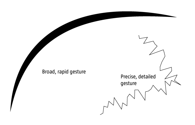
For my capstone project, I’m continuing to build on the kinect-based drawing system i built for p3. My previous project was, for all intents and purposes, a technical demo which helped me to better understand several technologies including the Kinect’s depth camera, OSC, and OpenFrameworks. While I definitely got a lot out of the project WRT the general structures of these systems, my final piece lacked an artistic angle. Further, as Golan pointed out in class, I didn’t make particularly robust use of gestural controls in determining the context of my drawing environment. In the interceding week, I’ve been trying to better understand the relation between the 3d meshes I’ve been able to pull of the Kinect using synapse and the flow/feel of the space of the application window. Two projects have served as particular inspiration.


Bloom by Brian Eno is a REALLY early iOS app. What’s compelling here is the looping system which reperforms simple touch/gestural operations. This sort of looping playback affords are really nice method of storing and recontextualizing previous action w/in a series.

Inkscapes is a recent project out of ITP using OF and iPads to create large-scale drawings. Relevant here is the framing of the drawn elements within a generative system. The interplay between the user and system generated elements provides both depth and serendipity to the piece.


layer_stack

 gesturez

gests

Caroline

07 Apr 2013

FaceGraphic

photo (3)

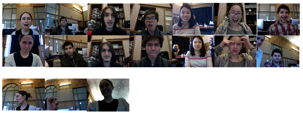
For my final project I want to use rough posture recognition to create system that triggers a photograph to be taken as soon as a pose enters a certain set of parameters. In the above photographs I attempted a rough approximation of this system.  The photographs on the top are photographs taken when faceOSC detected that eyebrow position and mouth width equaled two, the second row is when the system detected both those parameters equaled zero, and finally the bottom row shows a few samples of the mess ups.

I have a couple ideas of how I might implement this project at varying levels of complexity:

  • trigger a DSLR camera whenever face or body is in a particular position. Make a large format print of faces in a grid in their various positions. 
  • Record rough face tracking data of a face making a certain gesture. Capture that gesture frame by frame, and then capture photographs that imitate that gesture frame by frame.
  • Trigger photographs to be taken when people reach certain pitch volume combinations. Create an interactive installation that you sing to and it brings up people’s faces that were singing the closest pitch volume combination.

All of these ideas involve figuring out how to trigger a DSLR photograph from the computer and storing a database of images based on their various properties. Here are some resources I have come up with to help me figure out how to trigger a DSLR:

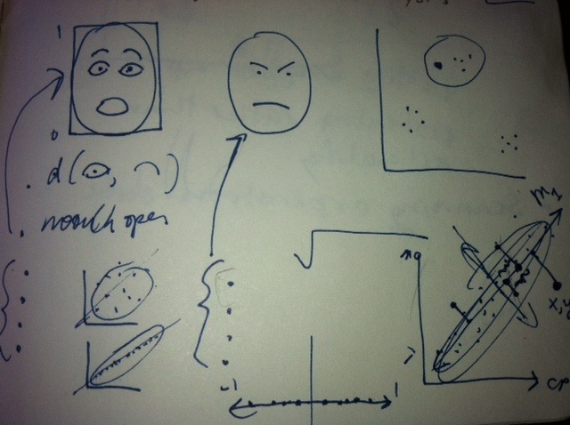
In terms of databasing photographs based on their various properties, Golan recommended looking into principal component analysis, which allows you to reduce many axis of similarity into a manageable amount. He drew me a beautiful picture of how it works:

photo (2)


I also found Open Frameworks thread that pretty much described this project. Here are some of the influences I pulled out of that:

Stop Motion by Ole Kristensen


Cheese by Christian Moeller

Ocean_v1. by Wolf Nkole Helzle

Keqin

01 Apr 2013

I just found that current cv or kinect system cannot give user real feeling or real feedback.

So I think I want to make some real thing that can give some feedback to users when they

interact with the cv or kinect system.

This is a robot hand controlled by a kind of material called SMA wires. I think I will use something like this to give people feedback on their hand.


And one more project about this.

And this is one haptic way to give feedback to user when they interact with the cv or kinect system.

Nathan

01 Apr 2013

I am aiming to build a ‘throwing’ machine that will proceded to launch light bulbs at a wall and/or me. If you have seen my main body of work you will understand that I am talking about apprehension, gentleness, aggressiveness, and semi-uncontrollable circumstances. I have been skimming the web for designs of machines that inspire the design and application of my own machine.

I’m looking for a machine that has a sense of ‘crude’ making and a machine that has a ‘fluid’ action.
I’m looking to build a machine that talks about more than the sum of its parts and actions.
I’m looking to do a performance with or a video of this machine working.
I’m looking to put this in my upcoming show as a physical installation with accompanying video.

Oscar Peters

So KANNO yang02

SENSELESS DRAWING BOT #2 from yang02 on Vimeo.

Robb

01 Apr 2013

Joshua Lopez-Binder and I plan on making some gorgeous and outrageously efficient heat sinks.
What is a heatsink, you may ask? A heat sink is an object, typically metal, that is designed to absorb and dissipate heat. They are primarily used to cool hot electrical components.

My vested interest in making a super efficient and highly beautiful heatsink is quite related to my continued, yet slow pursuit of making a new Cryoscope. I find its current design noisy(due to fan) and a little static aesthetically. The device needs a large heatsink in order for the solid state heat pump(Pelter Element) to refrigerate the contact surface.
The applications of such a component are not at all limited to my old project.
If I can get it to provoke imagery of a lightening storm, I think it would be pretty neat.
Josh and I have some theories. We think that naturally inspired fractal geometries will make very nice heat dumpsters indeed.

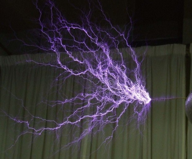
I am thrown with licthenberg figures, the pattern left behing by high intensity electrical charges. Here is an example of one on the back of a human who survived a lightening strike.722px-Tesla-coil-discharge
This looks like it will shape up to be the most formal thing I have pursued since enrolling in art school. I feel that the physical manifestation of thermal radiation of waste is an important aspect of my earlier thermal work. I had tried in the earliest Cryoscope to hide the byproduct heat using aesthetics that were too close to Apple for my comfort.

Lichtenberg ‘Art’

A group of scientists, dubbing themselves Lightening Whisperers, started a company which embeds Lichtenberg figures in acrylic (Plexiglass) blocks using a multi-million volt electron beam and a hammer and nail. The website is a great way to kill an hour looking at these beautiful little desk toys. They also shrink coins.

Josh Outlined some very nice works by Nervous System. They make very pretty generative jewelry, among other things. I just spent an hour scrolling on their blog. I always look too far outwards and end up with a post that is too short.

Lichtenberg Figure in Processing!

Alan

01 Apr 2013

###Hydrophobic Material As Art? 

I got the inspiration from this TED talk that we may use any material to make artwork. This can be extended to hydrophobic material, fire, water, electricity, magnetics, etc.


###basil.js – Computational and generative design using Adobe InDesign

basil.js is a scripting library that has been developed at the Visual Communication Institute at The Basel School of Design during the last nine months and is now made public as open-source. Based on the principles of “Processing”, basil.js allows designers and artists to individually expand the possibilities of Adobe InDesign in order to create complex projects in data visualization and generative design.

This inspired me since I may generate art around certain texts and images. However, the art is limited by Adobe software, and I may expand it to browser based application which is much more scalable.

###Turn Your Favorite Website Into A Playable 3D Maze With World Wide Maze

A rad new game from Google Chrome Experiments synchs up your computer’s Chrome browser with your smartphone to create a multi-platform coordinated 3D maze. The game, called World Wide Maze, turns any website into a playable game where you navigate a ball around a series of courses.

Browser interactions are always my favored projects. Disecting websites into pieces and reframing them is a nice idea. However, the game itself is still lame. There is still a chance to raise the game flow and whole design features.

### PM2.5 in China – Data Visualization

A tech team in China opened PM2.5 api to public in China for the first time. I may generate the first visualization art about PM 2.5 data in China.

Looking outwards – Final Project

1. A new AR platform is desperately needed.

So I will likely be using Vuforia – Qualcomm’s AR platform. After talking with the lead developer at BigPlayAR, it seems like Vuforia is the clear winner, allowing me to work in Unity or in their own environment.

2. I will also be wrapping up some loose ends with the Processing implementation.

community

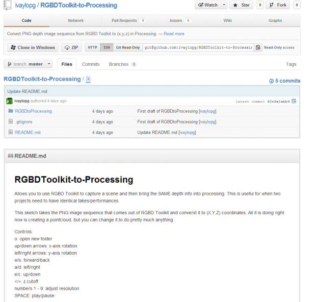
As Golan helped me discover, getting RGBD to work in Processing is a project that the community is just now tackling, so I likely will be forking this guy’s repo and pull requesting to create one dynamite implementation!

3. INSPIRATION

Geography-specific AR:

AR at MOMA:

AR Card Game:
This video autoplays so I made a link to it instead

Whimsical augmentation of a physical space:

Reinterpreting architecture from the perspective of the fantastic:

Another geo-augmentation

Marlena

01 Apr 2013

It’s become clear to me that I should spend some time thinking about making art concerning a topic that, due to recent events, has been haunting my mind for several months now: suicide. A friend of mine took his life a few months ago and I have a close family member who has inflicted self-harm and made threats of this nature. I have been pushing it aside for a long time and now would be a good opportunity to figure out exactly what I’m feeling and come to terms with it. I’ll do more research on past works soon–first I need to do some thinking of my own.

Elwin

01 Apr 2013

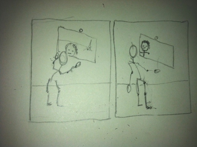
I’ve decided to take my “shy mirror” idea from project 3 to the next level for my capstone project. The comments that I received from fellow students really helped me to think a bit deeper about the concept and how far I could take this.

Development & Improvements

– Embed the camera behind the mirror in the center. This way the camera’s viewing angle will always rotate with the mirror and wouldn’t be restricted compared to a fixed camera with a fixed viewing angle like in my current design. Golan mentioned this in the comments and I had this idea earlier before, but the idea kind of got lost during the building process. This time I would definitely want to try out this method and probably purchase some acrylic mirror from Acrylite-Shop instead of the mirror I bought from RiteAid.

– Golan also mentioned using the standard OpenCV face tracker. I wasn’t aware that the standard library had a face tracking option. This is definitely something I will try out, since the ofxFaceTracker was lagging for some reason.

– Trajectory planning for smoother movement. At the moment I’m just sending out a rotational angle to the servo, hence the quick motion to a specific location.

– I always had the idea that this would be a wall piece. I think for the capstone project, I would be able to pull it off if I plan it in advance and arrange a space and materials to actually construct a wall for it. Also, the current mount is pretty ghetto and built last minute. For the capstone version, I would try to hide the electronics and spend more time creating and polishing a casing for the piece.

Personality

This would be the major attraction. Apart from further developing the points above, I’ve received a lot of feedback about creating more personality for the mirror. I think this is a very interesting idea and something I would like to pursue of the capstone version.

In the realm of the “shy mirror”, I could create and showcase several personalities based on motion, speed and timing. For example:
– Slow and smooth motion to create a shy and innocent character
– Quicker and smooth motion for scared (?)
– Quick and jerky to purposely neglect your presence like giving you the cold shoulder
– Quick and slow to ignore
These are now very quick ideas, but I would need to define them more in-depth.

Someone also mentioned adding motion of roaming around slowly in the absence of a face, and becomes startled when it finds one. I think that’s a great idea and it would really help in creating a character.

References / Inspiration

Pinokio


I think this is the most recent and well-known project showcasing personality in an inanimate object. The lamp really takes on a character and tries to interact with the person (although the person’s interaction with the lamp is a bit exaggerated). I could definitely take some notes from the motion and try to incorporate that into my mirrors.

(In)Security Camera // Silvia Ruzanka


This piece is already 10 years old! I like how it uses a security camera and reverses its purpose. The motion is a bit jerky though and personally I think the placement of the camera is too high. It’s weird when the camera is pointing upwards. It cuts of the interactions between the user and the camera. Perhaps that was the purpose of it…

Audience // Chris O’Shea


Reminds of meerkats following and staring at you. Really great how the number of mirrors creates a character as a whole. I don’t think it would have succeeded with only 1 or a couple of mirrors. Something to keep in mind when I’m developing my idea further