Category Archives: looking-outwards

Marlena

25 Feb 2013

When I sat down to browse the internet for this blog post I happened to be surrounded by five or six people currently knee-deep in designing a tabletop game. Everyone had done a lot of research into games and other interactive experiences–thus, after searching the internet for a bit, I asked them for some of their favorite interactive projects. After all, research can be done in a lot of different ways, right? I got a lot of good suggestions, and so in addition to one project that I found myself I will include my favorites of those that they suggested.

ANOMALY INTERACTIVE BOOK APP
http://www.experienceanomaly.com/
http://allthingsd.com/20130223/heres-what-happens-when-you-combine-a-comic-book-an-ipad-and-augmented-reality/?mod=atd_su/

Screen Shot 2013-02-24 at 11.55.23 PM

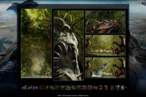
This book is an incredibly cool concept–the graphic novel Anomaly is a beautifully illustrated book that comes with a table app. When the user aims the tablet at the book, characters and scenes jump to life, becoming interactive elements that the user can play with and learn extra information from. I love the idea of gleaning more hidden information from a complex medium–with the addition of the app, the book moves from illustrated story to in-depth guide to this world that the artists have built.

While a very cool idea, the execution is still a little clunky. The 3D visuals sometimes break the immersion in their occasional dips into uncanny valley, for example, and the disconnect between book and tablet is unavoidable. That being said, it’s a cool and reasonably polished application to a relatively new technology. The company is already well into their second book, so I anticipate that their company will continue pushing the envelope on this technology for a while.

JOURNEY
http://thatgamecompany.com/games/journey/

Screen Shot 2013-02-24 at 11.53.36 PM

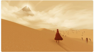
When I asked my friends about interactive art pieces, they told me to look up Journey. In fact, they said, we have it here; you should sit down and play. So I did. It was the most gorgeous video game that I’ve ever played. It was beautiful in every area–visual design, gameplay, plot, music, and length. It follows a hooded, nameless, voiceless character in their journey to the top of a mountain. Along the way they discover a lost, sunken city covered in sand in which strange flying red cloth creatures flock like birds and sea creatures.

I spent two hours playing this game and was entertained throughout. Not only that, but through the discussion I got a lot of good information about interactivity and game design from talking to my friends. For instance, the game will pair you with another person on the internet who is playing the game and the two of you traverse the mountain together for a time. You never talk to or message this person–you are both simply pilgrims on a journey. It’s an incredibly elegant way of playing a game with another person without breaking the illusion. Rather than laughing and joking with another person, you’ve just gained a companion for a time. It was a lovely touch to an already fantastic game.

INGRESS
http://www.ingress.com/

Screen Shot 2013-02-25 at 12.29.25 AM

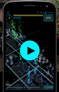
Like Anomaly, Ingress is a cool interactive piece that is among the first of its kind. Ingress is a multiplayer augmented reality game by Google that lets all of the users interact with works of art all over the world to stop an unnamed invasion force. As more players work together to unlock a particular area, the game works against the group as a whole to take over the city or town in question.

As this is an Android app and I have an iPhone, I didn’t get a chance to playtest this game. I love the idea, though. It’s a lot of fun to play games with a large community of people–Ingress takes the next step and brings the game to the players’ day-to-day environment. It’s real-time and hits a little closer to home in its targeting of recognizable works of art. I hope that soon I will get a chance to play it. If not, though, I’m sure that there will soon be more games of a similar nature that more closely links the game to our everyday lives.
Michael

25 Feb 2013

Wooden Mirror – Daniel Rozin

I wouldn’t be surprised if other people use this as well, but it’s still an example of interactive art that I remain deeply impressed by.  Technically, the complexity of doing image processing and controlling 830 servos nearly a decade and a half ago is enough to be cool by itself.  From an artistic perspective, I like his reinterpretation of the mirror using materials with completely different reflective properties (Lambertian rather than specular, like glass).  I think the sound of the physical moving parts adds another interesting dimension as well, as it conveys auditory information that corresponds to the motion of the subject.  As an artifact, the mirror lends itself to exploration and discovery, as its initial function may not be entirely clear.  I imagine that its behavior is also somewhat specific to the installation environment and local lighting conditions, which I believe enhances its charm rather than detracts from it as is common with many projects incorporating computer vision.


Chatroulette and Omegle

I think both of these websites are interesting in that they connect (in all likelihood) complete strangers and give them free reign to either A) hold intelligent conversations, B) be jerks, or C) show their junk off.  Usually it ends up being either B or C.  In any case, I think the collective behavior reveals something about human nature with respect to anonymity and our interactions with each other through the screen.  This can be found elsewhere, like in Youtube comments, but those interactions are still centered around something else like a video or article, and they happen in clusters.  Omegle appears to have changed to be more like Chatroulette, but I think it was more interesting when it was text-only.  I think a more specific and analog question is “How does the level of anonymity (acquaintance, video, voice, text) change a person’s interaction with another?”

My favorite Chatroulette experiment happened in undergrad when we filled an auditorium with 100 people and greeted strangers over video.  A lot of people were genuinely pleased and would talk with us for some time.  Others would hurry to cover themselves up in embarrassment.


Journey – thatgamecompany

It’s a video game, but not Minecraft, surprisingly.  I haven’t played this myself, but I find the concept delightful.  The gamer plays as a robed pilgrim on a quest to a distant but visible mountain.  The game can be played completely by oneself, and the journey is relatively short, but there is a twist.  At various points in the game, the player will encounter other pilgrims who may cooperate with them to solve puzzles and point out interesting places that might have otherwise been overlooked.  These travelers are actually other humans who are playing the game at the same time, but they are chosen at random and retain their anonymity.  The only means of communication are through auditory cues and physical gestures, so there are no indicators of age, gender, real location, etc.  In a sense, this is an extreme that even Omegle doesn’t reach, yet the results are almost universally more positive.  The game has won lots of accolades for its uniqueness, though I imagine this is something that does not have much room for improvement in the future.

Joshua

24 Feb 2013

.fluid

this project involves a speaker, non-newtonian fluid, and a touch sensitive table surface. Non-newtonian fluids are fluids in which the rate of deformation is not linearly related to the forces trying to deform that fluid.  One type of non-Newtonian fluid, which is being used in this video (probably cornstarch and water), gets more viscous as it gets more agitated.  If this fluid is placed on top of a speaker and vibrated at high frequencies, the fluid begins to get more viscous and can form little towers and blobs. It appears that in this project the interactive component involves controlling the frequency (or perhaps also amplitude) of the speaker.  I enjoy that multiple people can contact the table and the effects of this change are fairly visible in the behavior of the fluid.  In fact I think that this is more interesting in the liquid itself.  I wonder how the sensors work

here is another example of non-newtonian fluid on a speaker


Interactive Robotic Painting Machine

This project uses a genetic algorithm to create various iterations of strokes on a canvas.  The GA takes inputs from a microphone to somehow evaluate a given sequence of strokes, and create a new sequence based on those external inputs.  The machine has the ability to listen to itself.  Unfortunately there is not much information on the website about the details of the GA and how exactly it is processing the sound input and what the GA is optimizing for.  The general concept is fascinating, and the machine itself is beautiful.


Pulse

click on link to see video (this video can’t be embedded unless permission is given. oh well),

a little physical graph.  I kind of like this because it could go in so many directions.  It makes me think of some sort of configurable sculpture.  Sculptures that are visualizations of data.  The idea of a piece of string being pulled by motors is simple and could be modified in many ways.  The string could be stretchy, the motors could be replaced with linear actuators or a combination of linear actuators and servos to allow for and and depth change.  I don’t like how slow and jerky this model is, but I am sure with some nice servos and more wires it could be pretty slick.

Patt

24 Feb 2013

Starfield by Lab212

Starfield is an installation that uses the rhythm of a swing to control the projection of a starry sky. OpenFrameworks is used in conjunction with a Kinect and a projection to create the installation. The details of how this is done can be found in this link. I like this application because it is a simple interactive installation that gives a bigger effect. Event though a swinger, with his swinging motion can control the image projected on the wall, it really is gravity that is doing the work – which I find to be a cool concept. This simple activity of swinging allows you to space out in time, which is the same effect of when you look at a sky full of stars. The combination of the two brings the best of both worlds.

The V Motion Project by Assembly

I think this performance is just amazing. This live performance is a work of collaboration between musicians, dancers, programmers, designers and animators. I find the idea of integrating music with interaction really compelling, and they are able to execute it very well. It is the performance that makes me want to learn to how to combine different tools such as a Kinect and AbletonLive to create a similar project. It also heightens my interest in projection mapping.

Floating Forecaster by Richard Harvey

To me, this installation is more of a proof of concept than anything else. It shows an interaction between a physical object, a tool such as an iPhone, and a software (in this case MaxMSP). This reminds me of touchOSC, in which I have recently explored and slowly becoming familiar with. It is a good start, but I think it can be taken further.

Kyna

24 Feb 2013

Silk

Silk is an interactive website that uses mouse movement as a drawing tool to create beautiful textured art. There are several color options as well as symmetry options in composing your piece, and the somewhat-generative music is optional. I find this piece very aesthetically successful.

silk

CLOUD

CLOUD: An Interactive Sculpture Made from 6,000 Light Bulbs from Caitlind r.c. Brown on Vimeo.

This piece is composed of 6,000 lightbulbs, both new and burnt out, and each have a string to pull to toggle whether it is on or off. As an installation, this allows for individuals to come together collectively to experience the piece, and even accomplish goals together (as seen in the video).

001cloud_almost_done_large_verge_medium_landscape

Way

I included Way, despite the fact that it’s a game, because I feel like as compared to most games, even multiplayer games, Way has a very unique form of interaction. In the game, you play one of two characters on a split screen. Both of you must pass through your own personal puzzle in order for both of you to advance to the next stage. However, you cannot see all of the solutions to your own puzzle, and must rely on the other player to tell you how to proceed. You cannot type to each other or given any written or verbal communication. The only thing you can do if move your arms and head to make various gestural movements. I think this method of interaction and communication within gaming is relatively novel.

Also it’s from CMU!

Yvonne

24 Feb 2013

Mole Bot

Mole Bot is one of my favorite projects, why? Because it is an interactive pet coffee table! I think it is a well thought out project that approaches the 3d pixel in a different way. The interactivity with the “mole” is cute and fun, especially when combined with Kinect camera.


Angry Birds Live

I thought this was a fun project that linked the virtual with the real. It’s not an individual student project, true. But I enjoy how they took a game and translated that game into a reality in a fun, overly dramatic way.


ZeroN

I’m a sucker for gravitating/levitating objects. Anything that seems to defy gravity gets me all excited. That could explain why I like magic shows so much. Regardless, I think this project is interesting for its interactivity as well. I mean, you’re interacting with a floating ball, that’s just cool. And you can do a lot of real time stuff with it. Simulate solar systems, get video from an architectural model, or just play pong.

John

24 Feb 2013

Dactyl Nightmare

Back in the early nineties when we were all listening to Cassandra Complex and pouring over tattered copies of Neuromancer, I cajoled my parents into (a) taking me to Dave and Busters and (b) forking over many dollars to let me play Dactyl Nightmare. Dactyl Nightmare was one of the first immersive 3D virtual-reality games, and was both clunky and fairly crap-tacular if memory serves. I remember wearing a musty helmet and spinning around helplessly trying to navigate through a low polygon 3d environment without much luck. Firing weapons was hopeless. Nevertheless, games like Dactyl nightmare are important touchstones (a) in the cultural milieu that spawned Lawnmower Man and (b) as early, not-so-well-realized, examples of the CS research pouring over into popular gaming.


Apple Knowledge Navigator

Not a real product, but certainly one of the all-time greats in speculative interaction design. The knowledge navigator speaks for itself as both a rather humourous anachronism and as a vision of a future that’s (kinda-sorta) come to pass. While not interactive art, it’s certainly a reminder that thinking about what’s not yet possible can be a fruitful use of time and energy.

The Long March

This videogame piece by Feng Mengbo is basically a remix of videogame classics cast as the history of the People’s Republic of China. It’s installed as two huge projection screens facing one another which participants/visitors can walk through. The interaction takes the form of a standard (snes i think) controller, but by manipluating scale and content creates something much more compelling than any standard game of Street Fighter II.

Marlena

07 Feb 2013

http://infosthetics.com/archives/2012/12/bomb_sight_mapping_the_ww2_bombs_that_fell_on_london.html

Screen Shot 2013-02-07 at 12.21.03 PM

I grew up learning about the Battle of Britain in just about every history class I took. As school history books don’t usually focus on conveying the feeling of an event so much as the sequential events, it never really occurred to me how many bombs were actually dropped on London. Seeing a map of all of the bombs dropped mad me pause for a while–it doesn’t show the effects of the bombs, the million of English homes destroyed, and the 40,000 civilians killed but it shows the carpeting of the London map with bombs. Just by looking at the amount of red on the page gives you a little bit more insight into this aspect of World War II that you may not have previously been able to fully grasp.

http://number27.org/assets/work/extras/maps/transportation-big.jpg

Screen Shot 2013-02-07 at 12.33.07 PM


This is a very beautiful infographic by Jonathan Harris about the most common forms of transportation around the world. It does not contain a huge amount of information–it gives the reader a tidbit of information about each type of transportation. This is actually a good design choice: the more information about each form of transportation was present, the more the focus would be drawn away from the main focus: the variety of transportation methods available in the world today and by extension the enormous range of what constitutes “everyday life”. This infographic elegantly reminds us that there are other people living out there in the world by using a human tool, transportation, as its proxy.

http://www.guardian.co.uk/world/interactive/2012/may/08/gay-rights-united-states

Screen Shot 2013-02-07 at 12.52.17 PM

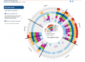
Here’s an infographic by the Guardian that shows the various gay rights related laws by region and state in the United States. Upon clicking on a state the reader gets a more detailed description of the rights available to members of the LGBT community such as rights to marriage, protection from discrimination, and the right to adopt. It really brings to light the division across the country on the issue of gay rights as well as the broad range of issues that members of the LGBT community has to face in everyday life. We hear about gay rights all the time but this infographic really helps to organize the facts in a reasonable, easy to read, and easy to compare manner.


~Taeyoon

07 Feb 2013

1. They Rule (voted for interesting dataset)

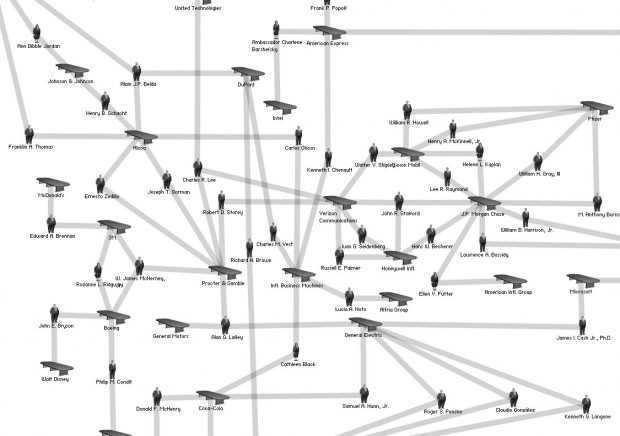
theyrule_01Josh On’s ‘They Rule’ visualizes interconnectedness of corporations that govern commerce and politics in the US. It is based on LittleSis. (LittleSis is a free database detailing the connections between powerful people and organizations.) While They Rule does not promise accurate representation of the major figures in the US, it does portray honest picture of stakeholders at work. It is true that the dataset available on LittleSis is interesting and resourceful, however it is only when they are visualized on ‘They Rule’ that the power structure becomes visible.


2. Valse Automatique (voted for provocative)

VALSE AUTOMATIQUE PROJECT| MADE from MADE on Vimeo.

Screen Shot 2012-12-08 at 8.59.45 AM5476622411_cc92d0385f_b

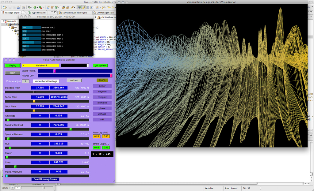
This project combines experimental rapid prototyping with music via data visualization. I think of this project as a provocative example of working with data because of it’s technical ambition. The symbiosis between sound and material (wax) is achieved by data transformed through various software platform (SuperCollider-Rhino/Grasshopper) and executed for fabrication by a giant robot arm. Additional visualization was created to help audience understand the process.

3. 3D printed disc for Fisher Price Toy Record Player (voted for well crafted)


This instruction by a maker named Fred is an interesting approach to materializing musical data. He wrote a software (windows only) which wraps musical notes to Fisher Price record. With data ready for OpenScad software, (which I have grown more interested about recently) you can make a STL file to 3D print your record. I love the way the project is documented and made available online. There are participants 3d prints of the records.

http://www.instructables.com/id/3D-printing-records-for-a-Fisher-Price-toy-record-/?ALLSTEPS

I guess the next step is 3D printed record.

Ersatz

06 Feb 2013

Lately, I am really interested in the process and algorithms of creating generative life forms and creatures. Here are three projects, that I like and would like to “dissect”, so I could learn more about the process.

Communion – A Celebration of Life

This one is a really fun project by FIELD and Matt Pyke.They made a wall of hundreds generated creatures accompanied through their evolution by a polyrhythmic soundtrack. Creative Applications.net has posted a great behind the scenes article, that explains the process of creating the installation

Weird Faces Study by Matthias Dörfelt using PaperJS


Matthias Dörfelt tries to create computer generated faces, that could not be instantly recognized as such. Event though, they look as hand drawn, they are actually completely algorithmically generated and every face is random and unique.

Cindermedusae by Marcin Ignac

http://marcinignac.com/projects/cindermedusae/

An old, but really awesome project by Marcin Ignac. Algorithmically generated sea creatures, that can be deformed, characterized and animated with modifying different parameters. I really love how their movements looks so organic and smooth.

Technique

I haven’t actually found the time to dig deeper for algorithms for generating organic looking and moving creatures, but will definitely do so. I am actually reading Dan Shiffman’s Nature of Code and The Generative Design book, which I think is a really good start towards the topic. But, if someone could recommend something, please comment!