Final Project: Minute

by areuter @ 2:12 am 11 May 2010

Overview

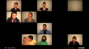
Minute is an examination of individual perception of time–specifically, how everyone perceives the duration of one minute differently. Participants in the project submit videos of what they perceive to be a minute to a database, from which a selection of the videos are chosen randomly to create a visual arrangement of people perceiving time in relation to one another.

Background

I first became interested in this project due to my own inability to accurately perceive time. When I was younger, I would always be the last to finish anything and I’d wonder if everyone was really fast or if I was just slow. This got me thinking about what time meant to me personally, and why I have the perceptions about it that I do. My investigation began about a year ago in Ally Reeve’s concept studio class, in which I conceived the idea of creating an video which contained an arrangement of people perceiving a minute based on background habits, such as whether or not they drink coffee. Then for my first assignment in this class, I expanded upon the idea by creating an application that pulls the videos from a database and arranges them on the screen, generally based on some background factor. For the final project, I wanted to carry this idea even further my making an interactive piece in which people can contribute their own minutes to the database, and then observe how their perception of a minute compares to all the others who have contributed their own minutes.

Implementation

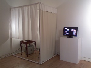
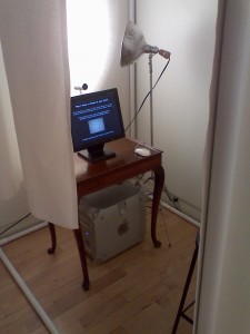
To collect the temporal perceptions of the masses, I constructed a recording booth in which participants can create videos of themselves perceiving their minute. The booth’s frame is made out of plumbing pipes so that it is easy to transport, and the backdrop is a stretch of light-blocking curtain backing. The material is pretty stiff, so it stays in place during the recordings and doesn’t cause too much distraction. Additionally, I hung a short curtain on the side of the booth to make it clear where people should enter, as well as make it easy to see if someone else was in the booth already without disturbing them. The whole structure white colored so that light reflects off the surfaces, as I only used one drawing light aimed at the wall behind the camera as my main source of illumination. (The booth is small, so I didn’t have room for more lights than that and shining the light directly on the booth’s occupant completely washed them out.) Inside the booth is a computer, a desk with a monitor and webcam, and a stool. The computer runs an openFrameworks application which automates the recording process in an effort to make it as simple as possible. Participants are invited to sit inside the booth, and instructions for recording their minute are displayed on the screen with a live stream from the webcam (so that they can adjust their appearance and placement inside the frame as necessary before they begin). When they are ready, they click the mouse to begin recording, and then click again when they feel that a minute has gone by. During this time, the webcam feed is not displayed so that it is not a distraction from perceiving the passage of time. After the final click, the video is sent wirelessly to the computer outside the booth, where it is saved in a directory containing all the minutes recorded so far.

The computer outside the booth runs another openFrameworks application that displays a sample of twenty minutes on a large widescreen monitor, arranged either randomly or by duration. As each video representation of a perceived minute ends, it immediately cuts to black and leaves a gap in the arrangement. After the last minute has disappeared from the screen, the program creates a band new arrangement of videos–no two iterations of the display will be the same. At the beginning of each iteration, the twenty minutes are chosen at random from the directory mentioned above. (All the videos are saved in their own file, separately from the application, so that they can be used the next time the program is run.) My hope is that after participants record and submit their minute to the database, they can step outside and see their minute in the next iteration on the display.

Here is a short sample of the minutes I collected at the Miller Gallery during the BFA/BXA senior exhibit (Fraps unfortunately limits the clip to 30 seconds):

Results

I’m pleased with the outcome of this project, although of course there are many areas which I could improve. One aspect of the project I deliberated over until the end was whether or not I should include the aspect of how a person’s background potentially influences their perception of time. One criticism I’ve heard is that doing so makes the project seem overly scientific for an artistic exploration. As the senior exhibit drew near, I decided that my time would be better spent keeping the piece simple but bringing it to a highly polished state, and looking back I think this definitely the right decision. It’s far more interesting just to arrange the videos by duration and listen to the audience’s conjectures about perception.

After completing the project, I made a couple observations. While the first participants were very withdrawn in their recordings, people became more and more adventurous in how they conveyed themselves. This was extremely interesting to observe, since I’m still very interested in how personality might play a role in how people perceive time. Also, I originally intended that only one person record their minute at a time, but some people really wanted to have someone else in the booth with them. I felt that this conveyed some aspect of their personality that might otherwise be lost, so I ended up deciding to let pairs of people perceive a minute together.

Lastly, there are a few other details that could be a little tighter, but I don’t feel that they detract from the piece in any major way. The booth is hard to keep clean because it’s all white, and sometimes the pipes don’t stick together very well. I ended up taping and nailing them into place, but it would have looked much cleaner if I had drilled a hole through each of the overlapping sections, and then placed a pin through the whole to keep them in place. Also, the recording application takes a few seconds to copy the video over to the other computer, and during that time it looks as if the program has frozen. Occasionally, people will click the mouse multiple times. Each click is queued and sent to the application after it has recovered, resulting in a number of quick scrap recordings that are still sent to the database. Also, it would have been nice to include a feature in the display application so that recently submitted minutes will always be selected. This way, people would be guaranteed the opportunity to see themselves right after recording.

Documentation and reactions to the project:
Final Project: Fluency Games

by davidyen @ 7:37 pm 10 May 2010

Introduction
For my final project, I worked with Professor Jack Mostow and the Project LISTEN team (www.cs.cmu.edu/~listen/) to do some exploratory work for their product, the Reading Tutor.

Background
Project LISTEN is a research project at CMU developing a new software, the Reading Tutor, for improving literacy in children. The Reading Tutor intelligently generates stories and listens to children read, providing helpful feedback.

My Involvement
I was asked to create sketches for a possible new component of the Reading Tutor, which would explore using visual feedback to help children read sentences more fluently (not currently a feature of Reading Tutor). This involved using canned speech and analysis couples to experiment with the intent of becoming “live” at a later date.

The Challenges
The most challenging parts of this project was working with the raw data from speech analysis software making partial hypotheses (and later correcting them) as to what was being said, and doing signal processing on the data. Also it was really fun and stimulating to work with experts in a subject to develop ideas.

Prosodic Data
Prosody is the pattern of rhythm, stresses and intonations of a spoken sentence. Project LISTEN developed speech analysis software that understands what words have been said and measures pitch & intensity over time.
Game Mechanics

Game Mechanics
I emphasized an approach that would incorporate game mechanics to the visualization of prosody to engage and connect with children. Game mechanics provide incentives for improvement and reinforcement through rewards.

The Games

Other preliminary sketches

The Games
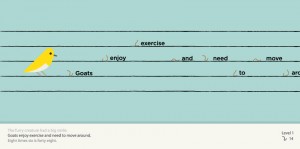
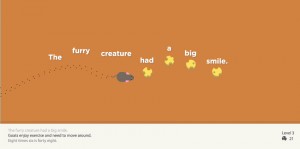
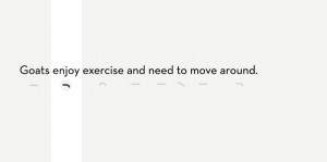
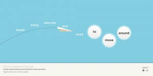
My sketches developed into a flexible system of “leveled” gameplay, which grows with the child’s abilities to provide a steady challenge. The framework provides a consistent objective (mimic the correct shape of the sentence) while slightly and intuitively mapping different game mechanisms to different visual scenarios.

Next Steps
I worked with the Project LISTEN team in the last few days of the semester by walking through my code together, so they can continue developing my sketches to hopefully be user tested this summer with local schools.

Thanks to Jack Mostow and Project LISTEN team for the great opportunity, essential guidance and accommodation, and Golan and Patrick for their help along the semester and for a fantastic class.

-David Yen

Looking Outwards: Freestyle

by guribe @ 10:56 pm 6 May 2010

Luminous Ceilings

This is a project I found on interactivearchitecture.org that looked interesting to me.

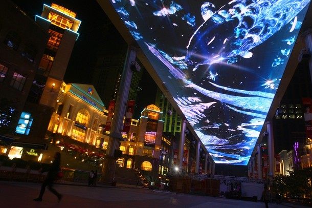
Thomas Schielke sent me his youtube presentation of Luminous ceilings a few months ago and usually I bin such emails since I like to find things for myself but I really enjoyed the way this research was put together (except the chessey music). Thomas explains that besides these ceilings providing spacious impressions they this work always metaphors the natural sky. “The historical observation of ceilings reveals that the image of heaven, which reached a theological culmination in the luminous Renaissance stucco techniques, turned into large-scale light emanating surfaces.”

Watch the video: luminous ceilings

From arclighting.de:

The aesthetic of luminous ceilings
From the image of heaven to dynamic light

Luminous ceilings provide spacious room impressions and can provide different types of lighting. Besides this, they are, however, also metaphors of the natural sky and a mirror of an aesthetic and architectural debate. The historical observation of ceilings reveals that the image of heaven, which reached a theological culmination in the luminous Renaissance stucco techniques, turned into large-scale light emanating surfaces. Even if the luminance of contemporary LED screens has increased intensely and thereby creates a point of attraction, designers still look to establish a pictorial language for an impressive appearance.

Looking Outwards: Final Project Inspiration

by guribe @ 10:55 pm

“Liquid Sound Collisions” is a project created at The Advanced Research Technology Collaboration and Visualization Lab at the Banff New Media Institute.

They use voices as sound and water to sculpt a 3D representation of the sound, and then used a 3D printer to create an object representing the sound.

Liquid Sound Collision is an aesthetic and interpretive study of the interactions that happen when recorded voices encounter computer-simulated fluids. In a digital environment, audio input can have a more obvious impact on the shape and distortion of iquids than in reality.

Each study sends two words that can be thought of as poetic opposites –
chaos and order, body and mind – as vibration source into a fluid
simulation. The waves created by the sound files run towards each other,
they collide and interfere with one another’s patterns. The moments of
these collisions are then translated into 3D models that are printed as
real sculptures.

The chosen words that depict dualistic world views are opposites, yet
are displayed as the turbulent flow that arises between the two
extremes.

Produced at The Advanced Research Technology Collaboration and Visualization Lab at the Banff New Media Institute.

Used Soft/Hardware: openFrameworks, MSAFluid library, Processing, Dimensions uPrint 3D Printer

More about this project can be seen here.

project listen sketches: progress

by davidyen @ 10:14 am 19 April 2010

Sentence summary: Mini game sketches for teaching children how to read more fluently.

I could display this on a laptop and possibly a DVD (not sure if I want to do a video instead of running the program, might be easier to explain).

Final project

by xiaoyuan @ 10:03 am

Get Adobe Flash player

AI-controlled flying, swarming attack saws killing little characters running around, making them bleed, painting the ground with blood.

Favorites:
500 rich people visualization – Paul
2 girls one cup – Paul

Hardware needs:
Computer, monitor, mouse
I expect the game to be playable.

Project progress

by kuanjuw @ 7:56 am 7 April 2010


wooduino and Braitenberg vehicle

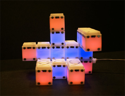
Blinky Blocks

by Michael Hill @ 7:45 am

When I first started this project, I wanted to create some kind of game that would run on the blocks. After fruitless hours of trying to get the simulator up and running, I decided that it would be better to create an interface that would allow an individual to effortlessly run a simulation without expert coding knowledge.

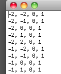
With this in mind, I set off to build an interface. Having been through the code enough, I knew that whenever a user desired to simulate a structure of blocks, they had to program it in by hand. Each block had to be manually entered into a text file:

To add to the complication, each time you wanted to see what your structure looked like, you would have to run the simulator all over from the beginning.

It became my goal to make this a much simpler process.  My first challenge was to figure out a solution to placing new blocks in the 3D space.  Over the past semester, I have been learning more a bout 3D programming and rounding up resources that might come in handy. Golan told me this problem of choosing an object was called the “Pick” problem.  This, in combination with my previous resources allowed me to put together a piece of software that users could add and subtract blocks, as well as import and export structures that could be loaded in to the Blinky Blocks simulator:

I also began coding an interpreter for LDP, but due to time constraints, I was only able to get a few command recognized.

When demonstrating this interface at the Gallery opening, I had several people comment on how intuitive the controls were, which affirmed my goal to make a simple interface that could be quickly picked up and learned.

Project Listen (capstone proposal)

by davidyen @ 6:57 pm 24 March 2010

For my final project, I’ll be working with Jack Mostow and the Project LISTEN team (http://www.cs.cmu.edu/~listen/). They’ve developed a software called the Reading Tutor, a software that supplements the individual attention of teachers to teach children how to read better. For my final project, they’ve asked me to create some design sketches that explore a new feature to perhaps eventually incorporate into the Reading Tutor software. The basic question I will be investigating is: Can visual cues and game-mechanisms help children read more fluently, in real-time?

The software they’ve already developed does some speech analysis that assesses the prosody of a child’s spoken reading. Prosody is the stresses, pacing, and changes in intonation within spoken language. Fluent & non-fluent readers speak with measurably different prosody.

My responsibility is to use canned speech samples of both fluent adults and non-fluent children, and the speech analysis results of these samples, to create some design explorations. I’ll investigate if kids can read a sentence more fluently (with the correct prosody) if they are given some visual cues as to how to say the sentence. I’ll create a few (goal: 3 to 4) sketches exploring both different visualization techniques of prosodic features, as well as different gameplay mechanisms to engage children & encourage improvement.

Eventually, I will work with the team to go from canned samples to real interactivity. I’d love to have this interactivity possible by the time of the final show, but that will depend on the ease of integrating my code into their software, which is uncertain. User testing will be done with children in pittsburgh schools over the summer.

Fantastic use of ChatRoulette

by jsinclai @ 10:44 pm 21 March 2010

Only because I know this class is in love with ChatRoulette:

Ben Folds on ChatRoulette while performing:
Ben Folds on Chat Roulette

and the full video taken from the audience http://www.twitvid.com/67269

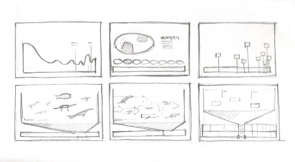
Final Project Proposal: Earth Timeline

by caudenri @ 6:58 pm

I’m currently working on a group project in which we are designing an exhibit about the evolution of birds. As I research the topic, I’ve become increasingly interested in the way that people perceive time on a long scale and also in the history of the earth. I would like to build on the research and motivation from this other project and create an interactive timeline for my capstone project. I would like to show the scale of the different time periods of earth’s history and what was going on on the Earth at that time period (this is of course dependent on the research that is available; factors like temperature data is more accurate in recent history than the theories we have for ancient times.) Factors I’d specifically like to show are average temperatures, continent formation, extinctions, and an brief overview of the types of life in the time period.

I know I’d like to do some sort of an interface that shows the whole timeline but allows you to magnify any portion to see the detail. I looked around for timelines like this on the internet and found a few nice ones but they all felt a little too segmented to me. I want to find a way to keep the information close together so it would be easy for the user to explore and compare information.

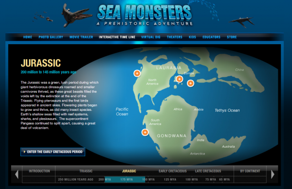
timeline example 1

I like the presentation of background information in this example and how they present the world maps for each period. http://www.nationalgeographic.com/seamonsters/timeline/index.html#jurassic

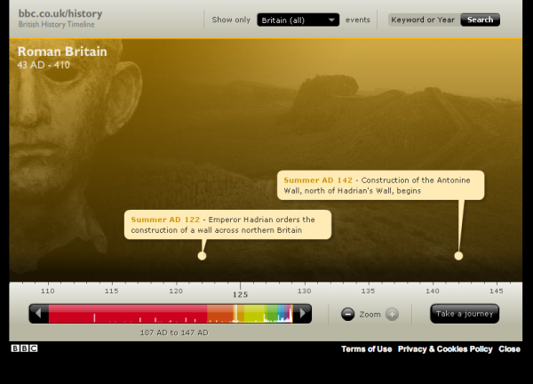
timeline example 2

British History timeline– The aesthetics are not great but I like the way of showing a larger part of the timeline at the bottom of the screen and using that to control where you are on the main screen frame.  http://www.bbc.co.uk/history/interactive/timelines/british/index.shtml

It’s generally difficult for people to conceive of long time periods; the dinosaurs lived 65 million years ago but what does that mean? I would want this piece to be easy to understand and navigate and to be interesting to play with. I envision that something like this could appear on a website for the National Geographic or Discovery.

sketch ideas

Here’s a few sketches I made for several modes the timeline could have and what the interface could look like, however I’d like to come up with a way to show all the information in a more integrated way.

Looking outwards: TypeStar

by davidyen @ 4:12 pm 15 March 2010

Since I’m doing my final project in the typography and speech visualization space, I thought this project was relevant.

TypeStar by Scott Gamer
He doesn’t say but I think it uses timed lyric data to create a kinetic typography visualization with a bunch of “preset visualization schemes.” Asked to make a kinetic type piece (see youtube) but instead made this software that generates kinetic type pieces.

This seems like a really useful tool, as audio-synced motion pieces can be a real pain to create. Imagine instead just finding the lyrics to a song online, and using a simple Processing app to record mouseclicks everytime each word is sung, quickly generating a file with timestamps for each word. With a timestamped lyric file and the mp3 file, you can get an infinite gallery of live visualizations to visually see what works right away. From there you could make a more fine tuned “canned” piece, with some editing and post processing work. Or, the results could be generative and not canned at all, you could generate timestamped files for a whole playlist and have the visualizations play on a large display at a party or club, if you wanted to go crazy you could even use amazon turk to get large amounts of timestamped lyric files.

–edit–
Apparently it uses “UltraStar” text files, I don’t have a clue what those are, but the Processing app I described above would do the same thing.

Looking Outward (Concept Exploration): Photo Petition

by sbisker @ 8:38 pm 14 March 2010

I’ve been thinking about how uber-cheap digital cameras can be used in public spaces for my final project. Mostly, I’ve been thinking about what individuals can do with cameras that they place in public places *themselves* that allows them to carry on a dialog with others in the community (as opposed to cameras placed by central authorities for surveillance and other “common good” purposes.)

Lately I’ve been thinking about interactions where individuals invite members of the community to actively take pictures of themselves (as opposed to taking “surveillance style” photos of people and places going about their normal business.)

One direction I am considering going in with this is the idea of a “photo petition.” Essentially, people are invited to take pictures of themselves rather than simply signing a piece of paper in order to “put a face” on the people who endorse or oppose a certain side of an issue. This isn’t really a new idea, but one particular photo petition caught my eye in particular – a project for Amnesty International where those petitioning were asked to hold up messages in the photos, messages chosen from a small selection of messages by the petition signer (it seems individual messages weren’t allowed, perhaps so they wouldn’t all have to be individually read and censored? or perhaps because of literacy issues in the region in question?).

Petitions, at least to me, often feel “empty” – my signature (or headshot) is only worth so much where there are millions of other people on the petition. I think that Amnesty sensed this as well, and they tried to get around it by adding a “personalization” element to their petition. But one person’s opinion, randomly chosen, still feels like just one person’s opinion – and reading one after another begins to feel like a jumble. Somehow the sense of “community” is lost – that is, unless the person collecting signatures explicitly explains what set of people he’s picked the individuals from.

What if we could give some context to these opinions? It seems like one way to do a photo petition would be to break down the petition into the smallest groups possible – and then build a visualization around those groups. What if a camera was placed in every neighborhood at the same time, collecting these opinions in parallel? Say, one at each major street corner. We could see the make up of who supports it in each region, and see how it changes from region to region. Local decision makers can see a local face on a petition – and more importantly, the context and backgrounds of the photos adds to the petition itself (since you’re not just dealing with faces, you’re dealing with pictures of PLACES too – a picture of me on an identified street is different then a picture of me against a black background or a generic street.)

If this idea seems like it could be one of a million similar photo community projects, well, that’s intentional. (In particular, it reminds me of Story Corps, except in this case, the Story Corps van costs $10 and is many places at once.) I’m trying to break down the “personal public camera” object into a “building block” of sorts, rather than custom-making it to a single project. If you’re going to invest some time in building hardware for a new interaction, it’s worth figuring out what it is exactly your interaction is capable of in general, in addition to any specific projects you may be thinking of doing with it.

Looking Outwards: Inflatables

by Max Hawkins @ 3:32 pm 28 February 2010

I came across this guy’s website a number of years ago. He builds awesome glowing plastic inflatables for parties and concerts.

Best of all he tells you how to make them and encourages you to build your own. I totally want to build one of these.

[AKAirways]

Project 3 Sketch–“Dandelion”

by aburridg @ 7:12 am 24 February 2010

Here is an image of a prototype of the piece:

In terms of interface, this is how I’m planning for it to look.

Right now I’m in the process of figuring out how to have my figure respond to “electromagnetic fields.” I’m going to have the stem of the dandelion and the little seedlings move depending on an electric field as shown by this Processing example here.

I’m going to have the electric flow depend on real-time audio input from the user. Right now I’m trying to figure out the ess library in Processing in order to use audio input.

I’m having a little trouble, but right now I’m focusing on the creation of the dandelion and the movement of its seeds.

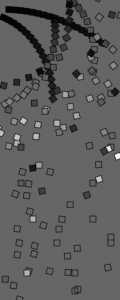
trying to reproduce Georg Nees

by jsinclai @ 5:43 pm 23 February 2010

So at the beginning of project 2 I wanted to emulate some stuff that the early generative art guys did, just to test my abilities and learn something new. The Georg Nees piece Schotter looked like it was really simple to recreate:

It really just looked like a nested for loop, with displacement and rotation increasing proportionally to the row. Well, I certainly had some learning to do, but I really like the process more than the product! My “broken Schotter”s are much more interesting to me than my success.

First attempt

Here’s a PDF that contains all 7. The last 3 are really cool next to each other.

GDE Error: Unable to load profile settings

Another issue I had was printing these out. Every printer I tried to print this on jammed. In particular, each printer had a “Fuser Jam.” After a week or so I realized that this is because the PDFs actually contain more data than it shows…well, I think that’s what the problem ways. In order to get them to print, I actually had to take a screenshot of the PDF (just a heads up!). I thought it was funny that this digital error was also causing physical errors as well (the printout would be there stuck in the “fuser,” all crumpled up).

I finally read the “translate” tutorial and figured it out.  Here are 6 different generations that are fairly close:

GDE Error: Unable to load profile settings

I also made a slightly interactive version that just uses mouseX and mouseY to affect the squares. Press any key to freeze the animation (any key again to resume):


https://ems.andrew.cmu.edu/2010spring/wp-content/uploads/2010/02/jsinclai_nees_sketch.html

I still need a paper cutter for the 11″x17″s, but I printed them out and put them on my walls 🙂

-Jordan

Looking Outward (Augmentation): Hacking your Camera

by sbisker @ 6:49 pm 20 February 2010

Anyone who knows me from outside of this class likely knows that my research involves playing around with time-lapse photography in public spaces, particularly using cheap keychain digital cameras. In particular, I wire up microcontrollers to these cameras such that they can take pictures every few minutes, with a cost per camera small enough that they can be simply left in public spaces in large numbers to learn about the world around us. I’m interested in “personal public computing”, the idea that individuals will be able to use cheap, ubiquitous hardware in public places that act on their behalf in the same ways that we today put up paper posters to find your missing dog, or that we hold up signs to protest abuse of power. If you’re curious, you can learn about it here or here, or drop me a line.

While poking around in preparation for a possible final project related to this work, I came across this cool resource for others who might want to make more sophisticated interactions that turn traditionally non-programmable hardware like digital cameras into “input devices.”

CHDK [Canon Hack Development Kit] is a firmware enhancement that operates on a number of Canon Cameras. CHDK gets loaded into your camera’s memory upon bootup (either manually or automatically). It provides additional functionality beyond that currently provided by the native camera firmware.
CHDK is not a permanent firmware upgrade: you decide how it is loaded (manually or automatically) and you can always easily remove it.”

Essentially, the Canon Hack Development Kit an open-source firmware upgrade that you can stick on a Canon digital camera in order to do more things with its hardware than Canon ever intended when they sold it to you. New camera features the open-source community has created with this new firmware include Motion Detection and Motion Triggered Photography, Time Lapse Photography, and scripting the camera’s operations such that the camera can do things such as prepare, take and analyze photos automagically. What’s more, the scripting language is generic enough that you can write scripts to program your camera’s actions, and share those scripts with others who own Canon cameras (even different models of Canons).

Canon has gone on record as saying that the CHDK does NOT void your camera’s warranty, since they deem firmware upgrades “a reversible operation”. What this probably really means is that Canon trusts an open-source community as organized as CHDK to create firmware versions that don’t literally brick people’s cameras, and they they’re asking CHDK to help them push the limits of their own hardware. This is quite exciting – more generally, I think we’re entering an era when companies are letting us “hack” the electronics in things we don’t normally consider programmable. This helps both us and product manufacturers explore possible new interactions with their hardware. A particularly geeky friend of mine is writing a new firmware for his big-screen TV, so he can programmatically do things like volume control and input selection, and ideally even more ambitious tasks like save raw video being shown on his TV from any input source to his desktop. What’s next? There’s some sort of “firmware” in everything these days, from our refrigerator’s temperature control to our car radio. How can we augment our day-to-day interactions by simply re-programming the hardware that exists all around us?

visually

by jedmund @ 6:20 am

Hey guys,

I just launched visually (http://vi.sual.ly/), a media bookmarking tool I’ve been working on since last summer. It is very humble right now, and I do consider it alpha software, but please take a look! It’s currently closed to everyone except for CMU students, so you have to use an @andrew.cmu.edu or @cmu.edu email account to register.

If you want to know more or have anything to say about it, let me know! (or if something breaks, cause that could happen too)

Cheers!

Project 2 – Making Faces

by jsinclai @ 3:29 pm 18 February 2010

For this project, I made faces.

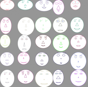
I was really intrigued by the Chernoff faces, not necessarily as a method of visualizing data, but just as a way to, for lack of a better term, express expression. They’re also really cute and fun to look at.

I created faces by randomly adjusting 20 different values associated with the head size and shape, the eyebrow size and shape, the eye size and shape, the pupil size and color, the nose size and shape, and the mouth size and shape.


I spent a lot of time tweaking how the different facial features interacted with each other to find positions and sizes that fit and made sense. And as you can see from the next photo, I also spent some time creating (and debugging with squares) more natural looking heads and smiles.

Alright, now I’ve got a bunch of faces…What next?

At first, I thought about breeding faces based on user input. But I think the world already has a notion of what an “ideal face” looks like.

So instead, I decided to reveal some identity behind this cartoony face. To do this, I hired people on Mechanical Turk to “name a face.” And name a face they did. In five hours, there were already over 400 names accumulated for my faces. The video below showcases some random faces and their names.

Project 2: Making Faces from Jordan Sinclair on Vimeo.

But why stop with a video? You can checked out random faces here: http://www.jonkantro.com/jordan/faceviewer/. And even try naming some faces yourself here: http://www.jonkantro.com/jordan/STIAProj2/

Looking outward:

There are two directions I would love to pursue. The first would involve creating life-like chernoff faces to visualize data, though, I could certainly see social issues arising.

The second direction would be to visualize these names and their faces. What does “John” look like? How about Bertrand? Or Francois? Perhaps I could create a limited set of faces and names, and visualize the connection between faces and names.

For those inclined, you can take a peek at one version of the code here: Chernoff_02_normalFaceToJavascript

Project 2: Dynamic Brush Simulation

by Michael Hill @ 9:04 am 17 February 2010


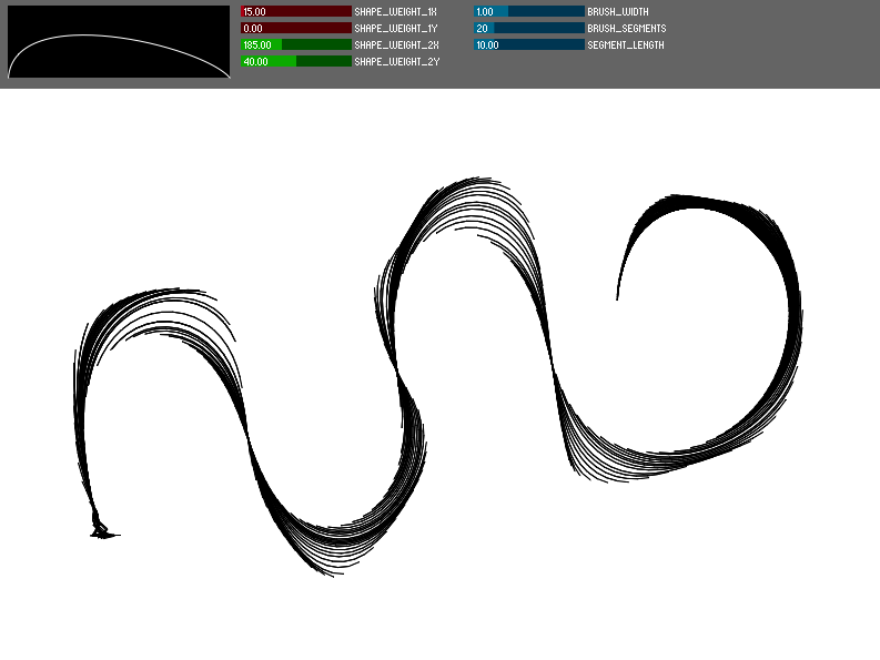
More information to come, for now, check it out here!

*Feb 21, 2010: Updated to work properly without tablet

Next Page »
This work is licensed under a Creative Commons Attribution-Noncommercial-Share Alike 3.0 Unported License.
(c) 2016 Special Topics in Interactive Art & Computational Design | powered by WordPress with Barecity