Looking Outwards: Brainball

by paulshen @ 4:09 pm 25 January 2010

Brainball

http://smart.tii.se/smart/projects/brainball/index_en.html

I found this installation navigating the Ars Electronica archives. This piece uses state-of-the-art technology to critique our competitive nature. Two players compete by achieving calmness and passivity. A system measures the biological signals in the players’ brains to produce this metric.

I think it makes an interesting point, how the advancement of technology is supposed to make our lives easier but often induces more stress. This is also true of competition, which often cause adrenaline rushes. This piece encourages the opposite and presents this concept using advanced machines.

The following is the given description by the creators.

“Brainball” is three projects in one: it’s a game, it’s art and it’s R&D. Two players sit at a table facing one another. Their brainwaves are registered and then analyzed and interpreted by a Macromedia Director application that controls magnets mounted beneath the table. These magnets, in turn, influence the direction of a ball on the table’s surface. The ball rolls towards the player whose brainwaves indicate a higher state of relaxation. Here, the use of cutting-edge biosensors opens up interesting human-machine interaction possibilities.

We live in a world in which everything seems to be moving faster and faster. New technologies that are actually supposed to make our lives easier lead to a spiral of incessant acceleration. More and more people suffer from exhaustion and stress-related health problems.

walking in the cloud

by Cheng @ 12:55 pm

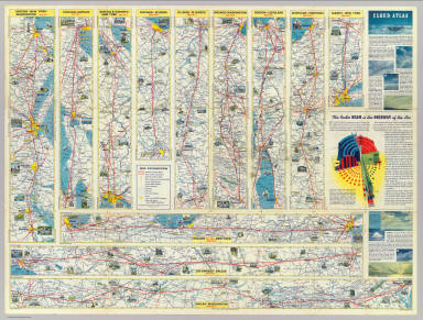
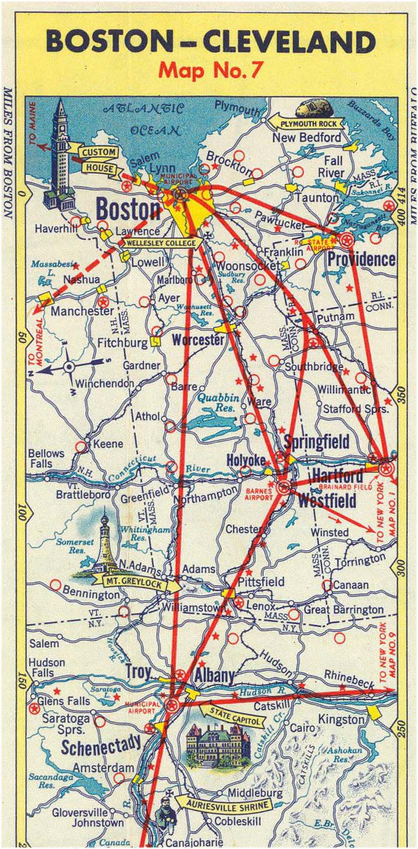
Pilots navigatDavid Rumsey Collection: (Verso of) American Airlines system map. Route of the flagships in relation to the air transport system of the United States … Prepared for American Airlines, Inc

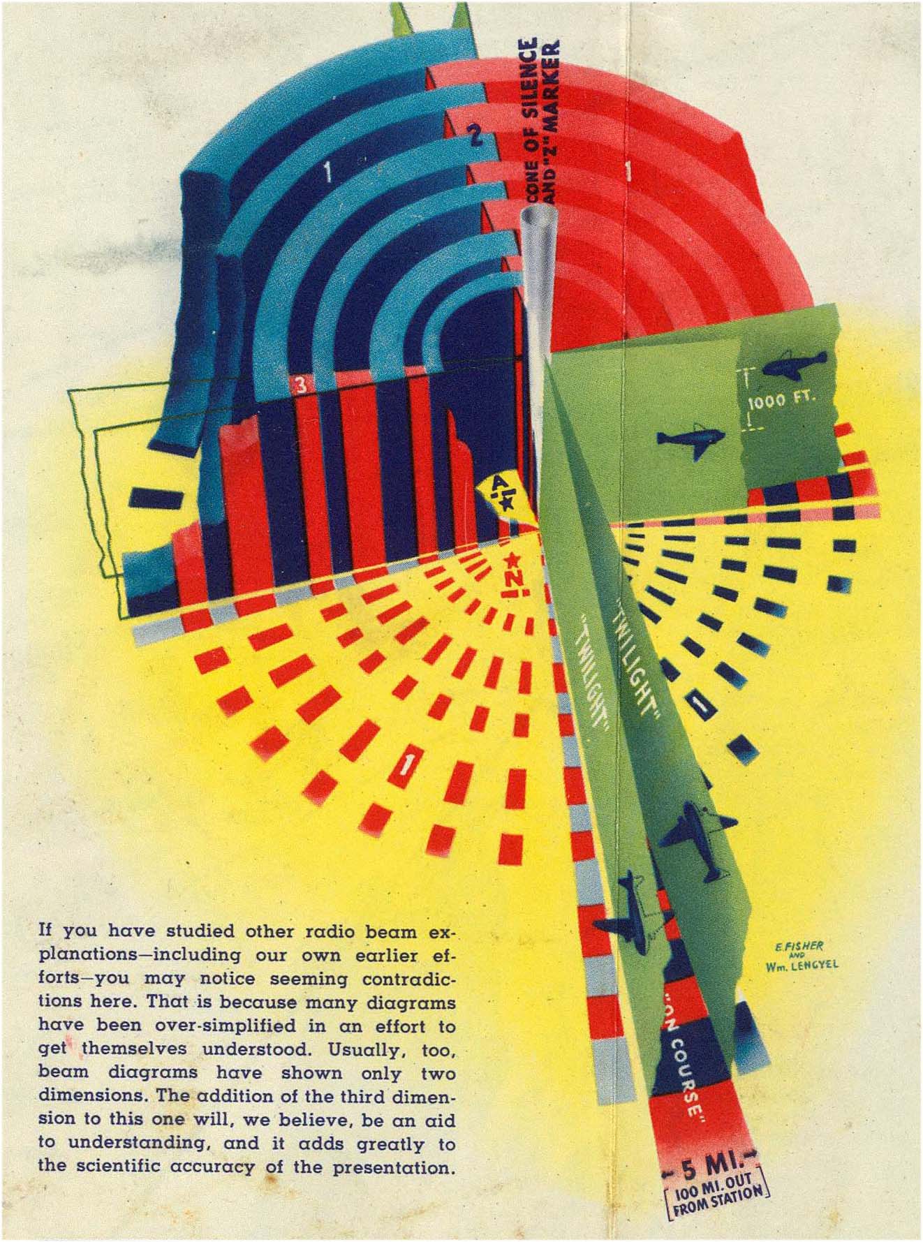
This is how pilots confirm their route in the 3D space.

Visually, lights standing high up from ground form a path for pilots to follow. The red flashing lights we see at night against the sky, when view from above, form some sort of zodiac for pilots and direct them to destination. It’s interesting to think about cities as nods of light flow. Could Boston be the North Star for pilots?

Auditorily, morse code style of beeps works like curbs for road drivers.

Looking outwards: Freestyle

by xiaoyuan @ 11:47 am

http://www.newgrounds.com/portal/view/320416
OMG, this is cool! These worms operate with inverse kinematics! THey swim around! They eat humans! They attack humans and the humans lose limbs and bleeed and die! 😀

Looking Outwards at Ice

by Karl DD @ 7:21 am

Below is a ‘reprint’ of part of my Project 1 post.


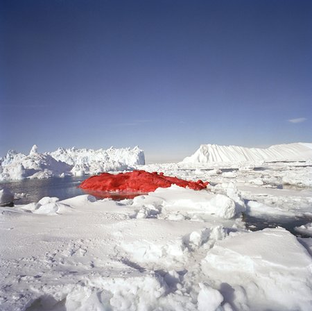
Marco Evaristti, Ice Cube Project, 2004. From Wikipedia:

With two icebreakers and a twenty-man crew, Evaristti used three fire hoses and 3,000 litres (790 US gallons) of paint to color the iceberg blood-red. The artist commented that, “We all have a need to decorate Mother Nature because it belongs to all us.”

Although a very simple idea, it immediately communicates a powerful ‘open’ message. This could be commentary on whaling, general environmentalism, or even protesting a war. The juxtaposition of blood red, with pure white is strongly out of place.

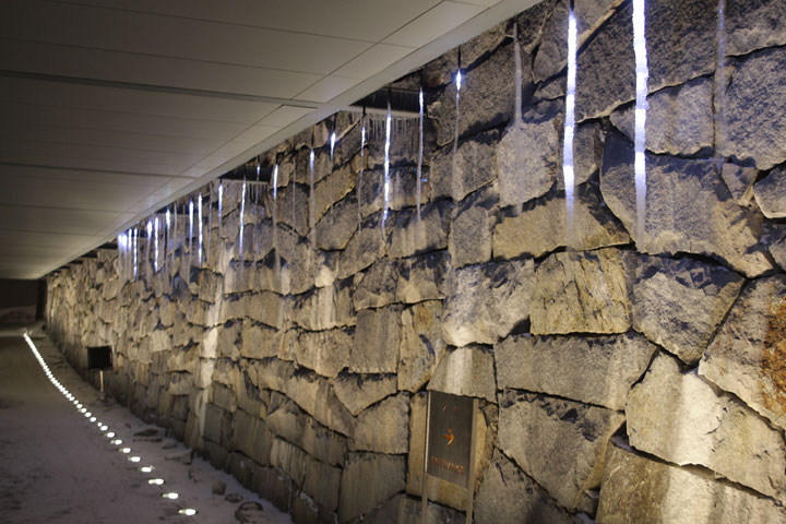
icicledrops, tEnt, 2006

We have developed the device which “invites/induces” natural icicles. Our device is composed of two parts- a pot and a string. A pot can preserve snows, control ices, and make a drop of water. A drop of water freezes again by an electronic-controlled cold string during trickling down. The accumulation of iced strings grows up to a big icicle.

8 LEDs which is attached to a string light up an icicle from inside. Light flickers like virtual drops, and generates new optical phenomena. Real water drops generate poly-rhythmic percussive sounds.

Using the above technique they can create icicles artificially regardless of the environment. What is really beautiful, especially in the top image below, is the way the icicles have been illuminated. They don’t look at this work as a ‘fabrication’ experiment, but rather an exploration of the aesthetics of icicles.

Looking Forward – A Tool to Deceive and Slaughter

by jmeng @ 4:33 am

I saw this from a gizmodo posting.

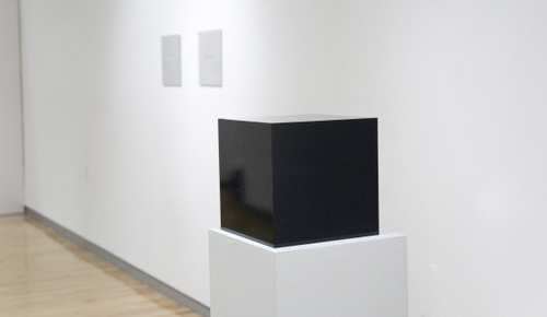
The shiny box above is “interactive art” that literally sells itself. You buy it on ebay, and when you get it, you plug an ethernet cable into it, and it sells itself on ebay. It comes with an interesting contract and list of rules which can be read at its ebay listing and comes with and instruction manual for cleaning and maintenance.

I think it would be interesting to see who’s been buying it, how many hands it’s exchanged, and how much it sells for at a time. I did find out though that apparently, it recently put itself online for a starting bid of $2,500 and is currently on sale for $4,250.

For more info from the artist’s page, go here.

Looking Outwards – Papercraft

by Max Hawkins @ 10:28 pm 24 January 2010

I’ve always enjoyed computational papercraft projects for the dichotomy they create. Paper folding is one of most traditional art techniques and 3D modeling one of the most cutting-edge, but they must both be present in a good papercraft project. The combination makes for some charming projects that make us wonder what things in our virtual world might look like IRL.

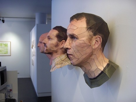
Above I linked to a great papercraft profile by Bert Simons, an artist who has been converting 3D models of people’s heads into real-life paper models. The results are convincingly realistic and can even be worn as a mask!

Simons did his paper work in a piece of software called Pepakura Designer which converts 3D models from various popular programs into paper cutouts (or laser-cut-outs) that can be glued together to create photorealistic models. There is a gallery of Pepakura-generated projects on the software’s website.

Others have had success creating paper models using the open source modeling software Blender.

Another (perhaps more politically charged) papercraft project is this paper AK-47 created by designer Martin Postler. I can’t find many details about how the model was constructed, so I don’t know if it was computer-generated or created by hand. One thing that this craft’s designer pointed out that hadn’t occurred to me is how paper-based models can take advantage of paper’s inherent malleability. People can customize their weapon by drawing on it, adding stickers, rearranging the pieces, or even burning it.

Update: I just found the company website for the designers who made this AK-47. It looks like it is computer-based. Check out their website for some other cool computer art projects.

As 3D printing becomes ever cheaper, many expect that someday a 3D printer will be as common and accessible as an office laser printer is today. Until then, however, it would be interesting if we could use our already-existing paper printing abilities to make interesting projects like these. There’s something special about seeing the virtual world become reality through 3D sculpture, and these paper products look like a great low-cost way to break that barrier.

Looking Outward: Sketch Furniture

by Nara @ 9:52 pm

Sketch Furniture

Sketch Furniture

Front Design, a Swedish furniture company, are pioneering a new technology they named “Sketch furniture“, also called “gestural furniture design”. They use motion capture to record pen strokes made in 3D and then use rapid prototyping technology to actually create furniture pieces from the motion capture data. This project struck me as really interesting because I have seen a lot of interactive art and computational design work, but I’ve never seen anyone attempt anything with furniture design. I think the concept is very interesting and adds value to the final pieces (which in my opinion are interesting to look at but not particularly beautiful). I also appreciate them making something ‘useful’; too much interactive art and design, in my opinion, is interesting and perhaps beautiful, but has absolutely no purpose. I could see this technology being developed to actually help furniture designers test out their ideas in 3D, and allow them to develop their concepts while thinking spatially, rather than having to do 2D sketches of something that will live in 3D space. I do think designers will become even more empowered if we’re not always stuck working on paper or a 2D screen, but can actually develop our ideas in 3D space.

Sketch Furniture video

Looking Outwards — Freestyle

by aburridg @ 8:39 pm

Here’s a cool piece called “aperture”:

It’s a interactive wall installation with many dots, and depending on how long a person stands by the dots, the dots will dilate accordingly. Here’s another picture that kind of shows the dilation process:

If you couldn’t tell…I’m having a hard time deciding on what exactly I should do for Project 3. So, I’ve been looking at various art pieces for inspiration. 🙂 I definitely think I want to incorporate sound into my third project though.

Looking Outwards (Freestyle) – End-user programming and the nature of art and design

by sbisker @ 5:41 pm 22 January 2010

This week, the User Interface Design group at MIT* got some buzz for their work on a new end-user programming tool, Sikuli. End-user programming itself is hardly a new concept, but the levels to which this paper succeeds – letting people merely visually identify and “select” parts of any open website or application in order to command its actions – pulls up larger questions about the nature of art and design. Who makes art, art? Is it fluency in a medium? Creativity? Or some concept even more amorphous and impossible to talk about?

Projects like this make it clear that programming is what typing was some twenty years ago – a skill that is hardly understood, and mastered by “a chosen few”, but clearly needed by large sections of society.

When I was first taught to type in elementary school, I was taught very formal methods. I was told to keep my fingers on the home row, to keep a proper “posture” – and to never look down at my fingers. (Heck, they even stuck a box over my hands so I couldn’t see.) Only then, my teachers surmised, could I achieve the typing speed of “the typists” – true members of the New Economy, who could type at the lightening-fast speed of 100 words per minute. So much emphasis was placed on raw speed that even my Mario Teaches Typing game kept a constant numerical score of my typing speed in the upper corner – making it clear even to children that always faster was always better.

As it turns out, I didn’t really listen. (I didn’t listen to much back then, but that’s another story.) And years passed, and I grew up typing all funny, and I entered “the New Economy” with a typing speed less than half of the “typists” of the 80’s. Yet somehow, my typing is still enough to get me through society – as typing became a critical part of everything I did, at a variety of speeds. Even my mother, who didn’t take a formal typing class, and was not “chosen” from youth to learn the home-row method, picked up typing as well – in her own unique way, starting one finger at a time and learning via muscle memory a technique even half as fast as mine (but still useful for her needs).

So, if you believe my rant above, it would seem that in 30 years, people would be “programming” in many different ways. Maybe not in the syntax that we call programming today, but typists traveling in time from the 1980’s would be amazed at what we do today with a few, slow keystrokes and the click of a mouse.

So, let’s tie this back into art and design. There’s a running idea that “everyone is a designer”, and that given the right toolkits, people will be able to design themselves usable and meaningful experiences. This idea is right, in many ways – and end-user programming work like this will allow truly creative people without “programming skill” to, well, program things no one has ever dreamed of. At the same time, there’s a distinct implication throughout the *practice* of art and design that progress comes from mastering new and unusual *mediums* through which to express your ideas – be it the repositioning of atoms with small laser beams, or controlling a 10-foot tall, six-axis welding robot. When people are asked if they are designers, they often answer in terms of mediums – saying “Oh, I can’t draw”, or “I’m more of a back-end programmer” (referring to HTML and CSS as a front-end, “designery” programming medium.) I don’t think an average person would say “I’m not a designer because I’m not creative” – indeed, American society encourages creativity in all aspects of life, in line with our individualistic (“cowboy?”) values. I might even go so far as to say that all Americans are somewhat creative (assuming they were encouraged to color in kindergarten.) But are all Americans artists or designers?

Suppose I work for UPS. If a off-the-shelf tool like Sikuli allows me to quickly create a version of “Flight Patterns”, but instead tracking UPS trucks for a UPS marketing campaign, am I still making art or design? (Let’s assume for simplicity that no “plagiarism” is occurring; due credit is given by me to the original “Flight Patterns” creator, who is in turn fine with me creating it.) To viewers of my piece unfamiliar with “Flight Patterns”, my UPS marketing campaign might look totally original. In that sense, it would have just as much value as an art piece in terms of getting people to think (perhaps even moreso, with its massive outreach.) In that sense, the project is still “art” in the sense that it might let people see something for the first time. Yet there’s a distinct sense that, in this scenario, such a project would be uninteresting – or, worse, part of “marketing”, design’s bastard younger cousin. Now, let’s say that UPS built this same project, but gave it a slight spin – they occasionally zoomed it into Kentucky so people could watch the rhythm of trucks around their international air hub in Louisville. Here, UPS has embodied their design with an insight that “Flight Patterns” could never have – but is just bringing new information into an existing visualization enough to make it an act of creative design? How about art? Is an application interface hand-coded in Intel-chip assembly, or sewn together from tin cans, somehow more artistic or designery than a version written in PyGTK in 3 days for an anxious client?

At least today, it’s impossible for me to really answer these questions in any satisfying way. All I know for sure is, using just Processing (a tiny subset of Java, a clunky programming language which is itself nearly 15 years old) our class of students was able to reproduce the earliest 1963 digital artworks of Michael Noll in approximately 15 minutes each. As better and better end-user programming tools find their ways into artists and designers – and perhaps wanna-be artists and designers – it is inevitable that these tools will be created for new mediums even faster than artists can “master” them. At that part, is everyone a designer, or is no one a designer? I’m rooting for the former.

*Yes, I have unavoidable biases on anything coming out of MIT. So it goes.

Looking Outwards – Dataset of GIThub projects’ activities (and swear words by programming language)

by jsinclai @ 9:12 pm 19 January 2010

http://corte.si/posts/code/devsurvey/index.html

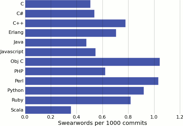
This guy has a really cool data set of over 5000 “active” GIT repositories. He pretty much did the first 3 steps of Ben Fry’s steps to making an info-vis: acquire, parse, and filter. He produced some basic statistics on the data, but there’s probably a lot more interesting information hiding there!

My favorite is the “Number of swear words per 1000 commits by language.” I remember an old javascript/php web app I made where I didn’t have a dev environment set up, I had to commit to the actual server to see results. Every time I had to debug something I’d end up with 50 or so commits just on that issue…many of the comments were filled with cursing 🙂

Jon Miller – Looking Outwards 2 – Small World

by Jon Miller @ 3:03 pm 18 January 2010

map

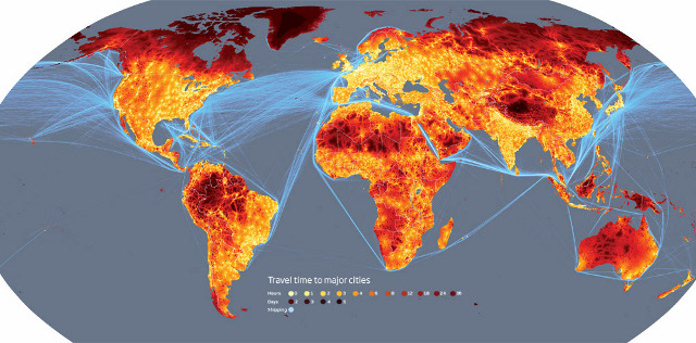
In tune with some of what has been shown in class, this is another project with a simple premise with meaningful implications. Presented in heat map form, it attempts to show the degree of “remoteness” in every location. It does this by calculating the distance it would take to travel (using conventional methods) from any point on the map to the nearest city of at least 50,000.

At a glance, it shows how mobile the world has become, and to me, the reds and yellows emphasize the dominance that humanity has over the planet. (Perhaps an interesting side note: in the comments about this image, people disagree over whether this is a good or bad thing.) It also reveals where people have not established themselves, showcasing the most inaccessible places on Earth. I was surprised by the remoteness of Tibet.

Source: http://www.newscientist.com/gallery/small-world

Looking Outwards — “Alien Space” by Alexandra Dementieva

by aburridg @ 3:03 pm

Alien Space from netlash on Vimeo.

This project seems very interesting–as you move through the art piece, the images and sounds played on the multiple projectors will change based on your movements.

It’s very similar to what I would be interested in doing for Project 2–and has giving me a lot of ideas!

I really wish I could actually go and see the piece. The idea of a cacophony, or a mixture of sounds you would not necessarily want to hear together, is very intriguing to me…especially if the cacophony consists of people’s voices. I can imagine the piece is very eerie if seen in person.

Looking Outwards — Visualizing Websites

by aburridg @ 2:47 pm

Aharef has an interesting project going on here, which interprets popular websites as graphs.

Unlike a lot of other website-visualization projects I’ve seen (where the nodes are webpages, and if a link exist betweens one webpage and another, there exists an edge between the webpages’ respected nodes), this project instead has graphs which represent html tags as nodes and the edges are created as a result of the hierarchical nature of tags. Or, for instance, let’s say there was an image tag within a link tag, then there would be an edge connecting those tabs’ respected nodes together.

Aharef colored the nodes based on what type of tag each node represents. For instance, dark blue nodes represent link tags and red nodes represent table tags. The piece was written using Processing and actually runs in real time–you type in a website, it goes to the website’s source code and calculates the graph.

One of the interesting depictions on the site is of boingboing.net:

You can see that the website has one large tag which has many many other tags within it.

I still code in html, so it was interesting for me to see these pictures because I can really see how the website designer structured the site. Although, I wonder if someone who was not familiar with html would find it interesting (besides the project’s aesthetic nature–the graphs themselves are very nicely layed out and colored).

Looking Outwards #2: Visualization

by areuter @ 8:37 am

Although I’m extremely interested in data visualization, I usually don’t discover anything through it that’s actually useful–ie: changes that way I live.  However, this project–a bar next to the shower that lights up one bulb for each 5 liters of water used–is something that could really have an impact on me, and as a result, the world.  I do have a bad habit of taking long showers, often because I lose track of time since I’m just waking up.  This project is a great way to communicate this type of information (I’m blind without my glasses, but the lights would be easy to see), and it’s also more accurate than other methods I’ve devised (like watching the clock,which isn’t an accurate measure of water consumption AND requires me to step out of the shower).  Plus the thing looks cool.

http://infosthetics.com/archives/2009/09/show-me_water_consumption_in_the_shower_at_a_glance.html

Looking Outwards – oSkope

by rcameron @ 8:21 am

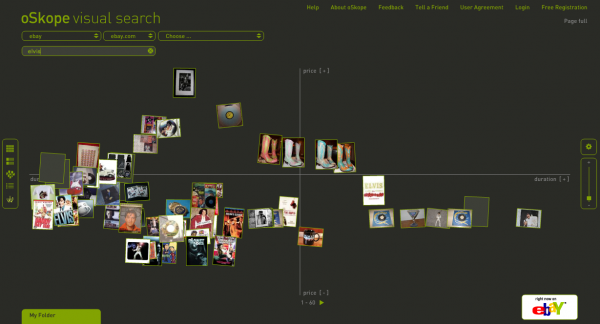
oSkope is a visual search engine that returns images as results. Pretty straighforward – You select a service from which to retrieve pictures and oSkope presents them to you. The winning feature here seems to be the graph view. This view charts the photos based on different statistics for each site. If you are searching eBay, it will chart them based on price and duration (of the auction, I assume).

oSkope

Looking Outwards – Sonification

by Mishugana @ 6:51 am

Charts Music – Johannes Kreidler make  recession art with microsoft songsmith and depressing data.

Johannes Kreidler is an german avant garde composer. A lot of his work deals with data and computers and composing sound with abstract concepts in mind.

Kriedlers website

A book Kriedler wrote on using pure data for music

Johannes Kreidler

Below is an embedded youtube video for Johannes Kreidler’s  Charts Music.

(Project’s Webpage)

It was made by taking real data readily available to the public and visually displaying the data alongside the sonification of the data in this youtube piece, (i haven’t seen anything signifying that this is documentation and not the actual work)

He uses a simple program called microsoft songsmith to take values of data from the past (then present) and make them into eerie musaq-like song portraits.

The power and strength in this piece is obviously the sound work and the visual accompaniment only serves to reinforce the contradictions and disparity the tunes produce. Using sound and music to allow the viewer/listener to create an image of values that are mathematically are tied to real world events and catastrophes somehow is very powerful. The intriguing space he inspires is something i think  all artists strive to create.

Although it would be stronger as an info-vis software (and artists are trending more towards transparency as well) to make available a program that would allow the user to submit any data and then turn it into a song in the same way that he has…. any user still has the ability to do it themselves using microsoft songsmith. (you can try the software for free)

Kreidler also has a certain level of intentionality in this piece…. while giving users/viewers the ability to explore data is very powerful, choosing data, and arranging its order adds the hand of the artist back into a work a bit more, and can present a clearer approach. And lastly then again by removing himself he could have made the work more neutral and allowed the user to ask their own questions and draw their own conclusions instead of walking the line of political art and political activism with an agenda.

either way the piece is very interesting, and i think sonification is under-explored and should be considered visualization even though technically it relies on sound as its medium, which is inherently not visual.

“its got a good beat, and you can dance to it.”

The World’s Eyes

by jedmund @ 5:52 am


The World’s Eyes

The World’s Eyes is a project from the MIT SENSEable Lab that uses Flickr as a tool for tracking photographers’ travels through Spain. By using Flickr, you can track lots of information about the user and the photograph, from the hometown of the photographer to the geolocation of where the image was taken. This results in a lot of interesting data that might uncover interesting tidbits of what is interesting to people. For example, if two people take an image in the same place, then it’s probably of more interest than a place that only one photographer has captured. If three people take an image in that place, then its even more of a hotspot, and so on and so forth.

I’m very interested in using this kind of subconscious attraction to certain things to put together information about human behavior and visual culture, so something like this is very interesting. Unfortunately, it doesn’t seem to be an ongoing project, but some of the visuals are interesting nonetheless, and the concept behind it is very thought-provoking. I chose this because out of all the things I looked at, it struck closest to home, and I was thinking about possibly using Flickr as an aggregation tool for our upcoming project, so I wanted to see what it had been used for already. Out of all the visualizations involving Flickr I could find, this seemed to be the most meaningful.

Looking Outward – McDonalds

by jmeng @ 5:49 am

Found this in a blog, linked from another blog, etc…

While it is not interactive, I found it a very interesting visual representation.

This map (found here) shows data from the 48 contiguous states colored by distance to the nearest McDonald’s. The information was sited to be taken from AggData.com around September 2009.

Some interesting things:
– In the US there are approximately 13,000 McDonalds
– The furthest distance between two McDonalds is 107 miles (between Dakotan hamlets of Meadow and Glad Valley)

Placebo’s Video Embed Test

by teecher @ 2:27 am

Hi everyone! I’m Placebo, Golan’s fake student. I think I’ve figured out how to embed videos. Check out this 3D Milk Scanner by Friedrich Kirschner, from Vimeo:

Now check out the latest interactive work by my friends, YesYesNo, on YouTube:

Looking Outwards – Fleshmaps

by Cheng @ 2:23 am

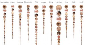
Fleshmaps: listen ( Fernanda Viégas and Martin Wattenberg) counts how frequent body parts appear in lyrics and show images of the body parts sized to its popularity, grouped by genre. Hip Hop, obviously, gets the biggest hip. Most genres have big eyes, followed by hand.

A interesting way to “view” music and genre, I found it amusing at a glance. Here are three things I would like to change, if I redo the work.

1. Change the soft, pale, sleepy pink color in the visualization to something more energetic.

2. Add interactivity. When viewer clicks on one body part, show random sample lyrics instead of numbers accurate to 0.01%.

3. Change visual presentation. Instead of cloud and array of circular images, build a real body with proportioned parts.

frequent
« Previous PageNext Page »
This work is licensed under a Creative Commons Attribution-Noncommercial-Share Alike 3.0 Unported License.
(c) 2016 Special Topics in Interactive Art & Computational Design | powered by WordPress with Barecity