clox-02-Reading

02-Reading:

Question 1A.

This is a plaster cast of an ant hill. Ants are known to have a complex social system that bestows on each ant a certain simple task. On an individual level, it can be difficult to observe how their actions contribute to the colony's complicated organizing principles (i.e. to make underground tunnels, or to organize themselves into a water repellant lattice). I think the effective complexity of an ant colony lies somewhere between fractals/L-systems and Genetic systems/A-life.

 Question 1B.

I am currently working on training a neural network on a corpus of Susan Sontag's (a personal literary 'hero' of mine) writing to create a simple tool that aids my understanding of This idea arose not as a postmodern statement against the empire of "The Author" nor did it come from a desire to make a tool that produces a unique textual artifact. I am making this tool to feel 'closer' to Sontag, to somehow tease out answers to questions I have about her thoughts, her writing practice, in the form of generating new "content" from what she left behind. At the same time, I know that what this tool generates encounters the bowls of oatmeal problem. While the text I have been able to generate is different each time, I am not sure why it is so, or what to 'ask' of the tool to make it generate something more specific--basically, the feedback I get from my neural network is limited, so I must rely on my own knowledge of Sontag's work to guide my tool. This is not really an issue for me since I want this tool to be mediated by a human. Anyways, I am still working on some of the issues around generative text and would love to learn more about the discussions

meh-Reading02

1A. Japanese ceramics could be seen as a great example of effective complexity. Just as other ceramics, basic rules such as what clay to use and what general shape to follow need to be followed to successfully create the ceramics. However, unlike other ceramics, Japanese ceramics shows a much greater tolerance to defects and more appreciation to the unpredictability in the glazing process. It strikes a great balance on the scale between total order and total randomness because it has to conform to certain rules to survive but its beauty actually comes from the unexpected.


1B. The Problem of Meaning has been a long-time struggle for me not only when I am producing generative art but also other digital art. The biggest drive for me to learn coding art is for very practical reason without much meaning, and I only assign meanings to the pieces as work progresses. My works also tend to have a more improvisational nature and I like to find out the final answer through experimentations. In the end I tend to believe that even though I use generative system for a very practical reason, the meaning of the works should be determined by the creator not the tool through which art is created.

MoMar-Interruptions

Assertations:

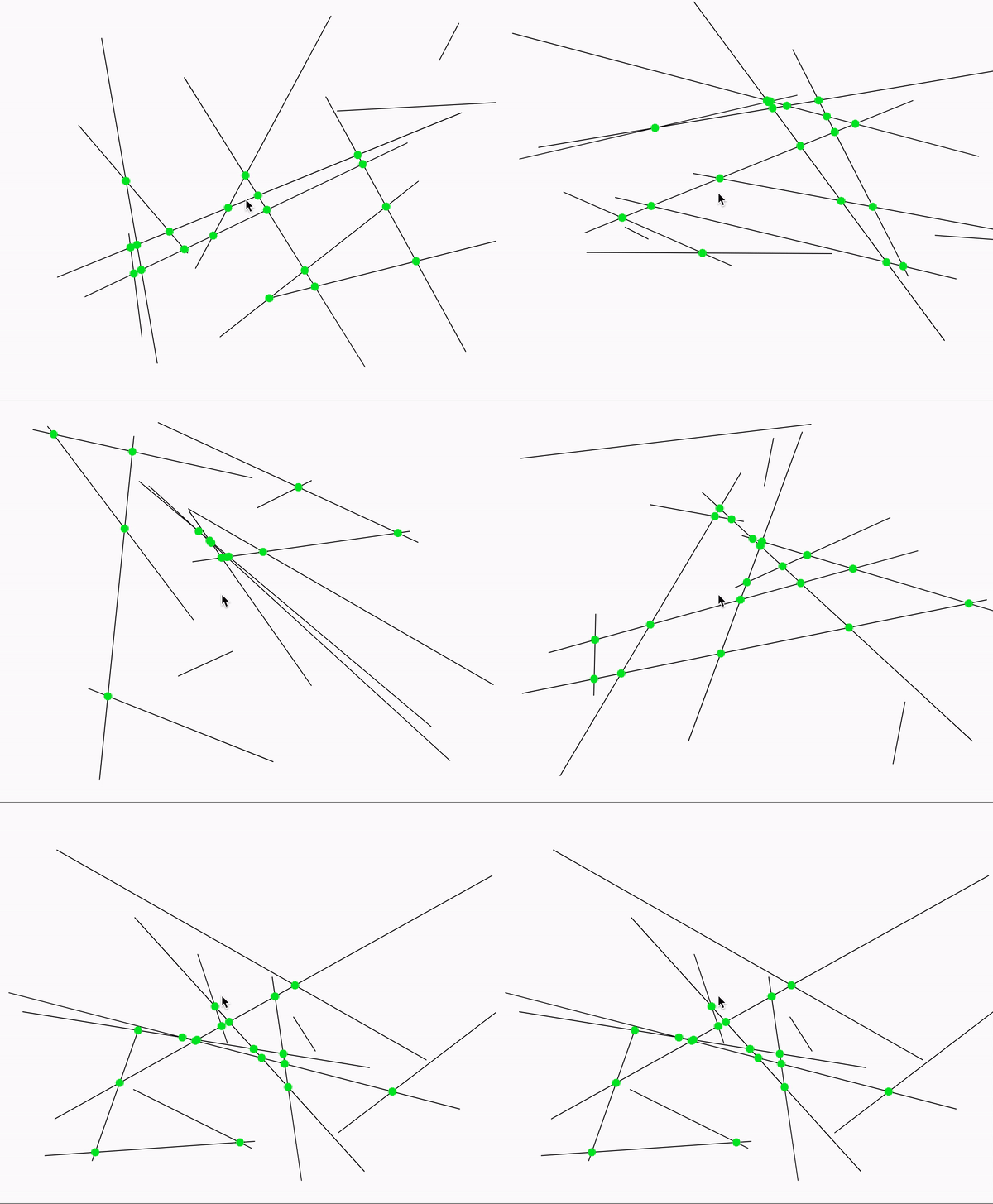
  1. The artwork is square
  2. The artwork consists of many short black lines, on a white background
  3. The lines all have the same length
  4. The lines seem to be generated randomly
  5. There is an occasional random space where the lines don't spawn
  6. The size of these spaces are random
  7. The line generation stays in the shape of a square (likely because of some margin).
  8. The outermost points on the outermost lines start on the edge of this square
  9. Lines typically intersect with each other
  10. More lines are vertical than horizontal

The Work:

https://editor.p5js.org/MoMar/sketches/Et7sHwo0Y

Process

After reading my assertions, I had a question: "How do I generate equal lines?" Apparently, all you need is a circle. I randomly generated my origin points and used this formula to create a start point for my line. To find the endpoint, I subtracted the midpoint from the start point. Then, I added this value to the midpoint and got the endpoint.

The next question was "How do I generate random empty spaces?" The answer: use noise.

The final question "When do I place the line?" was easy to answer. I just needed to place a line above a certain noise value


szh-LookingOutwards2

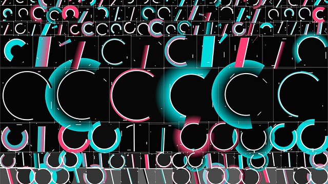
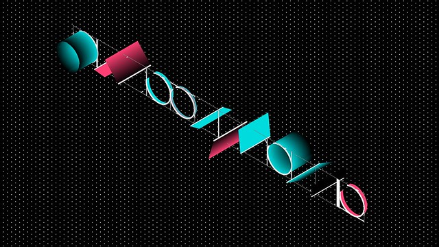
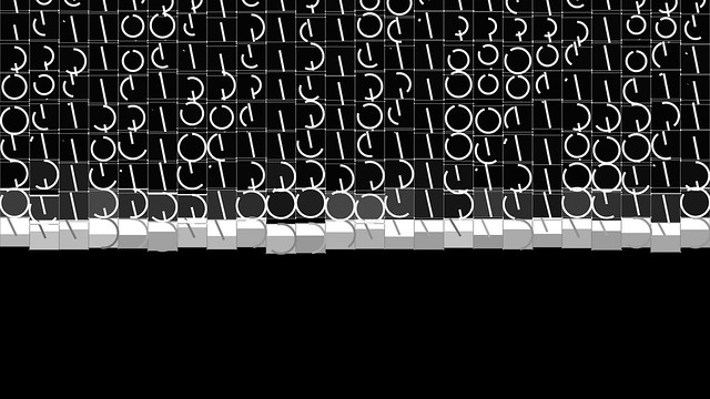
Zero One is a code-based generative video programmed by Raven Kwok and sound by Mike Gao. It was programmed and generated with Processing with minor edits in Premiere during composition. It consists of multiple interlinked generative systems, each of which has its customized features, but collectively share the core concept of an evolving elementary cellular automaton.

I really admire that within any still shot, even within repetitive patterns, each design/part looks different or unique from each other. It gives the entire video a more organic/natural feel to it, instead of being super cookie-cutter.

The project consists of multiple interlinked generative systems, each of which has its customized features, but collectively share the core concept of an evolving elementary cellular automaton.

The colors, shapes, and the motion graphics I feel are the areas in which the artist has taken control of and used their artistic sensibilities to adjust the project towards what they want appealing and attractive.

The order in this project is the similarity in shapes; the repetitive usage of circles and lines through out the entire video, and similar actions within a scene (e.g. the slant of all the images, or everything moving downwards). The disorder in the video are the specifically different forms each shape takes (size, color, each pixel movement). Each circle is sized a little differently, and the placing of, say a line through the circle, varies each time. This is the disorder of the artwork, but because it is placed in an orderly fashion / balanced order, it achieves effective complexity.

by Raven Kwok / 

Zero One | Video

szh-Reading02

I feel as though (many) natural things display signs of disorder or randomness while (many) human-designed/built things display signs of order, as we have dictated precisely where and how we want to place something. In this way, I feel as though flower fields or gardens exhibits effective complexity because planted by humans, they have specified growth locations, and are trimmed to the desire of the gardener. Many can be placed in rows or in specific grid structures, which is total order. However, I also feel like many naturally growing foliage have a mind of it's own and after the initial set up (planting the seed), so long as it does not cross a certain boundary, the plants are allowed to grow however they want.

Because most human planted flowers/trees/etc do have designated areas, I think this selection sits a little closer to total order. Due to the way that plants grow, I think there is an inherent degree of disorder (if left unmanaged by humans). Though, this also depends a little on the type of garden:

Image result for gardens

Somewhat in between -- the flowers/trees aren't allowed to (really pass into the concrete path (though it does, a little), but it also grows with a degree of disorder (leaning towards the path, not being completely straight/perpendicular to the ground).

Image result for flower fields

Much closer to total order; very organized with extremely even paths; in the distance, the colors are very distinguishable from each other.

Image result for flower fields

Although they are all the same breed, the colors of the flowers show a degree of randomness and disorder.


The Problem of Dynamics: Must generative art change over time while being exhibited to an audience?

The dynamism of a generative art piece is very subjective; I don't think that adding time as a factor necessarily increases it. To be considered generative art, it doesn't need to change over time -- as some art may be missed by the user, and while this is valid for art, I don't think this is an effect of generative art -- but I think that art that changes over time can certainly be considered generative.

As generative art is "autonomous", I think that the way the art is produced should be able to produce different art each time it is used (so it is not repeating / looping) but because the art must be created, recorded, started/stopped at some point, I do not agree that the art must change over time as it is being exhibited. It is only the point of creation do I think it should be able to change (not necessarily is changing, as this is up to the discretion of the creator, but simply has the ability to change).

clox-LookingOutwards-02

02--Looking Outwards:

Neural Network Generated Zines (2019), by Everest Pipkin

http://everest-pipkin.com/

In this project Everest made two zines (printed and digitized) using an "intensive upscaling algorithm" that reinscribed details in highly compressed thumbnails. Essentially, this project employs a powerful neural network (if I understood it correctly) to add more detail to an image whose format was intentionally designed to be a reduced (but visually effective) version of the original image. I'm interested in how this work touches on Hito Steyerl's discussion of the politics of 'poor images'. Steyerl argues in Defense of the Poor Image that there is a hierarchy of images based on their resolution, and that resolution has been "fetishized as if its lack amounted to the castration of the author."

We could simplify, then, and say that the upscaling algorithm is part of the redemptive 'agenda' of the empire of resolution. Yet, Everest's project complicates that assumption by showing us the limits of such algorithms. While we know that the 'poor images' in the zine have gone through a rigorous process of enrichment, they aren't particularly remarkable--they still fail as (en)riched images. Yet, what we are given in the zine is a kind of unheroic visual document of these two systems trying to compromise their difference--and we are asked to pay attention to that. In this project we already see tension between disorder (the reality of compressed, low res images) and order (the desire for high res, rich images). But with regards to how order and disorder function in this work effective complexity, I see this work hovering around simple-disordered.


sovid – Looking Outwards #1

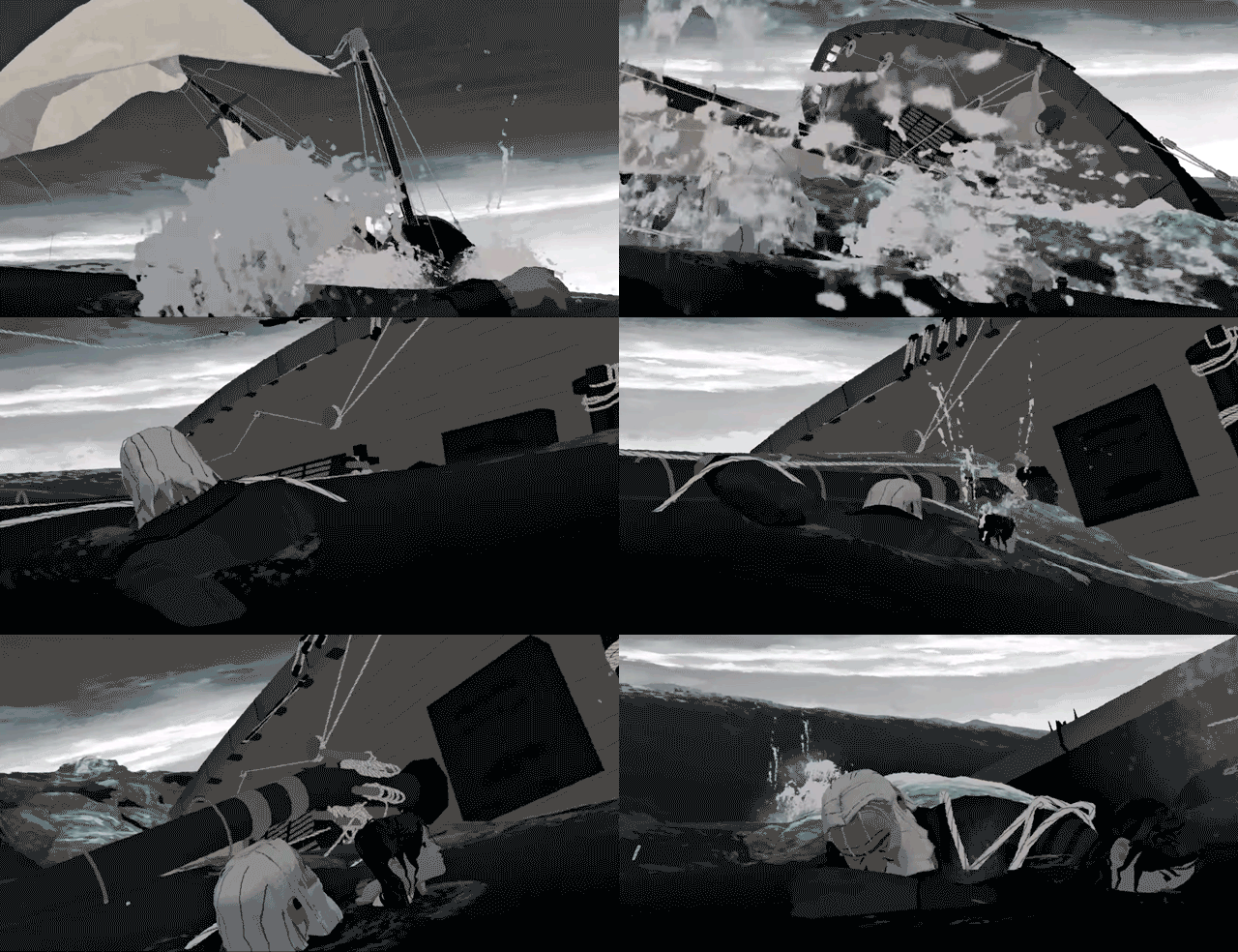
I recently attended a lecture at SIGGRAPH 2019 called "Classic Art, Cutting Edge", in which I was exposed to an animated short created for Google Spotlight. The 3D animated short told the story of an old sailor who finds redemption when he saves a young girl who had fallen overboard her ship. I enjoyed the story, but what captivated me the most was the way the animation was presented. The team of ten or so people at Boathouse studios had managed to create a beautiful sketch-like ocean scene that was able to run in realtime and in VR. I believe the project took them almost a year since the team was so small and the film was about 12 minutes. I am very interested in the new ways film and storytelling can be shown outside the scope of traditional theaters, and I have been working with more VR related projects recently. The shaders and ocean scripts were created by the team, as animating and simulating the ocean using normal simulation in Maya, for instance, would be too expensive for VR (the whole film is set in the ocean). I admire how they were able to create a captivating film, where the viewer has the ability to look wherever they would like but still be able to follow the narrative the way they intended.

A theatrical (non VR) version can be found here.