lubar – Looking Outwards – 1

Rain room by Random International 

This is a piece that I was exposed to at some point freshman year, and is one that I have continued to return to over and over again. 

Rain Room is a large interactive installation of downpour rain indoors that allows audience members to walk through it and stay dry. "3D depth cameras" places across the top beams of the structure track human movement and control the sprinkler grid, turning off the water in a 6 foot radius around a body.
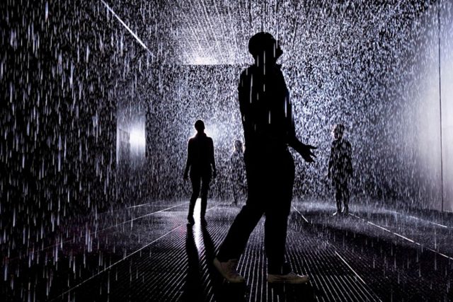
What draws me to this piece, is its seamless integration of interactive programming, human gesture, and natural phenomena in a way that recontextualizes the audiences experience and interaction with the event of walking through the rain. It evokes a sense of whimsy and creates an experience of discovery and curiosity, 'the controlling of the weather' striking a balance between 'how does this work', and 'how do I work within it'. The disappearing mechanisms and simplicity freedom of gesture in interacting with the space make way for the fully immersive, interactive experience. The work is by Hannes Koch and Florian Orktrass and installed by Random International, the sheer scale of the piece and the venues it has been created in reveals a large team behind the actuation of the work itself. I would assume that this is formed from a combination of "off the shelf" and custom software.

What is particularly exciting about this project is that it proposes opportunities in the future to create work through computing that manipulates and simulates moments that really accurately mimic and expand on natural phenomenon in a way that changes the context of its experience, and creates truly wonderful moments. 
vingu – looking outwards 1

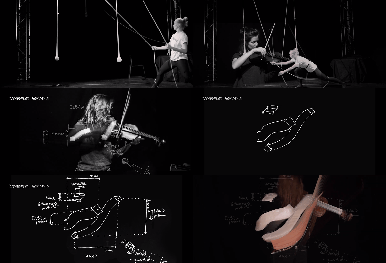
Tabita Cargnel calculated the movement of playing the violin and translated to a interactive piece where you move your limbs and "dance" to play the violin.

It's interesting to me because I played the violin for around 10 years, and although it is very technical, I've never seen it broken down/displayed like this. It's also interesting to recreate something very human, with technology, and how they map certain body parts to mechanical parts. In addition, it's not completely mechanical, there is still a human aspect to it; the mechanics are just aiding the experience.

I found the installation piece great because it utilizes the whole body to play the violin. (as I mentioned earlier, mapping different body parts to an object, that is unconventional) It also is very inviting and much more easier to play using this installation piece (which is funny to me, because when you learn to play the violin, it takes weeks, even months to play a nice sounding note). The way this is set up, it is more user friendly for the public, and there is no wrong way to play/dance/interact with it (while on the other hand violin is very strict with its technique).

The artist spent a lot of time understanding and calculating the mechanics of the violin. In addition, they were considerate of making this intimidating instrument "user/public" friendly. Re-imagining the violin. I like how the installation piece is fitted for one person, so it still has that solo/personal quality for the violin. Maybe for a suggestion, I'm curious how it would look like scaled up to a whole room. Rather than it be for one person, it is for a whole group of people (like a duet, or quartet, or even string orchestra). I imagine that it will look like a spider web where people crawl through, which sounds very interesting.

Tabita's recent works surround interactive installations, and bridge the gap between art and technology to "create honest and sometimes very literal pieces of work." (from her website) She was trained as a musician, which shows in some of her sound/music related works. She also studies robotics in college. It seems like her interest and music and technology inspires some of her pieces.

clox-lookingoutwards01

Quite frankly, I am not familiar with many interactive AND computational projects. However, I became more interested in learning how to code after I attended Robin's Sloan's workshop: Automatic Telling: A Cyborg Fiction-Writing Experiment (at the Studio). The workshop unfolded over the course of three days, during which the participants, coming from a wide range of disciplines--from game design to English literary studies-- sat down together on a long, continuous table to co-author, with the computer (specifically, an artificial neural network trained on artists' biographies and other corpora and developed by Sloan), a brief account of a fictional artistic movement of the late twentieth century: The Center for Midnight: A History in Fragments.

The tool that Sloan created, to me, promised a new way of thinking about writing, and challenged the sanctified position of the singular, genius author (now joined by a virtual "ghost-writer"). On a personal level, I wanted to believe that such a tool could help me get over my fear of writing.

Instead of supplanting the craft of writing, I strongly believe that this kind of tool augments our intelligence. Emerging from AI, AIA research, some propose is concerned with developing tools using AI to create "new cognitive technologies," or apparatuses that allow us to "explore and discover, to provide new representations and operations" of our own cognitive processes and intellectual frameworks (Carter, Nielsen, 2018).

Is this not the same intent with which Robin Sloan created his machine-learning-augmented text-editor? Have not all the objects (i.e. the quill, the pencil) and physical infrastructures (i.e. desks) through which we engage in the practice of writing been implicated in shaping the way we think about and feel writing (with our bodies and mind)?

vikz-LookingOutwards-01


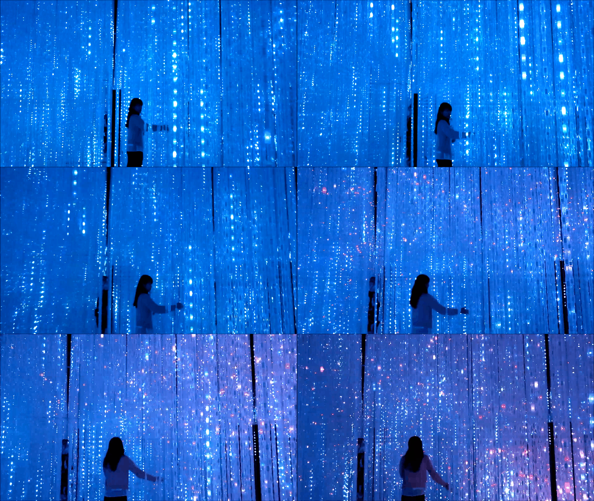
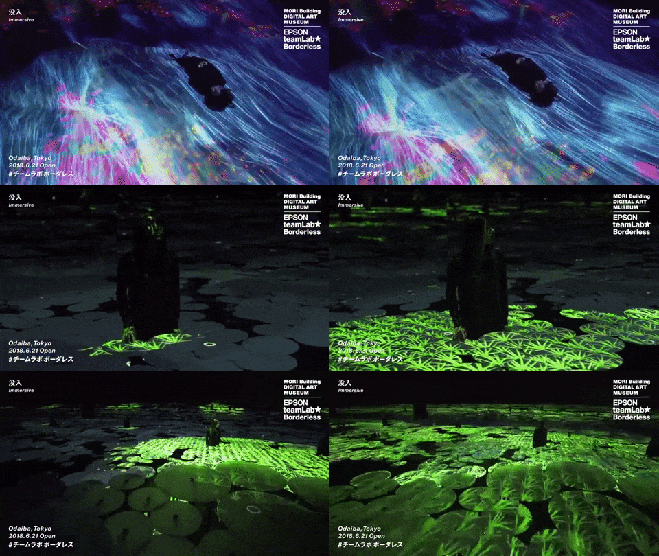
Last year, teamLab's talk regarding their Borderless and Planet environments was one of the first momentous exposures I had to the Studio for Creative Inquiry at Carnegie Mellon University, and greatly motivated me to wanting to take this class as well (in addition to also seeing the student work showcase). teamLab describes themselves as "an art collective, interdisciplinary group of ultratechnologists whose collaborative practice seeks to navigate the confluence of art, science, technology, design, and the natural world." I believe that teamLab does develop their own custom softwares and scripts, to which they utilize across their exhibitions. I was lucky enough to just recently visit teamLab's Borderless exhibit on my recent trip to Japan, less than a month ago.

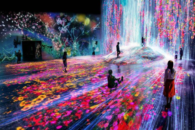
teamLab's Borderless is collaborative co-creation space for visitors to embrace creative and individualistic opinions and observations, while collaborating with strangers, families, and friends. At first glance, it seems to be just fascinating, exciting playground for young kids to frolic around and enjoy how intelligent of a world can respond to their each and every motion, however, upon further scrutiny and researching more into the mission purpose of teamLab, one can connect how each and every interaction and exhibit room space catalyzes some form of self awareness and discovery, in parallel with creating and existing in harmony with others.

There are many aspects that could be greatly expanded upon, and overall this environment space serves as a catalyst for many other monumental works and thinking to sprout from. Although extremely supernatural and mystical, which proves great delight to kids, I think it would be really interesting and beneficial if teamLab and/or other creators would be able to implement this sort of environments and interactions more seamlessly into everyday learning, rather than have it be an isolated experience that one would have to visit in order to be directly affected.

From what I gathered from their exhibit, it seems like teamLab is greatly inspired by the need to fill the gap between bringing together creativity and traditional classroom learning. In a growingly technological age where children can easily become more isolated, in combination with a culture that strictly enforces learning through traditional means of reading and writing, with right and wrong answers, teamLab aspires to facilitate a more organic, creative, and individualistic co-creating and learning environment.


sovid – Looking Outwards #1

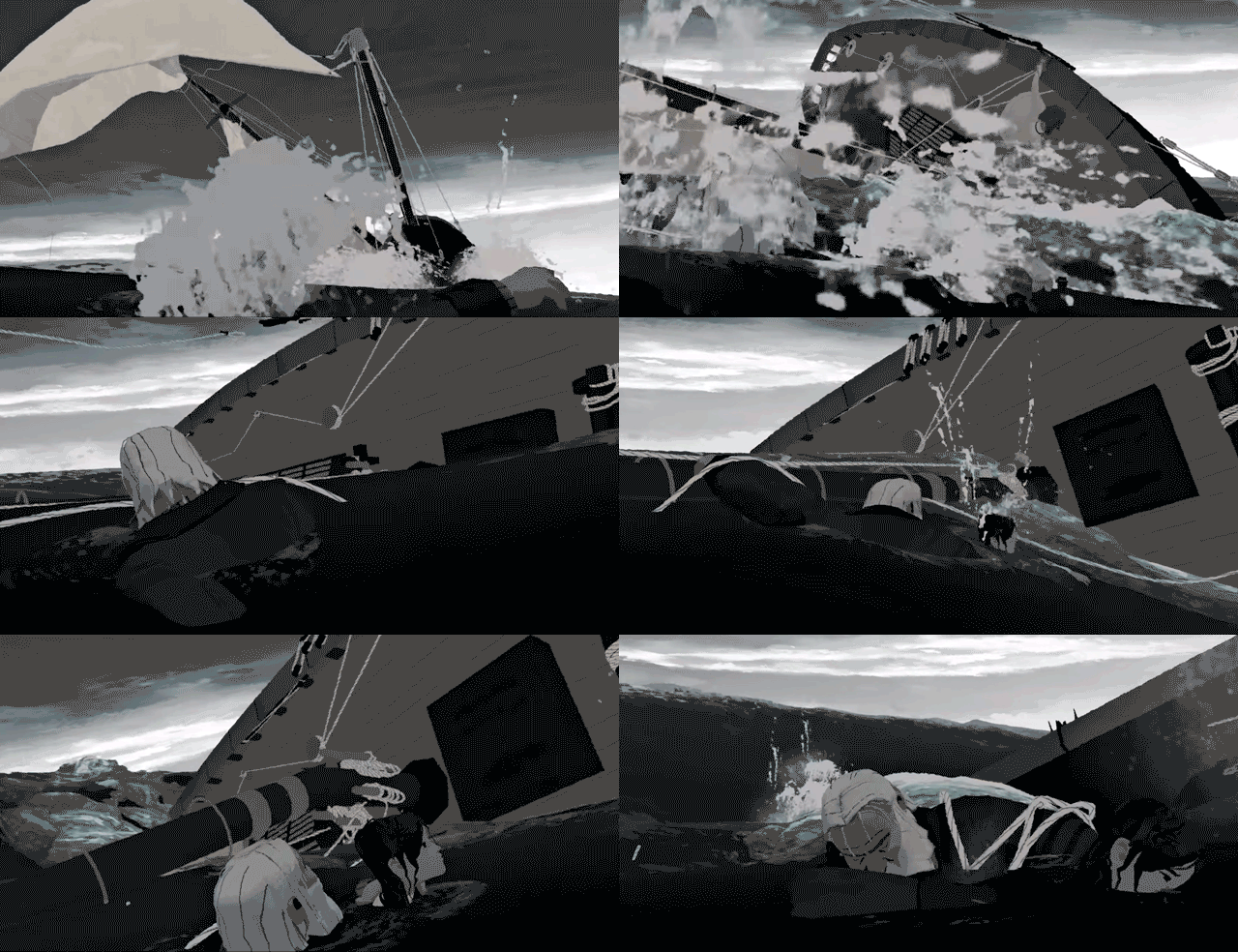
I recently attended a lecture at SIGGRAPH 2019 called "Classic Art, Cutting Edge", in which I was exposed to an animated short created for Google Spotlight. The 3D animated short told the story of an old sailor who finds redemption when he saves a young girl who had fallen overboard her ship. I enjoyed the story, but what captivated me the most was the way the animation was presented. The team of ten or so people at Boathouse studios had managed to create a beautiful sketch-like ocean scene that was able to run in realtime and in VR. I believe the project took them almost a year since the team was so small and the film was about 12 minutes. I am very interested in the new ways film and storytelling can be shown outside the scope of traditional theaters, and I have been working with more VR related projects recently. The shaders and ocean scripts were created by the team, as animating and simulating the ocean using normal simulation in Maya, for instance, would be too expensive for VR (the whole film is set in the ocean). I admire how they were able to create a captivating film, where the viewer has the ability to look wherever they would like but still be able to follow the narrative the way they intended.

A theatrical (non VR) version can be found here.

Zapra – lookingoutwards01

Limbo by Playdead, 2010
Gif source

As a lover of all things whimsical and uncanny, I'd describe discovering Limbo as my first experience being truly in awe of computational art. Developed by the small, Danish studio known as Playdead, it is just as much a work of art as it is a puzzle-based video game. Starting in a dark forest without evident controls or instructions, the game chronicles the terrifying challenges of a young boy as he travels through "the edge of hell." Unlike my favorite movies and books that could fall into the same genre, I'm in love with how Limbo uses code to tell a story and invites you to experience art through interaction. It feels far more intimate than animation; as you are tasked with saving this unfortunate protagonist, the creator invites you to explore and uncover what they've made for you. 

Starting as an independent project by Arnt Jensen in 2004, the game took 6 years to complete and expanded to a team of 16 by the time of its release. According to Wikipedia, much of Limbo's artistic direction drew from Jensen's personal experiences as a child and his admiration for the film noir genre. Martin Stig Andersen, an expert in "acousmatic music," compliments the exceptional art direction with an unearthly soundtrack comprised of computer-generated sounds. The game was created using Visual Basic and Visual Studio. Following Limbo's major success, Playdead expanded as a company and developed its second eerie horror game, Inside, in 2017 (as I patiently waited 3 years for its release).

Image result for limbo playdead
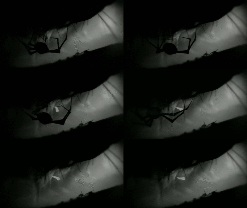
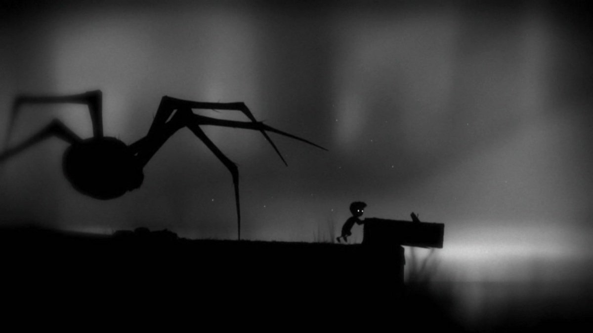
In one of the more chilling puzzles in the game, the boy must cross a pond without being killed by one of the many giant spiders.

meh-lookingoutwards01

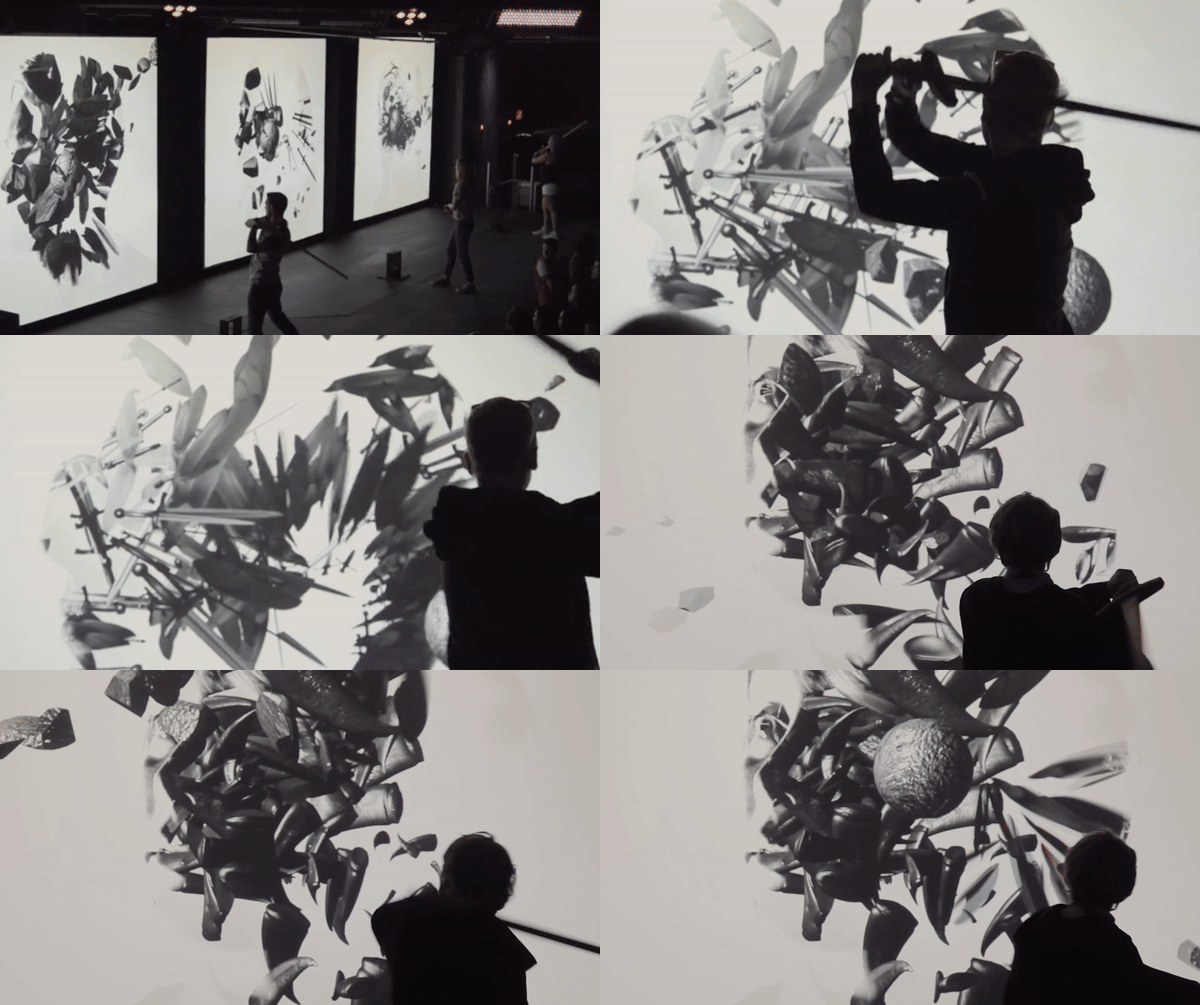
Sword Experience is an art installation piece by Red Paper Heart studio, inspired by the HBO series, Game of Thrones. They were asked to convey Arya Stark's journey in becoming an assassin. To create the piece they created custom graphics engine, written in the C++ framework Cinder, blends both 2d and 3d visual elements which are then masked by the user's own photo. The final artwork is then uploaded to a server and available for sharing the moment a user steps off stage.

This interactive game really inspires me because it not only maintain a high artistic craftsmanship but also creates a world that remains true to the original story. As commercial interactive ins is becoming more and more popular, the criteria in the field should be more about what quality can we achieve from and what meaning can we assign to the interactive technology. This piece successfully tells a very poetic story through very simple interaction.

Link: https://redpaperheart.com/work/swordexperience

sansal-lookingoutwards01

One major project that inspired me to take this class was the teamLab lecture and presentation last year. Their BORDERLESS installation in the MORI building in Tokyo was incredible (though I have not had the chance to visit in person, I am referencing the images presented during the lecture and on their website). TeamLab specializes in large-scale installations, incorporating both art and computer science into an interactive experience that is different for each viewer, as it relies heavily on user movement and actions. As a student interested in both art and computer science, and pursuing a degree in BCSA, this project seemed like a perfect harmony of the two disciplines, combining them in a way I never thought of before. I do not know the exact number of people involved in making it, but it must be a few hundred people involved in the entire process. To my knowledge, all of the computer graphics, artwork, and sound are created by teamLab, using custom scripts to program the entire installation. The project's creators might have been inspired by Japanese folk stories and cultural tales, as well as cultural objects of Japan. The project points to more connections and collaboration between computer scientists and artists, and the coming up of a more technological and interactive world.

https://borderless.teamlab.art/ , BORDERLESS, teamLab.

szh-lookingoutwards01

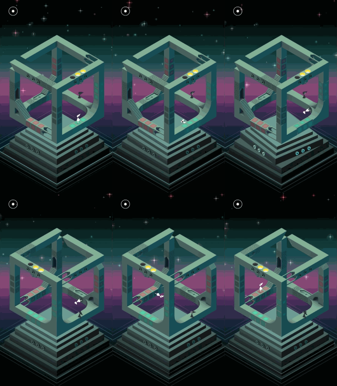
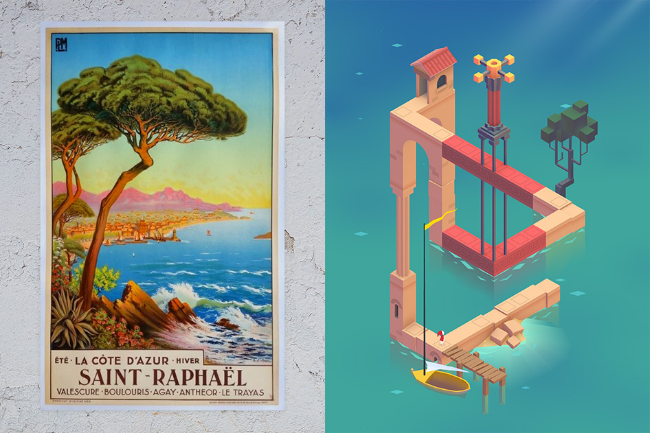
Monument Valley is an indie puzzle game developed and published by Ustwo Games, where the user manipulates the world of mazes of optical illusions and impossible objects in order to allow the Princess to reach a final platform.

I love this game because not only do the aesthetics and art style of the game really appeal to me (the color scheme is amazing and the UX of the entire game is incredibly satisfying and soothing), the puzzle part of this game is solved by utilizing the concept of impossible squares. I really admire this game because it almost breaks the laws of physics, and the user is required to "think outside of the box" to figure out the solutions for each puzzle. It takes advantage of the isometric art style and forces users to think about how the different structures can be moved around in order to find the solution. In addition, each level seems very different from the last (in that each setting and structure represents something else, from castles to moats, to random climbing structures), but still utilizes the same rules it establishes from the get go. I admire the simplicity of this game play, yet the game creation itself is quite complex.


The game was developed over ten months in 2013; the visual style was inspired by Japanese prints, minimalist sculpture, and other indie games.  The creators drew a lot of inspiration from other artists and art history.  The art was designed such that each frame would be worthy of public display. Ustwo is a digital design firm company that has designed iPhone apps since 2017.

null

"Changing the meaning and make it our own."

I find it really inspiring to see where these creators drew their own inspiration from. These other artworks gave ideas of more than just level design, but what the setting of a stage would look like, the color scheme of the structures, even the structure/castles themselves.

Although that the game appears 2D, it was built with 3D assets; custom-built extensions to the Unity Editor enabled Ustwo to create architecture that looks connected through the game-view camera, though in reality it isn't actually next to each other in world space.

One thing I found lacking within Monument Valley was it's story line, as it does have one and each stage opens with a quote that serves drama to the table, but I felt as though it made no difference to how I played the game. In fact, at times, it made no sense. I think adding a little story element behind why each structure was the way it is (why water here? why add the impossible square columns here?) can increase the gameplay experience.

The creators really did in effective job in creating a game where each still / snapshot of the gameplay is picturesque, making for a great screenshot. The way it thinks outside the box of physics really amazes me, and I admire it very much.

Game Trailer

lsh-lookingoutwards01

Mark Wheeler's This City is the piece that inspired me to learn openFrameworks. In the piece, Wheeler sits surrounded by a garden of synthesizers, MIDI controllers, and a laptop. Behind him, one sees a projection of infinite spanning roads packed with cars, which he controls with the MIDI devices around him. Part of the mysticism of the piece comes from the video composition: the dark room with subtle blips of light from the machines and the electronic music create a murky, ethereal tone. A moment that I especially admire is around the 1:18 minute mark where Wheeler cuts from footage of him turning a knob to the gravity disappearing in the scene.

This editing technique was able to convey a causal relationship in an elegant way. Mark coded the app himself using openFrameworks and co-directed the video with Clay Weishaar, and was assisted by Christine Cha. Around the time of the work, live coding audio visual had an exciting subculture forming, with tools such as Quil and Overtone becoming widely available. This project pointed towards an exciting future of coevolutionary works where audio and video have a direct relationship, instead of one controlling the other.

Link to project