szh-Interruptions

Observations:

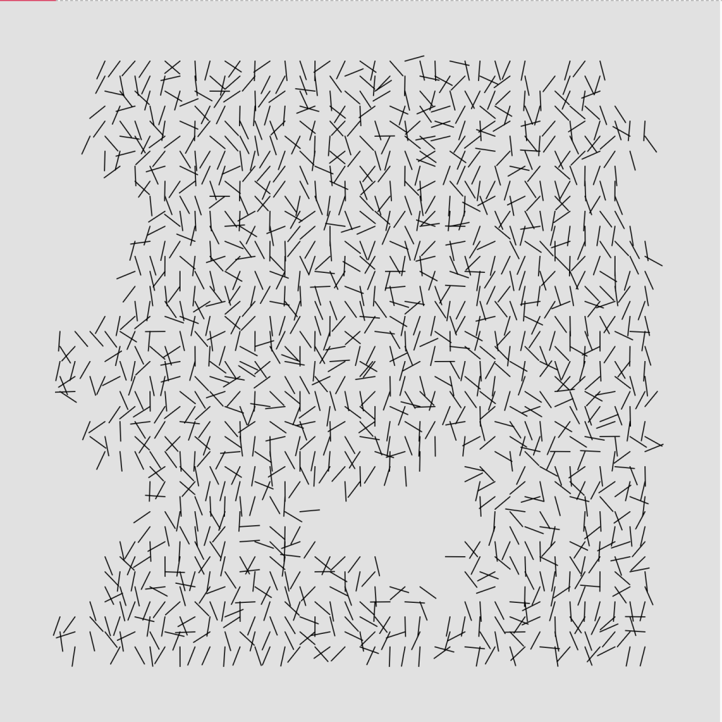
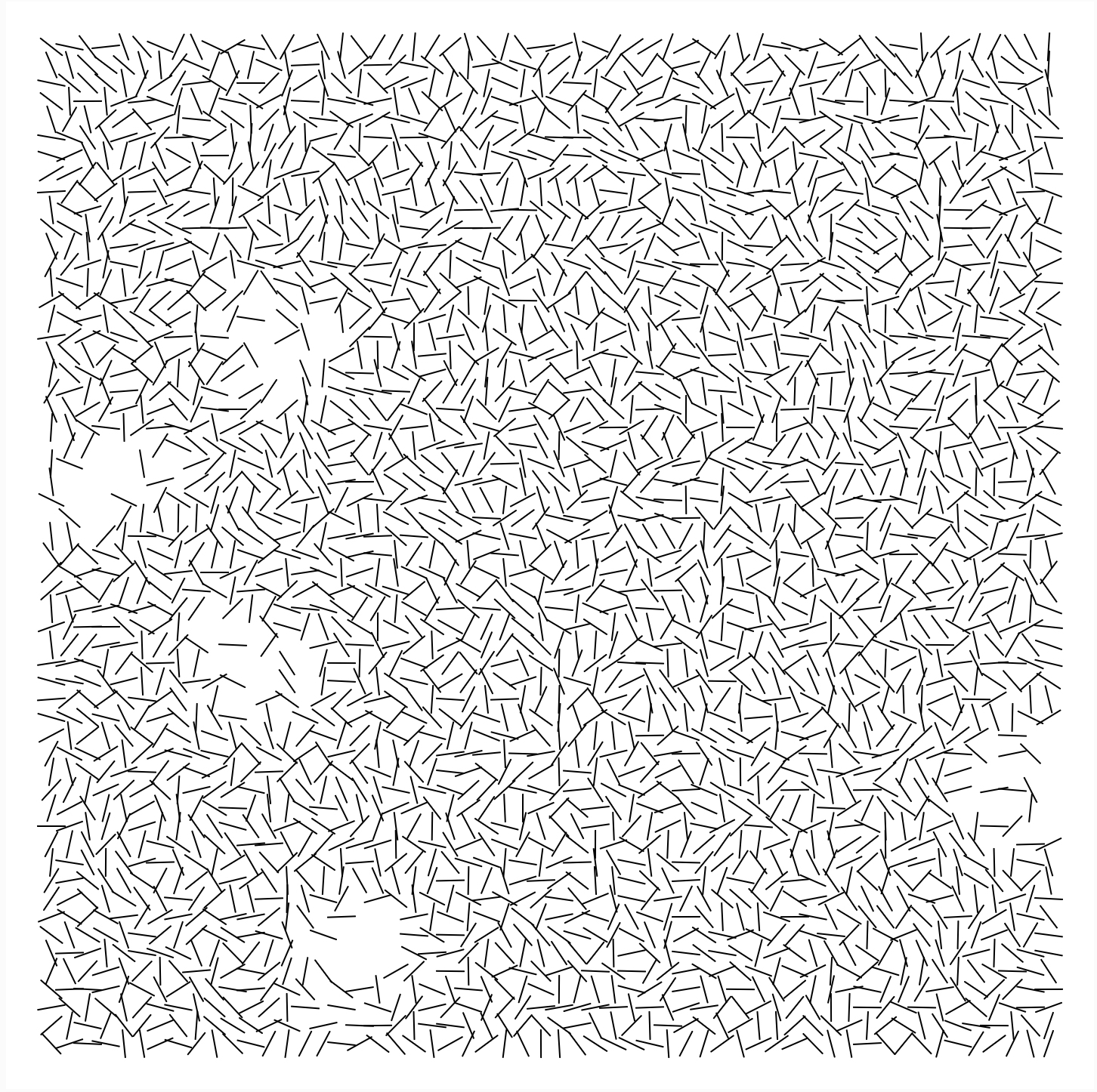
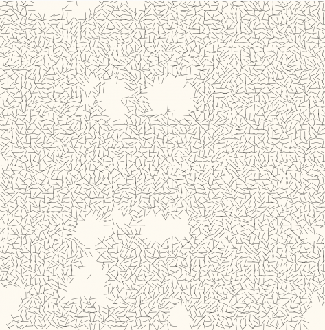
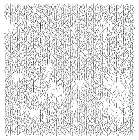
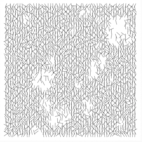
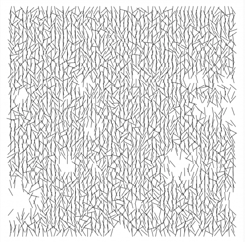
  1. The artwork is square with a border from the edge of the frame to the cluster of lines.
  2. The lines are are short and are all the same size.
  3. There are many lines in clusters that are spread about half of the lines' length.
  4. There are "holes" within the clusters of lines. These holes seem to be at most the area of 5 lines length. Generally they are smaller.
  5. The way that the lines seem to be clustered is mostly vertical or up to a 45 degree angle. Some are more (almost vertical), but not as many.
  6. The lines overlap slightly but for the most part, seem to be given its own space (side to side). There is slightly overlap row to row (this is rather consistent).
  7. Sometimes, observation 5 is flipped, so that most lines are horizontal rather than vertical.
  8.  Around the hole, there is less overlap between the lines and more lines are simply "floating" (not touching anything else).
  9. The gaps are at odd shapes ranging from more rectangular to small tiny circles. Other gaps are just larger spaces in between each overlap of the lines. The gaps in its entirety only compensates for a small percentage of the canvas.
  10. Some of the lines are repetitively at the same angle (side to side).
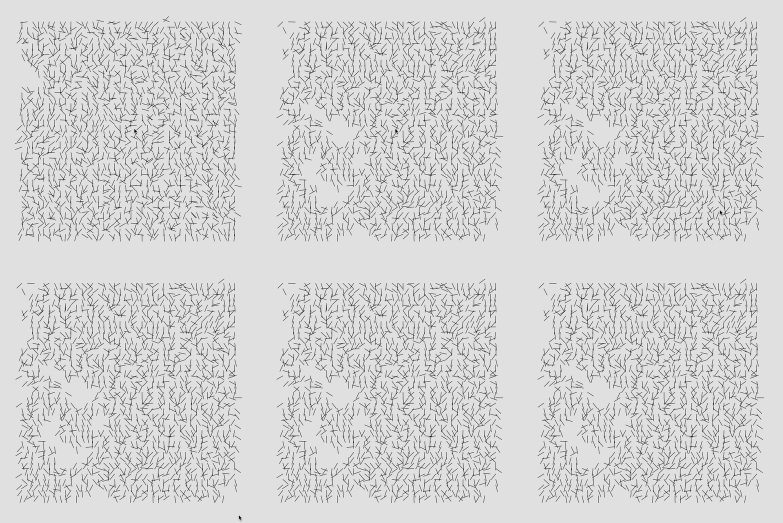
Code

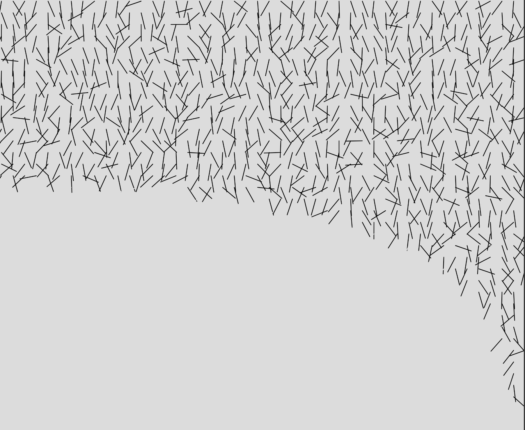
At first the result I made looked like the image below, but I felt as though my scatter of the lines weren't as long / random (?) as Molnar's. I increased the scale factor my lines, and when drawing them, I also added a factor to increase the scale as its drawn. Making the lines look the way I want was particularly hard, especially since I had the most struggle with finding a way to rotate the lines (since rotate() in p5.js turns the entire canvas, and not just the lines I'm looking at).

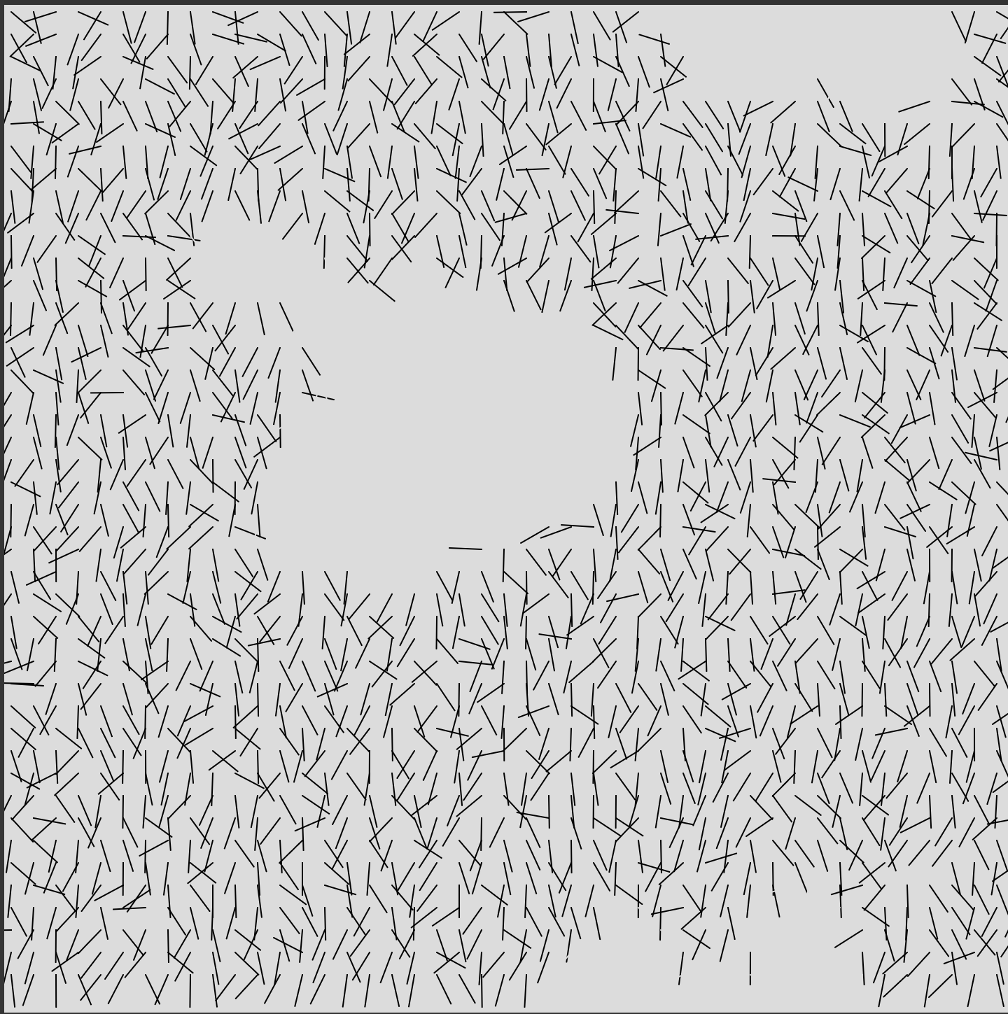
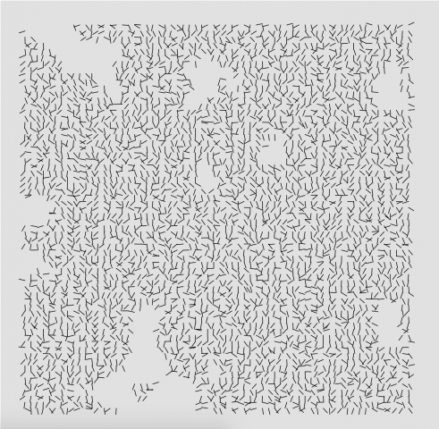
For the actual interruption, I used Perlin noise to achieve the effect you see above. Overall, this assignment was really interesting to see how I can achieve the look of this project, trying to figure it out piece by piece.


lubar-ReadingO2

Question 1A.

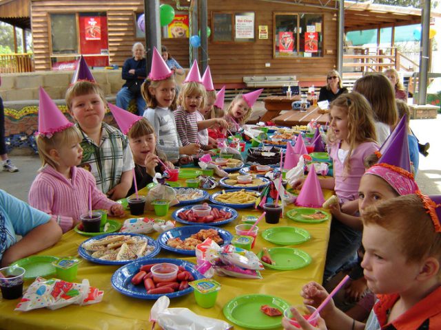
3rd grade birthday parties are these fantastic events that exhibit effective complexity, in that at this age the imposed parental structure and plan provided tends to follow the order of specific patters, ex: balloons, cake, theme (the specifics of falling under random as often chosen by child), child-friendly location, 3rd graders invited. 3rd grade birthday parties in this sense are often immediately recognizable as 3rd grade birthday parties. Then there is the total randomness that  occurs when 5 to 20 3rd graders of different dispositions are introduced onto the scene with balloons, cake, hats and freedom to play on a sugar kick, making each event unique. 

Question 1B,

To the Problem of Authenticity, and whether generative art is really art at all, I hold some personal stake. I've often heard from certain people that 'computerized' forms of art must be easier to make, as its the computer doing the work rather than the artist, and that particularity frustrates me as I think it is A) Not true, and B) Cheapening and disregarding of the authenticity of the work and art itself. I think that generative art is most certainly art, in that the process of creating the constraints and directions that allow for exciting randomness and multiple productions, is directed and chosen by the artist themselves, the computer is their creative tool.

sansal-Interruptions

  1. The artwork is square.
  2. The artwork consists of black lines on a white background.
  3. All lines have the same length.
  4. Some lines intersect, and some do not. All intersections occur mostly at the endpoints of lines.
  5. The lines on the artwork appear to be arranged in a basic grid formation.
  6. The lines are mostly vertical, with the maximum rotation from a vertical position being about 90 degrees. 
  7. Line rotations seem mostly random, as most lines near each other are not rotated the same amount.
  8. Every line is rotated from its center and not its endpoints.
  9. There appear to be areas of whitespace on the artwork where lines are not present.
  10. The lines not appearing in the whitespace have been removed by a normal distribution, and not randomly.
  11. The areas of whitespace do not form any discernible geometric shape.


I first noticed that the basic frame of the artwork was a grid of lines, so I began by using a nested for loop to create lines within a given grid size. I began experimenting with rotation of the lines using the rotate() function, but quickly realized that the function rotated the lines from the origin and not their individual center. It became difficult to change the rotation in a way that didn't coincide with the origin, until I found the translate() method. I attempted to use this to position a line at the center, rotate it, and then translate it to a specified area in the grid. However, this introduced a new problem in the line rotation, and I realized that the rotation was not completely random. They seemed to be rotated a maximum of 90 degrees from an initial vertical position, which led me to look for some kind of normal distribution algorithm. 

From here, I found that line rotation was much simpler with the p5.Vector object and its fromAngle() method. Using this, I was able to apply a rotation directly to a line and then translate it to a directed position in the grid, as well as keep all lines the same length. I also found the randomGaussian() method, which allowed for a production of a mean angle rotation, with a specified standard deviation as well. 

I added the fromMousePress() function from the Intersections assignment to allow for a different iteration of the image to be produced every mouse click. 

Finally, I moved onto the whitespace. This proved to be the most difficult part of the assignment for me, as I attempted various methods of using Perlin noise to create a normal whitespace. Following the tutorials from Coding Train, I eventually settled on creating a gradient map and using those values to determine whether or not a line would be drawn at that grid square. This method did not work as expected, as after many variations on the gradient thresholds, either a majority of the lines would disappear, or none at all. After many hours of messing with numbers and using the nested for loop variables in the equations for the x and y offsets, I found a method that produced a decent result where a small region of whitespace would appear, but still could not figure out how to create patches of whitespace appear. 

I redid my color gradient map from the ground up and messed around with the zoom and spread of the gradient to make it less random and more orderly. After some experimentation, I was able to produce a decent solution similar to Molnar's original work, which is represented by the last image I have embedded in this post. If I am to improve upon this, I want to fix my whitespace code so that it creates several small patches instead of a few large ones.


https://editor.p5js.org/svsalem/sketches/zJs4MQAnw

Final:


lsh-Interruptions

Observations:

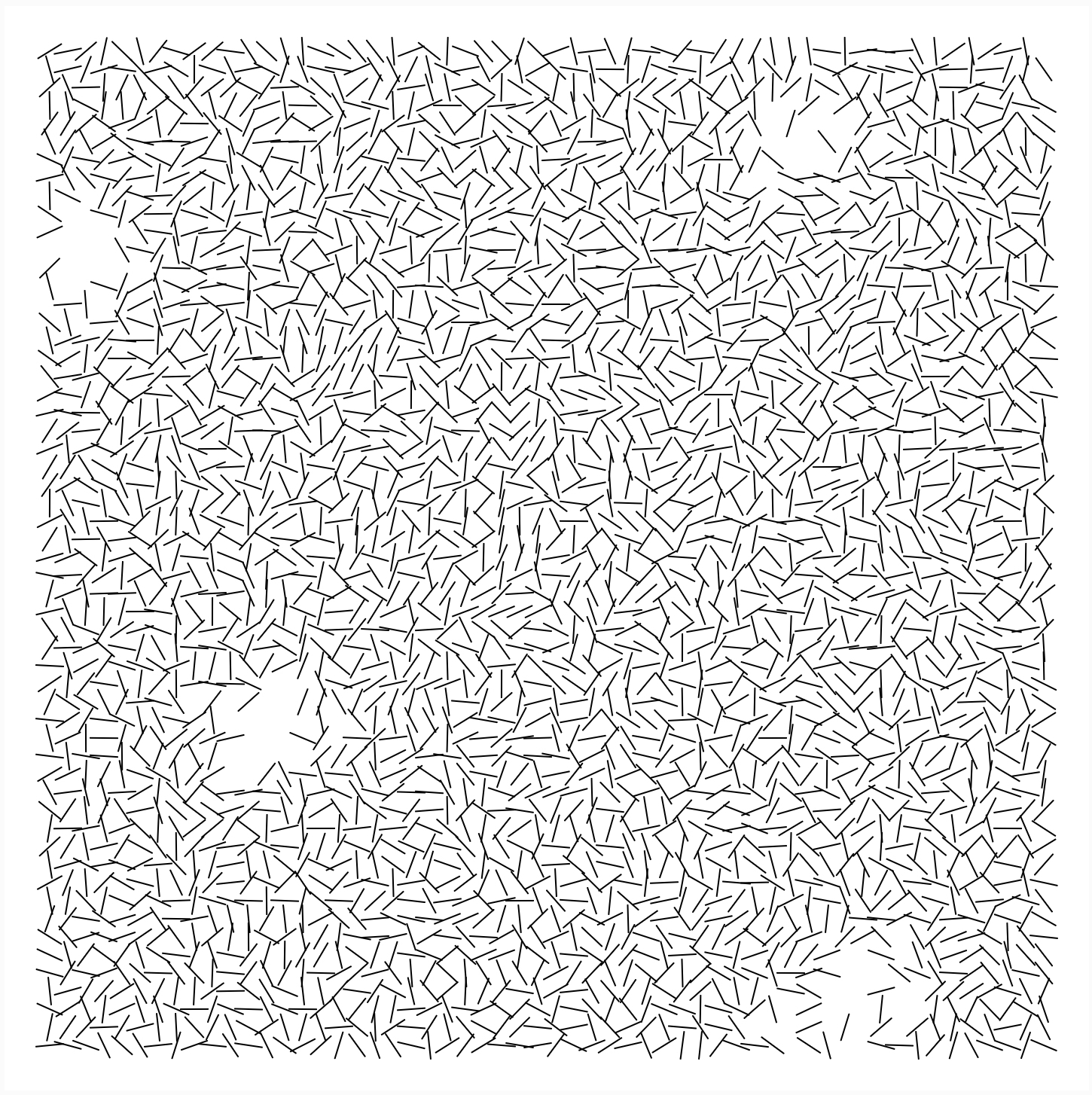
  1. The piece is 56 by 56 lines.
  2. The piece has a white border
  3. The piece has a series of lines
  4. Many of the lines touch at least one other line
  5. Many of the lines are almost upright
  6. Some areas are devoid of lines
  7. The lines are black
  8. All pieces seem to have a directionality to them (either vertical or horizontal)
  9. Some lines are alone in void space
  10. Some voids seem rectangular, while others seem circular

Link to P5JS sketch

The process of recoding the Molnár piece was much harder than I expected. I spent more than a handful of hours staring at the piece and wondering whether the runs were of the same algorithm, and if not, what had stayed the same. I fell short in a few ways. I had more straggler lines than I wanted (some were in the actual image, though for me it was a bug). Working with multiple holes proved harder than I thought. I don't think my piece has the same directionality as Molnár's piece either. I also tried to implement rectangular holes, but it didn't end up panning out. I have especially learned to appreciate the gaps, as the more I researched and worked, the more I noticed that was far from replication.

vingu – Reading 02

Question 1A. Something you like which exhibits effective complexity.  Where does your selection sit between total order and total randomness.

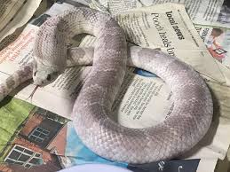
Snake scales are closer to total order. A snake morph is a genetic mutation that makes a snake look different than commonly expected (visual indicators). Some morphs can be predicted since most follow the punnet square rule (ie dominant, recessive, het). However, not all morphs are consistent/can be predicted since they can be spread out across different genes and we don't know which gene causes which morph. Hence, there are many combinations (python has like 100+ morphs). Some morphs can have repeated patterns, random blobs, scaleless snakes.

The blacktailed cribo is a simple example, but other snakes have many many morphs that can be hard to predict. Most morphs are discovered by people breeding snakes, so a lot of morphs have not been discovered yet.

false water cobra

hypomelanistic false water cobra

lavender false water cobra

Question 1B.  Problem of Authenticity.

The argument is that if the computer expresses itself that the artist can not anticipate, does it's randomness still qualify for the artist's expression? I believe that it is still the artist's expression. The artist created the code and system for the computer to execute.I see computers as a tool for randomization and computation  (like how paint, pens, etc are tools).

arwo-Reading02

1A. A honeycomb exhibits the idea of effective complexity as this is a simple system that contains high degrees of order and disorder. The beehive is a pretty complex hierarchical system and the honeycomb itself as a structure is very orderly, however I think there is a degree of disorder in the hive. I would place the honeycomb closer to the "total order" side of the spectrum (but not completely) and a little directed to the total randomness side.

1B. The Problem of Locality, Code, and Malleability is an interesting one to me as Galanter questions where art resides onto its logical status. The argument about generative art is that some people feel as though it is like any other artwork that has an object or event while others criticize the object or event and see the generative system as the art. Personally, I feel as though the generative system is the art itself because the most interesting/ more important part about generative art is how it was made to become the "object" or "event" rather than what the object becomes.

vikz-02-Reading

1A) Effective Complexity

Nature and biological life are systems that serve as exemplars to effective complexity, and so dandelions were what first came to my mind as one of my favorite instances of such. On the spectrum, I believe dandelions fall within an equal split between relative order and randomnesses, which is why I feel particularly drawn these weeds, as I am fascinated with the balance and similar distribution of both. Typically, dandelions can be associated with having extreme "randomness" -- pick up the flower, blow on it, and have the seeds scatter haphazardly over the field by dancing, lifting, and dipping from the wind. However, once each individual seed settles, there is a method to which biological processes will take place from there -- depending on the fertility of land, the seed will take root, germinate, bloom into flowers, and repurposed into white pappis with seeds at the end. Additionally, dandelions are capable of asexual reproduction, resulting in many identical flowers. Wind and/or other factors in nature then chaotically disperses of the seeds, and the cycle continues.

A dandelion as seen in three different phases.

1B) The problem of Meaning: Can and should generative art be about more than generative systems?

Generative art serves as a medium to help maximize the possibilities and skillsets of an artist. However, to this, arises the issue of whether or not the emphasis should be placed on the "generative" or "art" aspect. Some projects call for attention to be drawn to the multiple iterative art pieces as the final product (with little regards to the process in which went about creating them; a top down approach), whereas others highlight the system of creating generative art (with little regards to the byproduct itself; a bottom up approach). Although there lies value in both approaches, I find myself personally aligning with the values of bottom up. Typically, when I finalize my mind on exactly what an end desirable should exhibit, I find myself more "comfortable", in the sense that I have a working goal in mind and am more so simply seeking the bridges to connect me to that. Whereas, when I work from a bottom up approach, I find it more rewarding to "seek truth to process as being inartistically beautiful", which not only celebrate creation as an activity, but also allows me to maintain an open mindset, and ultimately, design and create emotionally durable experiences.


vikz-Interruptions

https://editor.p5js.org/vikz/sketches/m1kfW1x7c 

Observations:

  1. The artwork fits within a square
  2. Black lines on white background
  3. Lines are of same length and thickness
  4. Lines are placed at varying angles
  5. There is an overall flow to the image (having majority lines flowing either upwards/downwards, or flowing left/right
  6. Most lines are either touching one another or intersecting
  7. Lines near areas of negative space can be found to not touching other lines
  8. Many areas have repetitive lines "patterns" of some sort, with slight change of angle from one line to the next.
  9. Negative spaces between normal touching lines have relative similar area.
  10. There are random patches of absence of lines ("interruptions")
  11. Negative spaces "interruptions" are no more than 30% of the space.
  12. There are almost "columns" / "rows"; each line going down and across seem to have the same center point
  13. Amount of lines in each "column" / "row" ranges from roughly 45-55 lines.

Process: Originally, I had wrote three main functions (one to generate the lines themselves, one to generate a grid for which these lines would be placed, and one for calculating random holes based on noise(), to which I would then use in regards to the grid + line functions. I had run into several issues with this way, as I struggled manipulating each individual line to rotate in more "random" ways - it came down to either rotating all the lines at once, or rotating the entire canvas. I then decided to build off of Dan Shiffman's Coding Challenge #24, to which the manipulation of identical length lines were achieved through creation of a vector variable (p5.vector.fromAngle), to which he was then able to manipulate solely the vector itself by calling a rotation directly onto the vector, rather than the entire canvas. Then, through a noise function, I was able to achieve allotting "holes", or gaps in the canvas.

Although Dan Shiffman's way was very neat in achieving a series of segmented lines, I would have been more satisfied if I were to have the time to debug my own separate three functions. I believe that I would be able to achieve similar results if I could translate the way I drew lines by calling a vector, and then directly calling onto the vector to call for a rotation.

lsh-Reading02

  1. If effective complexity is to be understand as a system moving in a structured yet unpredictable way, the slime mold can be a fine example. The slime mold is a single celled organism that will continuously expand itself until it reaches food nearby, at which point it will contract until it exists in the shortest path between itself and food. It has no control over the food position, but will follow the same logical procedure when it finds the food.
  2. I think about The Problem Of Uniqueness quite often. Instagram is now full of simple effects on typography, or looping gifs of shape illusions. Even more complex generative art tends to follow much of the same structure. I do think that there are moments with which artists can express uniqueness, even in a space where it seems everyone is playing the same hand. Take for instance the generative artist Shane, who has done many plays on the idea of a tunnel, or turned a truchet pattern into a structure, or sculpture.

gray-Interruptions

Observations:

  1. The composition is square.
  2. The composition consists of black lines on a white background
  3. All the lines are the same length.
  4. The lines have randomized slopes, but tend towards vertical.
  5. There are margins that are about the length of two lines.
  6. The height of the rows and width of the columns is half the length of the lines.
  7. There are gaps where multiple lines are missing from a section of the grid, but the number of lines and the shape and position of the gap is fairly random.
  8. About 5-10% of the grid consists of gaps.
  9. There exist lines on the grid within gaps such that they are not adjacent to any other lines.
  10. There are 56 rows and 56 columns.

So I first did the grid of randomized lines that tend to be vertical, and then I wanted to do a weird recursive function to generate the voids as an array of points by starting with one point and then including adjacent points based on a probability. But that was really complicated, so then I saw someone talking about using just a random radius and making points in that radius voids, and I tried that. I added a weighted probability that those points wouldn't actually be voids, based on how far from the center of the circle void they were. That made the edges of my circles more fuzzy. I added a couple other things to add fuzziness. It's still definitely not the same program as Molnar's. Hers is very complex from what I can see. It's really impressive that she did that; it definitely seems like some kind of noise function, and mine is pretty far from that. When I squint I still just see a bunch of circles in mine.

link: https://editor.p5js.org/gray/sketches/LFzBlbk2c