Drewch – LookingOutwards02

That Game Company’s website: http://thatgamecompany.com/games/journey/

This is Journey, a game developed by That Game Company in 2012. They had a crew of 19 people and used PhyreEngine (and had inspiration from games like Braid). This is THE gaming experience of this decade, a story that I will never forget! Journey tells it’s narrative wordlessly, and its game mechanics aren’t particularly challenging. You won’t ever find yourself stuck on a puzzle, but Journey isn’t really a game about solving things. Journey is about finding your way up a mountain towards a light while being guided by another player who has already done the pilgrimage. This game tells a story that the player gives meaning in their own way, touching the soul in a way that only games can.

Journey excites me, not only because it is a beautiful game, but because it has made a major impact in the gaming community. It paved the way for more and more abstractionist/First Word games, and my new favorite game to come out this year: Bound, has clear inspiration from Journey. I feel like the path towards becoming a better person starts with understanding yourself, and these sorts of games are incredibly helpful at that.

20151201102529 Bound

HIZLIK-Clock

hizlik.clock.sketch ** Not working? Full screen version: Mirror (on personal site) ** 

How to read: #branches = hours, length of current hour/branch = minutes, #blossom clusters = seconds.

This project was quite fun to do- although the initial idea of using a recursive-style (but not really) generative tree seemed hard, the most time consuming part of this project was the more subtle things, such as how many branches were allowed to come out of a parent branch, the artistic design (strokeWeight, colors, etc), other “rules” regarding positioning and working on animations.

Although it seemed optional, I felt it was quite important to have the ability to re-grow your tree at any point (by clicking), and as an aesthetic design, having the branches “grow” into place quickly to catch up to the current time. I also felt adding the “floating” death animation for the blossoms was a nice touch, something better than just disappearing.

The hardest part of this project was actually debugging. As I added tools to help me develop (such as the ability to speed up time or force a specific time of day), I realized more and more how many issues there were that I couldn’t notice real-time, and figuring out what was wrong was quite an adventure.

24-hr-gif

screen-shot-2016-09-16-at-12-22-15-am screen-shot-2016-09-16-at-12-22-21-am

Written by Comments Off on HIZLIK-Clock Posted in Clock

Krawleb-Clock

Fair warning, this thing is an inefficient and slow mess, especially so if it’s late in the hour.

p5js Source

Initially for this assignment, I was exploring the idea using natural cues to depict time, like the sunrise, and had an idea of a sort of panorama of livestreams from around the world that would rotate as the day passes so the result is a perpetual sunrise. After a while of fiddling with ‘sunrise cam’ APIs I decided that was too finicky and wanted something self-contained.

I still liked the idea of natural indicators or systems, but centered my new direction around growth, decay, and lifetimes. I learned about DLA systems from Bourke and Shiffman, and wanted to create a clock that would grow and evolve over the course of the day, but would produce a different and unpredictable output. Inherently, this type of time-telling is significantly less exact, and gives more of a “half-past two” kind of time-telling vibe.

14315881_10210634152159065_1902977167_o

The initial idea was pretty simple: create a new ‘drunken walk’ particle every second, and then let these pseudo-randomly accumulate over the course of the day, forming an increasingly large and complex tree structure.

However, as often happens, a few things changed along the way. Firstly, my dreams of having one plant grow over the course of a day were crushed by the slowness of JavaScript handling collision detection between any more than about 2000 particles, and at the rate I introduce new particles, there are 3600 generated an hour. So, I decided to have a new ‘tree’ grow every hour, and needed a new way to indicate the accumulation of hours.

As a debugging tool, I added a sphere that would rotate my plant to indicate where the new particles were coming from, and as a sort of happy accident I found an interesting interaction between the particles (rendered the same color as the background to avoid cluttering the clock) and the trail left by the rotating orb that spawned the particles.

This effect, and the program with a background can be seen below:

clock-background-hidden clock-background-revealed

The particles act as very fast moving random erasers, which when done at a small scale, produces a nice smokey / liquid inky looking effect.

I decided to implement this as part of the clock because it was the kind of visual ‘decay’ that complimented the growth of the tree but on a much shorter timeline.

The quantity of orbs then became the indicator of the hour, which I think is the most important that it be explicitly count-able, followed by minutes, which is sort of a visual approximation, followed by seconds, which are only perceived by the effect they have on the other two components.

This clock takes quick a while to ‘ramp up’ and has a good deal of inaccuracy when it’s started not at or near the top of the hour. More specifically, I compensate for the current ‘minute’ by tossing in a bunch of particles when it starts (60 per minute) but the nature of the random walk means that the tree will not entirely catch up to the time it’s supposed to be.

However, this does mean that over the course of the hour, it produces a lot of interesting and unique textures and changes appearance dramatically over the course of the day.

Here’s around 11:03pm, where there are not enough particles to clearly articulate the number of orb emitters:

early-in-hour

Any here’s a more dramatic 2:15pm look:

insta

Apologies for the novella, that’s all folks!

Written by Comments Off on Krawleb-Clock Posted in Clock

ngdon-clock

ngdonclock

Here’s the fullscreen version

After staring at a digital clock for an extended period of time, I began to feel that the clock was dwelled by stick-like creatures who were enslaved to work endlessly in the confined rectangle of the display. And that was my inspiration.

I considered my goals. I want it to be playful and interesting, to be something that people will stare at for time longer than they should have at a clock, yet still utilitarian like a traditional digital clock, with which people can know the time immediately after a single glance. My clock can be placed at an airport or a train station, where both a large and clear clock and something to make waiting less boring is needed.

And then I started building everything from scratch. I wrote physics for the sticks, created a system for managing and animating them, etc.

ngdon_clocksketch

Afterwards I thought about the future of my project: These stick-like creatures will start to goof off when they assume nobody’s watching them. They will play with each other. And when the user comes back, the creatures will rush back into position.

I wrote my own physics engine for the sticks so that they behave like real sticks. In the future I might refine that engine into a separate project, perhaps called Stick2D, as an alternative to Box2D.

https://github.com/LingDong-/60-212/tree/master/clock

Written by Comments Off on ngdon-clock Posted in Clock

ngdon-lookingoutwards02

My huge interest in generative things, especially generative landscapes started years ago when I first saw Minecraft on somebody else’s computer. What amazed me was not only that the landscape is realistic and beautiful, but also that the maps were infinite, and every time a world is generated it was different from any other.
I spend hours traveling in these worlds pondering how they are generated. The style of my own work also started changing. I was beginning to use less and less pre-rendered images until one day I decided to have everything in a project procedurally generated.
The project was initially developed by a single person named Markus “Notch” Persson in java, and later by his team. This fact also convinced me how much a single person with a computer can do.
It is said that Notch was inspired by other generative games such as “Dwarf Fortress”.
I believe this project, among many others, may point to a very interesting future. What will we be able to generate? Will we be able to tell if something is real or generated?


Official site

Aliot-LookingOutwards02

Project page on Naimark’s website

This project, called Displacements, is something I was introduced to a few years ago in Larry Shea’s Media Performance class here at CMU. I wasn’t initially enamored by it, admittedly, but as time has gone on, I find myself thinking about this piece quite often. I think it struck a chord with me in the following months and years because it was such a simple, yet such precisely executed piece.

The installation is completely blank, white room in which a spinning projector projects color and movement onto. Before the room was colored white, actors had been filmed in the room with a camera rotating at the same speed in the same place as the projector, so that they appear in the projection.  Naimark is often referred to as a pioneer of projection mapping and indeed he is; Displacements was installed 1984 in the San Francisco Museum of Modern Art. (Although there are projection mapping projects such as the faces in Disney’s theme park as early as 1969)

As an artist who is interested in memory and the connection to space and objects, this piece hit each chord while simultaneously being a very open project. Its a step into augmented reality.

projfig5

projfig3

projfig2

Drewch – Clock

wave2

I didn’t really feel like using numbers or abstract representations of numbers, so I needed something cyclical. Since I liked the ocean, I decided to try to learn how to make a basic one out of shapes. Every 8 seconds it heaves up and down, and every millisecond a raindrop is made, and every minute, a cloud passes. I, unfortunately, couldn’t smoothly alter the Perlin Noise map so I couldn’t do the original plan of generating a wave every second. I’m sure there’s a way but I shifted gears instead (my only regret), but overall I achieved my goal of creating a calming, cyclical, generated animation.

sketch

github: https://github.com/AndyChanglee/60-212/blob/readme-edits/drewchClock.pde

Written by Comments Off on Drewch – Clock Posted in Clock

Jaqaur – LookingOutwards2

I’ll be honest; I don’t really keep up with the computational art scene. When I first heard this assignment, no particular project came to mind. Sill, I love computational art when I see it; when I was a kid, and my family visited a museum, I would always spend an unreasonably long time playing with the interactive wall projections, catching colorful raindrops in my hand or stretching out my arms to see how many digital birds I could get to land on them. While I love this sort of thing, and was really excited by the idea of this class, I can’t point to any specific project and say “That’s what inspired me.”

So, what am I going to write about? Only the latest, greatest, interactive augmented reality project that basically took over the world in less than a week. That’s right: Pokemon Go. Yeah, yeah, I know it’s not as purely artistic as many other computational art projects, but it’s an excellent example of emerging technologies coming together to form something that’s interactive, entertaining, and all-around pretty impressive.

For those of you who don’t know what Pokemon Go is, it’s a new(-ish) mobile game that allows users to collect and battle virtual animals called “Pokemon” in the real world. Players need to physically walk around to earn points, find Pokemon, and hatch eggs. It may seem pretty simplistic, but there’s a lot going on. The app uses GPS technology to find out where you are and how far you’ve walked (I tend to agree with the people who say that the phone’s pedometer would have been a better way to measure the latter). It uses data or WiFi to access game information, like what Pokemon and Pokestops are in your area. Finally, it uses your camera to display an augmented version of reality: one that includes little animals all over the place.

pokemon-go-in-action

None of these technologies are particularly new, but never before has there been a game that used all of them to this degree, on this scale. Through this app, players have access to an entire virtual world that Niantic (the company behind Pokemon Go) has created. Real-world locations are used as Poke-Gyms and Poke-stops, and you can watch the digital avatar you design for yourself walking through your town. It’s a massive project that has gotten nerds everywhere out walking, exercising, and socializing, and it’s success could mean more augmented reality games like this in the future.

pokemon-go-action-pcadvisor-co-uk

It may not be a traditional art project, but I find Pokemon Go pretty inspiring. Sure, it could use some improvements (*cough* tracking *cough*), but what’s more important than the gameplay itself is the fact that augmented reality is making its way into our everyday life. Niantic has even said that they are working on making it work on smart glasses! Pokemon Go is the first step in what is hopefully a massive entertainment revolution. If people had the opportunity to view the world around them through well-implemented augmented reality that wasn’t hugely inconvenient, it would make gaming much more immersive, exciting, and (for what it’s worth) healthy. That’s the sort of thing I want to work on in the future, and the sort of world I want to see.

Jaqaur – Clock

Click to re-set with a new color!
jaqaur_clock

I had a lot of ideas when I started working on this project, and as usual, I went with none of them. I considered an analog-style clock but with one hand pointing to the minutes whose length would correspond to the hours. I considered some clock that would make the user do work, either by solving a riddle or a math problem, in order to figure out the time, but I wanted to do something a little more interactive and fun to look at. I considered some complicated Rube-Goldberg-esque setups, but those would have been too complicated to make, I think. Some pictures of my initial sketches are below. My final idea is the closest to the second sketch, which was a screen full of all the numbers in a random order, and hands pointing from the mouse to the correct one, but it’s still not much like that.

Anyway, the idea that I actually went with is definitely my favorite. It’s a pile of marbles, each with a number on it. There is a marble for every second, every minute, and every hour, and they are all the same size except for when they are active. If the time is the number displayed on a marble, then that marble will grow to the appropriate size (hours get really big, minutes get kind of big, and seconds don’t grow much). It will shrink back again when it’s no longer needed.

The hardest part was getting the “physics” to work, and it’s still not perfect (most of the code that works was borrowed from other people; see my code’s comments). There was a sort of inverse relationship between the amount of overlap the circles could have (which is not good, and would lead to a bunch getting squished in the corners) and the amount of vibration throughout the pile (which is also not good because it can make marbles hard to read). Ultimately, I leaned towards the “More Vibration” side, and just put a cap on the marbles’ speed so they can’t shake too much.

I also had to add a function that tells the numbers themselves how big they need to be. I decided to make this a function of their marble’s width, and while it works pretty well, it makes the “display” function that much more complicated. Another problem I faced was turning it into 12-hour time. I knew the “hours” function was in terms of 24 time, so I added an “if” statement that would subtract 12 if hours() returned something greater than 12. However, I forgot that, in 24 hour time, midnight is 0:00! I only recently accounted for this, but now it works fine.

I really like how it looks now. The big marbles tend to slowly rise to the top, like they would in real life, but there is always movement. Personally, I can watch it for a really long time! I wouldn’t really change anything about it, except maybe patching up the physics. I think it’s really pretty and very readable. To make it even more interactive, I added a feature where when the user clicks on the Canvas, all of the balls get re-dropped in a new color. The color is always randomly generated, but I added a formula that prevents the color from being too dark or too ugly (in my opinion). Have fun playing with it!

My initial sketches:
img_2635img_2636

I would like to point out that this clock does not always work as intended when run alongside everyone else’s clock; it’s functions are slowed down such that the seconds can’t reach their full size before it is time for them to shrink again. This makes for less marble movement than intended. I highly recommend viewing this post in its own tab for maximum effect!

Written by Comments Off on Jaqaur – Clock Posted in Clock

Lumar-LookOutwards02

I really loved Stephanie Posevac (and the small startup interaction firm she works with in cali) when I was first introduced to this area of new media arts. I found data visualization incredibly exciting, both as a creative problem to work out how to best show complex data, but also to make the silly mundane things in life hold more meaning.

(short blurb on Stefanie – she’s a UK based designer who has made lots of  work with data projects that involve language, literature and science while illustrating for various books and exhibiting at the MoMa…like HOW COOL IS THAT?)

Eyeo2012 – Stefanie Posavec from Eyeo Festival // INSTINT on Vimeo.

But anywhooo – her work was the stepping stone that brought me interests further into data visualization. (Golan talked about her (or mentioned offhandedly?) during our first lecture as well) I really admired how beautiful her data aesthetic was – the aesthetic sells just as well as the functionality of the design.

Something along those lines – but not quite so aesthetic – also enables effortless data/information transmission;

An older project – but still one of my favorites- called NeuroViz is especially exciting because and it’s an incredibly simple tool for “visualizing the activation and inhibition of nodes within neural networks such that those within our brain.” Being able to communicate the complexity in a straightforward incredibly effortless way takes so much effort. I appreciate these more knowing the iterative process behind it.

Lumar-Clock

Note: for the version of code that was submitted before the due date (aka – the embed right below) was not tested for 10, 11, and 12 o clock times. (If I change the code structure significantly in my leisure time – like besides the superficial color values coded in –  I will post new versions in a separate post)

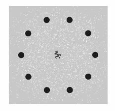
If you notice, the fattest circle drawer draws out the hour digit, the next biggest gives the number by ten minutes, and the thinnest automated one draws out the single minute digits. Move the mouse very slowly and have fun entwining the lines with eachother!

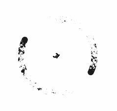
lumar-circlechangingoriginal

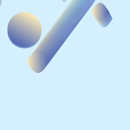
I feel like my first explorations into this effect were more successful.
lumar-circlechanging

screen-shot-2016-09-16-at-3-00-27-pm

(you can find more process on that in the other post I made early in the week)

The background() function seems to have changed some of its abilities from last year to this year’s current p5 version (Edit of previous statement, I ran the program with an older p5 version but it was exactly the same. I must have remembered things wrong….pity- I could have sworn it was different)

ex: A background of 3 opacity put in draw() only overlays over the previous frame’s shapes once (or only to a certain extent before it seems it no longer effects previously drawn afterimages) – it seems overlaying multiple layers of opacity 3 does not = overall opacity of 3 * number of layers.

iridescent

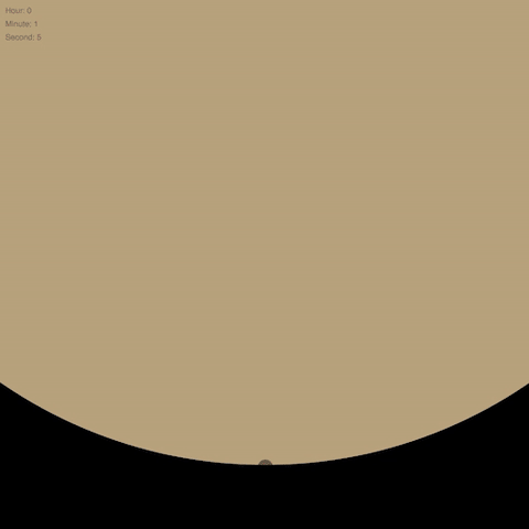
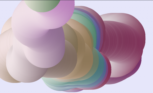
(above shows 3:46 pm – the colors reflect the kind of light and shadow expected at that time. The direction of the light also reflects the position of the sun if east was right and west was to the left. It’s how I know it’s pm as opposed to 3:46 am in the night)

this is the code that I used to convert hershey font data to vectors stored in arrays:

lumar_converthershey

(edit of converthersshey link above – I don’t recall what version I posted for that. I’m pretty sure the final version that I used to generate the info used in the final clock that I posted was made after I started this post…….well, anyway, if anyone tries to run that program and it doesn’t work – here’s the up to date version:https://github.com/MohahaMarisa/Interactivity-computation/blob/master/Lumar_ConvertHershey/Lumar_ConvertHershey.js)

scan-5

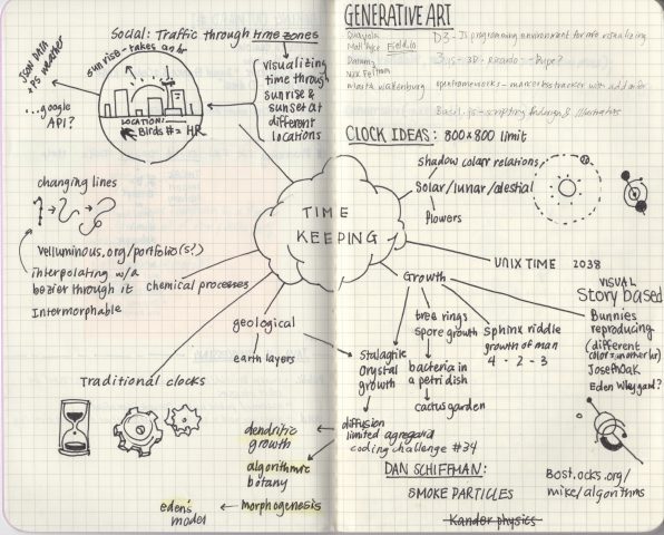
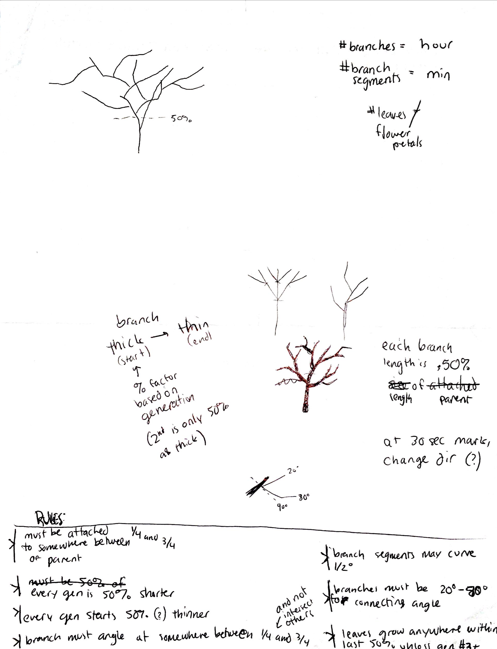
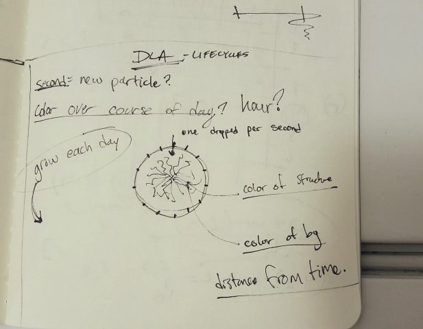
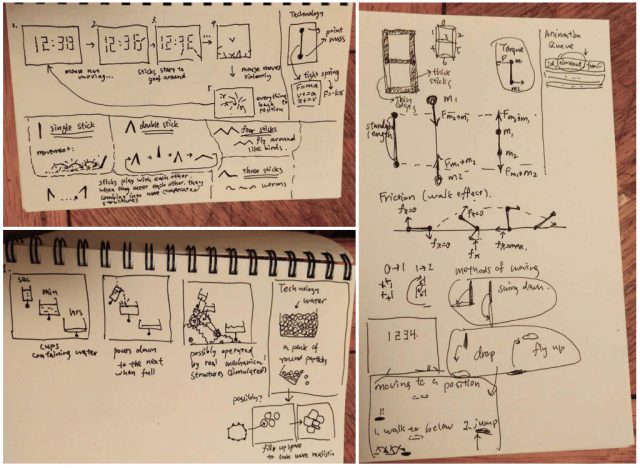
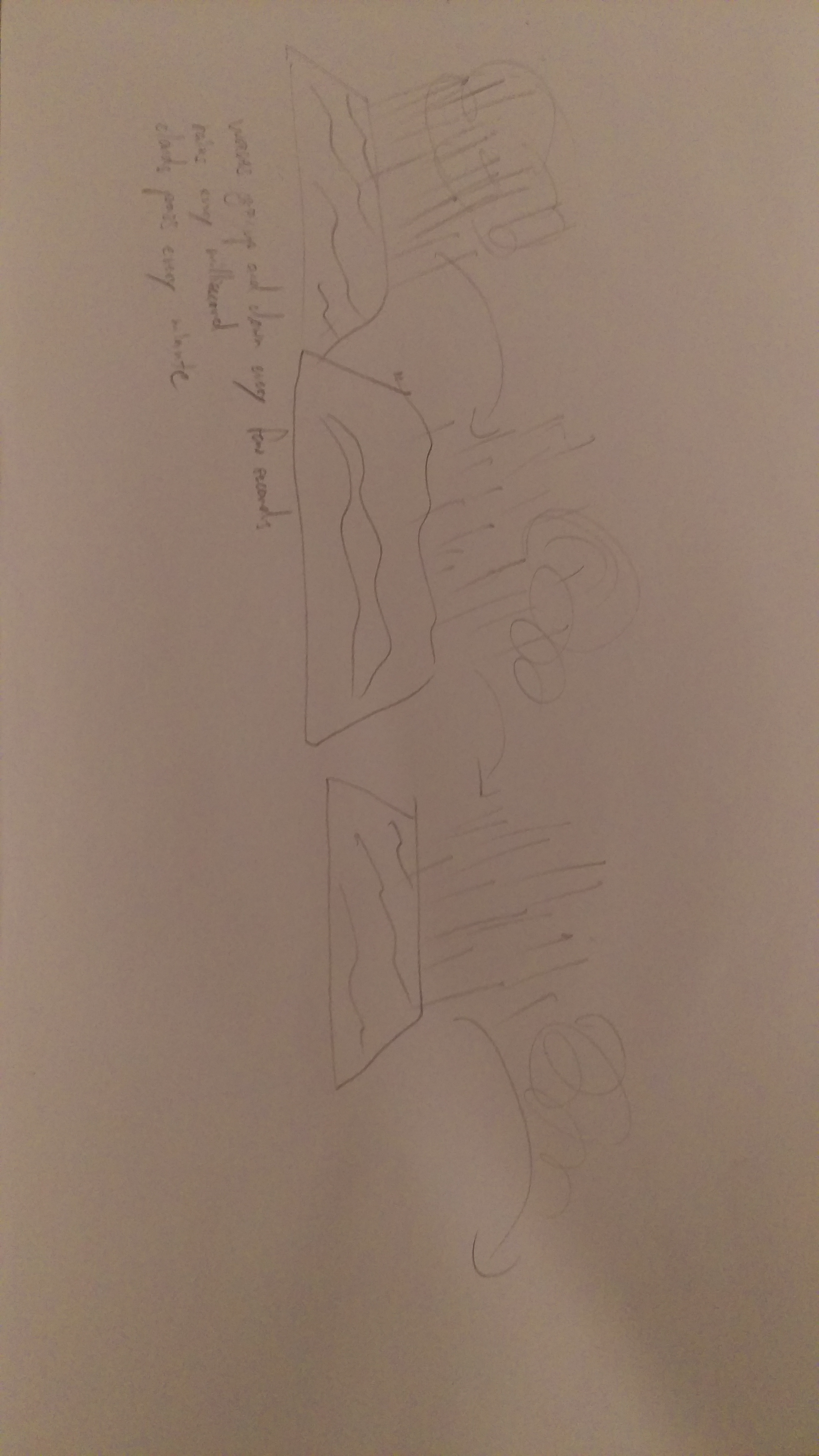
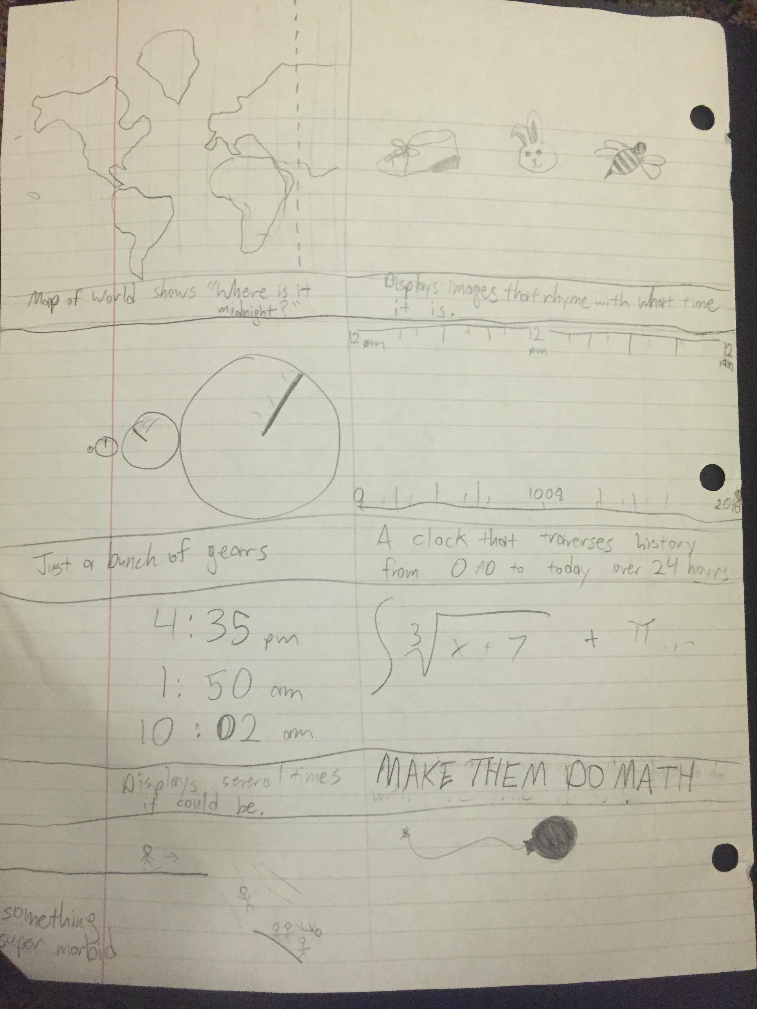
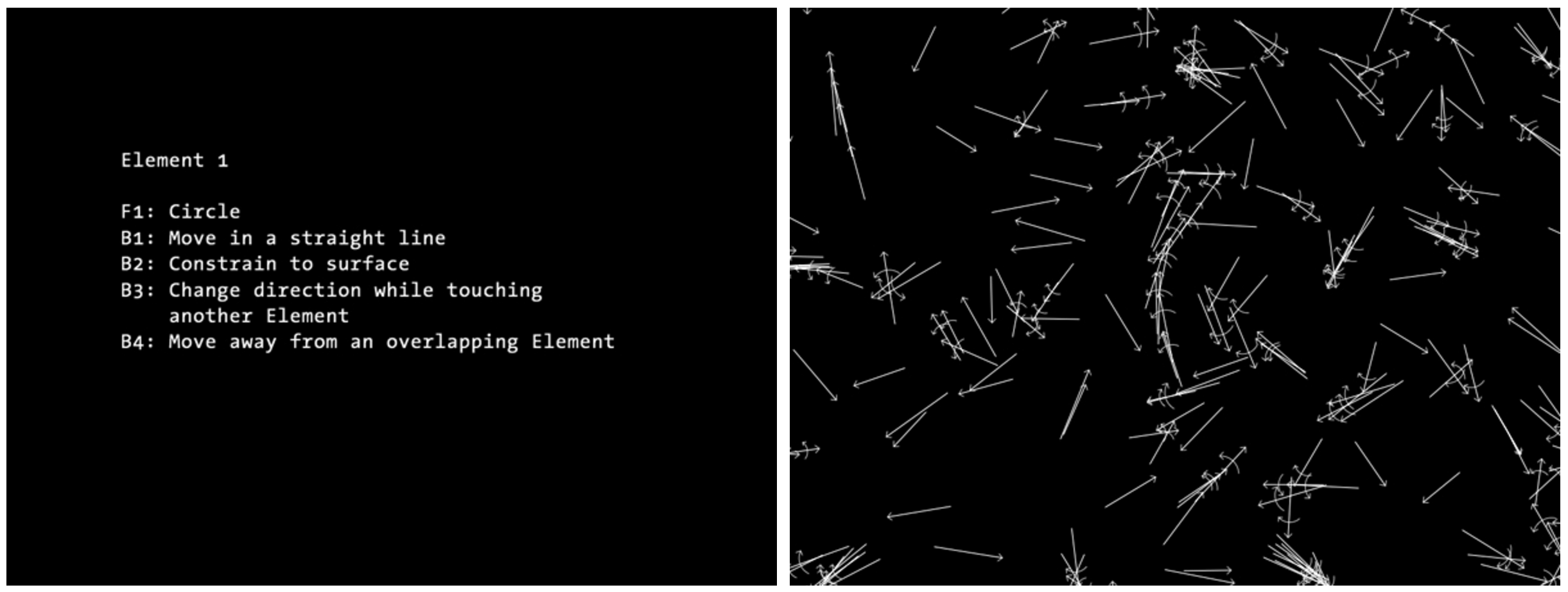
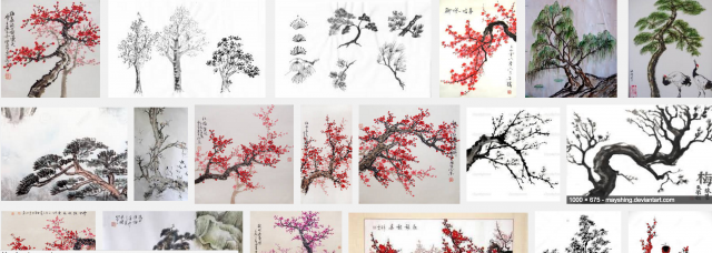
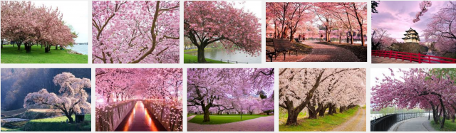
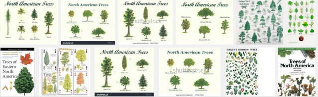
Concept mental map of all possible ideas for the clock: I wanted to establish a breadth of ideas before going in depth anywhere. I was too excited for the project just to explore only one area – which I’ll admit may or may not have been a bad thing given we have deadlines to meet. From the concept map, I really wanted to explore telling time through location and utilizing weather API’s to visualize realtime, location specific data. That combined with an interest in dendritic growth which later evolved into an exploration of recursive fractal trees (thank you Dan Shiffman!) ended up being a fairly…heavy program to figure out. The idea I actually settled on was actually just a tangent off a visual effect I coded up for fun.

scan-6

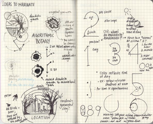
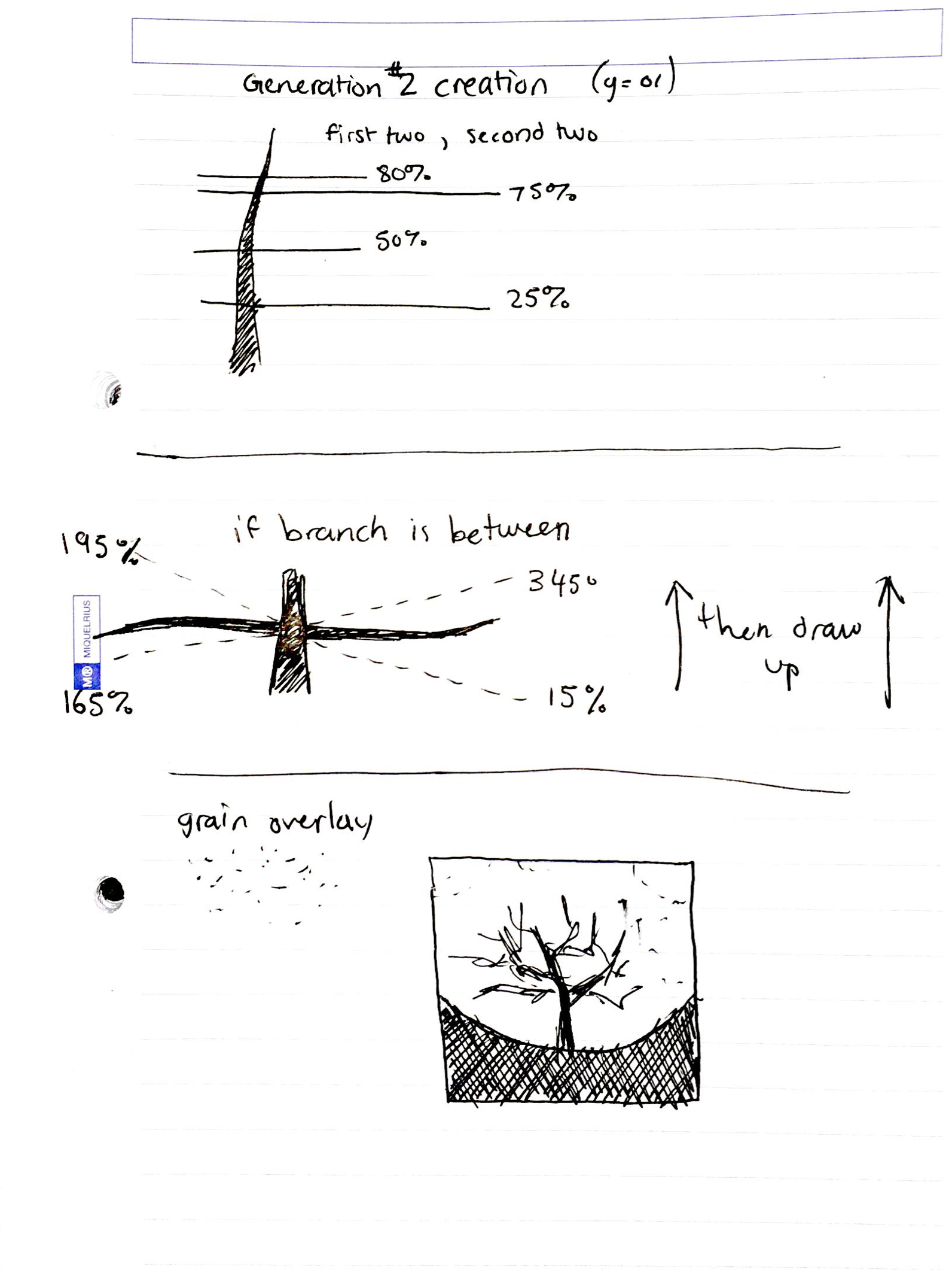
The left page was a further exploration of possibilities for the location clock (tell time through the scene – ex: clock shows sunrise in China tells you it’s say…6 pm in Pittsburgh). The fractal/recursive trees would be generated according to certain presets that would allow it to grow within patterns specific to the region (ie – wider angles of branching to achieve the twisted/squat bonsai look as opposed to branches all reach fairly consistently up for tropical trees, etc). If I can finish debugging the start of that code – I will upload.

These were some inspiration pics:

screen-shot-2016-09-14-at-6-11-16-pm screen-shot-2016-09-14-at-6-11-29-pm screen-shot-2016-09-14-at-6-12-02-pm screen-shot-2016-09-14-at-6-12-16-pm screen-shot-2016-09-14-at-6-12-55-pm

The page to the right is for the idea I actually ended up doing – I had spent too much time experimenting and not narrowing down and focussing in one direction that I feared I wouldn’t have time to finish. Since I had the bulk of the visuals for this soft gradient circle clock, I had thought I would be able to finish it in a timely manner and debugging without losing sleep….so I switched over.


victoryReflection: I predicted very very wrong. This soft gradient clock was definitely not quick. Linearly interpolating presented very curious challenges because it was a series of vector points that I generated out of Hershey font data online. I thought some sort of vector path addition would work – but if it does, the solution evaded me. Paul Bourke ad more complex interpolation that I want to explore over the weekend so I can tweak this clock to look be smoother with it’s motion.

The colors of the clock writing spheres reflect the kind of light and shadow that are outside. (see process book for details) In retrospect, it would’ve been much much smarter to fill my color array with the HSB color mode in a for loop than to personally hand pick my colors. Other than that the direction of the light reflects where the sun is in the ‘sky’.

Ex: 6 o clock means the light part of the gradient is on the right (EAST) side of the circle as if a sun was rising and casting light on that side.

Things to improve on:

1.nonlinear interpolation

2. the concept of the piece (conceptually….not that insightful on anything)

3. Visually appealing and fun to interact wit but I should probably throw in some slight noise into the colors for minutes and hours to differentiate it with more than just size.

4. Time management/a more efficient ideating process

5. The code is inefficient in some places – but I couldn’t figure out how to make it cleaner without doing some major overhaul – will definitely see what I can do about it next time.

I’ll probably add things on just for fun over the weekend – feel free to check out this link for anything new:

https://rawgit.com/MohahaMarisa/Interactivity-computation/master/Lumar_CircleGradient/index.html


RESOURCES:

Cambu and Krawleb for inspiration and reference help! Thank youuuu! (they are awesome ppl to talk to for idea bouncing or a fresh perspective!)

Golan Levin the awesome

Hershey Text:

https://github.com/techninja/hersheytextjs/blob/master/lib/hersheytext.js

https://forum.processing.org/two/discussion/9520/hershey-line-font-library

and who else? Yup. Paul Bourke!

http://paulbourke.net/dataformats/hershey/

Written by Comments Off on Lumar-Clock Posted in Clock

Xastol-LookingOutwards02

A computational project that got me interested in taking this class was SketchSynth by Billy Keyes. The project is basically a draw-able controller. The user takes a piece of paper and draws various buttons, sliders, and toggle switches. The program recognizes these drawn controls and then makes them functional through the tracking of human interactions with said controls. I admire how the artist connects the physical and virtual world through the nature of the project, and also how the user has control in what type of controller they develop. I also think it’s cool that this project actually sprang from a class held at CMU in 2012. It goes to show how we, although intermediate programs, have the resources to develop such exciting programs.

The project was created/developed entirely by one student. In terms of the software used to develop the program, Keyes primarily used commercial software (openFrameworks) and also used add-ons that were developed by other artists. This projects aids in developing a stronger user influence and sets the stage for more complex works where users can change the outcome of the program based on minor decisions.

cambu-lookingoutwards02

My first exposure to computational design and art was through Steven Wittens (acko.net) in my senior year of high school while taking a Calculus and Vectors class. I had become irritated with the way my teacher was approaching the topic, never letting us explore the material or do projects, instead forming the entire semester around wrote tests and quizzes. Around the same time, I also became aware of Bret Victor (worrydream.com), whose projects inspire me immensely to this day.

One of my favourite pieces of Bret’s work is Drawing Dynamic Visualizations (video, additional notes), a concept for a hybrid direct-manipulation/programmatic information visualizer.

In his talk, Bret introduces the problem of Spreadsheets only creating pre-fab visualizations, drawing programs like Illustrator not being able to deal with dynamic data, and the output of coded artifacts not being continuously “seeable.” Meaning you can’t see what you’re making until after you render, which creates a feedback loop where errors can occur. To express this idea, he posits that programming is equal to “Blindly Manipulating Symbols.” A feeling I relate very strongly to when I don’t know exactly what my code is doing and can’t recreate the entire structure in my mind’s eye.

As a solution to this problem, Bret presents a concept for a program that combines the idea of direct manipulation with the ability to process and handle dynamic data.


This prototype was created wholly by Bret, but is not his first attempt at creating programmatic drawing tools or concepts. For prior art, see his works: Substroke, Dynamic Drawing, and ‘Stop Drawing Dead Fish.’ In terms of the future, I see the possibility for tools like this to change how many people work with the computational display of information and ideas. Personally, I’ve never taken immense joy from the act of programming, but, rather from the results which it produces and I believe tools like this could make that power far more accessible and enjoyable.

Krawleb-LookingOutwards02

reas-element-1

For this week, I’ve chosen to write about one of the first computational design projects I ever heard about, and one that certainly changed the way I understood programming forever. While enrolled in 15-104, we were working in processing, which felt enormously intuitive for me. I had encountered programming in an introductory class in high school, but it had always been so deeply rooted in a perspective of math and execution of function that it never really grew on me and I found it difficult. Processing flipped the programming metaphor on its head, establishing a visual feedback system that I immediately understood. Naturally I was curious about who had created this amazing tool and quickly stumbled upon Casey Reas portfolio. I was enchanted by the intricate and pseudo-natural patterning in his work, but couldn’t unpack it visually. Then I found his “Process Compendium” which describes the algorithms behind (much of) his work in plain english, a logic-based framework for creating interactions infinitely more complex than each component. This compendium also explains likely the name behind ‘Processing’ as the method of translating a ruleset or process into a coded algorithm which creates an output. This collection of projects and the mindset it implied is what really showed me how powerful programming is as a creative medium, and how it allows artists and designs to work in ways so far beyond the capabilities of their owns hands, in an orchestration of thoughts and rules to make beautiful systems. Since then, I’ve followed this theme both in programming based work, as well as learning about natural generative or emergent systems as a lens to observe, learn from, and emulate nature.

http://reas.com/compendium_text/

Pamble – Looking Outwards 01

Rafael Lozano Hemmer is a Mexican-Canadian artist working mainly in large-scale interactive installations. In his 2013 Eyeo presentation, Hemmer covered a plethora of different projects across a very prolific career (even managing to break a rib in the middle of his presentation), which I won’t describe in their entirety, but rather focus on a few key projects, and some underlying principles which I found important and unique among artists dealing with interactivity.

The first project that piqued my interest was Body Movies. Inspired by the long tradition of shadow plays, Lozano Hemmer used a multi-projector setup to project giant 70 foot portraits of local people onto large facades in public plazas(he did iterations of the project in Rotterdam, Wellington, London, and beyond), and then also project people’s shadows onto those sets of portraits. He said that, in his work, it’s important to not tell the audience exactly what to do, but rather create an open space for them to explore, express themselves, and sometimes to communicate with others. I think this notion is very important when working in the field of interactive art. Interactive art can be really drab when the viewer’s experience consists simply of “getting the joke,” and figuring out whatever finite trick the artist had up their sleeve. In Body Movies, Lozano Hemmer’s projectors serve as the medium for the audience’s humor and creativity; viewers act out skits with each other and collaborate to animate the figures. There is a very short period of figuring out how to interact with the piece before the viewer is able to creatively explore its potential.

In making interactive art, it seems important for the artist to “get out of the way,” in a sense, and let the viewer express themselves through the piece. The artist’s job becomes to create a powerful, dynamic platform for the viewer to introduce and manipulate their own content. The piece where Lozano Hemmer most effectively “gets out of the way,” in my opinion is Voz Alta (“Out Loud” or “Loud Voice”). He was commissioned to make a work for the 40th anniversary of the student massacre in Tlatelolco, and decided to install a megaphone in the Plaza De Las Tres Culturas, allowing people to speak freely into it, sharing personal accounts and stories of the massacre. The megaphone was connected to a searchlight pointed at the ministry of foreign affairs which would flash every time someone spoke, along with three other searchlights pointed out across the city. The words spoken into the megaphone were broadcast uncensored over FM radio. I love this piece because Lozano Hemmer does such a good job of amplifying the voices of the participants and creating a warm and powerful platform for others to speak, while simultaneously making a few simple but poetic aesthetic choices, which complement rather than compete with or exploit the people participating.

pamble- First Word Art Last Word Art

While I do appreciate the way this phrase can illuminate certain discussions about art and technology, it is, I think, an ultimately limited tool for categorizing and evaluating which excludes and/or misunderstands a great deal of the art on this lil ol planet. (Of course, what phrase that attempts to summarize art doesn’t fail at least partially). In the universe of this phrase, one can venture to innovate and create a new form, or to perfect a pre-existing form. Meanwhile, content and context barely factor into the phrase at all. For instance, a relief print made in 2016, which doesn’t really turn the whole world of printmaking on its head, but which perfectly encapsulates and communicates, say, the experience of someone living in Flint Michigan- this certainly doesn’t constitute first word art, and I don’t think last word art is a great word for it either. The hypothetical print I’m talking about is one that is more focused on content and subject than craft and medium. The medium was picked because it seemed fit to carry the content. The way I understand last word art is sort of the opposite of the hypothetical print: finding the perfect content to fit the medium constitutes the last word in the ongoing discussion of that medium. I suppose you could tailor firstword/lastword to talk about content instead of medium/form, but then that sets up a somewhat gross race to make the BEST Flint related artwork, before abandoning the subject altogether after someone gets the last word. I think it’s best to think about form and content simultaneously, to listen to a medium tell you what it’s most fit to say, and to listen to content reveal its own grammar.

Darca-LookingOutwards01-Giorgia Lupi

The video I choose is from an information architect Giorgia Lupi in Eyeo 2014. She talked about her obsession with hand drawing and its role in her life as a design tool and a means of expression. She draws constantly whenever she is thinking, and it helps her so much to understand herself as an artist.

She takes her drawings very seriously and not seriously at all at the same time. She draws whatever is in her mind and does not really try to make sense of them, enjoying the moment of spontaneousness and comfort of expression. Then a lot of times in her work, when she tries to visualize complicated data and information, she can somehow retrieve the once random shapes and images in her drawings and create amazing and out-of-box ideas.

She talked about it like it happened so naturally, which is the most fascinating for me, that for her, working as an artist has become an extension of her inner self therefore is truly enjoyable and adventurous. Just like when she talked about her work visualizing the data of scientific articles and their citations over the years, she is inspired by her love of the music notes. She was fascinated by how music notes can display such compact information with so much elegance and simplicity, and how much they resembles the relationships among many factors in the scientific world, and translated the symbols of music into variables that can accurately reflect the information hidden in the data of 20 years. It appears to be a delightful coincidence, but in fact it takes really deep understanding of the data and imagination to make the connection valid, and create a whole new perspective. It is not only a good example of problem solving in design practice, but also human-centered design thinking, which results in an experience for the readers to engage, explore or even care, therefore delivers the information that is initially obscure and hard to follow through.

screen-shot-2016-09-09-at-6-30-02-pm

screen-shot-2016-09-09-at-6-30-16-pm

screen-shot-2016-09-11-at-10-19-41-pm

The Life Cycles of Ideas, Popular Science

Aside from her amazing projects, the speech really got me thinking about what makes an artist unique, what makes an artist’s personal style, and what I can do to find my own. While it’s difficult that information is overloaded, and everyone has his or her own theory of how to make it to the other side, her insistent self exploration and unprejudiced acceptance of herself and her art is truly inspiring. But most of all, she makes me never afraid of my ugly drawings again.

Darca-FirstWordLastWord

After reading this fascinating article, I started to wonder the purpose of defining artworks as “first word art” or “last word art”. Because it might just fall into the pattern of a closed circle in my opinion. It implies that certain kind of art should start somewhere and when it peaks, the mic is dropped and the chapter ends. But is it possible that “first word art” and “last word art” are simply outliers, or turning points that opens new doors to others who comes after? If technically the “last word art” can be overridden by something that is created in the future, the “last” in it simply stands for the turning point in the past. And it’s always open to interpretation that whether it is “first word art” or “last word art” as the history is written and more discoveries are made.

So one might imagine the history of art grows like trees, while there is a turning point, it simply grows out new branches and reaches further. It could be a continuous process in which every attempt of becoming a turning point is contributive and accumulates to the point that the turn is actually made.

Back to the discussion of “first word art” and “last word art”. In the world of new media, the community culture is a powerful factor that allows artists to share and collaborate more frequently and easily than ever. Artists with different backgrounds can bring in more “first word arts” in the collaboration, and this might be more likely to inspire each other to make something completely new (“first word art”); or become a stronger force to take certain “first word art” up a level.

I agree with the idea that “last word art” and “first word art” are not mutually exclusive. When I was reading the article, it occurred to me that the relationship between those two kinds of art might just be like Jon Stewart and Stephen Colbert. The former started the format of political satire on late night television and the other made his mark by playing an absolutely epic character that goes beyond the format itself. The character becomes his own “first word art”, starting a new genre of satirism. And those who come later often take a little from everyone, and even if not all of them are so symbolic as those two at this moment, there always shall be a John Oliver that takes it away to somewhere else.

kander-lookingoutwards02

I feel really basic writing this Looking Outwards assignment about a blockbuster film, but I hadn’t had much exposure to interactive art prior to this course, and my response does reflect one of my sources of information, so screw it, I’ll be basic. When I saw The Jungle Book last spring, I was completely blown away by its unprecedented vfx. I’m too young to remember when Fellowship of the Ring came out in 2001, but my hippocampus was firing on all cylinders by 2009, and the release of  The Jungle Book inspired a level of CGI hype that hasn’t been reached since Avatar.

The graphics in The Jungle Book are almost realer than life. It’s almost gets so real that it returns back into the realm of the imaginary from which it came. It took 800 computer graphics artists to bring the story to life, utilizing motion capture and compositing, among other techniques. In fact, the only physically real components were Mowgli and the pieces of the set that he immediately interacted with — all of the animals and about 80% of the jungle were computer generated. Since Hollywood isn’t allowed to keep exotic animals for reference, each animal had to be researched extensively.

I assumed that most of the art for The Jungle Book was done using preexisting software, but in researching for this project, I learned that there were some challenges that required software engineering to surmount. For example, the CGI characters didn’t throw shadows onto the live-action Mowgli, so they had to develop software that would project the animals’ shadows.

See the movie’s website here

Aliot-Clock

The goal in this project for me was to make a clock that didn’t completely abstract the data so that the time was readable, but that didn’t immediately appear to be a clock. I used the concentric orbiting motion of celestial bodies to inspire how I thought about days, hours, minutes and seconds, each of which is represented by a circle. The intersections of the circles belay information about the hour, minute, second, or millisecond respectively.

In my planning, I had initially run through several ideas. One was a poem-clock in which I would use a rhyming dictionary to find words that rhymed with the time. For example “five thirty six” could be abstracted to “jive dirty kicks.” The user would have to solve a sort of riddle to determine the time. I then contemplated using a more physical, particle-like representation for  units of time reacting in a Rube Goldberg setup. Seconds would be falling circles which would collect into a container, merge together, and then pour into another container containing larger circles representing minutes, etc. I thought that my current representation was a good compromise between legibility and physicality.

img_0898

clock

Written by Comments Off on Aliot-Clock Posted in Clock

Guodu-LookingOutwards01

Eyeo 2015 – Zach Lieberman, From Point A to Point B

zach-profile_original

Zach Lieberman is an American new media artist and programmer who has “a simple goal: he wants you surprised”. He describes the core of his work to be “augmenting the body’s ability to communicate”. He is the co-creator of openFrameworks and currently teaches at Parsons School of Design, where he received his MFA in Design and Technology.

Immediately upon speaking, Zach seems like such a down-to-earth, fun, and approachable guy, asking if the audience, “felt like family”. We all went on a “journey” because his talk was so humorous, engaging, deep, and human, and this latter point is want I was to discuss about Lieberman.

Zach stated he’s been to Eyeo 4 times and it’s been an emotional ride, where the first time he was really happy because it was his first time, the second time he was heartbroken for some reason, the third time he was happy again because he had just opened a new school (School for Poetic Computation), but in this fourth talk, his father had just died three weeks ago. I was really moved because Zach still came to Eyeo to give his talk, making it a tribute to his Father’s belief that “The world needs stories. We are drowning in data, and we need people to weave stories.”

What struck me was how genuinely passionate he was about his work, you can just hear it by his enthusiastic tone and the number of times he said he was “obsessed” with things like how a line (he talked A LOT about this, it was so cool) can be used to separate or disconnect people, how the “world is all around us, we just need a way to see or hear it”, and how everything is about connections. To me, his work doesn’t come off as computational or cold, which is what I associate with most programmers (but then again, I haven’t had much exposure to a lot of creative computing projects yet so more to come in Looking Outwards :^) ).

I really admire this because I think some of Lieberman’s work can be considered human-centered design, which is what I’ve been learning in the School of Design. I think the way that he talks about his thought process for his Play the World piano radio is inspirational for me as a designer. I saw it as another way to think about creating products that are engaging, emotional, memorable, and understanding of natural human behavior. Basically he created a program that makes the keys on a piano have the same pitch as a random song from around the world, so people can see and hear what African music might sound like and then suddenly from Rio de Janiero (go to 27:19 in the video to see how excited kids and adults got when they played this piano). One guy who played it said to Zach, “I need this in my life”. The current, sad stereotype with technology is that we’d rather be spending time on our smart phone screen than with close family and friends. I think Zach’s attitude and work shows that technology can touch upon topics that get people to see other people’s world views and stories, making it seems like the technology that we interact with now (mostly phones, tablets, and computers) is just the beginning and we will be having more intricate and thought provoking experiences.

Other cool projects that I didn’t touch upon:

  • Last year, I designed a font with a friend, but Zach created a program to visualize a car’s movement into a font :O
  • Zach, my instructor Golan (!!!!!!!), and others worked together to create an abstract, playful speech performance


Antar-lookingoutwards02

Symphonie Cinétique – The Poetry of Motion (2013), Joachim Sauter (ART+COM) X Ólafur Arnalds

Symphonie Cinétique is a collaborative piece created by Joachim Sauter and ART+COM, with Icelandic composer and pianist Ólafur Arnalds. The group of artists, designers, engineers and programmers that is Berlin’s ART+COM built five large responsive pieces to create a kinetic composition that translates music into mechanical motion.  It took this large interdisciplinary team over five years to create the pieces, which were exhibited at MADE in 2013.

This one one of the first pieces of responsive art that completely captured my interest and made me determined to learn how to create responsive and interactive work. Seeing the designers, and engineers work with the musician to create an instillation over five years is an inspirational moment for interdisciplinary collaboration. I always understood interaction to be “if I kick my work, it should kick me back”, but this piece helped me understand interaction is more than simply action and reaction. The musician and the pieces are creating poetry together, and while both are independently beautiful pieces of art, they create a surreal experience when in harmony.

From what I understand, almost everything ART+COM creates is in house, and for 20 years I believe they would be considered First Word art. Since 1995 ART+COM has been working to visualize concepts that are seem intangible. This is simply another iteration at an attempt to create a physical piece to visualize something we cannot see. While Arnalds has composed for many dances, which one could say the human visual interpretation of music, he has never been able to truly see his music. I imagine both Arnalds and Sauter were inspired by other interpretations of music visualizes and interactive mechanics.


Lumar-GradiantCircleForFun

This was a slight tangent from our actual assignment – just a special effect; it’s a color gradient in various shapes (the example here is a circle).

Cambu had pinned a really cool visual on pinterest and I had thought it was an incredibly beautiful yet refreshingly simple aesthetic that would be fairly short and quick to code up…..so I couldn’t resist. (Credit and thanks to cambu for bringing up the concept!!!! Probably wouldn’t have ever crossed my mind to try it otherwise. IT’S SO FUN TO PLAAAAY WITH)
(Much love for Krawleb for introducing, explaining and teaching how the noise function works! I really appreciate the time you take to help others!!!!)

I might add more features after this post – to see the latest verison:

(P.S. the circle rotates in the most up to date version!)

https://rawgit.com/MohahaMarisa/Interactivity-computation/master/Lumar_CircleGradient/index.html
lumar-circlechanging

lumar-circles