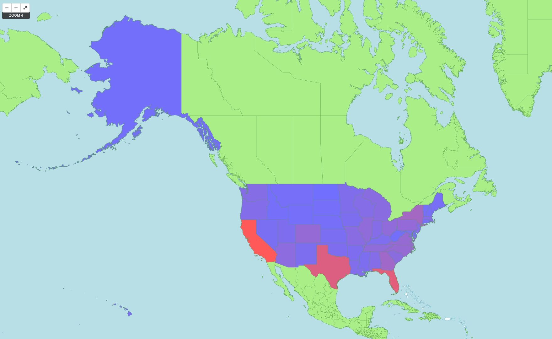
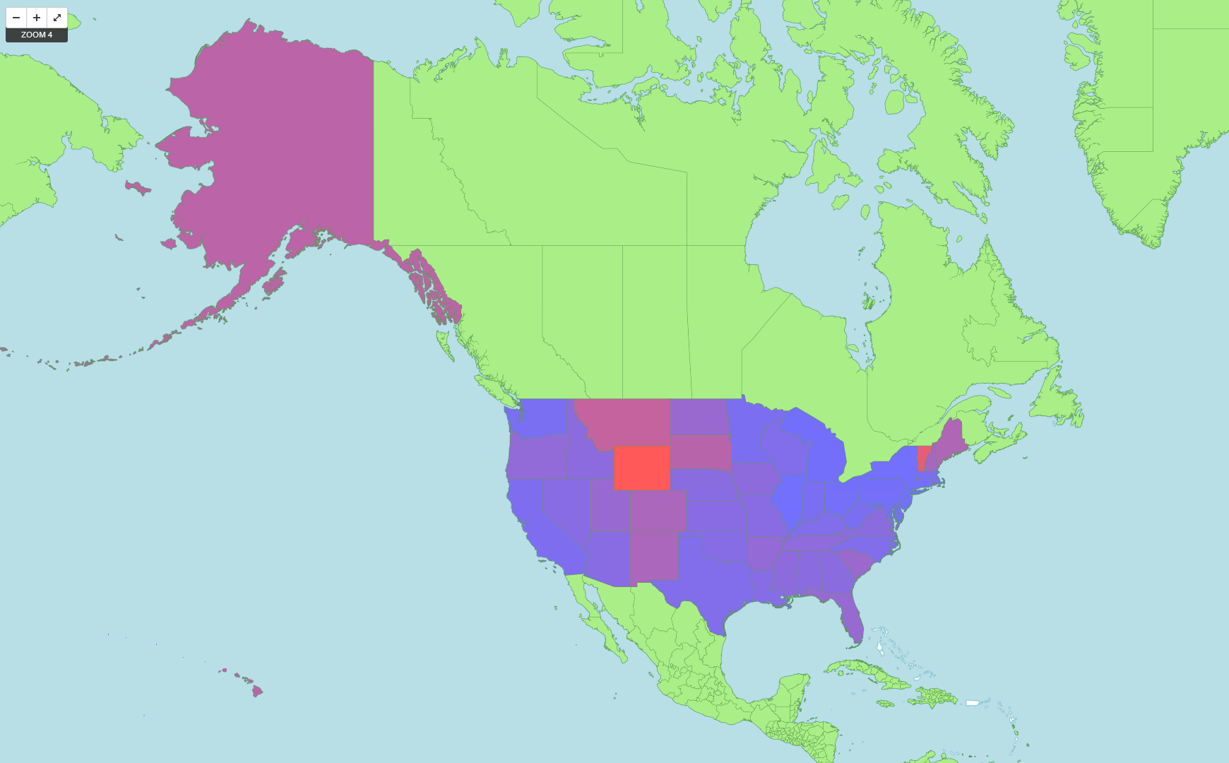
I created an interactive map that shows the total number of hotels per state (USA only) on one layer, and the number of hotels per capita per state on a different layer. I used Tilemill, so it is easy to switch back and forth between layers using Tilemill’s UI.
The total number of hotels is a fairly useless layer, since it strongly correlates with the total population of the state. California has the most number of hotels, then Texas, then Florida and New York. However, the number of hotels per capita shows some interesting data. Wyoming has the highest number of hotels per capita, followed closely by Vermont. Hawaii and Alaska also have a large number.
My first step to creating this map was to extract only the American hotels from the whole csv file. I created a new csv file with just the state name. I wrote a Python script to count the number of times each state name appeared in the file, and created two colour values based on linear interpolation between a blue (#7070FF) and a red (#FF5959). One colour value was created from the rank of total hotels, and the other from the rank of per capita hotels. I then output these colours in an .mss format, which is a styling format that Tilemill uses.

