Yvonne

10 Feb 2013

I’m trying to make a data visualization using an animal shelter dataset I found here (https://data.weatherfordtx.gov/Community-Services/Animal-Shelter-All-Animal-Cases/2ek5-qq7s). I have 29,600 animals since 2007. Information includes animal type, breed, gender, name, arrival date, arrival reason, etc. At the moment I am currently trying to create a visualization using toxiclibs that involves particles. Each animal is a particle that moves into and out of the shelter on a time basis. I’m trying to get it so you can organize the particles to understand the data in different ways (number of black animals vs. other colored animals in the shelter, number of euthanizations, number of dogs vs. number of cats).

I’m also interested in other items of data, such as the number of pounds of animals euthanized. As well as reasons for shelter arrival and so forth. I’m also working on a code that enables a user to click on a particle and get the animal’s name and other data.

I guess I don’t have it entirely fleshed out because I’m unsure what I am capable of producing. At the moment I have a particles system working and my API data is finally coming into Processing correctly. I just need to get the two to work together and produce something interesting.

I have rough sketches, but unfortunately I left them at studio and don’t have photos of them. I’ll bring them to class on Monday.

Michael

10 Feb 2013

Update 2/11/13

Woo!  The good news is that I figured out that I don’t need to split the image and can just serve chunks of it at a time using some more complex Sifteo commands, which eliminates the blind spots and should enable me to scroll smoothly using tilting gestures.  The slightly bad news means that I need to rewrite a lot of stuff, and so I’ve posted a new list below.

1. Get the newest image from a dropbox or git repository (Probably trivial)

2. Write processing script to resize and convert images and autogenerate a LUA script (Needs a rewrite…)

3.  Regularly run the processing script, re-compile, and re-upload to the Sifteo base (Maybe not too hard)

4.  Figure out how to rotate images (Done by rotating orientation, which is a good move.)

5.  Figure out how to pan around a larger image with one cube, and then make this tilt-dependent.  (Done, but needs to be smoother.  Takes a leaf from both the sensor demo and the stars demo.)

6.  Fix some weird scrolling issues and do image edge detection and handling (In progress)

—— These are optional but will let me do images that are 4x larger ——

7.  Devise a scheme for managing asset groups better on the limited cube resources (tough but interesting)

8.  Devise a scheme to predict which asset group will be needed next and load in a timely manner to keep the interaction smooth (Hard but very interesting and possibly publishable)

 

2/10/13

This post is meant as a living document to track my status on Project 2.  In my sketch, I made a list of steps that needed to be completed for the project, along with their estimated difficulty.  Now that I’ve made some progress and added a few things to the list as well, I figure I’ll update this post regularly to reflect where I’m at.

The general idea of the project is to create a system to allow children to explore large images on a small scale by using arrangements of Sifteo cubes as windows through which to view the larger picture.  This is an extension of my Project 1 work with Sifteo cubes

1. Get the newest image from a dropbox or git repository (Probably trivial)

2. Write processing script to chop images and autogenerate a LUA script (Done.  Also generates a short .h file to store the number of rows and columns.)

3.  Regularly run the processing script, re-compile, and re-upload to the Sifteo base (Maybe not too hard)

4.  Figure out how to rotate images (Done.  There may be more elegant ways to do this.)

5.  Figure out how to pan around a larger image with one cube, and then make this tilt-dependent.  (probably tough but essential to a good interaction.)

6.  Devise a scheme for managing asset groups better on the limited cube resources (tough but interesting)

7.  Devise a scheme to predict which asset group will be needed next and load in a timely manner to keep the interaction smooth (Hard but very interesting and possibly publishable)
Marlena

07 Feb 2013

http://infosthetics.com/archives/2012/12/bomb_sight_mapping_the_ww2_bombs_that_fell_on_london.html

Screen Shot 2013-02-07 at 12.21.03 PM

I grew up learning about the Battle of Britain in just about every history class I took. As school history books don’t usually focus on conveying the feeling of an event so much as the sequential events, it never really occurred to me how many bombs were actually dropped on London. Seeing a map of all of the bombs dropped mad me pause for a while–it doesn’t show the effects of the bombs, the million of English homes destroyed, and the 40,000 civilians killed but it shows the carpeting of the London map with bombs. Just by looking at the amount of red on the page gives you a little bit more insight into this aspect of World War II that you may not have previously been able to fully grasp.

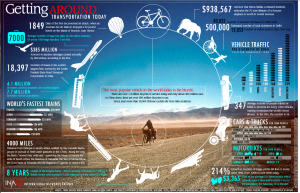
http://number27.org/assets/work/extras/maps/transportation-big.jpg

Screen Shot 2013-02-07 at 12.33.07 PM


This is a very beautiful infographic by Jonathan Harris about the most common forms of transportation around the world. It does not contain a huge amount of information–it gives the reader a tidbit of information about each type of transportation. This is actually a good design choice: the more information about each form of transportation was present, the more the focus would be drawn away from the main focus: the variety of transportation methods available in the world today and by extension the enormous range of what constitutes “everyday life”. This infographic elegantly reminds us that there are other people living out there in the world by using a human tool, transportation, as its proxy.

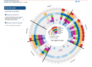
http://www.guardian.co.uk/world/interactive/2012/may/08/gay-rights-united-states

Screen Shot 2013-02-07 at 12.52.17 PM

Here’s an infographic by the Guardian that shows the various gay rights related laws by region and state in the United States. Upon clicking on a state the reader gets a more detailed description of the rights available to members of the LGBT community such as rights to marriage, protection from discrimination, and the right to adopt. It really brings to light the division across the country on the issue of gay rights as well as the broad range of issues that members of the LGBT community has to face in everyday life. We hear about gay rights all the time but this infographic really helps to organize the facts in a reasonable, easy to read, and easy to compare manner.


Ersatz

07 Feb 2013

Twitter Faces

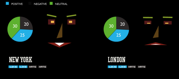
Does social networks have emotions? For this project, I would like to experiment and try to put a face and extract expressions from Tweets around the world. The idea is to get a decent amount of recent tweets around the center of a big city, for example New York, do a basic sentiment analysis and extract an average mood of the people posting. The application will run in real time and I will query for new tweets every 5 or 10 minutes, this way I could create a lively face, that constantly changes mood and expressions. I think it will be really interesting to see the overall mood of people in a certain city, are they happy when there is a big event coming up, or are they sad, if something bad has happend. For the moment, I will use a really basic sentiment analysis, using only dictionaries with positive and negative words, but along the way, I could switch to a more complex method, if I find something suitable for real time processing.

Here is just a quick sketch I did in Illustrator, just to show how the application might look. The idea is that the face and expression changes will be animated, so we could get that lively feel. Also, I could list the most mentioned positive or negative words.

Twitter Faces

I will probably implement the app in Openframeworks, but I am also thinking about doing an online version, probably using Processing.js

Any comments are welcomed!

~Taeyoon

07 Feb 2013

1. They Rule (voted for interesting dataset)

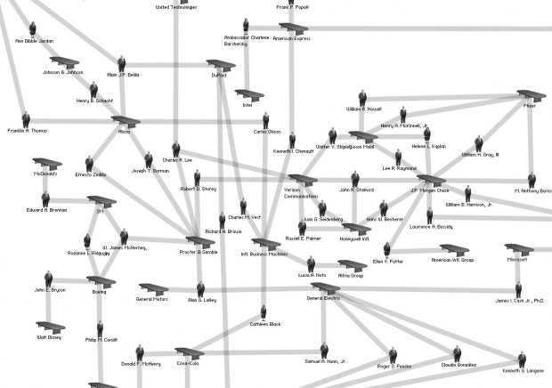
theyrule_01Josh On’s ‘They Rule’ visualizes interconnectedness of corporations that govern commerce and politics in the US. It is based on LittleSis. (LittleSis is a free database detailing the connections between powerful people and organizations.) While They Rule does not promise accurate representation of the major figures in the US, it does portray honest picture of stakeholders at work. It is true that the dataset available on LittleSis is interesting and resourceful, however it is only when they are visualized on ‘They Rule’ that the power structure becomes visible.


2. Valse Automatique (voted for provocative)

VALSE AUTOMATIQUE PROJECT| MADE from MADE on Vimeo.

Screen Shot 2012-12-08 at 8.59.45 AM5476622411_cc92d0385f_b

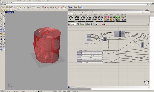
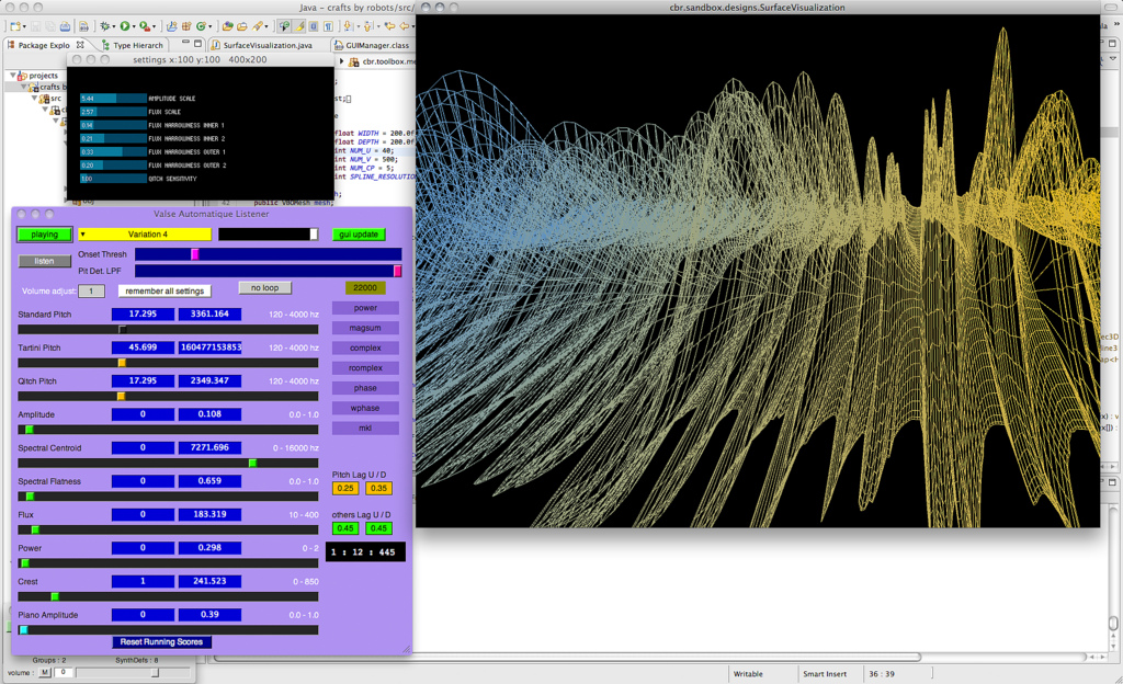
This project combines experimental rapid prototyping with music via data visualization. I think of this project as a provocative example of working with data because of it’s technical ambition. The symbiosis between sound and material (wax) is achieved by data transformed through various software platform (SuperCollider-Rhino/Grasshopper) and executed for fabrication by a giant robot arm. Additional visualization was created to help audience understand the process.

3. 3D printed disc for Fisher Price Toy Record Player (voted for well crafted)


This instruction by a maker named Fred is an interesting approach to materializing musical data. He wrote a software (windows only) which wraps musical notes to Fisher Price record. With data ready for OpenScad software, (which I have grown more interested about recently) you can make a STL file to 3D print your record. I love the way the project is documented and made available online. There are participants 3d prints of the records.

http://www.instructables.com/id/3D-printing-records-for-a-Fisher-Price-toy-record-/?ALLSTEPS

I guess the next step is 3D printed record.

Ersatz

06 Feb 2013

Lately, I am really interested in the process and algorithms of creating generative life forms and creatures. Here are three projects, that I like and would like to “dissect”, so I could learn more about the process.

Communion – A Celebration of Life

This one is a really fun project by FIELD and Matt Pyke.They made a wall of hundreds generated creatures accompanied through their evolution by a polyrhythmic soundtrack. Creative Applications.net has posted a great behind the scenes article, that explains the process of creating the installation

Weird Faces Study by Matthias Dörfelt using PaperJS


Matthias Dörfelt tries to create computer generated faces, that could not be instantly recognized as such. Event though, they look as hand drawn, they are actually completely algorithmically generated and every face is random and unique.

Cindermedusae by Marcin Ignac

http://marcinignac.com/projects/cindermedusae/

An old, but really awesome project by Marcin Ignac. Algorithmically generated sea creatures, that can be deformed, characterized and animated with modifying different parameters. I really love how their movements looks so organic and smooth.

Technique

I haven’t actually found the time to dig deeper for algorithms for generating organic looking and moving creatures, but will definitely do so. I am actually reading Dan Shiffman’s Nature of Code and The Generative Design book, which I think is a really good start towards the topic. But, if someone could recommend something, please comment!

Robb

06 Feb 2013

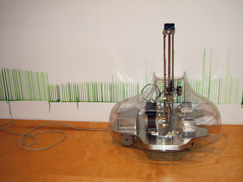
Grower – 2004 – Sabrina Raaf

PICT1699
This robot crawls along the wall and paints hopeful blades of grass which correspond to C02 emissions.
This doesn’t actually appear to have anything to do with environmentalism, which is refreshing and strange.
The artist sees it as more of a visualization of organic life and the chemical impacts organisms have on one another.
As an early example of data-driven kinetic art, this piece subscribes to what will later become tropes in the genre.
I am seriously considering doing a data-driven eco-themed sculpture, and happening across this really well done example is informing my research well.
This is not a guilt dispensing device, as much environmentally themed art tends toward, but a truly though provoking exploration of the relationships between living things, expressed effectively by an artificial living thing drawing fake living things. Whoa.

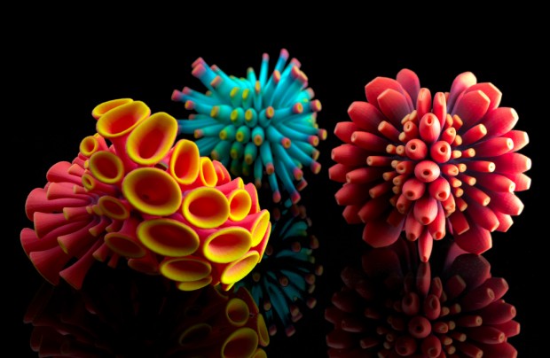
Colony – 2013 – Nervous System

8423782217_2c8df42622_b


The work of Nervous System is a beautiful set of examples in the field of generative tangibles. They have coined their wares as physibles.
Their attention to aesthetic detail and current architectural trends sets them apart from other product design firms. Biomimetic forms have always been beautiful and are just coming around to the mass market spotlight. The combination of Product Design, Architecture, Programming, and fashion is quite striking.

Elwin

06 Feb 2013

Generative Art

I had a hard time choosing which topic I should do for my assignment. Information visualization seems more approachable to me, but I’ve decided to go for generative art since I’ve never really done anything like that before.

Concept: Thalassophobia

In my initial concept, I Wondered if it’s possible to create something abstract that provokes the feeling of thalassophobia and giant sea creatures with generative art.

The abstract art could be made out of dynamic dark blue/green/grey colors blobs or blurry particles, which will move very slowly across the screen. I’m also thinking to combine this with dark ambient music to create suspense, and if possible project this in a cave projection system. This all sounds very interesting to me, but I have no idea to be honest where to start yet since I’ve never done any kind of artsy (abstract) visualization before. This could be challenging…

Process

Creating generative art is tougher then I thought. It’s quite difficult to find good tutorials online, explaining the fundamentals and guide you through the process. I went through several books and finally got my hands on Matt Pearson’s “Generative Art: A practical guide using processing“. This is truly an amazing book. It helped me to understand various types of generative art. But even with the basic knowledge, I felt clueless on where to start. I ended up tweaking a lot of the examples, trying to combine different sketches, but I didn’t like any of the results. The deadline is getting closer and closer, and I’ll need to prioritize and make decisions based on time, knowledge and capability to code something artsy. In the end, I modified my initial concept and I experimented with some code.

Eye of Cthulhu

I threw away the idea of adding dynamic colors and motion, and went for black and white and static rotation instead. I made minor tweaks to Matt Pearson’s Sutcliffe Pentagons code and played with the variables to create various effects. For the ambiance and suspense, I was able to find an audio track from Svartsinn & Gydja – Terrenum Corpus which worked very well with the generated visualizations. Also, I was able to get permission to use the cave projection system at the ETC, but I haven’t tried projecting my visualizations yet (will try that Monday).

As for the art, it uses the Sutcliffe Pentagons algorithm, but I’m using 32 sides instead of 5 sides and it projects fractals to the outside. I added 2 to 4 additional Sutcliffe Pentagons next to each other, varied the radius, strutFactor with perlin noise to create the effects below.


The results are quite cool, but I’m not completely satisfied with the overall goal. It feels like I should do more or be more bold in the experimentation, but again I felt stuck during my development process. As a post-mortem, I think I was a bit too ambitious coming in this project with zero knowledge for creating generative art. I would need to take more time to gain more experience, develop stronger coding and math skills for future artwork.

Bueno

06 Feb 2013

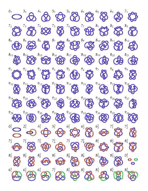
We recently confronted a problem in Great Theoretical Ideas in Computer Science that had to do with wrapping rope around pegs in such a way that removing any one of them would cause the entire mass to fall. The proper answers were, I thought, rather aesthetically pleasing, and as a result I have decided to see if I can create the ultimate knot. There’s actually a lot of mathematical theory behind knots – here’s a diagram i found with only a few minutes of searchging:

I’d like these knots to be generated in a genetic fashion. Perhaps i give the knot maker a specific task to fill, and see what knot best fulfills the task. Perhaps instead I go for visual complexity, or ease of replication by a human being. Imagine chaining together multiple knots…

I would like this program to be able to “play back” how a knot is tied. This generated animation could itself be a point of focus of the project.


Alan

06 Feb 2013

I archived all kinds of online knowledge in this website https://pinboard.in. There are also a big database for public knowledge to share.

Here’s the api to get all these information. https://pinboard.in/api/

I am trying to visualize how I am currently managing my online knowledge and what’s the relations between different topics and different people.