Anna

25 Feb 2013

G’d’eve, folks. Here’s a nifty trio of interactive things I’ve discovered while perusing the internet this week.

Daily Dose of Shakespeare : Stubbornness
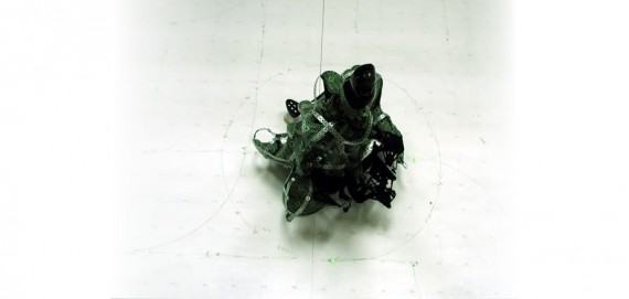
[C]aliban Robot Artificial Shakespearean Stubbornness… aka “CRASS”
This ugly little abomination locates humans, targets them, and delivers caustic Shakespearean insults originally attributed to the wicked Caliban from The Tempest (you may recall me moaning on a previous blog post about people forgetting this play, so I’m pretty excited that somebody used it)! Usually, I don’t like ugly stuff, but the choice to make this little dude as completely wretched looking as possible is frankly hilarious to me, given the character of Caliban. The robot doesn’t allow for people to respond to its insults, which in a certain light could be viewed as a shortcoming of the interaction, but the artists provide a pretty adorable rationale for why two-way-dialogue isn’t possible with their monster. They invent the concept of “artificial stubbornness”, explaining that in normal conversation between two humans, stubbornness occurs when one human isn’t capable of modifying their position or opinion based on feedback from another. The robot, they say, is merely exhibiting the same behavior, but “artificially”…. because it simply can’t listen. A good example of a clever narrative compensating for technical limitations—or, maybe, a piece of interactive art created specifically to fit a clever narrative.

Not for all those insect phobic people, I guess…


Delicate Boundaries
This is an older piece which I just happened to stumble across. Little glowing bug-like creatures swarm out of a screen and onto participants, crawling across them much the same way a parade of ants might crawl across your shoe. It seems pretty simple, but I really like the clean execution, and the message it’s trying to convey about the boundaries between virtual and ‘actual’. The artist seems to want to make a point about how uncomfortably and unexpectedly invasive digital technology is becoming in our lives, and the use of creatures that resemble bugs or bacteria of some-sort really drives home the metaphor for me. I’d like this piece more if the bugs somehow had a bit more substance when they left the screen, so that it wasn’t so obvious that they are just light projected onto clothing. I feel like advancements have been made since 2007 that would allow for 3D hologram-like creatures that would prove much more startling.

Everything is better with watercolors…


Starlay
This interactive comic for the iPad has been all over blogs this week, and although I’m not utterly blown away by the interactivity (it seems like very standard, game-like, touch-and-discover mechanics), I really do appreciate the art style. The hand-drawn lines and broad watercolor splashes really make this experience something lovely.

Michael

25 Feb 2013

Wooden Mirror – Daniel Rozin

I wouldn’t be surprised if other people use this as well, but it’s still an example of interactive art that I remain deeply impressed by.  Technically, the complexity of doing image processing and controlling 830 servos nearly a decade and a half ago is enough to be cool by itself.  From an artistic perspective, I like his reinterpretation of the mirror using materials with completely different reflective properties (Lambertian rather than specular, like glass).  I think the sound of the physical moving parts adds another interesting dimension as well, as it conveys auditory information that corresponds to the motion of the subject.  As an artifact, the mirror lends itself to exploration and discovery, as its initial function may not be entirely clear.  I imagine that its behavior is also somewhat specific to the installation environment and local lighting conditions, which I believe enhances its charm rather than detracts from it as is common with many projects incorporating computer vision.


Chatroulette and Omegle

I think both of these websites are interesting in that they connect (in all likelihood) complete strangers and give them free reign to either A) hold intelligent conversations, B) be jerks, or C) show their junk off.  Usually it ends up being either B or C.  In any case, I think the collective behavior reveals something about human nature with respect to anonymity and our interactions with each other through the screen.  This can be found elsewhere, like in Youtube comments, but those interactions are still centered around something else like a video or article, and they happen in clusters.  Omegle appears to have changed to be more like Chatroulette, but I think it was more interesting when it was text-only.  I think a more specific and analog question is “How does the level of anonymity (acquaintance, video, voice, text) change a person’s interaction with another?”

My favorite Chatroulette experiment happened in undergrad when we filled an auditorium with 100 people and greeted strangers over video.  A lot of people were genuinely pleased and would talk with us for some time.  Others would hurry to cover themselves up in embarrassment.


Journey – thatgamecompany

It’s a video game, but not Minecraft, surprisingly.  I haven’t played this myself, but I find the concept delightful.  The gamer plays as a robed pilgrim on a quest to a distant but visible mountain.  The game can be played completely by oneself, and the journey is relatively short, but there is a twist.  At various points in the game, the player will encounter other pilgrims who may cooperate with them to solve puzzles and point out interesting places that might have otherwise been overlooked.  These travelers are actually other humans who are playing the game at the same time, but they are chosen at random and retain their anonymity.  The only means of communication are through auditory cues and physical gestures, so there are no indicators of age, gender, real location, etc.  In a sense, this is an extreme that even Omegle doesn’t reach, yet the results are almost universally more positive.  The game has won lots of accolades for its uniqueness, though I imagine this is something that does not have much room for improvement in the future.

Joshua

24 Feb 2013

.fluid

this project involves a speaker, non-newtonian fluid, and a touch sensitive table surface. Non-newtonian fluids are fluids in which the rate of deformation is not linearly related to the forces trying to deform that fluid.  One type of non-Newtonian fluid, which is being used in this video (probably cornstarch and water), gets more viscous as it gets more agitated.  If this fluid is placed on top of a speaker and vibrated at high frequencies, the fluid begins to get more viscous and can form little towers and blobs. It appears that in this project the interactive component involves controlling the frequency (or perhaps also amplitude) of the speaker.  I enjoy that multiple people can contact the table and the effects of this change are fairly visible in the behavior of the fluid.  In fact I think that this is more interesting in the liquid itself.  I wonder how the sensors work

here is another example of non-newtonian fluid on a speaker


Interactive Robotic Painting Machine

This project uses a genetic algorithm to create various iterations of strokes on a canvas.  The GA takes inputs from a microphone to somehow evaluate a given sequence of strokes, and create a new sequence based on those external inputs.  The machine has the ability to listen to itself.  Unfortunately there is not much information on the website about the details of the GA and how exactly it is processing the sound input and what the GA is optimizing for.  The general concept is fascinating, and the machine itself is beautiful.


Pulse

click on link to see video (this video can’t be embedded unless permission is given. oh well),

a little physical graph.  I kind of like this because it could go in so many directions.  It makes me think of some sort of configurable sculpture.  Sculptures that are visualizations of data.  The idea of a piece of string being pulled by motors is simple and could be modified in many ways.  The string could be stretchy, the motors could be replaced with linear actuators or a combination of linear actuators and servos to allow for and and depth change.  I don’t like how slow and jerky this model is, but I am sure with some nice servos and more wires it could be pretty slick.

Patt

24 Feb 2013

Starfield by Lab212

Starfield is an installation that uses the rhythm of a swing to control the projection of a starry sky. OpenFrameworks is used in conjunction with a Kinect and a projection to create the installation. The details of how this is done can be found in this link. I like this application because it is a simple interactive installation that gives a bigger effect. Event though a swinger, with his swinging motion can control the image projected on the wall, it really is gravity that is doing the work – which I find to be a cool concept. This simple activity of swinging allows you to space out in time, which is the same effect of when you look at a sky full of stars. The combination of the two brings the best of both worlds.

The V Motion Project by Assembly

I think this performance is just amazing. This live performance is a work of collaboration between musicians, dancers, programmers, designers and animators. I find the idea of integrating music with interaction really compelling, and they are able to execute it very well. It is the performance that makes me want to learn to how to combine different tools such as a Kinect and AbletonLive to create a similar project. It also heightens my interest in projection mapping.

Floating Forecaster by Richard Harvey

To me, this installation is more of a proof of concept than anything else. It shows an interaction between a physical object, a tool such as an iPhone, and a software (in this case MaxMSP). This reminds me of touchOSC, in which I have recently explored and slowly becoming familiar with. It is a good start, but I think it can be taken further.

Kyna

24 Feb 2013

Silk

Silk is an interactive website that uses mouse movement as a drawing tool to create beautiful textured art. There are several color options as well as symmetry options in composing your piece, and the somewhat-generative music is optional. I find this piece very aesthetically successful.

silk

CLOUD

CLOUD: An Interactive Sculpture Made from 6,000 Light Bulbs from Caitlind r.c. Brown on Vimeo.

This piece is composed of 6,000 lightbulbs, both new and burnt out, and each have a string to pull to toggle whether it is on or off. As an installation, this allows for individuals to come together collectively to experience the piece, and even accomplish goals together (as seen in the video).

001cloud_almost_done_large_verge_medium_landscape

Way

I included Way, despite the fact that it’s a game, because I feel like as compared to most games, even multiplayer games, Way has a very unique form of interaction. In the game, you play one of two characters on a split screen. Both of you must pass through your own personal puzzle in order for both of you to advance to the next stage. However, you cannot see all of the solutions to your own puzzle, and must rely on the other player to tell you how to proceed. You cannot type to each other or given any written or verbal communication. The only thing you can do if move your arms and head to make various gestural movements. I think this method of interaction and communication within gaming is relatively novel.

Also it’s from CMU!

Yvonne

24 Feb 2013

Mole Bot

Mole Bot is one of my favorite projects, why? Because it is an interactive pet coffee table! I think it is a well thought out project that approaches the 3d pixel in a different way. The interactivity with the “mole” is cute and fun, especially when combined with Kinect camera.


Angry Birds Live

I thought this was a fun project that linked the virtual with the real. It’s not an individual student project, true. But I enjoy how they took a game and translated that game into a reality in a fun, overly dramatic way.


ZeroN

I’m a sucker for gravitating/levitating objects. Anything that seems to defy gravity gets me all excited. That could explain why I like magic shows so much. Regardless, I think this project is interesting for its interactivity as well. I mean, you’re interacting with a floating ball, that’s just cool. And you can do a lot of real time stuff with it. Simulate solar systems, get video from an architectural model, or just play pong.

John

24 Feb 2013

Dactyl Nightmare

Back in the early nineties when we were all listening to Cassandra Complex and pouring over tattered copies of Neuromancer, I cajoled my parents into (a) taking me to Dave and Busters and (b) forking over many dollars to let me play Dactyl Nightmare. Dactyl Nightmare was one of the first immersive 3D virtual-reality games, and was both clunky and fairly crap-tacular if memory serves. I remember wearing a musty helmet and spinning around helplessly trying to navigate through a low polygon 3d environment without much luck. Firing weapons was hopeless. Nevertheless, games like Dactyl nightmare are important touchstones (a) in the cultural milieu that spawned Lawnmower Man and (b) as early, not-so-well-realized, examples of the CS research pouring over into popular gaming.


Apple Knowledge Navigator

Not a real product, but certainly one of the all-time greats in speculative interaction design. The knowledge navigator speaks for itself as both a rather humourous anachronism and as a vision of a future that’s (kinda-sorta) come to pass. While not interactive art, it’s certainly a reminder that thinking about what’s not yet possible can be a fruitful use of time and energy.

The Long March

This videogame piece by Feng Mengbo is basically a remix of videogame classics cast as the history of the People’s Republic of China. It’s installed as two huge projection screens facing one another which participants/visitors can walk through. The interaction takes the form of a standard (snes i think) controller, but by manipluating scale and content creates something much more compelling than any standard game of Street Fighter II.

Meng

18 Feb 2013

A Data Generative Art Project: Global Economy Rosalization

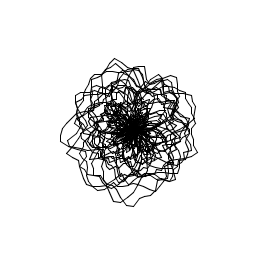
I used Processing to visualize global economy in an artistic way. The flower-like Lines Sketches are generated from four key index date from IMF. More information about the data are in the end of the passage.

Before I get the data visualization project, I pay attention to  World Economic Forum in January, and had a glance of the Report. The global risks is  especially interested to me, but the data charts and forms are very difficult to read.I feel, as a general reader, I am not read the data as serious as professional analysts. Instead of reading the data, I am feeling the data. So I choose global economic related visualization as one of my initial ideas. I want to the data to be more impressive, generating more feeling in the common reader, the data not only serve as a media facilitate reading (Even thought I feel this goal is not achieved when I read the wef report).
Also, I feel meaningful data generative art is not only an random generative fun/eye candy, but interpreting one media to another – to build a bridge between different dialogue. Maybe the interpretation is not very powerful/impressive, but I learned how to interpret by interpreting the economic to roses.

I chose Processing as my coding environment, and started by drawing a line-rose with some magic numbers. The picture is pretty rose-like. But after using the real data. The economy of the countries kinda freak out, not like a rose at all( or like a crazy rose).
Screen Shot 2013-02-18 at 7.49.33 AM

I basically learn coding/processing by myself. During my time writing this, feel my code is not well written (I feel puzzled at when there are more than one ways of writing it but I can’t tell which is the better way),for example, not-efficiency, bad structure. I want to write elegant code. If anyone could take a look at my code at github and pointing out some problems, I would be very glad! (Thanks in advance!)

http://www.weforum.org/reports
I have to admitt:

Finally, this is the source code at git hub
https://github.com/mengs/EconRose

PS: About Data
Data Source:
October 2012 World Economic Outlook
IMF http://www.imf.org/

Selected Data Items:
GDP
Inflation
Population
Government Revenue

Total sample:
185 Countries

Ersatz

17 Feb 2013

Screen Shot 2013-02-17 at 9.03.37 PM

Description

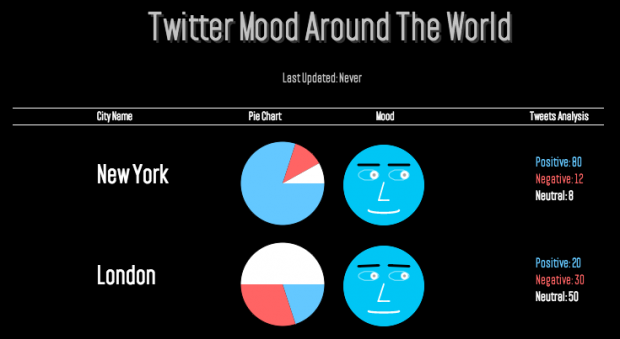
Twitter Faces is a real-time data visualization of agregated people mood in cities around the world. Every two minutes, the application gets the latest one hundred tweets
around a city and does a basic sentimental analysis. Then an average mood is calculated, based on the number of positive and negative people comments, and visualized as a smiling or a sad face.

Implementation

diagram

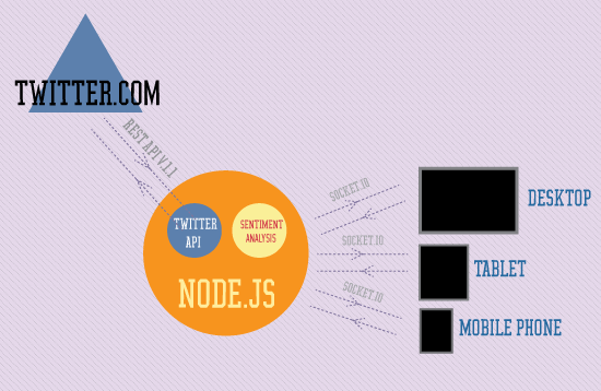
The application is divided in two, a server and a client. The server is implemented, using server side JavaScript with Node.JS and the client, uses Processing’s little brother – Processing.js, so the visualization could be loaded on every major browser, without the need for additional plug-ins, like Java or Flash. Procesing.js is also supported on almost every modern mobile browser, but for now it runs rather slow, so for a better support on mobile, I will need to use something different, like CSS3 transforms and animations, or an SVG framework like Raphael.JS.

Sentiment Analysis

For the sentiment analysis, I have decided to use the most basic algorithm. I would scan every tweet and count every positive or negative word, found in a word list. The average mood is calculated like this: MOOD = POSITIVE WORD COUNT – NEGATIVE WORD COUNT, if the MOOD is equal to zero, the tweet is marked as neutral, if the MOOD is higher then 0, the tweet is marked as positive and if MOOD is lower then 0, as negative.

I have looked into using Sentiment analysis sites, like http://sentiment140.com, but most of them were paid services and querying an additional API would slow things down, so for this project I decided to go with something free and fast.

Server Side

The server side script, runs on (you guessed it) the server :) It’s implemented with Node.js, using Socket.IO and Twit modules. Every two minutes the script will download the last 100 tweets from four cities (London, Cape Town, New York, Sydney – all English speaking), then it will do a sentiment analysis and save the aggregated results as an array. On the other side, it will listen for client connections and will respond to all requests for data.

Client Side

The client runs in the user’s browser and the application could be loaded in almost every major browser version. When loaded the application connects to the server and request all aggregated city data. Then from the average sentiment data, it will generate a face expressing the mood of the people tweeting around the city. The application runs in real time, so all face changes, on new data, are animated. I really wanted to make the face looks more lively, so I have implemented some animations, like rolling and closing eyes, running all the time.

Source Code: Github
Demo: http://www.kamend.com/demos/twitterfaces/