Looking outwards- 1/26/12

by alex @ 1:29 am 26 January 2012

https://www.youtube.com/watch?v=IULdfQbzxKQ

This project is somewhat tech driven, but I really like how much the creators of the project freak out over it. It is a really well made robot obviously– but I’m more interested by the passion of the creators. It is also interesting that they created a robot with such culture relevance to the incredibly passionate soccer world.


http://www.thisiscolossal.com/2011/12/carved-book-landscapes-by-guy-laramee/?src=footer

These book carvings are done Guy Laramee. The books are somewhat TYPT (typical public taste). But as a person with a digital fabrication background this work inspired me by the potential of re-fabricating existing material. I can imagine making work more meaningful by carving out of existing ‘books’ or generally any found object.

http://www.thisiscolossal.com/2011/04/one-man-100000-toothpicks-and-35-years-scott-weavers-rolling-through-the-bay/?src=footer

http://www.daito.ws/en/work/particles.html#3

I like these two works. They are both incredible and highly similar–they both revolve around moving balls and rail systems. Daito’s is more advanced technologically while Scott Weaver’s is more passionate. The contrast between these two works is somewhere I want to fall. Weaver’s incredibly weird passion and fanatic nature is so unique and seems very old fashion, whereas Daito is obviously one of the best coder’s and inventors currently in the art world.

John Brieger — Looking Outwards 2 (Info Visualization)

by John Brieger @ 7:46 pm 25 January 2012

Information visualization is a tricky art. I picked a few I liked and thought other people might like to see.

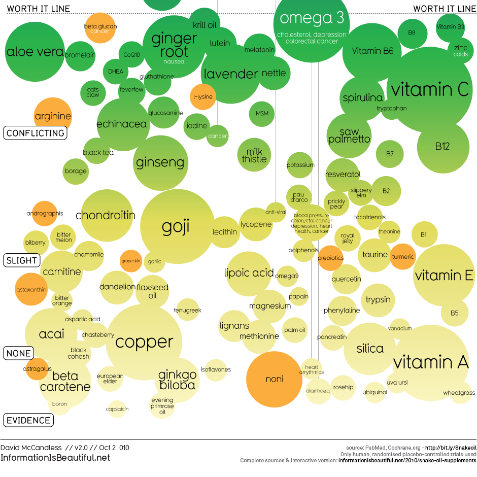
Snake Oil: Visualizing Health Supplement Data

Link To Interactive Visualization

Click the picture to go through to the interactive visualization.

Cinemetrics

[vimeo=https://vimeo.com/26584083 w=600]
Similar to Wattenberg’s shape of song, Cinemetrics is a way to visualize the entirety of film at once. I liked the comparisons between multiple works by the same director in particular.

Luke Loeffler – Looking Outwards (Info Visualizations)

by luke @ 3:29 pm 24 January 2012

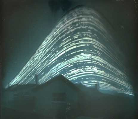
This amazing image was made from a super-long exposure by a pinhole camera facing the sun. You can see the summer and winter arcs as well as cloud cover and sunny days and the visualization has a special aura about it since it is purely the result of a physical process. More of these types of images are at http://www.solargraphy.com

The Clock by Christian Marclay

In this film, Marclay cuts together all the scenes featuring a clock such that the time seen is the same as the current local time. It is an interesting way to visualize the appearance of various times of day in film.

Visualization through Photographic Collections

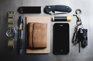
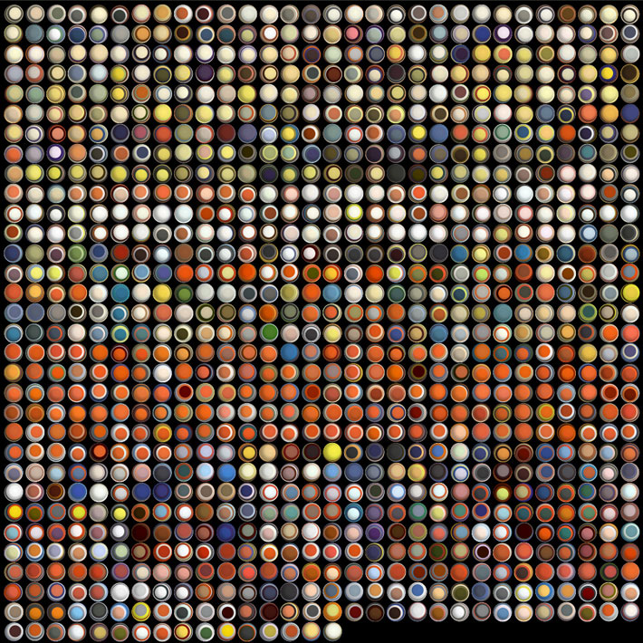
Often amusing, sometimes disturbing, http://everyday-carry.com features items the (predominantly male) readership carries on a daily basis.

“Women laughing alone with salad,” visualizing the atmosphere of stock photography purveyors and consumers through this common meme.


Terrain/topography

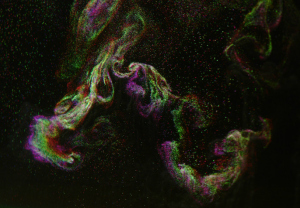
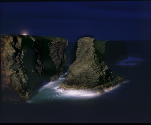
One last set of images… These photos blow my mind. They are long exposure photographs of a regular geometric shape projected on massive landscapes, revealing the underlying shape. (You really have to see these large to get it).

Xing Xu-LookingOutwards-1

by xing @ 6:33 am

cubelets

Cubelets are magnetic blocks that can be snapped together to make an endless variety of robots with no programming and no wires. You can build robots that drive around on a tabletop, respond to light, sound, and temperature, and have surprisingly lifelike behavior. But instead of programming that behavior, you snap the cubelets together and watch the behavior emerge like with a flock of birds or a swarm of bees.
it is a new modular and tactical way to teach kids to learn how the idea of electronics and  logic.
If the look is gonna have a cuter and softer touch, it is more likable for kids.
[vimeo=https://vimeo.com/user5176324/cubelets]
http://www.modrobotics.com/

still life
Still Life by Scott Garner is an interactive wall piece that takes traditional still life painting and ads a motion-sensitive frame on a rotating mount.
Thought painting as a format of traditional art, it is truly interesting to combine the new technology to interact with the painting.
If it is possible, we could add more interaction to it not only the physic system in the “still life”
[vimeo=https://vimeo.com/35109750]

The Warhol: D.I.Y. POP
Create your own digital silkscreen print, just like Andy Warhol would have with the Warhol: D.I.Y. POP app from The Andy Warhol Museum.
It allows the guest to reproduce the artwork and to learn the process of making the artwork is very important.
It could has a better sense of aesthetics.

Pop app

Ju Young Park – LookingOutwards

by ju @ 6:16 am


[youtube=https://www.youtube.com/watch?v=eKtnPOB0VoY]


Lee Lee Nam is a South Korean Media Artist, who uses technology in order to create moving image arts. He tends to use already known images, especially Korean traditional drawings in his works. He makes small objects in famous paintings or drawings live by animating them around canvas of screen. He believes that video art could express imagination. I personally love his works, especially projects about traditional Asian folding screens. Currently, he holds over 200 exhibitions in areas like New York, Beijing, Germany, Washington, and etc. I hope him to make his  works more interactive with audience in such a way that viewers can interact with  his works by touching or sensing them.

One of my favorite projects of his is starting at 2:43 from the video.


[youtube=https://www.youtube.com/watch?v=wrfJ9EOSFEU]


Pillow Talk is a project created by a small company, Little Riot. It is an interactive design project that connects long distance lovers. Each person has a ring sensor they wear to bed at night, and a flat fabric panel which slots inside their pillowcase. The ring wirelessly communicates with the other person’s pillow; when one person goes to bed, their lover’s pillow begins to glow softly to indicate their presence. I find this project interesting since two different users in different locations could interact at the same time. I think it is attractive how this project goes beyond the concept of space. However, I still think the project has a lot to work on more. I think it could improve more if each person can write on each pillow and chat through the pillow while in bed. I personally find this way more interesting.

You can read more HERE 


[vimeo=https://vimeo.com/5190335]


Many people might already know this project, Sound Playground. I’ve already known this project, but I would like to post it anyway since I find this really interesting. Sound Playground is a musical interactive project by Aesthetec.  The project conveys hundred LEDs, touch sensors, and Ethernet controllers for museum application. The project allows audience to actively interact with technology and music. By just touching installations, audience can create unique rhythms, volumes, and melody.  The project itself interprets as a new form of musical instruments. I am interested in technology-music projects like this one, and I hope to create something alike Sound Playground in future.

VarvaraToulkeridou-LookingOutwards-1

by varvara @ 4:07 am

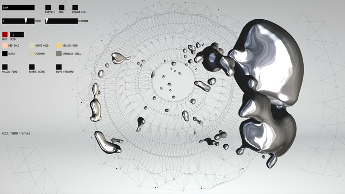
Montblanc Generative Artworks, onformative, 2011

project’s webpage: http://www.onformative.com/work/montblanc-artworks/

This project was developed as a product presentation for the Montblanc watches product line. The idea is that each product creates its own variation of generative artwork following rules defined by the artist. The artwork has been conceptualized as the interaction of two elements – linear structures and amorphous bodies. The linear structures, formed as networks of lines, visualize the mechanism and the high precision of the movement. The amorphous bodies, formed by liquid silver and gold, represent the high quality of the materials that the watch is composed of. I find the artist’s selection of the two elements really effective because it creates a series of strong contradictions: linear and amorphous, rigid and fluid, void and full, structured and freeform.

All the watch specifications, for example size, material, casing type, etc., are read from a product database and a corresponding animation is generated. The animations were created in processing. Libraries as toxiclibs for the fluid animation, GLGraphics for shading, Lee Byrons meshLib and the Ani Tweaning for the meshing and its animation as well as ControlP5 and ProScene for camera and control were used.
 

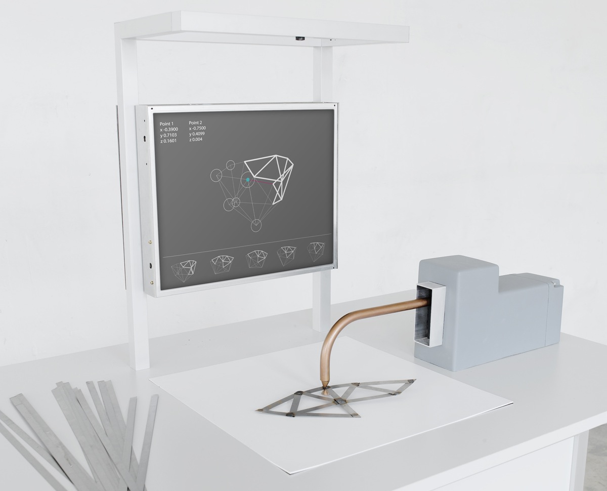
Computer Augmented Crafts, Christian Fiebig, 2011

project’s web page: http://christianfiebig.de/computeraugmentedcrafts/

I selected this project because is related to one of my main research interests: how a computer interface can creatively assist the designer during the design process. I wish there was also a video that would demonstrate the prototype in action! The prototype involves a computer that recognizes the structures created on-camera by spot-welding thin strips of metal together and instantly generates other design suggestions based on any special parameters programmed by the designer. This project highlights a way of exploiting the advantages of technology to enhance traditional craftsmanship. Software used was vvvv and fiducial marker tracker on a Windows XP Desktop PC with webcam.
Hydrogeny, Eveline Domnitch & Dmitry Gelfand, 2010

project’s web page: http://portablepalace.com/hydrogeny.html

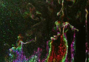
The following video comes from an installation composed of a water-filled container and an array of electrodes situated at the bottom of the container. The electrical perturbation, originating form the electrodes, splits water into hydrogen and oxygen gas resulting to the emergence of bubble clouds which are slowly detaching from the electrode surface and rise towards the liquids surface. I find really interesting how the visual effect of the form emergence is being enhanced by sound and color; the combination of the three makes the installation environment really immersive. The bubble formation is accompanied by acoustic vibrations generated by the transducers and the bubbles themselves. In addition, a white laser sheet scans and illuminates the hydrogen bubble formations resulting to each bubble surface divides the white light into its constituent spectrum of color.

Link to the video:

hydrogenymov.htm


Luke Loeffler – Looking Outwards

by luke @ 3:07 am

Part of the Sentient City Survival Kit, the Serindipitor is an iPhone mapping app that gives you faulty, suboptimal directions to your destination in the hopes that you will stumble upon a new discovery along the way. It is interesting to think of how much power mapping applications have over traffic flow and what we ultimately see on a day to day basis. Entire neighborhoods can effectively become “blacklisted” in real life as electronic navigation becomes more common. My one suggestion on the app is to also mix in optimal directions occasionally to make it less obvious and visible.


Google Vase as seen on Today and Tomorrow

Daniel Michel searched for 8 different vases on Google Images. The rotation outlines of the 8 vases were arranged around a center and connected by minimal surfaces in a 3D construction software. Afterwards the textures were set on the surfaces and the vase was printed by a 3D-Printer in plaster.”

This project has been out for a while but a really compelling instance of digital fabrication techniques bringing segments of completely 2d objects to life in the form of a 3d mashup.

Horizon Notations

Although hand-drawn, these colorful drawings are still very much algorithmic, notating various features of the sky over time. One of the problems I have with computational/generative art is the lack of human touch and nuance. By executing computational techniques by hand (much in the way of Sol LeWit and countless others), the best of both worlds can be obtained. Click the drawing to see additional images in the series.

Nir Rachmel | LookingOutwards-1

by nir @ 2:40 am

1. In the following link , I found a beautiful data visualization project by Jer Thorp. He was asked to visualize almost 140 years of the magazine Popular Science. The outcome is just beautiful, as can be seen – (Visualizing 138 Years of Popular Science Magazine. While is is a very creative idea, and very thoughtful, I wonder if the artist didn’t miss something. Besides being very aesthetically pleasing, this imagery does not convey any new information to the audience.

2. Another beautiful data visualization can be found in the following link. Following the riots in London, the artist mapped how misinformation could be spread on Twitter during a time of crisis. It’s visually appealing and invites the user to “play” with it for a while and learn. The user can choose different hoaxes and explore how the news spread among the twitter community. This kind of vizualization is very interesting, in my opinion, as it has political context and shows how twitter plays an important roles in these past few years’ events.

3. Last (but not least), Beautiful website. The interaction is very cool and engaging, but as always the case with these highly sophisticated html5 / css / js / flash techniques, one wonders what is the correct amount of “cool stuff”. Anything over that amount will very quickly lead to a slow website and impatient users not coming back ever again.

KelseyLee-LookingOutwards-1

by kelsey @ 2:17 am

Light Invaders

by  Superscript² and Martial Geoffre-Rouland
Tech: Flash, WebApp, openFrameworks
[vimeo=https://vimeo.com/12048349]

Using Stealth Led this light installation displayed user created graphics and synchronized them to DJ sets. I was drawn to the project because of the immersive experience, merging music and lights together, filling a whole room and surrounding the concert goers. One thing however that I would like to see, would be this same experience in a more toned down setting, as seen in the behind the scenes video above. The power of the empty warehouse and the projections/music would have a completely different feeling than the intended visualizations for a concert (as seen below) and would provoke a different sort of contemplation.

[youtube=https://www.youtube.com/watch?v=CxREp9upZQY&feature=player_embedded#!]

Where is Your Art

by András Juhász Márton, Melinda Matúz, Gergely Kovács and Barbara Sterk
Tech:WebApp, mini Robots (with text to speech software)
[vimeo=https://vimeo.com/5858426]

When entering the room of this kinetic sound installation, these tiny robots begin to talk about art by using text to speech software and speaking recent tweets. I like the idea of how unusual it must be to see tiny robots acting like humans, by speaking text written by people. I especially like how the robots move seemingly in space, suspended above the ground with poles. However I’d want to focus more attention in on the robots because it was hard to hear them in the video, so I wasn’t sure what the impact of the actual text content would change the experience; possibly adding a microphone would allow the robots to have a stronger impact.

Still Life

Tech: Unity, C, Objects
[vimeo=https://vimeo.com/35109750]

This seemingly usual still life painting (Still Life by Scott Gardner) is actually a Unity made 3D model that is on a rotating mount. Using sensors, manipulations of the painting’s frame (eg. tipping it on it’s side) results in movement of painting’s contents, as if they were real. I’m inspired by the idea of blending the real world and a piece of art contained in a frame. Updating the still life, and adding this whole new level of interaction with the piece is a seemingly simple idea, and yet the provocative nature of this blending is very captivating. This piece was made with a television screen, I think it’d be interesting to take it a step further with a touchscreen instead, allowing for poking and prodding to be added to this set of interaction possibilities.

EvanSheehan-LookingOutwards-1

by Evan @ 1:56 am

Mandala (A Musical Palindrome)

[youtube=https://www.youtube.com/watch?&v=_4GbaK22jjw]

A friend of mine sent me this piece recently because of my FaceOSC project. The guy used the planets of our solar system to generate a piece of music by assigning each planet a pitch and then playing that pitch each time that planet completed an orbit about the sun. The periodicity of the orbits of the planets results in a piece of music that is the same as backwards and forwards if you let it play out long enough.

I love this piece for several reasons. One: SCIENCE. Two: I really like the notion of making art from physical phenomenon. Three: as a musician, I enjoy it when people take data typically represented visually and present it aurally.

I really enjoyed the visualizations in this piece: the demonstration of a planet’s natural sine wave and the evidence that the piece is a palindrome. But I think the piece as a whole was too text heavy. A lot of information could have been conveyed visually and might have made the piece more fun to watch.

Meek•FM
[vimeo=https://vimeo.com/35146511]

Here’s another interesting project that converts visual data to sound. They built a board that allows you to control letterforms projected by the device. But the letterforms are parsed into sounds as well as light, so the board is also an instrument of sorts.

Again, I love the blending and blurring of audio and visual information. I also love the craftsmanship and interactivity of the board. It strikes me as a very engaging piece. It’s the kind of thing that’s inspired me ever since I was a kid visiting science and natural history museums to make things.

Magnetic Movie
[youtube=https://www.youtube.com/watch?v=IT2AQC3X5bk]

Based, I believe, on the audio track, this movie is an artist’s conception of what magnetic fields look like. I love the lines; they remind me of many renderings of chaotic maps I’ve seen. I don’t know that this is really a form of computational art, but it is art inspired by science. It’s something of a shame that those are not real magnetic fields, but it’s still fun to watch.

« Previous PageNext Page »
This work is licensed under a Creative Commons Attribution-Noncommercial-Share Alike 3.0 Unported License.
(c) 2023 Interactive Art and Computational Design, Spring 2012 | powered by WordPress with Barecity