Billy Keyes – Looking Outwards 2

by Billy @ 3:55 pm 29 January 2012

I’m on the look out for information visualizations this week.

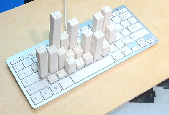
Keyboard Frequency Sculpture

Mike Knuepfel made this clever, simple visualization of the letter frequencies of the English language (as reported by Wikipedia). The physicality of this piece (literally) makes it stand out, given that the data are common and could be visualized in many different ways. By building on top of a real keyboard the inefficiencies of the standard QWERTY layout are made obvious; you can imagine laying your hands on top of the sculpture in a way that you wouldn’t do with a bar chart, heat map, or other 2D representation. Some commenters have called out the project for depicting letter frequency and not key frequency as might be implied by the setting. But while key frequency would be interesting (especially for gamers or Photoshop users), I don’t think the use of letter frequency detracts from the result.

Binary Subdivision of the World

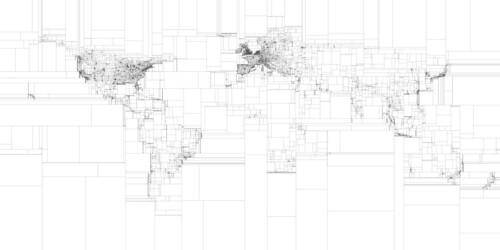
Binary subdivision of the world

This image by Eric Fischer divides the world into boxes that contain an equal number of geotagged tweets. The result is, for the most part, not surprising: areas with low population density require larger boxes to contain the same number of tweets as areas with high population density. What I liked is how clearly the shapes of continents are outlined by the changing density of boxes. This visualization would be unremarkable if it was overlaid on an actual map of the world; the fact that the world map emerges from a non-topographical data set makes this effective. Also of note: Eric wrote this to figure out the ideal way to query geo-APIs of web services like Picasa.

Drawing Water

Last, another piece which shows geographic shapes derived from non-traditional data. David Wicks’s Drawing Water depicts a theoretical flow of water from locations of rainfall to locations of consumption. While sources and sinks are based on actual consumption and precipitation figures, the paths are generated. Again, I think this disconnect from reality makes the piece more effective. We all know, to some extent, how water flows through streams and rivers to feed lakes and reservoirs and by removing this element, Wicks lets us focus on the where of flow rather than the how. It appears that an interactive version of Drawing Water exists, and I wish there was a better video demonstrating how the interaction works.

Sarah Keeling; Looking Outwards 2

by sarah @ 1:51 pm

Sweet Spot

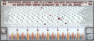
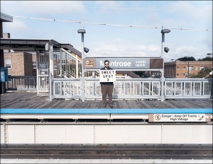
Jonathans Gitelson created the data visualization “Sweet Spot” that shows where to stand on the train platform so that when the train stops, you would be conveniently right in front of the doors. The project consists of a diagram showing where the sweet spots are on the platform as well as a series of photographs of him standing in each “sweet spot”. The idea for the project came from his morning commute into Chicago and the struggle to get a seat on the train during the morning rush. I saw this piece at the Scottsdale Museum of Contemporary Art over the break and thought it might be interesting to look at for its concept and ideas of the different odd data that can be visualized. I think that his approach of making the diagram by hand is unique, but that the way he formatted the information could be done in a different way that would convey the information more effectively.

http://www.thegit.net/sweet_spot

Map of Scientific Collaboration Between Researchers

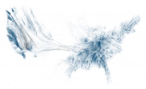
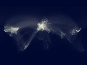
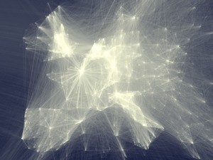
Oliver Beauchesne created a data visualization that mapped where scientific collaborators were from through 2005 to 2009. He got the idea to do so from the Facebook friendship map and decided to make a similar one with a data set from his work. I think it shows interesting patterns and groupings of collaborations that would otherwise not really be known. I also think that data removed, it is a beautiful image and that the abstraction of the map adds to its interest.

http://www.visualcomplexity.com/vc/project_details.cfm?id=747&index=747&domain=

20 Hz

20 Hz was made by Ruth Jarman and Joe Gerhardt (known as Semiconductor) in 2011 and is a bit of a different approach to data visualization than some of the example we have been looking at. They use radio data (captured at 20 Hz) gathered from a geo-magnetic storm in Earth’s upper atmosphere as the audio for the piece. The changes in the sound then generates the visual forms and patterns that appear.

EvanSheehan-LookingOutwards-2

by Evan @ 10:00 pm 28 January 2012

Bowing Gestures

[youtube=https://www.youtube.com/watch?v=nuFPmEJkSkA]

So much expression in bowed instruments comes from how the musician uses the bow. I love watching all these dimensions of the bow represented simultaneously in real-time with the actual music. Unfortunately, I don’t find it all that readable, so it’s not very instructive. There’s a little too much going on and the data’s too raw for me to get much out of it without a great deal more study.

The Beatles: Song Keys

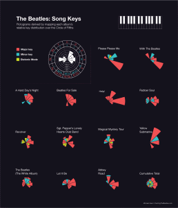
This is probably my favorite graphic from the Charting the Beatles project. I think it’s pretty cool how much information is packed into this static image, and the kinds of trends you can see just at a glance. Things like Help! having no songs written in a minor key or how the three of the Beatles’ more unusual records—Revolver, Sgt. Pepper, and Magical Mystery Tour—immediately stand out from the rest because of the variety of unusual keys the Beatles used on those albums.

I wish the visualization was interactive, though. I’d like to be able to mouse over the pie segments to see which songs they represent. I’m curious, for example, which songs on A Hard Days Night were written in Fm.

Joe Medwid – Looking Outwards – 2

by Joe @ 7:36 pm

Breakdown of Samples in Girl Talk Tracks.

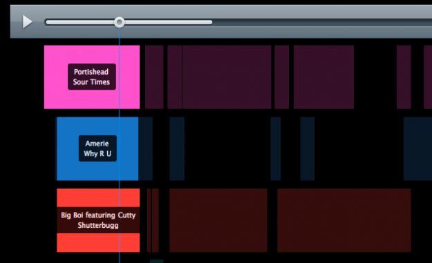
A refreshingly simple (read: achievable for one of my limited resources) visualization that shows exactly which samples are playing when in Girltalk tracks, based on data gathered from Wikipedia. A decidedly simple application, but useful for people like me who often have trouble keeping track of the tracks… on… these… tracks? The creator is definitely taking the most obvious approach to this visualization and though it’s undoubtedly effective, it could certainly be polished a bit more. I can envision a guitar-hero-like glow on the various tracks as they begin to play in unison, for example.

Wikipedia Edits on a Random Day

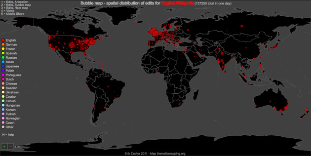
A multi-format visualization of Wikipedia edits on a random day. By far the most interesting of the various available formats is the animated setting, showing edits in real-time as they pop up over the 24-hour period, color-coded by language. My primary motivation in posting this particular video is utter rage that someone took the best idea I managed to scrape together for our visualization project. GRRR. That said, the graphical fidelity of this piece could definitely be improved, as could its speed, presumably by limiting the available number of days.

Dungeons and Dragons Visual Resume

An animator / artist presents his resume in the form of that time-honored pen and paper standby, the Dungeons and Dragons Character sheet. For the uninitiated, during a game of D&D, each player has a sheet very similar to this that essential provides all of the relevant game information about a character, from how smart they are to how well they can open a lock or use a bow. Though the analogue is sound and the premise is one I’ve often contemplated pursuing myself, this particular example could benefit from a few fundamental changes. It sticks to the actual sheet’s layout a bit too slavishly, lacking general information hierarchy and failing to emphasize data that would be relevant to any legitimate reader. Though given the format, legitimacy might not be the creator’s main concern.

KelseyLee-LookingOutwards-2

by kelsey @ 6:13 pm

GE: A Slice of Life

[youtube=https://www.youtube.com/watch?feature=player_embedded&v=cIQXIJPb43U#!]
In this visualization, photographs were taking of different cross-sections of everyday objects (eg. horned melon, baseball hairdryer), and then the photographs were montaged together into a video. The idea of examining cross sections of objects isn’t very inventive, however looking at these non-tissue sample/non-biology related objects makes for an interesting twist, especially since this data isn’t something that many people have probably examined in this light. I would like this to be a more interactive collection of images that I could click through; the video was good to advertise for this technology, but people who are actually interested in the cross sections can’t process everything that fast.

Cartagram

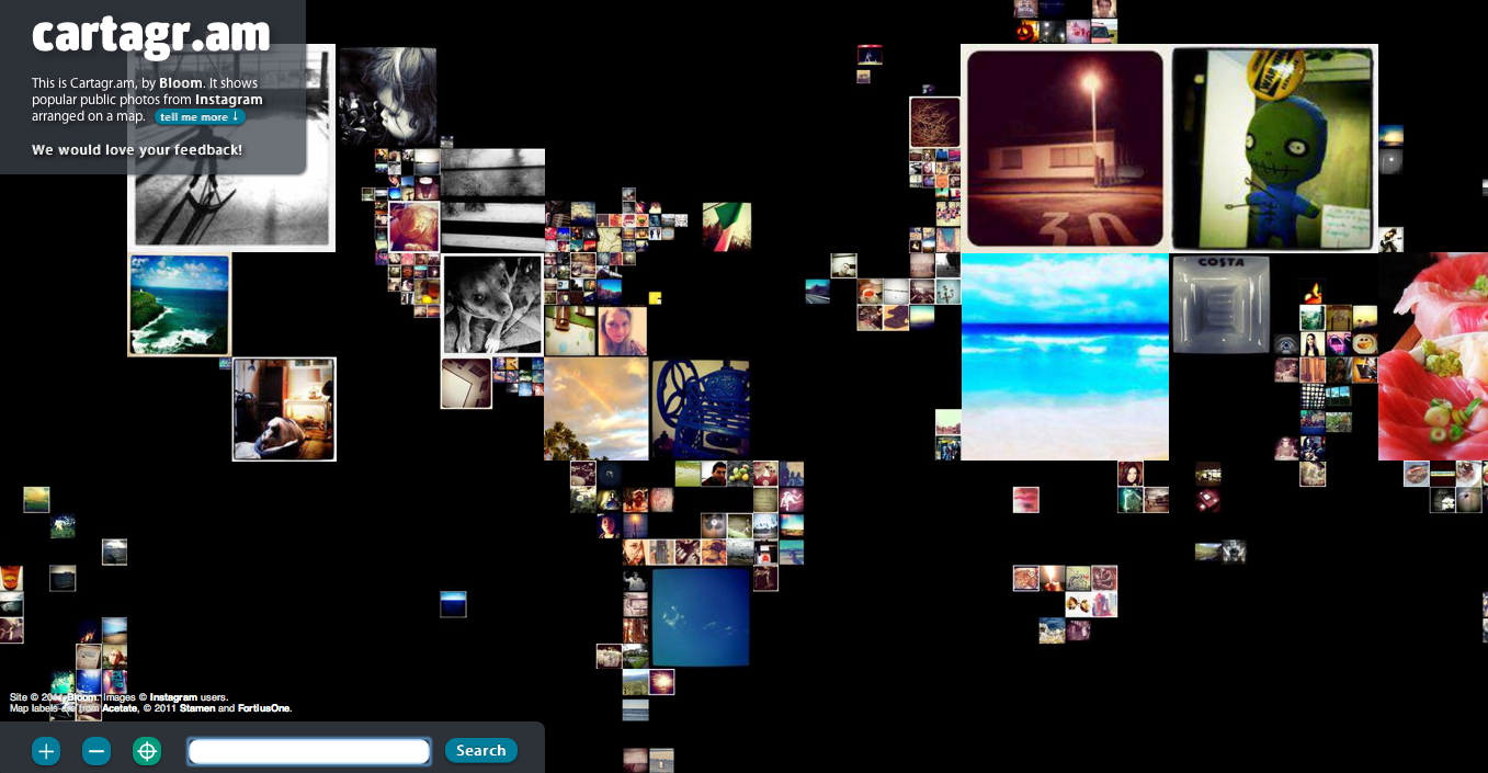
This site, collaged Instagram photos into a map of the world, based on the location associated with the photo. Zooming in to different regions of map or searching for a specific location allows people to get the most out of the data, and personalize it for themselves. This piece is interesting because Instagram is a product mainly used by people who are thinking only about what is going on in their own lives and catalogue that, however when collaging all of the photos together, the images can be reused for this whole other purpose of deriving location based trends across many users. In a future iteration it’d be interesting to utilize a magnifying glass type feature, because as the user zooms into the screen the images change and move around, and context is also lost, but that is the only way to truly see some of the smaller photos.

Evolution of Web

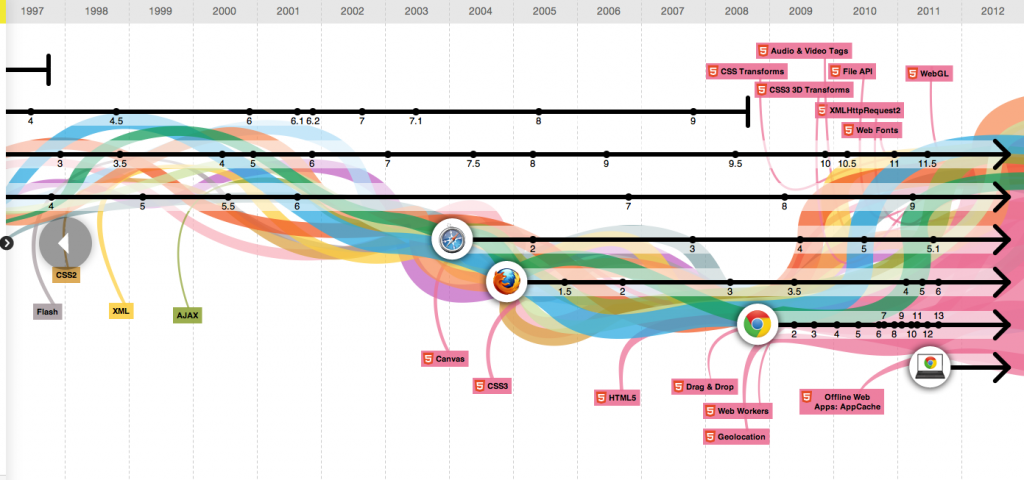
This visualization shows the origin, lifepspans of internet browsers and internet technology over time. There are also screenshots associated with each of the browsers from various years as well as Wikipedia links to different technologies. I really like this piece because it quickly conveys meaning (origin of a browser/technology) and yet layers more meaning in the piece for those that are interested. I would say,that one thing that initially confused me was the colored lines in the background, I thought there was some significance between the colors and the technologies, only later realizing that it was like that for decorative reasons.

Sam Lavery – Looking Outwards 2

by sam @ 4:37 pm

http://mbostock.github.com/protovis/ex/cars.html

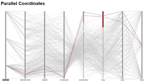
I am a big fan of visualizations that condense a massive amount of data into a beautiful, interactive form. The above is a visualization of cars using 8 variables such as engine cylinders, weight, year, mpg, etc. This multivariate information tool was created at the HCI institute at Stanford. I think that this visualization is very informative and also aesthetically beautiful. By dragging the parallel columns you can create ranges in every variable, highlighting only the cars that fall within every range specified. This is endlessly entertaining and I found myself losing track of time as I interacted with it.

[youtube https://www.youtube.com/watch?v=WIbRqAM7QNM]

http://www.connect2congress.com/blog/

Connect2Congress is a project by Peter Kinaird, a Phd student at the HCII at CMU. While this is not a polished visualization (he is working on an improved interface), it is very successful in presenting a lot of information graphically and in a short amount of time. Similar to the baby names graphic, this interactive visualization is appealing because the user can manipulate and explore the data to learn more about what they are interested in. It is very easy to ask Connect2Congress specific questions about the voting habits of our elected officials. I hope that visualizations such as this gain popularity during this year’s election cycle.

L.Outwards–Data Vis

by alex @ 1:38 pm 27 January 2012

2 HOURS, 2 MINUTES, 2 SECONDS (WIND AT WALDEN POND, MARCH 12, 2007)

by: Spencer Finch

“This piece re-creates the changing breeze experienced on Walden Pond’s shore. The duration of the wind cycle is a reference to Thoreau’s stay at the pond, which lasted two years, two months, and two days…”

This is hands down one of my favorite data visualizations. I became aware of Spencer Finch this past summer. His work is often simple both visually and conceptually, yet secretly complex. He does a great job of hiding the technology of the work and keeping the viewers focused on the romantics of the work.

Alot of his work has some sense of input– either strict data, collected data, personal data, or sensory data. All his work is worth seeing though.

This is another piece of his. Ice cream in the color of the sunset taking place outside the gallery:

////////////////////////////////////////////\\\\\\\\\\\\\\\\\\\\\\\\\\\\\\\\\\\\\\\\\\\\
\\\\\\\\\\\\\\\\\\\\\\\\\\\\\\\\\\\\\\\\\\\\////////////////////////////////////////////

Arctic Sun – Solar Exploration Device for the Arctic
by: Nathalie Miebach

“Using a base of 48 hours, this piece converts various layers of data (July 06 – June 07) related to the gravitational influence of both Sun and Moon on the Arctic environment. ”

Nathalie creates insane work. I’m not sure really how I feel about it aesthetically mainly because I haven’t seen her work in person. But I think this is incredible as a form of ‘data visualization’. Her work is just throwing up massive amount of data–I like that aspect of it.

////////////////////////////////////////////\\\\\\\\\\\\\\\\\\\\\\\\\\\\\\\\\\\\\\\\\\\\
\\\\\\\\\\\\\\\\\\\\\\\\\\\\\\\\\\\\\\\\\\\\////////////////////////////////////////////

Kepler Exoplanet Candidates
Jer Thorp

Everyone knows the work of Jer Thorp, but I feel like this piece goes unnoticed. Jer actually showed me how he programmed this piece and it is actually really simple!! With that said… it is still a really satisfying interaction. The interaction is both intriguing AND necessary. It helps get a clearer picture of the information presented.

Zack J-W Look Out!: infoVis.1

by zack @ 11:03 pm 26 January 2012

This was my first taste of the power of imaging software to visualize data and that power no doubt inspired me to check out computation as an augmentation or entity in art and design.  This is a brief clip of Hans Rosling from TED 2006.

[youtube https://www.youtube.com/watch?v=GeXJnOE-1gw]

It’s difficult to critique what Rosling does here but if I were to, I would say that where this falls short is that it begins to tap into the power of computation and yet remains in the format of static graphic design visualizations.  It’s like Tufte in motion.  The power of computation in visualization is, at least, to present information in a more exciting dimensions than x and y.

Alex Wolfe | Looking Outwards | Gauntlet

by a.wolfe @ 4:37 am

Doggleganger

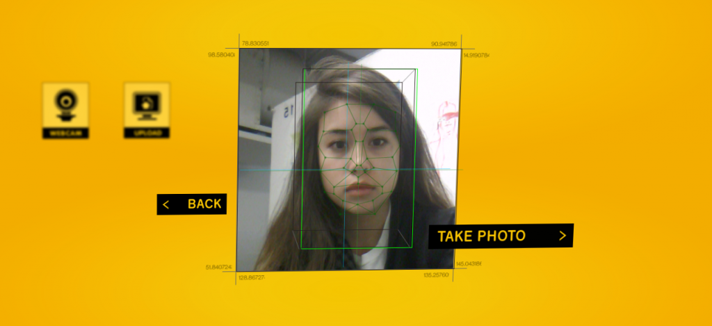
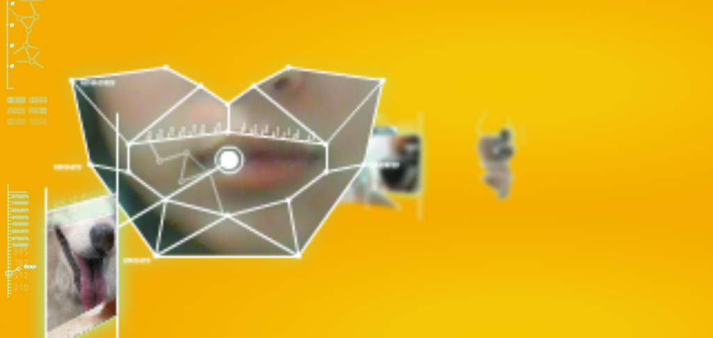
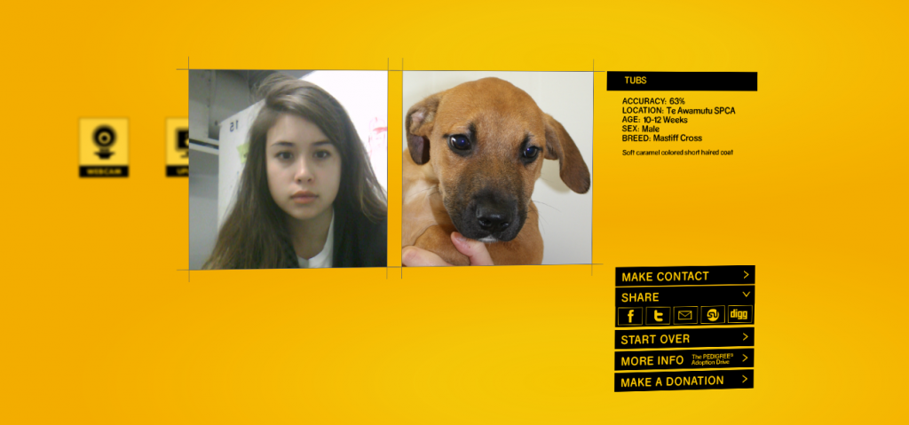
Doggleganger  is an app  developed by the Pedigree Adoption Drive and NEC. It uses a simple face recognition system to match dogs in need of a home to the humans that use it, building on the idea that people tend to look like their dogs. Its a ridiculously fun/clever way to aid these dogs who would otherwise die in the shelters. Unfortunately, you currently have to take a quick jaunt to New Zealand to pick up your new soul mate, but hey that’s kind of a win win.

The Artist is Present

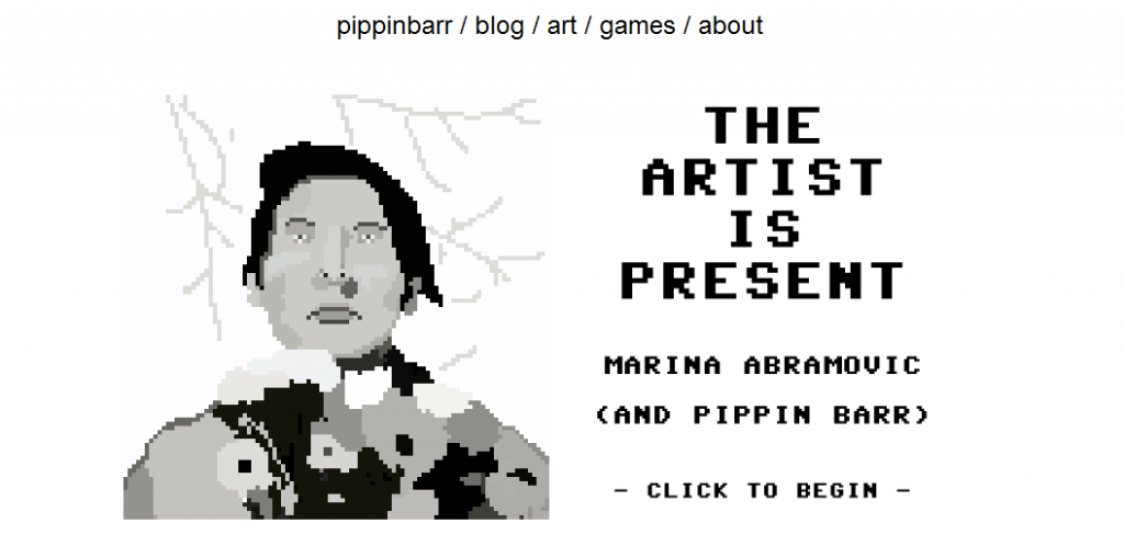
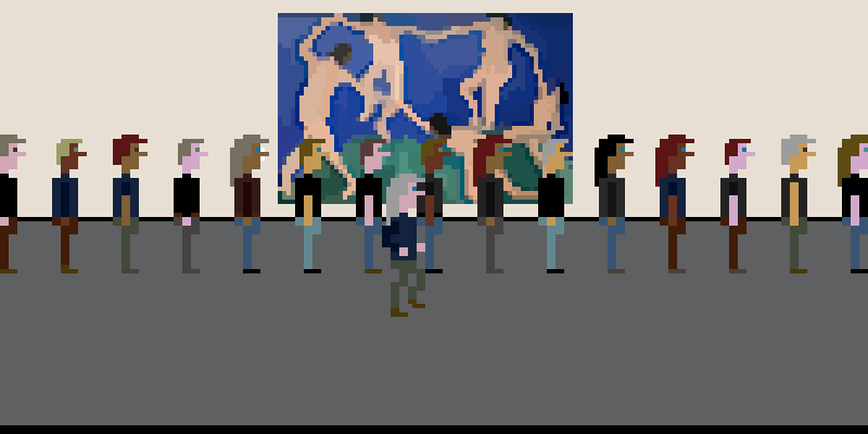
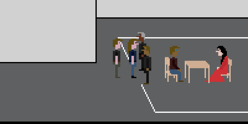
Developed by pippinbar games, The Artist is Present is an old school Sierra-style recreation of the famous performance piece of the same name by Marina Abramovic. The user can relieve the experience including the incredibly long and frustrating line into the museum.

“Have the experience only a lucky few have ever had! Stare into Marina Abramovic’s eyes! Make of it what you will! Just like art!”


Andreas Schlegel | Procedural Drawings

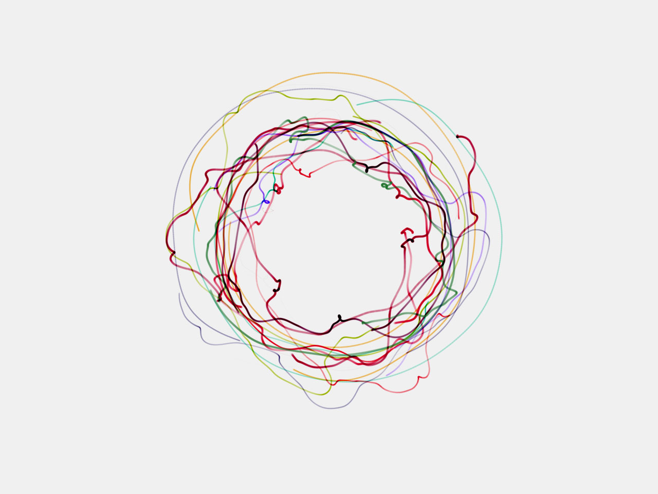
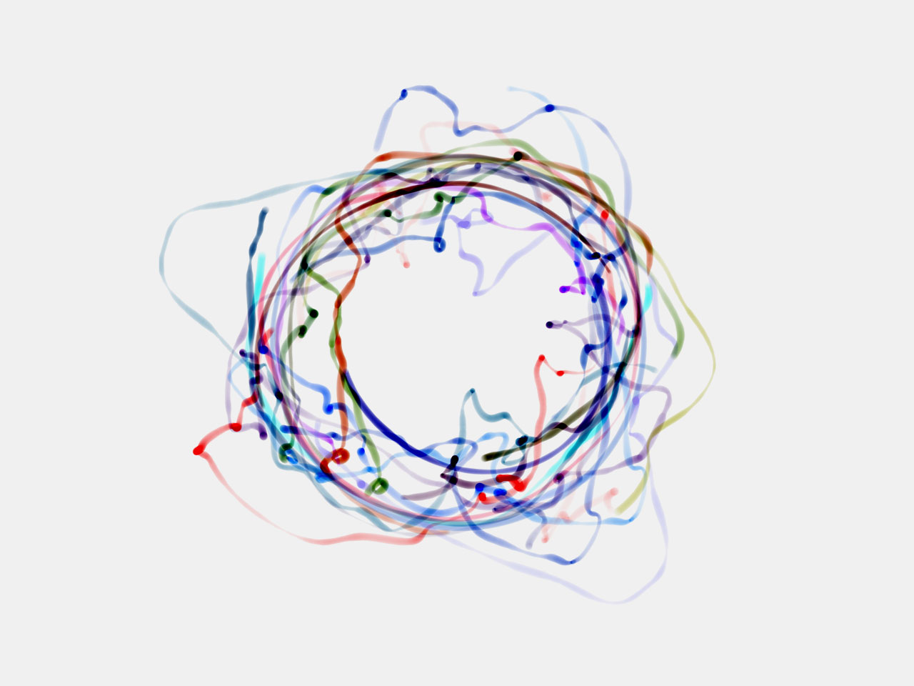
Andreas uses a CNC to produce these very simplistic drawings that are quite beautiful.


Duncan Boehle – Looking Outwards 1

by duncan @ 3:12 am


3 Dreams of Black

3 Dreams of Black is an interactive music video that uses WebGL to dynamically change the scenery and visuals of the video. As the viewer moves the mouse around the screen and points at the walls of an abstract cityscape, flora and fauna grow and stream out from where the viewer is pointing, creating a mesmerizing set of animations. In an opposing scene, the viewer draws dark pools into a green landscape, from which disfigured animals spawn and follow the camera. But perhaps the most interesting scene is where the viewer guides a flock of birds around a desert, which contains user-submitted voxel art to view and explore.

The most interesting aspect about the project for me is the manner in which the scenes seem to organically grow and morph in reaction to the mouse, and everything seems deliberately beautiful despite being completely dynamic. Although the user-submitted content is nice to see, it only seems to distract from the artistic vision of the project, since it didn’t seem to be (or need to be) the main focus.

The visuals throughout the project all seemed to be digital, but their appearance ranged from hand-painted to N64-esque low-poly graphics. I think the project did a great job demonstrating the power of WebGL in an interactive context, but I think they could have made a better artistic point with being more selective about what they showed off. The organic generation/corruption of the different scenes could have made a stronger thematic point, especially if it had been more strongly tied to the music.

Because it’s interactive (and short), you should take a look at the full website. But if you’re short on time or graphical processing power, here’s the YouTube demo:

[youtube=https://www.youtube.com/watch?v=ReH7zzj5GPc&rel=0&w=550]


Still Life

Still Life is an interactive art piece by Scott Garner that teases the saturated genre of typical still life paintings containing fruits and vases. What looks at first like a painting is actually an LCD display with a wooden frame, displaying a scene being rendered and simulated in Unity3D. As the viewer tilts the frame, held by a rotating wall mount, the direction of gravity in the scene adjusts accordingly, giving the illusion that the scene is physically contained in the art display.

The work is relatively simple, and it achieves its purpose perfectly well: to add a new dimension to traditional still life painting. What I enjoy is how simply it subverts the viewer’s expectation for a framed painting with an entertaining twist. The first things that come to mind are other classical paintings that could have been given interesting spins. For example, a “painting” of Mona Lisa with facial tracking, where she subtly rotated her head to face the viewer, or a view of The Persistence of Memory where the melting clocks are actually simulated fluids that very slowly melt across the scene.

Unfortunately the work does come across as a little gimmicky, but I think for what it tried to do it worked very well. I’m curious if there are other materials that could have given an even better illusion, such as an OLED screen to remove the typical LCD screen glare, or better textures for the fruit so they look more realistic.

You can check out the Vimeo video here:

[vimeo 35109750 w=550]


Machines

Machines is a project to collaborate between engineers and musicians to create unique instrumentations and pieces of music. The machines are made mostly from recycled and surplus parts, and they have a very steampunk aesthetic that makes them look far more abstract than traditional instruments. The project would involve collaborating with traditional musicians who would try to create new kinds of music while learning from and influencing the engineers.

The types of machines in the project looked very compelling to me, because I’ve always been a fan of both experimental music and rube goldberg machines, and their inventions so far seem to be a great mix of both worlds. Inviting talented musicians to play with these instruments and see what they can come up with seems like a great way to join two worlds and fully realize the potential of this type of project; it makes it much more interesting than if they had simply built fun-sounding machines with no feedback from artists who could fully utilize them.

Although I am a fan of the visuals of the machines they’ve built, it seems like they’re focusing a lot on the presentation rather than the musicality, which has a lot of untapped potential. Musical instruments seem to be a relatively untapped genre of experimentation, since we’ve been refining the same ones for hundreds of years, so I hope they create machines that produce a large spectrum of types of music and sounds, and investigate other world music cultures for more inspiration.

The project is currently in funding via Kickstarter; click on the image to view the project’s page:

Machines

« Previous PageNext Page »
This work is licensed under a Creative Commons Attribution-Noncommercial-Share Alike 3.0 Unported License.
(c) 2023 Interactive Art and Computational Design, Spring 2012 | powered by WordPress with Barecity